Trending
Opinion: How will Project 2025 impact game developers?
The Heritage Foundation's manifesto for the possible next administration could do great harm to many, including large portions of the game development community.
How to make use of traversal spaces and make them fun and interactive for the player.

Flow in level design is the art of guiding the player through the level. However, flow is not restricted to layout only, since the pacing and the challenges the player will face throughout the level is part of the flow. Naturally, we call it flow since the player is traversing through space, just like water following the stream in a river. Flow should rarely be broken, meaning that the flow should not lead to a dead end most of the time. Of course dead ends are okay to promote backtracking and other quirks created with a specific design in mind. The issue rise when the dead end is simply just a dead end.
In this article, as I have labeled as part 01 since I will return to write more about flow, I am going to go through a couple of stages of flow used in games to make it more interesting, extend playing time and also keep things fresh and fun for the player.
Let’s begin!
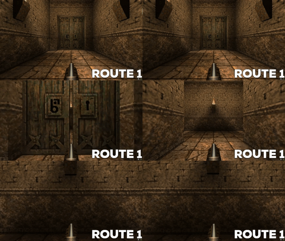
In this example the player is going to follow a laid out linear path through a door. Great, easy enough! A beginner level designer may create a straight path like this.
Route 1

This is fine if the goal is to simply traverse. However, it’s good to mix it up now and then. Like this.
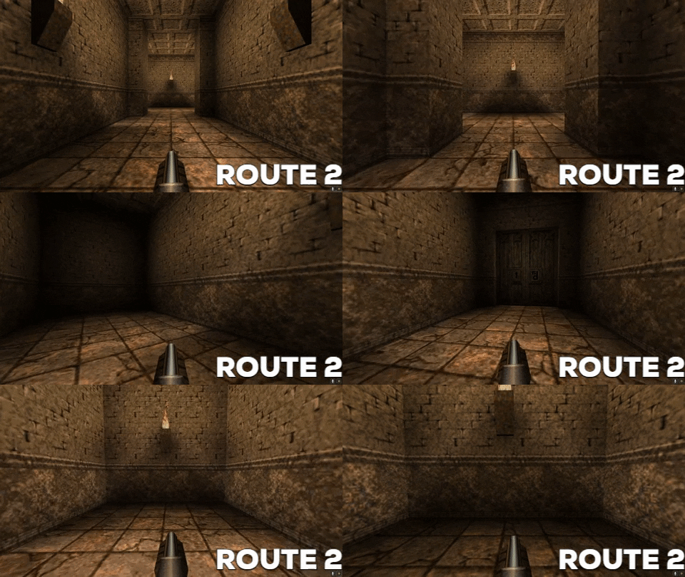
Route 2

Here our beginner designer has decided to play with the geometry a bit and added a turn to the right. This is still pretty simple, however this adds another layer of depth since we can spawn enemies behind the corner to surprise the player and drive gameplay. But our designer can do better.
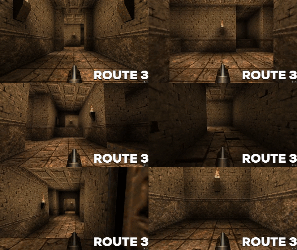
Route 3

In this example the designer is going for more intermediate design choices. Our beginner has now understood the value of loops and we are therefore required to unlock the door by pushing a button. The designer has also added a lift and some verticality making the space more interesting and less flat. Naturally, we need to reach the button and a good rule of thumb is also to see what you unlock when you push said button. Rarely do people understand or remember what has or is supposed to happen if they get no immediate response from pressing the button. This is because the door, the lift or whatever obstacle there was before no longer exists in their working memory inside their brains. Our designer has one more trick to play to make it even more interesting.
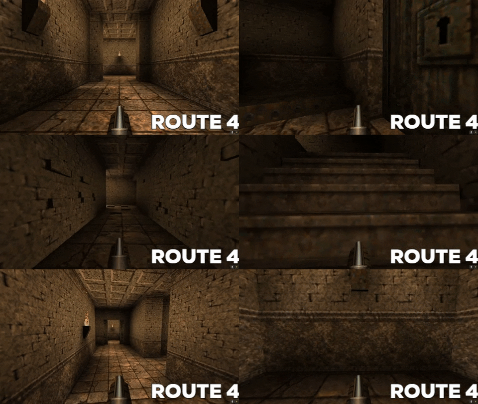
Route 4

In this stage the designer has been stricken by the designers’ disease and is now wholly committed to this area and have therefore added yet another loop within the loop to provide a cooler and more fun experience. The way is laid out seemingly linear for the player but the designer has the intention to shock and therefore they’ve made the floor into a breakable trap that will be destroyed upon touch. The player will fall down into the hole and is now forced to navigate this new area and fight the monsters ambushing them. Simple yet very effective to spice things up and keep things interesting.
Topdown example

Summary
Straight paths are okay if the aim is to simply traverse space. If you find yourself with multiple straight paths it’s time to spice some of them up by adding turns or small interactive events.
The player should see what happens when they interact with something.
Dead ends are okay if they are leading to something else but are not okay if they are simply dead ends without any meaning.
Be aware of over committing to every single room you create.
You May Also Like