Trending
Opinion: How will Project 2025 impact game developers?
The Heritage Foundation's manifesto for the possible next administration could do great harm to many, including large portions of the game development community.
Naughty Dog calls Uncharted their 'biggest and most complex' challenge yet, and shares successes and stumbles in this fascinating postmortem.

[Naughty Dog calls Uncharted their 'biggest and most complex' challenge yet, and shares successes and stumbles in this fascinating postmortem, originally printed in Game Developer magazine.]
At the end of 2004, some of the developers at Naughty Dog (Jak and Daxter, Crash Bandicoot), began work on the studio's first-ever game for the PlayStation 3.
Cryptically assigned the working title Big, the project would prove to be Naughty Dog's biggest and most complex game yet. This postmortem discusses some of the things that we Dogs struggled with, some of our successes and failures, and what we plan to do differently next time.
1. Strong up-front design -- that we can ditch when we need to.
As we began to build our new PS3 technology, we also started to formulate a design and direction for what would eventually become Uncharted: Drake's Fortune. Once we'd agreed on the game's general scope, we defined the tone -- a light, cheerful, humorous one, similar to that of our pulp adventure inspirations -- and what the core mechanics for the game would be. However, one of our strengths at Naughty Dog is prototyping early and knowing when it's time to deviate from our design documents.
A great example of this is our aiming mechanic. We initially thought that Uncharted would use an automatic lock-on aiming mechanic for its gunplay. We spent several months trying different lock-on target selection mechanics, control schemes, and camera combinations; we even implemented several types of mini-games for executing special kills while using the lock-on.
Despite all of the planning and production time that we'd invested in the mechanic, the gameplay never gelled for us and we eventually decided to try a completely different approach: free, manual aiming.
Even with the free aiming in a rough form, the game instantly became more visceral and fun. Although this new direction meant months of new work, we'd made our decision just early enough to be practical -- we had enough time to integrate and polish the new mechanic, and it was definitely the right choice to make for our game.
We use this kind of process a lot at Naughty Dog -- having a well-defined idea on paper is great, but the best way to firm up a game design is by trial and error, and you have to know when an idea just isn't working and have the courage to ditch in it favor of a better plan.
2. Focused gameplay.
Except for a few vehicle-based sections, Uncharted's gameplay is tightly focused on a few core mechanics. This was quite a difference from the design approach of the Jak and Daxter series, where much of the fun was derived from the sheer variety of gameplay in the missions.
This focused approach, along with the realistic world we created for Uncharted, made game design on the project quite challenging. We couldn't just come up with some wacky idea and give it its own separate mission in order to make a section of the game more interesting.
This resulted in what we feel is a much more elegant design overall. We were forced to think about the game as a whole, and to make sure that our core mechanics were truly exceptional.
Additionally, because we created things more systemically -- like the player's mechanics and the AI-polishing the game in the final months of production became a little easier. For example, whenever we refined an aspect of the player's move set, almost every level became more fun because they almost all relied on that core move set.

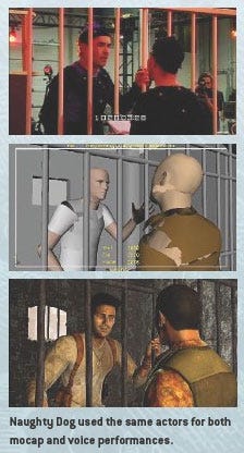
The actors did a blocking walk-through before hitting the mocap stage.
3. Great performances through subtlety.
 We're happy to say that we've received a lot of praise for Uncharted's characters, and the performances we captured and created for them.
However, we think that the success of the story, the tone of the game, and the characters comes from a combination of elements that can be united under a banner of subtlety.
Because this was our first experience using motion capture, we had an open mind about how to do things, and our approach ended up owing more to the way a movie or theater production is staged than the way most people in the games industry run their mocap shoots.
For example, we chose to use the same actors for both the physical and vocal performances in our cut scenes, which is unusual for games.
We did a lot of table-reads and blocking walk-throughs with the actors, so that the scenes were well thought-out when the time came to do the shoot.
This also let our actors improvise with the motion-capture director and our game director, and many of our favorite moments in the game are a result of our actors' creativity.
Our choice to use the same actors to mocap both voice and physical performances paid off. We believed that on the PlayStation 3, the characters were going to be of high enough fidelity that the player would notice the nuances that a trained actor would bring to a mocapped performance.
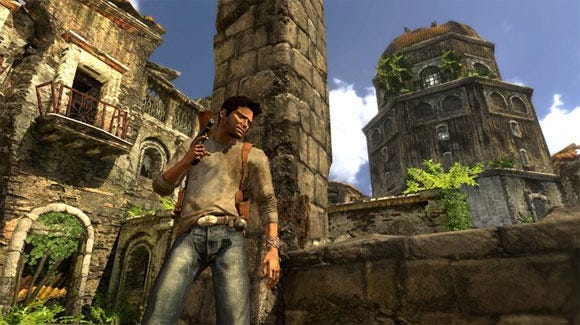
The concepts for the main characters were always directed towards simplicity -- Drake's outfit is really no more than a t-shirt and jeans. The reason for this, and for other choices like it, is that we wanted the characters' personalities to come through in the performances of the actors, rather than being expressed in accessories and trinkets attached to the character model.
We even took a minimalist approach with the story. We constantly applied the rule of "show, don't tell" during our writing sessions. If a line of dialog could be implied in a gesture or an expression, it was left out. Additionally, characters' lines almost always had two layers of meaning: what the character was apparently saying on the surface, and what they were really thinking (which, again, was conveyed by the physical performances).
There were times where we questioned ourselves and wondered whether this sort of depth in writing and performance would come off in the game -- but our fears were quickly laid to rest as the cutscenes started coming together.
The high-resolution characters that our artists created combined with the mocap data our talented animators finessed really brought the nuanced performances to life.
As characters delivered lines that contained layers of subtext, their true emotional state could be read in their gestures and expressions -- and it's this delicate combination and the resulting authenticity of character that we think is the key to the success of our story.
4. Animation and AI.
Animation and AI were very important for our project from the beginning. We'd been proud of the animation in our previous games, both in-game and in our cutscenes. We knew that in order to make our realistic characters' humanity and vulnerability as believable as they needed to be, we'd have to work extra hard. Excellent facial animation, in particular, would be key to depicting a relatable hero that you'd really want to root for.
Also, AI was really going to make or break the gameplay -- both for the enemies in combat and the friendly characters that Drake would journey through the game with. So at the beginning of the project, we set out to create very complex animation and AI systems, which were planned to provide a general solution to the problems associated with believable human interactions within a game environment.
Ultimately, our initial directions for both systems proved to be too complex. We had gotten hung up on aesthetics, and forgot about just getting the game working and making it fun. So instead we implemented simpler solutions, more focused on the kinds of activities and behaviors that you associate with the type of character-action game we had in mind.
We used layering and blending techniques to play back different full-body, partial, and additive animations on Drake's body and for the AI-driven characters, resulting in a huge apparent variety of animations. Sometimes we'd be playing back up to 25 layered Drake animations at once! We also used some inverse kinematics techniques to help register Drake to the environment, and in the end, we were very happy with the results that we got.
5. Next-gen graphics.
For our previous four projects, our studio worked exclusively on the PlayStation 2. That left us facing a big learning experience as far as developing modern graphics technologies -- such as shaders -- and Uncharted saw a tremendous amount of collaboration between programmers and artists in order to achieve the kinds of results we wanted.

As we'd done for previous Naughty Dog projects, we used multiple rendering engines at once, which we wrote specially to handle different parts of the game world.
Two of the major systems rendered our geometry and a third did water, while other renderers took care of particles, decals, and the HUD. All of these were very heavily optimized for the PlayStation 3 hardware, using the console's SPUs in some cases to supercharge the RSX graphics processor.
Our water shader not only uses the same basic reflection and refraction techniques as other games, but uniquely models water flow effectively.Color is computed not from textures but by using optical and physical principles, some based on water depth, which helps give our water a very realistic look. We did all of our water effects -- foam, water bubbles from churn, and silt -- in the shader, which also helped our water "sell."
All in all, we were very happy that we not only caught up in terms of graphics technologies, but even helped raise the bar.
1. Slow to get up to speed.
When we first started developing ideas for Uncharted, we explored a lot of different directions. Although we always knew that we wanted to make a third-person character-action game set in a load-free world, the rest of the gameplay, story, and settings changed a lot in our early discussions.
For a variety of reasons, it took us a while to settle on the final concept of the game. And, because we were very focused on creating technology in the early part of the project -- the engine, the rendering pipeline, and tools -- we didn't have the programming support to prototype our gameplay ideas.
This slow start put a dent in the team's morale, but once we focused the design, communicated it to the team, and began implementing against it, everyone's spirits lifted and we began to move forward with great speed.
For our next project we're making sure to keep the team well informed as the game's story ideas firm up, and to get people working on the realization of those ideas as quickly as we can.
2. Tools rethink at the halfway mark.
Partly driven by a desire to share technology, we developed all-new tools for Uncharted, including a new asset-management system, our first GUI build tool, and a shader and material editor. But in June of 2006, about halfway through the game's development cycle, the team faced a big crisis. Creating our first E3 teaser trailer exposed numerous problems with our new tools, and people were very frustrated.
We realized that we'd bitten off too much with our tools approach -- we'd tried to be too clever, coming up with convoluted approaches that were intended to solve every last problem that anyone had ever had with each kind of tool. To make it worse, we'd gotten distracted by our lofty aspirations, and had left it very late to implement a build pipeline that let people actually run and play levels.
To solve these problems we moved back toward our familiar Jak and Daxter method of doing things for many of the tools. From then on things got better and better, and we began to get really good traction on building out the game.
The moral that we took away was that even though it's good to aim high with your tools, you should choose your battles, and shouldn't try to solve every last tools issue that your team faces. In some cases, simple work-arounds are better and free up more time to work on the game itself.
3. Delayed building out the game.
Having held ourselves up by not getting a good build pipeline in place early on, we were then playing catch-up throughout the project. A recurring theme in our postmortem discussions for Uncharted has been that, in many cases, we wished that we'd started building out the game with the simple tools that became available early on, rather than waiting for the technologies or gameplay code we thought we needed to support our sometimes overly complex design or production ideas.
This problem has some similarity to the tools problems we faced -- we set our goals too high, and had to bring ourselves down to earth in order to be able to move forward. For example, we had wanted to use a system of interchangeable body and clothing parts for our enemies in order to get a huge apparent variety of enemies and reinforce the reality of the world. We wanted the player to have the feeling that each enemy character was unique.
The problem was that this held up our whole enemy implementation process. We couldn't start finalizing the enemies until we finally realized we didn't have time to create our parts system, and simply got on with making the enemies that are in the shipped game.
This ties in with one of our prevailing development philosophies at Naughty Dog, which is that getting on with making the game is the best way to make it. It's important to do enough planning, but don't over-plan. You make so many discoveries during implementation that will change the design that it's best to begin implementation as early as possible, to the extent that your tools allow, on any given day.
4. Realism in gameplay is hard.
Although we took a lot of the right steps in our approach to developing a realistic story and character, we seriously underestimated the impact that realism would have on our game design. A major example of this was the difficulty we faced while we were tuning the health of the enemies.
We initially set up the enemies to take a bunch of hits before dying, so that each enemy felt like a formidable opponent.
However, we soon started getting feedback from players that it seemed incredibly unrealistic for the enemies to take more than a couple of shots before going down. This meant that we had to constantly retune our setups and spawn additional enemy waves to compensate for the change.
At the last minute we also implemented an injured state for the enemies which changed their animation when they were hurt, so that they could react to getting shot in the arm or the leg.
A different kind of struggle between reality and game design happened when we tried to visually differentiate between the different enemy classes. We initially approached their character designs with the same subtle approach that we applied to the main characters, but because the enemies are usually some distance away from the camera on the screen, and hence are quite small, these subtle differences weren't noticeable by the player.
We kept tweaking the enemy designs as we developed the game, and stylized them a bit with some success. In the end we felt that we could have pushed their visual design even more, as some players still had trouble distinguishing between some of the different classes, and we'll continue to explore this issue on our next project.
5. Not enough iteration of level layout.
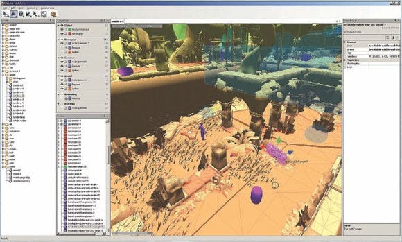
We had a very mixed-media approach to level layout for Uncharted. Basically, whatever worked well for the designer of the level was okay with us. Some designers started with plan-view pencil sketches or detailed layouts on squared paper.
Most of us used Adobe Illustrator and simple prototype geometry built in Maya, which let us iterate on our level designs more easily. Sometimes we would move back and forth between both applications, annotating screen captures of Maya geometry in Illustrator, and then making more changes to it.

The Uncharted level editor.
If we hadn't been so pressed for time, we would have iterated each level many more times before we moved on to the stage of creating finished environment art. We found that the more we could polish a level while it was still simple from an art point of view, the less time we wasted redoing work on the environments later on.
This stage is also a great time for designers, concept artists, and background artists to share their ideas and find ways to make them work together in harmony, so that the level both looks amazing and plays really well.
There's no doubt about it: Uncharted: Drake's Fortune was a tough game to make. Getting up to speed on the PlayStation 3 and creating a character-action experience from an untested game idea was a very challenging task.
We sweated, we cried, we laughed, and eventually, we conquered. We looked at the mountain of problems we'd overcome and, in the words of Nathan Drake, said, "Adios, asshole."
At the end, we had created a terrific thrill-ride of an action-adventure game that captured the essential flavor of the stories we loved as kids, but that felt new and contemporary at the same time. We are really proud of Uncharted: Drake's Fortune and the whole of our team agrees that this is the best game we've ever made. Now it's time to get back on the road, and see if we can't better it.
Uncharted: Drake's Fortune
Developer: Naughty Dog
Publisher: Sony Computer Entertainment
Release Date: North America: November 19th, 2007; Japan and Australia: December 6th, 2007; Europe: December 7th, 2007
Number of Full-Time Developers: Approximately 70 Naughty Dogs
Number of Contractors: 6
Length of Development: 1 year preproduction, 2 years full production
Lines of Code: Approximately two million
Development Software Used: Autodesk Maya, Pixologic ZBrush, Autodesk Mudbox, Adobe Photoshop, Adobe Illustrator
Read more about:
FeaturesYou May Also Like