Trending
Opinion: How will Project 2025 impact game developers?
The Heritage Foundation's manifesto for the possible next administration could do great harm to many, including large portions of the game development community.
In this in-depth Gamasutra postmortem, the team at console and PC developer Demiurge Studios (Mass Effect for PC) explain what went right and wrong in creating popular iPhone word game WordFu, from swift iteration to localization complexity and beyond.

[In this in-depth Gamasutra postmortem, the team at console and PC developer Demiurge Studios (Mass Effect for PC) explain what went right and wrong in creating popular iPhone word game WordFu, from swift iteration to localization complexity and beyond.]
WordFu is a puzzle word game developed by ngmoco and Demiurge Studios for the iPhone and iPod touch. Its initial release was in late February of 2009, and had three updates spanning the following months.
The project started as a simple dice-based word game, and quickly grew to be a much bigger game than we expected. We learned a lot along the way, and had a great time making and playing WordFu.
As with all games on this platform, climbing to the top is a mysterious and exciting prospect -- one we saw briefly before falling back into the ever-growing jumbled conglomeration that is the Apple App Store. But this isn't about reaching the top 10; it's about our journey there.
1. ...And I Want It Yesterday
As the first iPhone game Demiurge had ever developed, there were many things that were completely new to us. We didn't expect to be able to implement and iterate new features so quickly -- a pleasant surprise. With this new, fast development process, adding a new feature took two days to implement and three days to iterate and turn it around to the publisher.
This sort of turnaround was completely foreign to us, since we're used to developing much larger-scale games. Normally a new feature (of proportionally the same magnitude of impact that the features we added to WordFu took) can take up to a week to implement and weeks to iterate upon. Additionally, we use Scrum development methods in most of our projects, so new features aren't even tasked until the next sprint.
Features like the power-up dice were added quickly and easily thanks to the rapid turnaround process. Within a week, we were able to have dice that froze time, temporarily doubled word scores, and allowed a die to be flicked. This didn't include the art changes needed for the feature, but normally a feature that changes the scope of the game takes longer than this to successfully integrate.
2. Easy Updates
Since features are relatively easy to implement, we could take feedback and quickly put it into the game. The Apple App Store made this process easy and fast, so when customers and critics requested features, we could turn around and easily update WordFu.
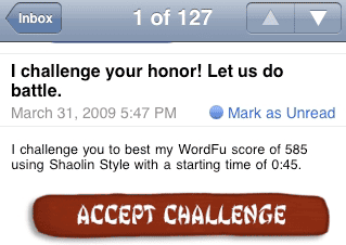
Some people didn't like the stress (or what we like to call "challenge") of a short starting time, so our first update allowed people to choose a longer starting time. We also allowed people to play their own music while playing WordFu. Multiplayer was limited to playing against people in your local Wi-Fi network, so we added the ability to challenge your friends via email. This feature was expanded in the next update.
In WordFu version 1.2, challenging your friends to beat your score was augmented to include Facebook and Twitter posting. These are two venues that the iPhone and iPod touch can uniquely interact with, whereas other gaming platforms have more traditional multiplayer networks. It was exciting to see what new ways people could share and experience WordFu.
The third and final update included localization for German, French, and Spanish versions of WordFu. These posed some interesting challenges, since we had to translate many of the art assets in game, which I discuss later.
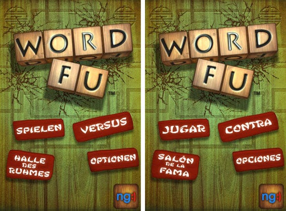
Title screens in German and Spanish
Being able to listen to your fans and critiques and actually make changes is a satisfying experience, especially when they realize that you're actively improving the game. It also helps when the process of implementing, sending off, and updating content is relatively fast and easy.
3. Multiplayer
Every week in the office, Demiurge has a game night where everyone stays late, plays video games, board games, and eats pizza. One of the greatest moments during development was when we passed around copies of WordFu and had people play the versus mode.
It was extremely flattering and exciting when we couldn't get people to stop playing our game! We played for so long that we had to trade off the one charger cord in the office so that everyone's batteries would stay alive. This is when we knew we had found something special.
New and interesting dynamics emerged when we were competing against each other. In WordFu, you must shake the letter dice until you find a set from which you will find your words. Normally, players try to optimize the letters to achieve the highest possible score, but in versus mode a different strategy arose.
People were trying to sabotage each other by choosing a set of less than ideal letters (i.e. only one vowel and a bunch of less commonly used consonants). It became a game of who could make the best of the worst letters. This session doubled as a focus test and a play test, since we received lots of great feedback on both gameplay and bugs.
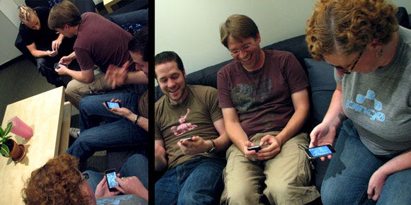
Demiurge staff duking it out in versus mode.
4. Wacky Style
Nailing the style of the game was a difficult process that ultimately paid off in the end. The sound effects had a significant influence on the visual style. The game started out with a more photo-real appearance, with the dice and board mimicking real-life objects.
The tone of the game was very different, and much more serious. Once the sound effects were added into the game, however, perceptions of the game changed. With wacky kung fu quips, it became lighthearted and cheeky, and the art was changed to match the new tone.
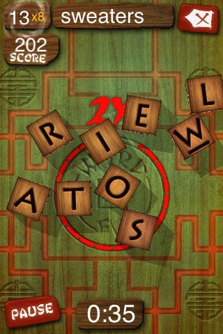
There was a debate over whether to move forward with a more Flash-like modern interface, or whether to stay in the photo-real realm, or if a combination was possible. A Flash-y style had become popular for iPhone games, and we didn't want to seem behind the times.
However, the tactile gameplay of rolling 3D dice on a board lent itself to a more reality-based art style. As for a combination, we felt that the two clashed with each other, and chose to pursue only one. Ultimately the unique style made it stand out amongst other word games, and helped to influence the arcade-style gameplay.
5. A Match Made in Heaven
A great developer-publisher relationship is invaluable to a project's success. Demiurge and ngmoco worked extremely well together, with each side contributing to and collaborating on the development.
When we first partnered with ngmoco to create WordFu, they had no expectations that we would know everything about developing an iPhone game, and they were very helpful throughout the process.
Whether it was ramp-up, debugging, or design input, they were there every step of the way. They've developed a handful of titles on the platform, so their experience helped solve problems quickly and efficiently when they arose.
We had a great relationship of sharing ideas and collaborating to bring new features to fruition. This process was even better, since ngmoco was very flexible about scheduling new features. If new things were added, ngmoco was understanding about their impact on the schedule and was willing to drop features and requests when necessary.
1. New Technology Hiccups
Not only were we completely new to the platform, the platform itself is relatively new. We encountered a few problems as a result of being unfamiliar with it.
Old habits die hard, and in our initial stages, converting primarily PC users to the Mac OS seemed like enough of a problem. Just getting over the fact that Ctrl+C didn't copy and F3 didn't find the next instance of something took a while to retrain the muscle memory. After many years of using Visual Studio, switching to Xcode also took some getting used to.
Next came the real problems. We were crashing a lot, due to running out of memory. When we learned how to use the Instruments tool, it showed us quickly where the memory was being sucked up. It turned out we weren't allocating memory efficiently, and we could see that audio was the main offender. Using this tool, we could pinpoint problems and optimize the game accordingly.
The UI Kit system for making Apple buttons and lists didn't integrate well with OpenGL, and we didn't discover this until relatively late in the project. We had to redo a lot of the way the UI was handled to make things run smoothly. Had we known the systems didn't work well together from the start, we would have planned differently.
Another problem was that provisioning profiles, developer IDs, and app signing was hard to get right and ended up being a huge hassle. It took us a long time to figure out how to setup the project so it could be run by multiple developers right out of source control without any changes.
While none of these issues were specifically anticipated, any project on an unfamiliar platform is expected to have some bumps in the road. Most of them were relatively low-impact on the schedule, and we've learned our lessons on the platform for future projects.
2. New Kids on the Block
In addition to having issues with the hardware itself, being new to the platform was also difficult since we didn't have an established development process.
One major obstacle was the art pipeline. It was very inefficient, since it required an artist to pass the assets to an engineer, see it in game, decide what changes to make, and then go back to his machine to make the revisions.
Not only did this slow down artists, it sidetracked engineers who had to stop what they were doing to help artists. This process is usually much more streamlined, allowing artists to develop, review, and tweak assets within their own environment.
Due to the lack of artist tools, art had to be built by an engineer, and also didn't allow multiple artists to simultaneously add assets to the project. If we decide to commit to the platform for future releases, a new pipeline will definitely need to be developed.
3. Lost in Translation
Our third update to WordFu was creating localized versions for German, French, and Spanish. Localizing the game was more complex than normal due to font limitations on the iPhone. The text in WordFu is a custom font, and many of the words are rotated at various angles. Since the iPhone doesn't allow developers to use custom fonts, nor does it support text rotation, we had to have most of the text in the game be in art assets.
This starts to get very expensive when every instance of every piece of text has to be recreated for each supported language, rather than simple string replacements. It rapidly increases the amount of localization work because it now involves artists, and it also increases the amount of space the game takes up.
The assets that need to be localized take up about 11MB of space, so keeping all available languages in one SKU was out of the question. We had to set up our own build process, since Apple's localization system only supports one build with all assets. Propagation of changes had the potential to be a large problem, since each language SKU was separate. This problem was diverted as a result of our custom build process.
The issue wasn't lack of foresight -- we knew the consequences of pursuing this art direction would be costly before we even started localization. The Asian-themed font and slanted angles were integral in creating a unique style for WordFu, so in the end it was worth the extra effort in the localization process.
4. Give Me More, More, More
When ngmoco first approached us with the concept of WordFu, we thought a dice-based word game sounded simple enough...
What started out as a six-week jaunt, incrementally progressed into a four and a half-month expedition. Thanks to the ease of App updates, we're in our eighth month, and we're still cranking out new features and improvements.
We were consistently on-time and didn't miss any major deadlines, but the project expanded to be much larger than we expected. While this is a success in many respects, feature creep (the cause of these extensions) becomes a nightmare for project planning.
Every time we showed the game, either internally or to ngmoco, the reply would always be "That's great! Wouldn't it be cool to do this, too?" We got lots of great ideas to improve upon the game; no single one was very big or time-intensive, but they certainly began to add up.
We quickly fell into a feature creep loop, since each time we added a new features, it received positive feedback. It's easy to scale back when the game is visibly becoming overly complex, but breaking the loop is much more difficult when each time you add a new feature, both the developer and the publisher like the addition.
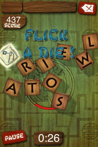
To compound matters, we didn't have a clear vision of when the project would be feature complete. Thus, it became very difficult to plan when or what type of developers would be needed - some features were more art-intensive, others required engineering. Staff always had to be on their toes to come on to or off the project on a weekly basis.
On top of staffing issues, the game itself started to become messily constructed. Features were engineered without long-term visibility, so they were implemented to be acceptably functional and not necessarily optimal. Then, more features were piled on top before an optimization pass could be taken. The system would have been more stable and ultimately faster to make if we had known the scope from the start.
In the end, the game came out better than we could have imagined, with lots of features and ongoing updates. However, it was an unexpected resource commitment, affecting the progress of other projects at the studio.
5. Too Many Cooks in the Kitchen
Feature creep and the lack of vision on project scope lead us into another problem. We had many artists rolling onto and off of the project as we needed them, and the consistency of the artistic vision was difficult to maintain.
Naturally, each artist has his or her own style -- a problem that seemed to be more noticeable on a title with fewer assets than the large-scale games we're used to developing. With four different artists having worked on the project, maintaining a consistent style was a challenge.
For example, when we added special power-up dice, a new artist was tasked with creating the effects and text. Text like "Double Score!" needed to be both exciting and interesting, while matching the existing art. Finding the right balance of uniformity and contrast was an iterative process made more difficult by the fact that we had new artists thrown into the mix.
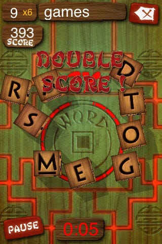
The outcome of the art style ended up being something that "went right", but the process of getting there bogged down development on a title to which we were already over-committed.
We seem to thrive on journeying into unfamiliar endeavors, and this project was no exception. We learned a lot about what we'd do differently, as well as the same, in upcoming iPhone games. It was interesting to see how many design and process principles were still applicable to this platform.
We're entering a new generation of technology. Smart phone technology is becoming more and more ubiquitous. Soon, everyone will have a powerful computer in his or her pocket. It's going to change how people think about how they interact with information and with each other in a big way.
We only touched the surface of this with how WordFu interacts with social networking systems. As this platform and its market grows, the coming years will be very exciting, to say the least.
Developer: Demiurge Studios
Publisher: ngmoco:)
Release Dates: February 26, 2009 (v 1.0), March 31 (v 1.1), April 21 (v 1.2), and June 29 (v 1.3)
Platform: iPhone and iPod touch
Development Time: 8.5 months
Number of Developers: 3 at any given time, 8 total
Longest possible French word in WordFu: constitutionnalisassions
Read more about:
FeaturesYou May Also Like