Trending
Opinion: How will Project 2025 impact game developers?
The Heritage Foundation's manifesto for the possible next administration could do great harm to many, including large portions of the game development community.
In this incredibly detailed postmortem, Sony Bend dives deeply into the the development of Uncharted: Golden Abyss for the PlayStation Vita, explaining precisely what roadblocks held back the system's premier launch title.
November 8, 2012

Author: by Chris Reese
Written primarily by writer and director John Garvin, the following incredibly detailed postmortem follows the ins and outs of Sony Bend's development of Uncharted: Golden Abyss, the PlayStation Vita launch title and premier game.
The development of Uncharted: Golden Abyss was a perfect storm of challenges: we were a launch title for new hardware, which meant that our schedule was not flexible; we were crafting gameplay mechanics we had no experience with (traversal and the PS Vita's touch and gyro controls), which meant a huge learning curve and lots of R&D time; we were creating a rendering engine that used next-gen shader techniques, which meant our artists had to learn an entirely new way to create assets; we were working on a franchise that was new to us, which meant we had to retool all of our processes, from the way we built assets to the way we thought about level design; and we were working on an Uncharted title, which meant an exponential increase -- from what we were used to -- in the amount of cinematics, detail, animation and polish that would be needed.
Somehow, we managed to pull it off. Not only did we ship on schedule with the hardware, but we were able to hit all of our milestones, including key demos for the 2011 PlayStation Meeting hardware reveal (when the PS Vita was still being called NGP) and the 2011 E3 press conference, where Bend Studio co-director and technical director Chris Reese and I demoed the game live on stage.
Uncharted: Golden Abyss became the PS Vita showcase title, acting as Sony's ambassador to third party developers, media and gamers. It was our job to show what could be done with a next-generation handheld and we delivered. We also think we managed to build a pretty darn good Uncharted game... but it wasn't easy.
Warning: Because narrative drove almost every aspect of production in Uncharted: Golden Abyss, there are spoilers galore here. Be forewarned.
1. Story
(Note: Interestingly enough, "Story" is also in What Went Wrong. Skip ahead and read that first to get a clearer picture of the entire narrative process.)
For a narrative-driven game like Uncharted, story is everything. It drives the game's locations, characters, action, animation, set pieces and cinematics. It took us awhile to get there, but once the script was complete, it became the blueprint for the entire game. There are a couple of reasons we consider the Golden Abyss script to be one of our success stories.
First, even though the story went through major iterations, key visual elements in the story remained consistent, allowing us to begin creating assets with confidence that time-consuming production work wouldn't be tossed out. For example, from the beginning we knew that Drake was going to seek, and find, Quivira, one of the seven cities of gold. This allowed us to start, very early, visual development for Quiviran architecture, caverns, temples, statues and ruins.
We also knew that Quivira was going to be hidden deep within a rainforest. In the first few drafts of the script the rainforest's location changed several times (Mexico, Central America, South America), but the fact that we had a rainforest world was never in doubt. This allowed the environment team to complete a large amount of R&D even before we moved development from the PS3 to the PS Vita.
Second, once we started development, the script was locked (with one huge exception... see "Scope" in What Went Wrong) and became the backbone for the entire game. Game development is a messy business, because gameplay means iteration. You want things to change as you discover what makes your game fun. But from the beginning we felt that it was going to be necessary to separate narrative from gameplay as much as possible, to find the "fun" in things that could be changed, and leave the expensive narrative elements alone.
For example, the story called for a Shanty Town setting where Drake and Chase are held prisoner and escape, searching for her stolen gold amulet (one of the game's important MacGuffins) along the way. The exact details of the Shanty Town layouts, the minute-to-minute player experience, the traversal paths and combat areas, all changed during development as we refined our gameplay mechanics. But the story beats that drove the sequence never changed:
Drake wakes up and finds himself prisoner. Chase breaks him out.
Chase leads Drake to Guerro's headquarters to get her amulet
Along the way Drake and Chase see Dante with Guerro and realize that Dante has betrayed them (surprise... not)
Drake discovers truckloads of stolen artifacts and research, forcing Chase to come clean about her grandfather
Drake becomes invested in Chase's quest and agrees to help her
Drake retrieves the amulet and returns it to Chase... now she trusts him
Because the key narrative beats were locked, we could plan and schedule motion capture performance shoots, know what character assets would be needed for each level, start building environment assets and props and fine tune player paths, AI, collectible placement, all without fear that work was going to get tossed. Narrative didn't need to change as we made the levels more fun. If a designer came to us and said, "Hey, it would be fun if Drake was on a rickety rooftop and it collapsed beneath him," we could add that, no problem, because it wouldn't affect the core beats of the story. But if a designer said, "Hey, wouldn't it be fun if Drake woke up in the mountains and had to dig his way out of an ice cave?" That would be a problem.
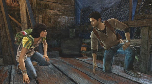
Shot from the opening movie in the Shanty Town world. Though the flow of the level changed considerably during production, story beats like this were locked months in advance, allowing production of expensive cinematics to begin without fear of later revision.
We felt, and still feel, that development choices are almost analogous to the "any two cards" philosophy in Texas Hold'em: Is a cold-mountain environment and traversal over ice-covered rocks better than a rainy-rainforest environment and traversal over old ruins? Any given design choice could have potentially positive and negative impacts on the game. We always erred on the side of decisions that would have the least impact on our schedule. The locked script prevented us from making major and costly changes for their own sake. Gameplay could morph all it wanted, but the narrative beats remained as static as the laws of the universe. Iterative changes within the framework established by the story? No problem. Big changes that would change the narrative backbone? Uh-uh.
Because the script was locked before core production began, we could start planning and scheduling the creation of assets for all of our characters, sets, environments and more. The locked script helped with outsourcing as well: Over and over we were told by our support groups (animation, mocap, audio etc.) how much they appreciated the upfront planning we were able to do.
We completed our performance capture in just six shoots, starting in January of 2011 and finishing up the following May. Each shoot was three days -- one day of rehearsal and two days of shooting. This meant that we were able to shoot over 200 pages of script in just 12 days of performance capture, spread out over five months. While individual scenes and shots were still being written and polished during that time, the major beats of the story never changed. Such an aggressive -- and cost saving -- schedule would have been impossible if the story were still in flux.
2. Outsourcing
Uncharted: Golden Abyss is a huge game, much larger than our core team of 55 people could hope to build on its own. To get the game done we relied on the hard work of several support teams. MK Productions (five people) did some of our large animated events; Scratch Image (three people) did almost all of our lip synching and facial animation; our producing team in Foster City (10 people) handled the logistics for everything, including localization, QA, interfacing with support groups, focus testing and more; the Sony music team (35 people) wrote and produced our soundtrack; the Sony sound department (34 people) developed all of the game's sound effects and VO; the Visual Arts and Services Group (32 people) helped with cinematic animation and motion capture clean-up; we did all of our motion capture at the Culver City motion-capture studio (30 people); and the performance capture director and actors (11 people) brought our characters to life. This doesn't even begin to count the many, many people working in Global Technology, Platform Architecture, Game Tech, HR, Finance, PR, Marketing, Management, as well as the many teams responsible for localization in Europe, Asia and Latin America.
Coordinating all of these people took a tremendous amount of direction, planning and scheduling. For our studio production manager, who normally manages our internal asset creation and milestone schedules, managing outsourcing became almost a second full time job. Even so, the outside work would have been impossible to manage without the help of key production managers from the support teams. To pull it off, you need solid, proactive and organized individuals in key management roles. We were, and are, very fortunate to have this. Sometimes you read a credit roll and think, "ah, come on... it doesn't take that many people to make a video game... they're padding this thing." The Uncharted: Golden Abyss credit roll is six minutes long, and yes, it took all those people, and more, to make the game and get it into the hands of players.
Finally, I can't emphasize enough the amount of assistance we got from Naughty Dog: Amy Hennig, their writer and creative director, helped considerably by assisting with casting, selecting a director, reading every page of every script, offering advice, suggestions, insights and revisions; the NDI design and engineering staff were on hand throughout the project to answer questions; we were allowed to use their mocap studio in Culver City; and as you'll read more about later, we used their source code as a blueprint for our engineering systems and their immense texture and animation libraries to make our game more authentically Uncharted. Without NDI, there would have been no Uncharted: Golden Abyss.
3. Focus Testing
For our previous games we had only done a limited amount of focus testing, usually very late in development. The reason was partly schedule and logistics -- the game would come together so late that we felt we really wouldn't have time to address issues that a focus test might reveal. But it was also partly our attitude: we were the developers! What could we possibly learn from mere gamers? We couldn't have been more wrong.
Our producers in Foster City had been extolling the virtues of focus testing for years. Because this was an Uncharted game, and because Naughty Dog integrates focus testing so completely into their process, we decided to embrace it as well. I'm glad we did.
We hired a consultant to help with recruiting and questionnaires, and built, for the first time, an internal focus testing area with six PS Vita stations, complete with "over the shoulder" cameras (so we could see how they were using the PS Vita touch and motion controls) and video feeds that were piped directly to our desks. Anyone on the team could watch the focus test playthroughs and we encouraged them to do so.
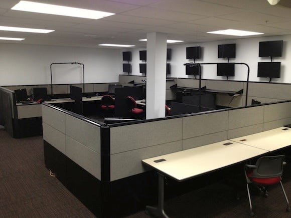
Bend Studio's new focus test area. Each station is set up with an external camera that allows us to see how gamers use the PS Vita controls.
The game had been in development for over a year and we were mere weeks from Alpha when in late September of 2011 we finally cobbled together a build of the game that could be played from beginning to end. Many levels were incomplete. You often could not load or stream from one level to another. There were incomplete features, crash bugs, missing polish and missing content. But for the first time, you could actually play the game and get a sense of what it was.
Chris Reese was one of the first to play the build. He came away from the experience with mixed feelings: "There's something there alright... it wasn't 'unfun'..." Hardly the high praise I was looking for. Our producer's reaction was more dramatic. He spent two days in our guest office playing the build and every time I walked by I could hear him swearing at the PS Vita. Not good. When he was done he told us he could see the potential, that there wasn't any one "big thing" wrong, just a thousand little things. His quote, "death by a thousand cuts," became our mantra over the next few weeks.
So we knew what to expect from our first internal focus test. We got six local gamers, set them up to play, and spent the next two days studying their actions. Every couple of hours we would stop them and have them fill out the questionnaires. At the end we did a group interview which turned into a free-wheeling discussion where they could say anything they liked -- which they did... in excruciating detail. Every little thing that could be picked on, they picked on.
A lot of issues they raised we already knew about, but there were a few key issues that we didn't. Equally important, we had implemented a metrics system that gathered information from their play sessions: how often did they die? Where? How long did they spend in each level? Where did they get stuck? How long did combat sequences last? How much ammo did they use? And so on. The metrics proved invaluable. Here are highlights of the important things we learned from focus testing:
Game Length. The game was big. Much bigger than it needed to be. We've never skimped when it comes to play time in our games. I think most of the Syphon Filter titles clocked in at eight to 10 hours, as did Resistance: Retribution. The first run through of Uncharted: Golden Abyss took players 16 hours.
Crazy as it sounds, up to that point we were honestly afraid the game wasn't long enough -- that the player wouldn't spend enough time with the game to give it that epic Uncharted feeling. Getting confirmation early about the game's length helped tremendously in terms of shaping the final polish because we were able to whittle things down instead of scrambling to add new content.
Flow. The game had multiple areas where the players simply got stuck or lost. This was one of the things contributing to that 16-hour playthrough. Our metrics showed us exactly where the players were spending the most time, and we were able to fix them.
One trouble spot, for example, was the maze in Chapter 15, where Drake must find four chimera statues in order to progress. Players got stuck here for hours because climbing ledges weren't obvious enough, and rooms either looked the same or were too dark. We were able to fix most of these problems: we broke holes into ceilings to let in light, making statues pop more; we made the rooms more distinctive. When these fixes didn't solve the problem we added an interactive map that updated when the player collected a symbol.
Fixing these types of problems improved flow while shortening the gameplay experience (in a good way). By the time we shipped, the game was still 10-12 hours long (again, see "Scope" in What Went Wrong), but players weren't getting as frustrated in these problem areas.
Chase's Character. Almost universally, focus testers hated Chase, the game's new female protagonist. This came as a surprise. We had done a thorough job vetting actresses in our casting process, which took weeks and involved dozens of readings -- including an audition where prospective actresses read with Nolan North. Everyone agreed that Christine Lakin was awesome, so she wasn't the problem.
And we had done all of our performance capture Naughty Dog style, a process new to us which gave the actors and director a full day of rehearsal before the performance was captured (mocap and voice at the same time.) The acting was top notch, the characters seemed natural, the banter flowed, the chemistry was there. So the performance capture wasn't the problem either.
The problem, we discovered, was the writing. In the script, Chase's character was a bit of a smart ass and a little sarcastic. Christine read these lines as intended and riffed on them, making Chase a little edgy. Drake was written to fire right back at her, to tease her, to cajole her. Their banter was great, we thought, and Nolan started to play off her tone, firing back attitude and one-liners. Players were going to love it.
But it didn't work out that way. Amy Hennig had warned us that writing female characters in this genre was hard, that you had to walk a fine line between making them too forceful or too wimpy (I'm paraphrasing like crazy here). To put it bluntly, they were calling Chase a wimp, a whiner, and a bitch.
The "bitch" label was unfair. What's that old adage? If a man acts forceful he's "take-charge and aggressive, a real leader" but if a woman acts that way, she's being "pushy and a bitch" -- an unfair gender stereotype, but one we had to deal with.
How? By making her less aggressive and critical. In the original script she told Drake that charcoal rubbings were "old school," in the revision, she told him they were cool. Focus testers' complaints about Chase being a "whiner" were spot on: in the original script she spent way too much time saying things like "Oh my God" and crying out every time Drake fell victim to a rickety structure (which he was prone to do), or every time something bad or unexpected happened; we strengthened her character by changing a lot of those responses.
Their "wimp" label was also a fair assessment. For gameplay reasons we constantly put Chase into situations where Drake needed to take action. Call it lazy if you want, but we ended up with a few "Princess Peach" scenarios... It seemed that poor Chase was constantly being choked, shot at, knocked out, dragged around and kidnapped. We fixed that, as well as we could, by changing the scenarios to make Chase less of a victim.
For example, in Chapter 10, Drake sees Chase being choked by a thug on a bridge; in the original version, Drake has so many seconds to use his sniper rifle to take the thug out, or Chase would die. In the revised version, Chase kicks the guy in the junk and runs. Drake still has to protect her as she runs, but at least she showed some initiative and power, and wasn't a complete victim.
We also found that focus testers were taking their cue from Drake: because he sounded annoyed with Chase for constantly getting into trouble, focus testers became annoyed with her as well. So when we revised Chase, we also revised Drake, making him react to her in a more positive way. In the bridge encounter mentioned above, for example, Drake originally sees Chase being choked and sounds exasperated -- "Not again!" In the revision, he sees Chase take action and says, "Chase... Ooooh, nice!"
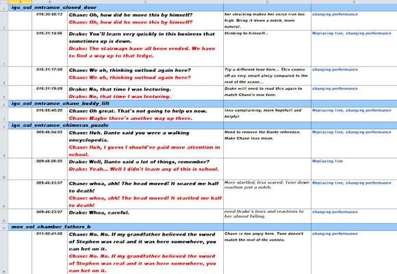
A sample of some of the Chase and Drake lines that we revised as a result of the focus tests. Column C contains the dialogue: black text are the original lines, red text are the revisions. Column D contains directions for the actors. (Click for large version.)
In keeping with the "script is locked" approach to assets, all the new lines were written to match the existing animation and lip synch. Thanks to the magic of ADR (the process where actors speak their lines while watching video playback), we didn't have to redo a single frame of animation. By the time we got to our third focus test, the replacement lines were in and focus testers stopped complaining about Chase. Once the game shipped, some players ended up not liking her anyway (see "Story" in What Went Wrong), but without the focus test data we might have shipped a Chase that no one liked -- a disaster that could have ruined the game.
The Beginning. Originally, the game opened with Chapter 2, the scene where Dante and Drake put on their backpacks and head up the trail to the rope bridge. We chose this low-key, character oriented opening deliberately, knowing it would be hard to compete with the cinematic, vertical train-wreck climb that opened Uncharted 2: Among Thieves.
We spent weeks polishing Chapter 2 until the dialogue popped, the traversal flowed, the vistas sparkled... But focus testers complained that our opening was too slow because they didn't get to fire their first shot until something like 35 minutes into the game; there was too much traversal, too many puzzles, too much talking. They liked all that, but they also wanted to shoot their guns. Please, please let us shoot our guns.
So we added a prologue chapter to the game. Because we were already using our Serpent Temple level as the game's downloadable demo, we knew it wouldn't be much of a spoiler if we used it for a "flash-forward" opening. It was a good way to start the game with some action: Drake climbs all over the visually interesting Quiviran statues and dangles out over a precipice high above the rainforest, all while fighting an army of Dante's mercenaries.
But though the new opening improved pacing by starting the game with much needed action, it hurt the overall presentation because we no longer had a polished introduction movie. The Serpent Temple start-of-level movie was a low budget affair, with very little performance capture and dialogue that, frankly, wasn't very polished -- Drake's clichéd and forgettable line, "Son of a bitch... I'll see you in hell!" wasn't my best moment as a writer. But the movie was never intended to be more than just a short, load-masking cutscene; we didn't want to start the game with it, but there was no time or budget to replace it with something better.

Changing the game's opening required us to start the game with a low-budget movie (left), rather than the high-budget movie (right) that we originally planned. The new opening helped with pacing and gameplay flow, but hurt presentation and story. (Click for large version.)
In the end, even this change wasn't enough, and we had to add a combat sequence to Chapter 2. This was an example where the locked script hurt development (more on this later). It was difficult to introduce bad guys earlier, because we had already shot and produced the scenes at the Spanish gravesite where Drake is introduced to Guerro's thugs. We couldn't just introduce some random guys for Drake to shoot because it wouldn't be Uncharted -- Drake has to have justifiable motivation. Our solution, while it worked, wasn't optimal:
DRAKE
Who's shooting at us?
DANTE
How do I know? Must be poachers. They come up here all the time.
DRAKE
Maybe Guerro's men?
DANTE
No, I told you. Guerro don't come up here.
Again, weeks of carefully edited production that introduced Guerro's thugs was wasted as we were forced to use some hastily written pick-up VO and in-game animation in order to give them an earlier entrance.
The Ending. Focus testers also complained about our ending, saying it was too slow and anti-climactic. In the original ending, once the player rescued Chase from beneath the large stone block, they had to help her traverse along a dangerous path, avoiding crumbling statues and falling rocks, eventually making their way up to Sully as the cavern collapsed around them.
The focus testers made us realize that once players had beaten the bosses and rescued the heroine, emotionally, they were done with the game. More traversal, no matter how exciting the collapsing cavern might have been, was pointless busy-work. So we cut everything after the rescue and dove into the ending cinematic.
Overall we had four internal and two external focus test sessions. The data we got from watching these gamers play was invaluable, and helped us focus our time and energy during the polish phase of development. Some of the issues that came out of focus testing were things we would have discovered on our own, but there's no question that we also learned about -- and fixed -- important issues that would have gone unnoticed. We're now firm believers in making focus testing an integral part of development.
4. Hardware Prototyping
Because we were a launch title for new hardware, early support from the SCEI technology groups was going to be critical, and we got all the support we asked for. Chris Reese had this to say about our successes in developing for the new hardware:
Chris Reese: In the early days the challenge was prototyping proof of concept for gameplay ideas without the use of a game engine. Hardware prototypes for the PS Vita were changing frequently, and many of those prototype boards we had access to typically didn't have the full capabilities that the final hardware was spec'd to have.
This required us to work on very discrete elements of the engine that focused purely on a given aspect of hardware / gameplay that we wanted to test out and vet with the rest of the development team. Especially important was the inclusion of external groups within WWS / Sony / Sony Japan (SCEI) if hardware refinement was needed to make the gameplay feature work as designed.
We didn't have an engine, so we didn't have any pre-made assumptions as to what the hardware was capable of. Ultimately this led to the discovery of new ways to extend the Uncharted game experience and to the realization that by combining elements of motion, touch and traditional controls, we could create a unique integrated experience on the PS Vita that couldn't be achieved on the PS3 console. This was a key factor in confirming the direction of our technology and development for Uncharted on PS Vita.
Revisions of development hardware were always in short supply and had to be shared across multiple teams within Sony. Realistically, this meant our entire studio would often have one or two of the latest development kits -- which didn't stretch too well across a team of 50-plus people. To ensure we could move forward with production, the game and rendering engines were developed on the PS3, and in fact all production continued on our PS3 engine up until the final year, prior to launch of the PS Vita in Japan.
The PS Vita game and rendering engines were developed in tandem with the PS3. As we learned more about the performance of the hardware we could make better-educated assumptions on how the final target hardware would ultimately perform and consequently we would make changes to the PS3 engine to ensure that the production team was building for PS Vita and not the PS3. The engineering team had a mandate to never allow the production team to come to a halt, even in the event of catastrophic hardware failures -- which, thankfully, were a rare occurrence. Keeping development parity between PS Vita and PS3 did reduce our engineering bandwidth overall, but was also one of the single biggest successes for the team to remain productive during a period of time when PS Vita specs and available working hardware were in flux.
While we had a significant amount of experience and code written for the PSP by the time we finished Resistance: Retribution. The decision from day one was to build a new game engine that was developed to take advantage of the unique hardware that the PS Vita offered.
Naughty Dog also provided access to Uncharted: Drake's Fortune and Uncharted 2: Among Thieves source code, and this was invaluable. We did not port the Uncharted code from Naughty Dog, but instead used it more as a blueprint on how to approach the development for a PS Vita version of Uncharted. This proved to be especially useful for core systems, suchas animation, to ensure we could replicate the look and feel from the PS3.
John Garvin: As Chris points out, we completed our first year of development without having anything remotely like final hardware. But this didn't stop us from getting a lot of development done. While the story department (i.e. me) was busy floundering away an entire year, design and engineering were making great progress. Partly this was because we had identified several features that we knew we wanted, regardless of what the story might be.
Since Uncharted is all about exploring historical mysteries, we spent some time brainstorming ways players could interact with artifacts using the PS Vita controls. We decided early on that we wanted to develop a PS Vita game, not just a stripped down version of a PS3 game. In other words, if you could play our game just as well on the PS3, we felt that we would have failed. We had a whole toy box full of new ways to interact with the game and we wanted to use them.
One example was the SLR camera. While we never thought we could work this directly into the story (would Nathan Drake really keep a camera in his pocket and whip it out like a tourist every time he saw something interesting?), we felt we could work a camera mode in as an unlock for collectables, regardless of story.
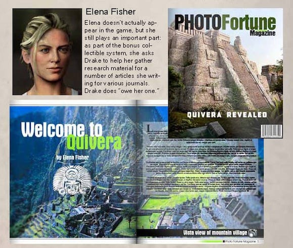
An early version of the game (June, 2010) took place between Uncharted 1 and 2 and had Drake helping Elena by taking photographs for her.
Drake would be asked to photograph statues, temple facades, ruins etc. and after equipping his trusty camera, as the player moved and rotated the PS Vita in real space, we updated the in-game camera to match. It made for a convincing and effective illusion. The PS Vita's gyro was so accurate, in fact, that we used this feature for our sniper rifle's scope mode as well as our Intu-Aim -- which allowed the player to adjust all reticle movement using the PS Vita's motion controls.
As various hardware features came online in the ever-evolving dev kits, we would brainstorm ways to use them. The touch screen could be used to clean artifacts, piece together torn documents or rotate stone puzzles; the rear touch could be used to rotate skulls and amulets; the camera could be used to detect light so ancient parchments could be held up to a light sources.
None of these were groundbreaking or original, but later on, when we were trying to break up core action or slow the pace of the game a bit, it was nice to have an entire library of mini-games ready to go. Developing them not only helped us learn more about the hardware (allowing us to give valuable feedback on things like usability and sensitivity), but it also helped the design team think in terms of developing a PS Vita Uncharted. The mini-game prototypes also provided us with demo material that felt like Uncharted, months before we ever got Drake running around in an environment.
5. Environments
Speaking of environments, we feel that the process we used to create our next-gen environments was one of the big success stories for Uncharted: Golden Abyss. Francois Gilbert, our Principal Artist who led up the environment effort, discusses this in some detail.
Francois Gilbert: Just as we entered preproduction, Uncharted 2: Among Thieves hit beta, and we got an early build in the Bend Studio office. We all gathered around the PS3 as the Warzone level booted up. It was the first scene we saw from Among Thieves and it blew us away. We knew once this scene was released to the press, Uncharted 2: Among Thieves would become the new visual benchmark on what was possible on the PS3. And PS3 visuals are what were expected from us and the PS Vita.
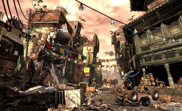
The warzone streets from Uncharted 2: Among Thieves.
We were really excited to work on the Uncharted franchise, but this was going to be quite the challenge. Not only did we have the pressure of translating a Naughty Dog franchise to the handheld, but the PS Vita does not have the processing power of the PS3. In order to come anywhere close to these kinds of visuals on the PS Vita, we would need to focus our energies and use as many visual cheats and tricks as we could. Luckily we had been working on the PSP for years, and this experience had given us the correct mindset: every cycle counts, cut the right corners, and focus on the final frame more than on individual details.
To start things off, we analyzed the Warzone scene and came up with the key notes to hit:
The amount of stuff in the frame! The geometry and population density was like nothing we'd seen before. We knew we'd need to create this sense and illusion of this visual overload in our levels as well.
Silhouette, negative space, and composition. We would need to pay special attention to these elements when assembling our scenes, and make sure to add detail and definition on silhouette edges.
The backgrounds and vistas. We'd need to have lots of breathtaking vista views in our game as well. We knew the PS3 allowed Naughty Dog to add lots of geometry detail to their backgrounds. With a more limited poly budget, we'd have to use a careful mix of paintings and geometry to pull these off.
The lighting. Uncharted 2 has some beautiful ambient light detail and a rich and dynamic direct light system. We would have to use a similar approach if we wanted to come close to their final frame. We'd want to also use similar techniques and post FX to match their look and render quality.
The Warzone scene also showcased tons of texture variance and hit the right balance with materials and specular highlights. We'd also want crisp texture definition and variation, while our memory limitation would require us to choose wisely what textures we'd load into our levels. We also wanted to have materials and lighting that would push the crunch on our normal maps.
The Plan
We needed a good plan to pull this off. We quickly realized we couldn't be a globetrotting Uncharted. Each new local would require new texture sets and models/assets and we didn't have the time or resources... too risky. Instead, we decided to focus our production energies on just a few locations, so we used Uncharted 2: Among Thieves as our quality and visual bar and Uncharted: Drake's Fortune as our location reference. Naughty Dog also likes to introduce new technology in every game they bring out, so we decided for environment graphics, we would try to achieve PS3-like water.
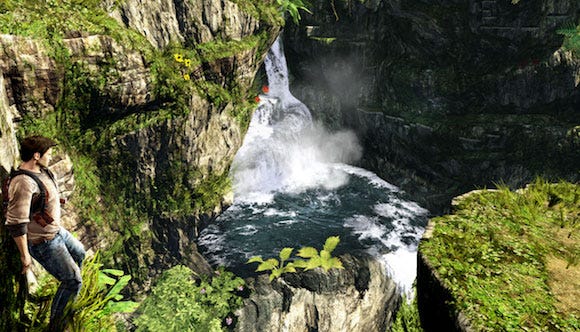
We identified the realistic rendering of water as an early graphical goal.
Next, it was important to lay out a solid tools plan. Bend Studio hadn't done a PS3 title yet (going directly from PS2 to PSP), so all of our tools and technology needed to be overhauled for PS Vita development. Being late to the party is sometimes a good thing, as we were able to learn from everyone else's experience on PS3. We spent quite a bit of energy diving into papers and presentations that provided solid advice on what to do and to avoid. We found lots of best practices established by Naughty Dog, Guerilla, and Crytek that would hopefully translate to the PS Vita hardware architecture.
An additional transition we had to make during this period was switching from a Max-centric studio to Maya. We were the last North American Sony studio on Max. For us to tap into SCE tools from our internal technology groups we had to make the switch... and it was definitely a switch worth making.
In planning out our tools and process, we also took into consideration our lessons and experience making games on the PSP. One key tool mantra we had from the start was: since the final screen is a known factor, use real-time updating. So we planned from the get-go to have a robust live-update pipeline from our tools to the PS Vita: making sure we were able to tune lighting and post on the final dev kit screen (especially important on PS Vita, because OLED and LCD color and contrast is so different).
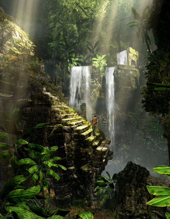
A shot from our trailer showing off our goal of achieving a richly detailed frame.
Graphics Engine
Here's a quick glance at how we planned out our Environment Graphics. First off, No LODs = happy artists! We decided to fade out objects at a distance (a technique also used by Naughty Dog on Uncharted). We figured, on a smaller screen, we could fade things out even sooner.
PS Vita has an advanced GPU chipset, so we got to do what all the cool kids were doing on PS3: deferred rendering, cascaded shadow maps, SSAO, and a fully real-time lighting solution (no bake!) On the materials/shaders, we'd sacrifice flexibility for performance. It was important for us to load the frame with detail and "visual noise", so if a material reflection was a bit chunky but a few cycles cheaper and allowed us to add 15 instances instead of 12, then it was a sacrifice worth making. We also used Naughty Dog shader and render techniques such as their vertex-colored moving foliage shader and tonemapping post effect.
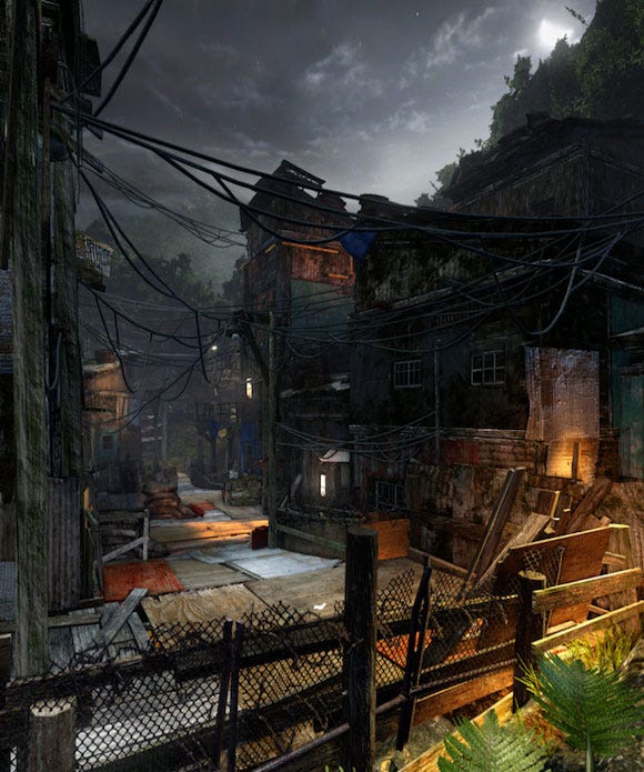
A final frame from one of the Shanty Town levels.
Level Building Process
For geometry and level building, we created our base mesh very low resolution (about 1.5 times PSP res), but layered it thick in population. So the base level skin (terrain ground plane and cliff sides) was very low resolution, but the trick was to hide that base level skin. So in rainforest levels we'd layer on ruins mesh, add plant layers (layers of cards with 1bit alpha), vines, rocks, flowers... and after a few passes, the scene was transformed into a really rich frame. After this layering pass, you could barely see the base skin. We'd keep adding more layers until the frame felt like it had PS3 density. So even if the base geometry parts were at 1.5 PSP res, once layered, we were pushing scenes over 200,000 polys.
Building low resolution parts combined with this layering approach was also a safe bet: being a launch title, the final PS Vita hardware specs were a moving target and in the worst case (where the hardware wasn't performing as expected) we could strip out a few geometry detail layers and still get the base frame looking good with minimal production impact. But as it turns out, polys weren't our rendering bottleneck, and we added geometry polish layers right up until we shipped.
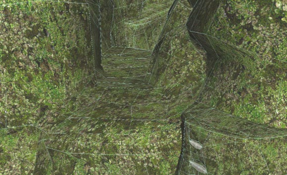
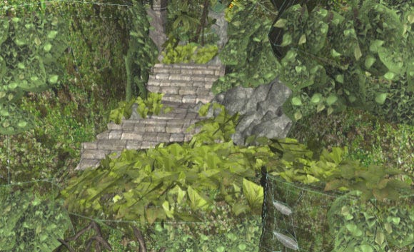
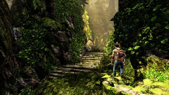
An example of a progression from the course base mesh, layers of detail, and the final lighting and atmosphere.
Geometry was one thing, but textures are also very important to the look of an Uncharted game. Luckily, Naughty Dog let us use their entire Uncharted texture library. This was a huge win for us. There's no way had the time and resources to deliver the texture quality that Naughty Dog could produce: their textures are some of the best in the industry. So we always looked at their textures before producing any asset. We understood that anything mapped with these already had an advanced level of polish.
For populating the world, we relied heavily on instancing and a Lego building block approach. Our typical levels had an 80 percent building block 20 percent one-off ratio. This gave us tremendous reuse and huge memory savings (both when streaming in levels and on the final memory for the Vita game card). Using this approach worked well with our small team: we just had to polish the master instances, and each building block was its own data packet (with associated info like collision, shadow proxy, fade distances...)
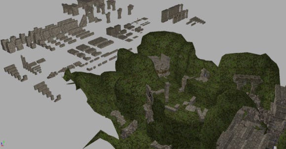
Maya screen showing the modular parts used to build our Quiviran ruins.
Another key element to our building process was the use of maquettes. Before layout and design was done with a space we produced environment maquettes to prepare and plan level art aesthetics and communicate visual direction. We also used these to test lighting, ambience and mood, render technology and shaders, and stress test the building blocks (see if there's enough variation or rarely used parts we can ditch). These were also used for vista and lighting scheme and color values that were then referenced in the final game levels. So even if a maquette wasn't used in the final game, many nuts 'n' bolts decisions were made using this set.
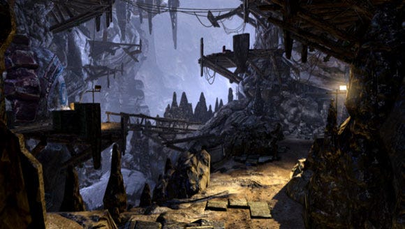
The final frame of one of our Quiviran underground levels.
Production
As we neared the end of our pre-production phase, we were told we'd have a few weeks to produce a demo level for the PS Vita hardware reveal in Tokyo. We had a simple space in block form laid out by design, and the timing was right: we had our plans and base systems/technology close to presentable form. The environment team dog-piled on the level, and in two days we had a very solid first draft... and two weeks later we were done with final polish. Our process works!
We used this production approach for the rest of the game, dog-piling and specializing. One of our artists had the bad luck of revealing he was really good at placing flowers and ended up placing most of these throughout the game. In the end, we produced 35 levels in less than a year.
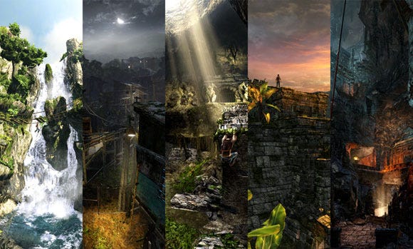
Examples of the rich diversity we were able to achieve in Uncharted: Golden Abyss.
We would have liked to have more time and resources and a larger scope and more environment settings, better anti-aliasing and shadow resolution, more 3D geometry in our backgrounds and more shadow-casting lights and material variation. A more robust and dynamic object system would have been great, more "switches" for adding movement to our real-time lighting and a better streaming system would have given us more flexibility... but we did what we could in the time we had... and it gives us things to work on for our next game.
1. Story
Having a locked script that defined characters, locations, cinematics and set pieces was great for development... once we got there. The challenge was getting there. For better or worse, I've always been Bend Studio's primary writer (often in collaboration with other writers).
Having written the scripts for all seven Syphon Filter games and for Resistance: Retribution, I thought I knew a thing or two about story and writing for video games. So when I played the first Uncharted I thought, rather naively, that it was going to be easy. It wasn't.
To start, the franchise formula is challenging. You have to find a compelling historical mystery with "gaps" that can be filled creatively; the history needs to be real and researched; you need a MacGuffin that is valuable, that people may have heard of, and that is potentially cursed; settings and plots need to be realistic, fantastic elements need to be reasonable in an X-Files sort of way; the tone should be mostly light in a summer blockbuster style; settings have to be traversable, exotic, romantic, and, well, uncharted in some way; there needs to be an army of bad guys to kill; the story has to lend itself to puzzles, twists, turns, surprises; bad guys have to be interesting, powerful, but not clichéd... and you have to do all this without repeating what has already been done in Uncharted 1, 2, and 3 (not to mention avoiding overused tropes from genre film franchises). I severely underestimated the amount of work this was going to be.
We began working on story ideas in 2009. The first version was a Drake origin story that started with him as a young dropout running scams on a college campus. He had met, and fallen for, an ambitious graduate student who'd been screwed out of an important discovery in the Grand Canyon (this character would eventually evolve into Chase).
The story involved grave robbing in Mesa Verde, lost temples in the Louisiana swamps, a museum heist during a hurricane in New Orleans and a boat chase through the Grand Canyon.
One of our earliest PS3 prototypes of the game took place on the New Orleans streets: we had built out an entire section which could be traversed, which contained our first AI proof of concept, and where we showed off our touch melee, SLR camera and interaction prototypes.
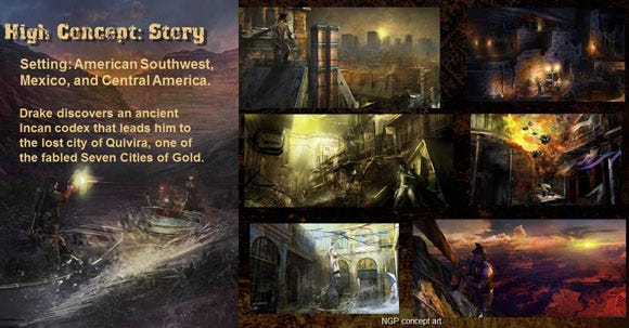
In this slide from October 2009 you can see many of the key concepts, set pieces and locations in the story. (Click for larger version.)
We spent a few months on this concept, working on scripts and concept art before we scrapped it. The issues were varied: First, Naughty Dog wasn't entirely comfortable with us filling in so much of Drake's backstory -- one of the dangers of working on someone else's franchise (we didn't know it at the time, but Naughty Dog would take Drake's origin in a completely different direction in Uncharted 3: Drake's Deception.) Second, the Southwest American locales weren't deemed "Uncharted" enough... it seemed like Drake would be bumping into tourists every time he climbed around a corner. And a minor concern was that the big action set piece of Drake fighting an army of bad guys in a hurricane-pummeled New Orleans was perhaps a little insensitive.
The second version of the story was more ambitious. Retaining the key Quivira plot and rainforest locations, we decided that maybe the PS Vita version of Uncharted should be completely different than the console versions. We decided to make Uncharted an open-world, hub-based game. The idea was that Drake was hired by a wealthy woman to complete her missing husband's research into the lost city of Quivira.
It would have been an open world where the player could have moved back and forth between his camp (where the player could interact with Elena and Sully), and various ruins sites, where he would have to compete for artifacts by fighting other mercenaries and local drug-running thugs. We spent a couple of months on this idea, completing concept art, prototypes, and actual mesh layouts before saner heads prevailed: Amy Hennig pointed out that it was out of character for Drake to be such a blatant mercenary for hire. He wouldn't pursue something simply because he was being paid to; he would have to be invested in the mystery in a personal way or the story wouldn't be Uncharted.
More importantly, we realized that turning Uncharted into an open-world, hub-based game might deviate too far from the established formula; players might not accept the changes (something we learned the hard way with Syphon Filter: The Omega Strain, which deviated from the Syphon formula substantially). We also realized that we had enough on our plate without trying to design and implement and open-world game system, with which we had exactly zero experience.
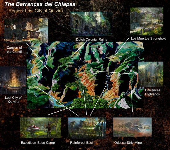
Slide taken from a January 2010 story presentation, the second iteration of Uncharted: Golden Abyss, when it was a HUB based game. Some of the location ideas made it into the final game. (Click for larger version.)
So we started over, salvaging as many elements from the previous drafts as possible. We spent all of 2010 iterating on the story. Locations came and went. Characters were created, iterated on, revised or discarded (see "Scope" section for more details). It wasn't until fall of 2010 that we had something close to final, and we didn't start casting until December 2010.
Looking back on the process, I'm not sure what we could have done differently. Not being the original writers on the franchise, it took a while to wrap our heads around what it meant to be Uncharted, to figure out the style, the pacing, the tone of the characters. Not being in control of the main characters' destinies made it challenging to come up with compelling conflicts and story arcs.
I wonder, with some regret, how much easier development would have been had we locked the story a year earlier. With an extra year to prototype environments, characters and movies, we may have been able to avoid the awful crunch that consumed most of 2011.
I mentioned earlier that once we got there, the locked script helped immensely by keeping production moving, and by keeping large changes to a minimum. But the locked script also hurt in an important way: once we discovered that the game was too big, we couldn't cut much more than we already had without leaving the story and pacing in shambles. Important character and plot developments happened in each world, and more importantly, key gameplay sequences. Even through the story we set out to tell in the beginning was too big, trimming it halfway through development would have weakened it, making game-play scenarios feel isolated and meaningless.
Pacing issues uncovered during the focus tests were hard to fix because we couldn't just move gameplay scenarios around. For example, there is a stretch of gameplay in Chapter 2 where the player has five touchscreen interactions in a row: a combination lock, Conquistador helmet, human skull, amulet, and grave marker, one right after the other. While we managed to add a combat scenario just before this, there was not easy way to spread these puzzles out and add different types of gameplay between them.
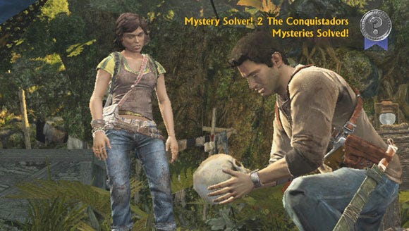
During the Conquistador gravesite sequence, the player has to perform five touch puzzles in a row, including the examination of this 500-year-old skull. The locked script and tight integration of story and gameplay made fixing pacing issues like this problematic.
Story-wise, there was no other place to put them, because this is where and when the actions took place. Gameplay-wise, the pacing suffered, but it would have been impractical and expensive to change. Like most sequences, narrative and gameplay were tightly interwoven and since the script was written, performances recorded, production well under way, we were stuck. This is a good example of where it would have been far better to have had a solid gameplay plan completed before the script was written.
Critical reaction to the Uncharted: Golden Abyss' story was mixed. Some of this was because I'm no Amy Hennig, who brings a very distinctive and natural style to her writing. But also, I think, players really wanted to see more of the characters they had grown to love: Elena, Chloe, and Sully. A new cast of characters, whether they were compellingly written or not -- and I let players be the judge of that -- was never going to compete with established characters from the console games.
There was strong resistance to Chase in particular because she wasn't Elena. Since this was a prequel, and players knew Drake didn't end up with Chase (she's never seen in the console games, after all), then what, some players wondered, was the point of spending time with her?
And we almost learned the hard way how much players love Sully. At one point in development, we had considered cutting Sully from the game because that would have enabled us to shorten the rainforest trek sequence (Chapters 22-27) considerably, cutting weeks from our polish schedule. Amy talked us out of cutting Sully, predicting something that players later confirmed: without Sully, it's not Uncharted. His relationship with Drake is core to the franchise. Even players who didn't like our story initially warmed to it once Sully came on stage midway through the game. I can only imagine the fan outrage we would have suffered if Sully hadn't made an important appearance.
2. Fusing PS Vita and Conventional Controls
PS Vita's Unique Control Inputs
While story and mission design were huge challenges and took months of iteration, designing controls for the many new inputs of the PS Vita hardware proved equally so. Jeff Ross, one of our Senior Designers, had this to say:
Jeff Ross: One of our greatest design challenges was to fuse the PS Vita's special inputs (front and rear touch screens, accelerometer, cameras, gyro, and compass) with conventional controls (buttons and joysticks) while simultaneously remaining true to the Uncharted franchise, and while delivering on gamer expectations of the hardware.
The cinematic action-adventure genre was crying out for tactile controls like touch and gyro: recall Raiders of the Lost Ark, where Indy had to do things like weigh out a bag of sand, touch artifacts with his bare hands to feel the engravings, or move and rotate the Staff of Ra into the light. It seemed to us that this was the perfect application of the PS Vita inputs for a franchise like Uncharted.
We had already played plenty of games on the Wii and iPhone that demonstrated the limitations of touch and motion inputs for more conventional gameplay like movement and combat -- cases where we would make use of the PS Vita's buttons and two sticks. But we felt our implementation of PS Vita-specific mechanics like charcoal rubbings, digital camera, codex, cryptex, jigsaw puzzles, and the light puzzle successfully merged fiction and gameplay.
We were even able to port existing franchise mechanics like Drake's journal and traversal to the PS Vita controls. Ranged combat benefited from subtle but integral gyro aiming that helps players fine-tune headshots. But some players and critics thought we went too far with the PS Vita controls, like when we added touch to the melee and boss fight mechanics. Our final analysis is that their strong negative reaction wasn't because of the mechanics themselves (in fact, anecdotal evidence shows that lots of gamers liked these features), but because we didn't give them a choice.
When we added PS Vita-specific inputs to other core mechanics, we gave players the option to play with sticks and buttons instead. For example, when we added touch inputs to traversal, we kept Uncharted's conventional climbing controls as well, so there was no downside to a player not liking it -- they could simply revert to the sticks and buttons instead. For aiming, the gyroscope didn't replace stick aiming, only enhanced it, and could be turned off by the player.
Touch melee, on the other hand, evaded our hybrid design approach, because focus tests didn't identify this mechanic as being a significant problem, and we saw that emerging iOS games like Infinity Blade used the mechanic successfully. In hindsight, we should have taken a global two-input method approach to every system that logically supported it. If you wanted to use touch? Great. Want sticks and buttons instead? Fine by us.
The Canoe Sequence
The inclusion of a player-controlled canoe sequence required us to design something without any existing standard to draw lessons from or to compare our results against. A kayaking mini-game was found in Wii Sports Resort, but that game focused on large body movements simulating paddling, so we couldn't draw any meaningful lessons from that. We were on our own in deciding what the first action adventure canoeing experience would be.
The only thing we knew for certain was the plot, which required Drake and Sully to quietly infiltrate the enemy-filled rainforest, and the basic human-powered canoe was all that fit their budget. Over the life of the project, the canoe implementation took on many forms from rail controls to a full-blown canoe simulation. The final version wound up employing a variety of techniques including railed navigation, player driven propulsion, calm water and white river rapids, a frantic waterfall escape, and an explosive combat sequence where players could play as Sully for the first time in franchise history.
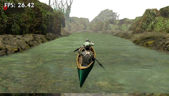
Screenshot taken from an early version of the river level. In early prototypes of the canoe, the player could steer the canoe left and right, controlling the paddles by swiping the touch screen.
The full canoe simulation was a lot of fun, but was cut from the shipped game because it would have required too much player instruction and practice: by the time they learned how to operate the canoe effectively, the mission would have been over. This was disappointing from a design point of view, but was determined to be the right thing to do after we watched a small sample of users attempt to paddle up stream.
In the simulation, the canoe was steered by players alternately swiping up and down on the sides of the screen. To some, swiping on the left side of the screen meant to turn the boat to the right (which was the intended effect), other players assumed that swiping left meant steering left, and no amount of training could reverse this instinct.
We could have included an option to invert the controls, but there turned out to be an even greater problem that was too big to solve: the touchscreen swipe rate. Some players would gently alternate swipes on each side, resulting in straight navigation at optimum speed. These were our target gamers, the ones who could effectively control, and therefore appreciate, the simulation. Other gamers would spam short swipes on one side of the screen before realizing they were turning undesirably and they would frantically switch sides to try counter steering, often times running aground and then having to reverse their way back into the water. These problems could have been solved with a lot more training time and with helper features like "auto returning" a grounded boat to the center of the path, but given the relatively small part the canoe played in the context of the entire game, we just couldn't dedicate the time or resources to making the simulation aspects work.
We're still quite proud of the canoe's final implementation, as it was the proper balance between narrative and interactive immersion. Most gamers probably won't ever question if they're missing an awesome canoe simulation. Toward the end of the project, we questioned whether the months of development time for such a short section of gameplay was worth it, but I think if you play it, you'll agree that it's not only fun to play, but absolutely gorgeous. And who can argue against spending some time with Sully, drifting along in a canoe?
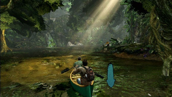
Screenshot from the final game. You can see the swipe icon to the right of the canoe. What the player lost in terms of freedom of control, they gained in freedom from frustration.
3. Documentation
Something we continually struggled with during development was how to document features and how to keep team members up to date on changes. It was not a new problem, and one we'd been trying to solve for a few projects.
For years we had used the "Master Design Document," a massive Word document that became the game's development bible, often running to hundreds of pages with cross-linked documents (when Word still had that functionality.)
We moved away from the bible for the same reasons that many teams have: no one ever read the thing, and it was hard to keep up-to-date. For the last two projects, we've moved more towards wiki and email, with mixed success.
Wiki can be a powerful communication tool because it seems more accessible than Word docs -- wiki pages tend to be less dense, with more emphasis on bullet points, images and diagrams; information is broken up into smaller chunks, with easily accessible links to related information. Team members seem more willing to surf our web to find what they need.
Early in development we used the wiki for all of our designs: worlds, levels, features, AI, weapons, etc.
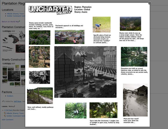
An early wiki page shows how we tried to make information more accessible by using lots of bullet points, links and images. This page is taken from 2009, when the game was still a hub. (Click for larger version.)
Later, the wiki was used almost exclusively to track lists of things that needed to be fixed: Each level had its own wiki and team members were asked to check and updated these lists daily.
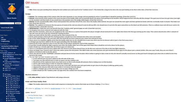
As we neared important milestones, the wiki was used to track "to do" lists. (Click for larger version.)
We also used the wiki to track art, design and engineering global tasks, production milestones, and more.
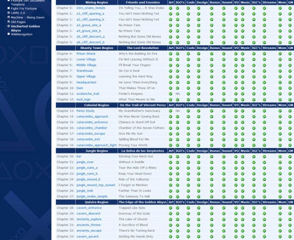
Production for the entire game was tracked via wiki. From this page we could see a snapshot of every important feature for every level in the game. (Click for larger version.)
But the wiki has its problems. For one thing, wiki pages are hard to edit -- wiki markup may be useful for a lot of things, but writing creative design docs isn't one of them. Late in the project we got the ability to edit pages using Word, but it was still hard to make sure formatting was correct, and at the time, adding illustrations wasn't easy, nor could you link documents via Perforce to ensure that everything was current. And though wiki pages were easier to access than Word docs (which had to be updated via Perforce), there was still no way to force team members to actually read them.
Equally troubling, though wiki pages were less dense than Word docs, they still tended to get out of date at an alarming rate. By the end of development, the Uncharted: Golden Abyss main wiki page had 171 child pages, each of which had dozens of children of their own, which had additional child pages, ad infinitum. Almost all of these pages were out of date well before alpha. Keeping information up-to-date became a full time task that no one had time for.
This is one of the reasons we came to rely on email. Emails can be effective because not only are they as succinct as wiki pages, they are almost guaranteed to be timely: if I read an email sent today, its information is almost guaranteed to be current. We used emails to generate to-do lists, create action items, track assignments, discuss issues, etc. Our Principal Environment artist used email to send out his "FixPix"; these were compilations of graphic issues, bugs and polish requests that Francois made for each level of the game. They proved to be an effective form of communication because they were almost entirely visual, making miscommunications between lead and artist very rare.
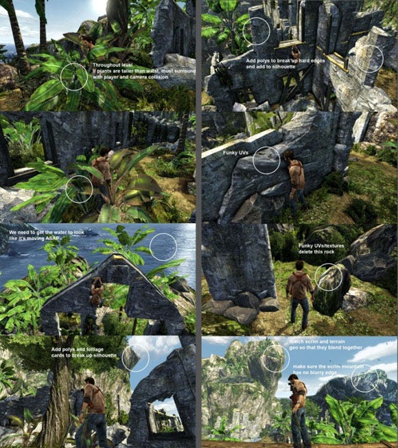
FixPix like this were used to visually illustrate graphic bugs and to request polish. (Click for larger version.)
When issues were more complicated, emails often turned into protracted chains that devolved into buck-passing and finger-pointing. Here's an example from 2011: the original email is a list of issues found while playing through the Shanty Upper Village level. The text in red is a team member's response, and you can see how the thread got out of hand from there. The obvious problem with email is if a problem requires team interaction, asynchronous communication probably isn't the most effective solution. It's too easy to punt the issue back and forth, or play the "blame game."
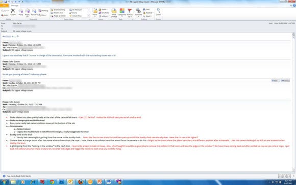
The perils of email: it's too easy to take comments out of context to play the "blame game" rather than work together to solve problems. (Click for larger version.)
For our current project, we're still using wiki (until we find a better solution) but we've made a conscious effort to move away from email. We spend a lot more time in one-on-one meetings discussing issues face-to-face, using email as a follow-up -- and there are far more ad-hoc meetings in common areas.
We also got some great advice from Brian Fleming at Sucker Punch Productions, and now have weekly meetings with the entire team. We've broken the team into four groups of roughly 10-15 people each; Chris and I, along with our production manager, meet with each group for a half hour every Monday morning, without exception. These meetings are strictly for information gathering: Chris and I give them information about the state of the studio and project, our production manager gives an update on what the rest of the team is doing, and team members give us information on their current tasks. All of this is designed to ensure that folks are reading the wikis, are working on the correct tasks, and that we're all moving lockstep toward the next milestone.
4. Scope
Bend Studio has always developed third-person action games, whether the emphasis was on Syphon Filter-style stealth action or Resistance: Retribution-style sci-fi action, but we completely underestimated the amount of additional content required by an Uncharted game. As we finished prototyping and began actual production, we realized this, and started making big cuts in the design and story. Here's some examples of things we cut before production began:
The Chindi
Much has been made of the fact that there are no supernatural enemies at the end of Uncharted: Golden Abyss. Originally, there were going to be. In an early draft of the story, Drake reached the underground city of gold and discovered that all of Guerro's men had been killed -- victims of what the local superstitions called "Chindi" (who would turn out to be ancestors of Quivirans, mutated by generations of exposure to the radioactive gold).
Partly we cut the Chindi because we knew we had our work cut out for us just nailing Uncharted-style combat with regular humans, without the headache of a completely different set of AI, animations (which we didn't have), combat mechanics, character assets, etc.
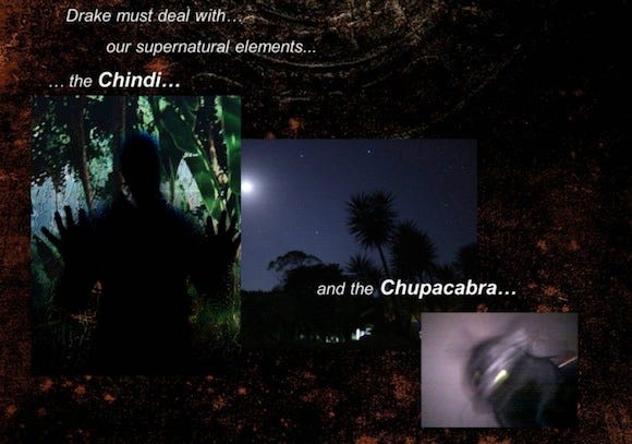
This slide is from an Uncharted NGP presentation dated January 2010.
Cutting the Chindi also helped differentiate our game from Uncharted: Drake's Fortune. Reading an early draft of the story, Amy had expressed some misgivings that the Chindi were pretty similar to the Descendants. Later, when I asked if the Uncharted formula required a supernatural ending, she said absolutely not. So the Chindi were cut. Some players missed them and said we weren't Uncharted without the supernatural ending; others thought its absence made the game better. We weren't making a judgment call either way -- we were merely trying to trim the schedule.
The cut didn't hurt gameplay too much, we felt, because we were able to rewrite the story (we were still in pre-production, remember) and have Dante show up toward the end of the game with an army of mercenaries. The mercs provided combat scenarios that contrasted nicely with Guerro's thugs. The mercs had better and more powerful weapons, flak jackets, and they looked different: more military, more organized. While the Mercs didn't offer unique gameplay mechanics the way Uncharted's supernatural enemies do, they helped our schedule immensely, because we could share behaviors and animations across all enemy types.
Isla Providencia
In the original story, Chase and Drake find Esteban's Crypt in the Sete Cidades Retreat only to discover that the Esteban's Sword (another important MacGuffin) had been carted off centuries earlier by none other than Henry Morgan, who hid the sword and other plunder in his secret hideaway on an island in the Caribbean. Drake teamed up with another old friend, Harry Flynn, to help retrieve it.
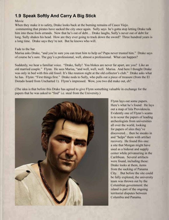
This page from a June 2010 draft of the story shows how Drake would have interacted with Harry Flynn on a deserted Caribbean island.
We loved the idea of showing how Drake might have screwed Flynn over early in their careers, perhaps explaining Flynn's behavior in Uncharted 2: Among Thieves. But we realized that cutting this plot element would allow us to cut an entire world's worth of characters, mocap, sets, movies, and gameplay. At the time, I hated to see Flynn go, but as it turned out, we didn't cut nearly enough. And thankfully, Uncharted fans don't love Flynn nearly as much as they love Sully.
The Highlands
This world would have taken place between Chapter 27, the last rainforest level, and Chapter 28, the first Quiviran level. Drake and Sully were to traverse dangerous cliffs, narrow trails and more rickety bridges as they fought their way up to a Machu Picchu-type city where they would have discovered the entrance to the lost city of gold.
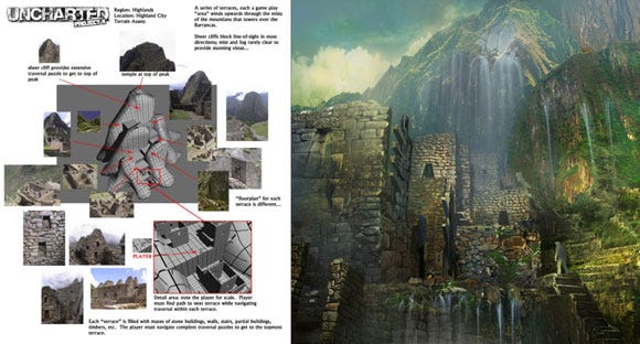
High-level design and concept art for the Highlands, another world that would have starred Sully. (Click for larger version.)
This world didn't get cut until just before final production began, so we had concept art, maquettes, layouts, as well as playable gray box levels. But as production began we were still worried about being able to pull off the Naughty Dog-style open spaces, cliffs, and vistas.
As it turned out, our environment and tech team proved that we could do vistas just fine, and I can only imagine how spectacular the traversal in this world would have been. At the time we were sorry to see the Highlands go because we worried the player wasn't going to get enough Sully time, but that turned out to be a non-issue, mostly because the rainforest world almost doubled in size during production (which was, no pun intended, a much bigger issue).
Shanty Avalanche World
The last major cut came after the script was locked and full production had begun -- but the cut was not the result of our having realized our game had scope issues. It was cut because of a tsunami.
Originally the shanty avalanche world took place between Chapter 9 (the last shantytown level) and Chapter 10 (the "side scrolling" level where weaponless Drake and Chase run for their lives). In the avalanche levels Drake and Chase would have been trapped in the middle of a massive avalanche that was sweeping the shantytown down the mountainside (the bridge was originally a dam). They were to backtrack through the shantytown, but would now face a torrent of mud, struggling to stay ahead of the destruction all around them. It would have been a spectacular action set piece. Like the Highlands world, we had already completed maquettes, layout and gray-box levels -- the world was ready for production.
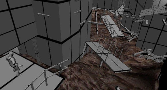
In this gray-box playable layout, Drake is contemplating a traversal path that will keep him out of the torrent of raging mud below.
Then in March of 2011, a disastrous earthquake and tsunami hit Japan and we, along with the rest of the world, spent several days watching images and videos of the awful destruction as entire towns were swept away by torrents of muddy water. In the aftermath of this, we worried that maybe the avalanche world would feel a little on the exploitive side, and that at some point we might be asked to remove it.
Something similar had happened to our studio more than once: Our opening world in Syphon Filter: The Omega Strain was originally set in Toronto, Canada -- until the Canadian press found out that "Sony was creating virtual terrorist attacks on their soil." Mere weeks before alpha, we had to scramble to change every reference from Toronto to the fictional "Carthage, Michigan." We also had our original cover and marketing pulled from Syphon Filter 3 because our story involved a terrorist bombing in Washington DC... unfortunate given our September 25, 2001 release date (just weeks after 9/11). We weren't going to take any chances with our avalanche, and the world was cut.
But even with all those cuts, Uncharted: Golden Abyss was still a huge game. Partly this was because some levels had to be divided in half in order to work with our streaming engine. In any other franchise this might not have been a big deal: divide a large level and you end up with two smaller levels, right?
But with Uncharted, that's not how it worked out. Because our streaming required a cinematic to mask asset loading, each level required a transition cinematic -- at one point we had trimmed over 20 minutes from the script, but by the time we reached gold master, we had added all those minutes back in, and then some. And it turned out that the amount of polish wasn't cut in half, but doubled; it was hard to tell artists, "look, this level gets only half your time and attention because it's not really a full level." Development just doesn't work that way.
Misunderstanding the correlation between level size and asset needs was a mistake we made from the start. Because we were worried about memory and streaming, we had made the decision early on to create more, smaller levels, thinking they would be easier to build, load and polish. But Uncharted is a dense experience in terms of assets per square foot of environment. Even small levels tended to get filled up with AI nodes, VO triggers, traversal edges, unique action moments, special animations, collectible hiding spots... all of which needed art, animation, audio, scripting and sometimes code support. And as the layouts got fleshed out, each experience grew in the telling until we were looking at a massive amount of assets that needed to be polished.
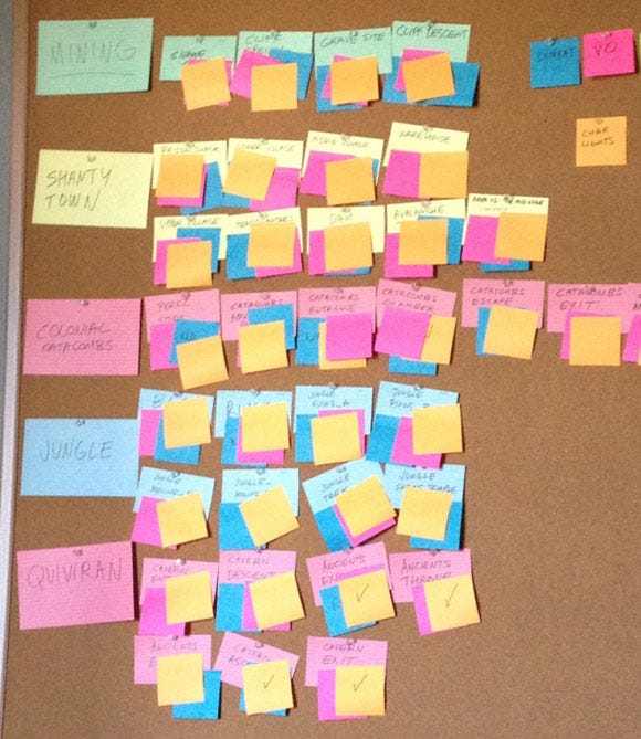
The "world" board in my office. Each of the 34 small index cards represents a level, organized chronologically into the game's five worlds. Each of the colored post-it notes represents some aspect of asset polish that is complete for that level.
Resistance: Retribution had only 23 levels -- at a PSP level of quality. Uncharted: Golden Abyss had 34 next-gen quality levels, each of which had five times the content of any PSP game we had ever made. What were we thinking? We were trying to make something akin to a next-gen quality console game with a core team that was a third the size of a Naughty Dog or Santa Monica Studio. It was insanity. I shudder to think what would have happened if we had not cut those three additional worlds: the game would have been almost a third again as large, maybe another 15 levels. We'd probably still be working on the game today.
In the end, we needed to cut even more, but that's where the reality of the locked script really hurt us. The only way to have fixed the scope issue, in hindsight, would have been to tell a more modest story to begin with. Maybe there should have only been one antagonist instead of two; maybe the whole Perez backstory was too expensive and unnecessary; maybe we didn't really need such a long trek through the rainforest (thankfully we didn't cut that -- yay Sully!) And maybe a handheld game didn't need two hours of cinematics (twice that of Resistance: Retribution.)
Given the chance to do it again, we would have spent much more time up front vetting every aspect of the experience, negotiating a target game length. It was an expensive lesson, given the amount of overtime we had to work to finish the game.
5. Crunch
From January to December of 2011, the team worked pretty much nonstop, many of us putting in evenings and weekends for months at a time. Every evening we tried to offer a catered dinner so the team could maximize their time and get home as early as possible. Our office manager tells us that we ordered over 158 overtime meals during that crunch. There's been at least some crunch on every project I've ever worked on, but this was harsh by any standard.
As studio directors, Chris and I were responsible for the schedule and hence the crunch, and we took that responsibility very seriously. Overtime on past projects could be blamed on poor planning, mismanaged design, lack of proper prototyping, unclear milestones, uncontrolled iteration... the usual suspects. But not this time... at least not entirely.
Our crunch in Uncharted: Golden Abyss was almost completely attributable to one thing: ambition. As noted above, we didn't do a very good job of managing the scope of the game, which for some players ended up being a 10 to 12 hour experience -- compare this to God of War: Chains of Olympus, one of the highest rated games for the PSP, which clocked in at six or seven hours.
During the project postmortems, "Managing a healthy work / quality of life balance" came up as a top concern for almost everyone in the studio, Chris and myself included. Our families didn't see us a lot in 2011, and we vowed to do everything in our power to keep that from happening again. Some of the steps we've taken include:
Negotiating as reasonable a schedule as possible, given our studio's burn rate and budgets
Holding weekly meetings with every individual on the team, where issues of scheduling, scope, progress and productivity can be raised directly
Vetting the scope of our next project up front in an attempt to find that balance between the optimal player experience and the time we need to create it
A year before we shipped, we gave the team a pep talk, pointing out that for many of us, Uncharted: Golden Abyss might be our only chance, ever, to work on a premiere launch title for new hardware, a title that could define that hardware for years to come. I believed it then and I believe it now: chances like this only come along once in a career.
Even though development was stressful and meant many months of hard work, I'm glad our studio took on the challenge and rose to it. Every project is a learning experience and developing Uncharted: Golden Abyss taught us a lot. We learned important things about planning and scoping. We learned about the immeasurable value that early and constant focus testing can add. We learned how to begin real development even while key parts of the project are in flux, by defining important, story-independent features up front. We learned a lot about next-gen graphics and non-traditional controls. We learned a lot about story, character, presentation and pacing. But most important, we learned a lot about how we work together as a team, how we react to stress, how we communicate with each other, how we get things done. The development of Uncharted: Golden Abyss was far from a perfect process, and the game isn't perfect either, but as a studio, we're proud of what we accomplished, and are excited to put these lessons to work on our next game... which will be even better.
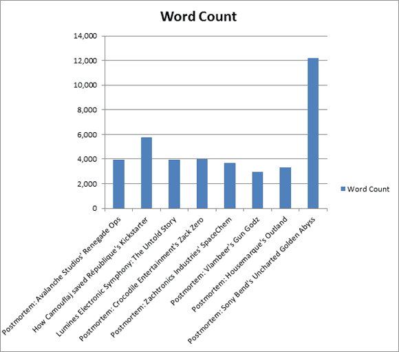
After reading this postmortem, one of my senior designers pointed out that it is three times as long as other recent postmortems. I guess we still have more work to do on our scoping issues.
Read more about:
FeaturesYou May Also Like