Trending
Opinion: How will Project 2025 impact game developers?
The Heritage Foundation's manifesto for the possible next administration could do great harm to many, including large portions of the game development community.

Featured Blog | This community-written post highlights the best of what the game industry has to offer. Read more like it on the Game Developer Blogs or learn how to Submit Your Own Blog Post
Back in 2011, the Bowery district was alive and kicking. You will never find a more wretched hub of scum and villainy. This was one of the regions players would bounty hunt aliens in the cancelled sequel to Prey.


Now that Arkane Studio’s version of Prey is out and living its own life, I rummaged through some old notes I had on Human Head Studio's Prey 2 world.
What you’ll be looking at are top-down designs from the 3D environments. Areas the player could not reach in the distance are not included. So don’t interpret these layouts as small city islands. Central City on Exodus was a vast urban sprawl surrounding the player.
The planet Exodus was tidal locked, so regions had a fixed amount of light for the whole day. Only the weather conditions changed. Spanning the equator was Central City at the edge of night. The Bowery was one of the many districts found there. Undercity was below the raised Central City, so it was naturally dark surrounded by massive caverns. The Depot was just south at the edge of Central City in the colder night. And Locktown was out in the baking hot sun.
The Bowery’s the entertainment, neon-noir hub the public saw at E3 in 2011. It’s filled with loads of vice and wares. This city layout went through 3-4 different versions.
Here’s some scraps from an early version I did. Various paths and population density provided diversity to different neighborhoods.
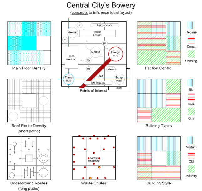
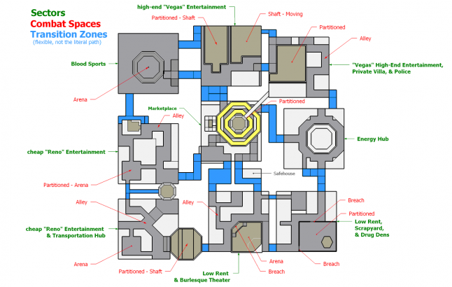


The further north you went in this district the more elevated and opulent it became. The northern edge featured glitzy casinos and blood sport arenas. The southern edge featured seedy theaters and questionable gambling.
Solar energy collected on the light side of Exodus beyond Locktown fueled various Energy Hubs throughout Central City. These arched over the sky and were sometimes subject to raids. One of these anchored itself on the eastern edge of the district.
The Bowery was also the main marketplace for Central City. This huge hive of activity was right in the middle of the district.


As with any district, it featured a lot of verticality. Primary streets tracked the player to different points-of-interest while more challenging routes shortcutted across, over, and under the neighborhoods.
More playtesting and ways to improve navigation prompted another version. Level Designer Dave Halsted created this next iteration largely from scratch, working with Artists and the Lead Designer. The team fine-tuned this into Version 3 which was showcased at E3.
This Bowery was like a big block of swiss cheese. Where most games at the time provided some verticality, they relied a lot on moving horizontally across the game to get to new content. In the Bowery, events could be found on platforms layered above and below one another.
You could sprint over local rooftops, still dwarfed in the shadows of larger suspended buildings out of reach above. You could slip underneath the main promenades to avoid detection. Some characters couldn't be reached unless you had the right gadget or knew the right climbing path to encounter them.
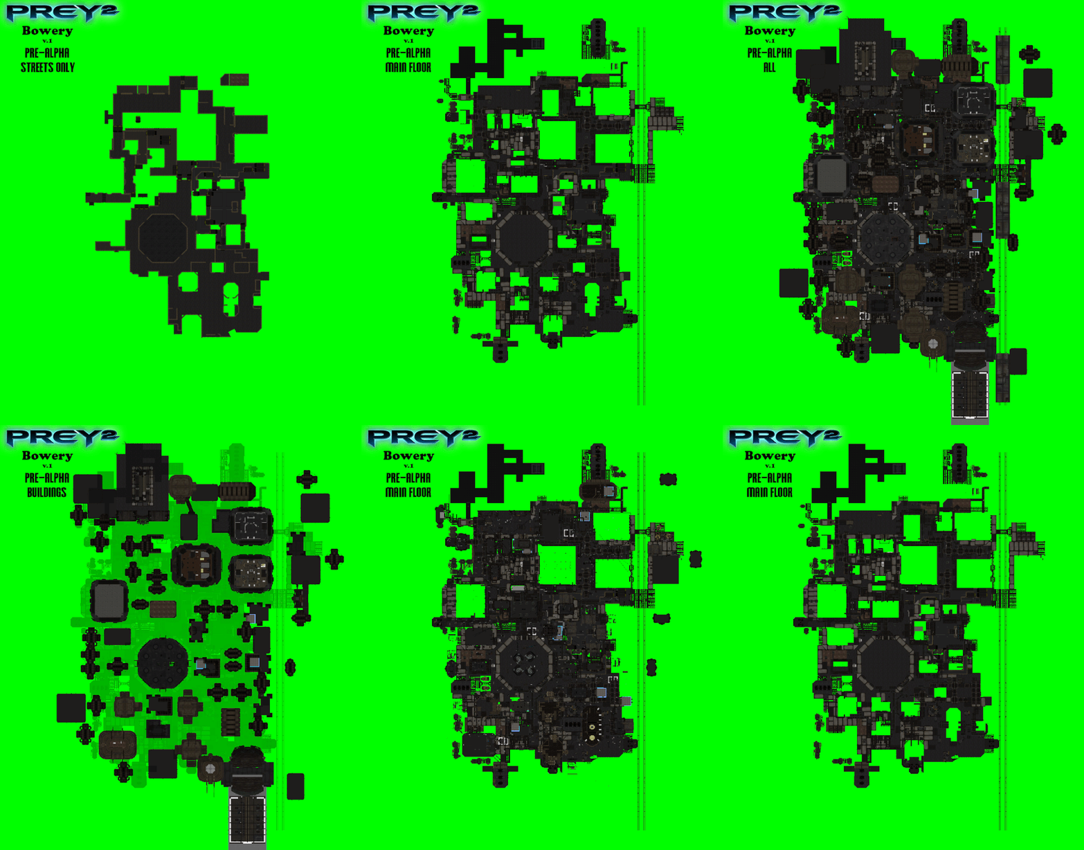
Looking down, here's some of the larger skybox of buildings and skyroads overlapping the district.
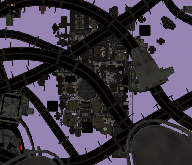
Below is the variety of things you would discover in the Bowery. You had various ways to travel to other locations on the planet. Trains and Taxis were common ways. Some where unique, though. You could take an elevator down to the mining zone or you could Portal jump to a larger casino beyond the western edge of the Bowery. Both of these were “dungeons” you experienced in a more authored and linear way, contrasting the sandbox nature of the city hubs.
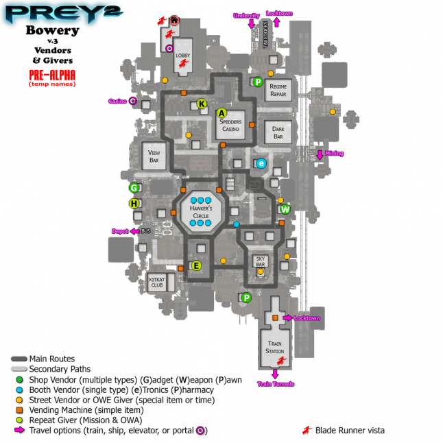
The portal jump to the west side Casino...
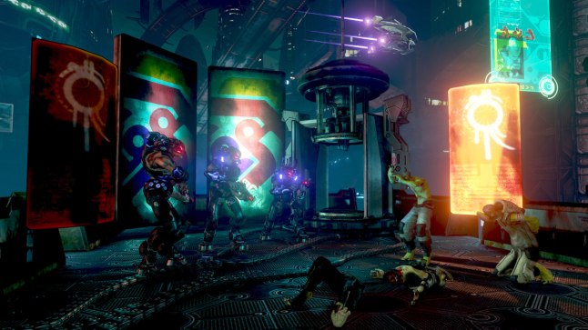
It should be no surprise Blade Runner inspired several locations throughout the game. Several could be found in the Bowery…


In addition to the player's apartment, several medium-sized interiors were spaced around the district including several clubs, a casino, and a marketplace.
Beyond that, a dozen shop types provided items to purchase while other nooks had alien contacts to help you track down info. Blue labeled locations were managed by the authoritarian Regime. Those along with city-system outlets could be sabotaged to cause chaos, distraction, and draw out enemies. Some vendors gave you specific upgrades, some gave you credits for things you found or captured. Some simply let you mingle with the inhabitants, gamble, or drink.
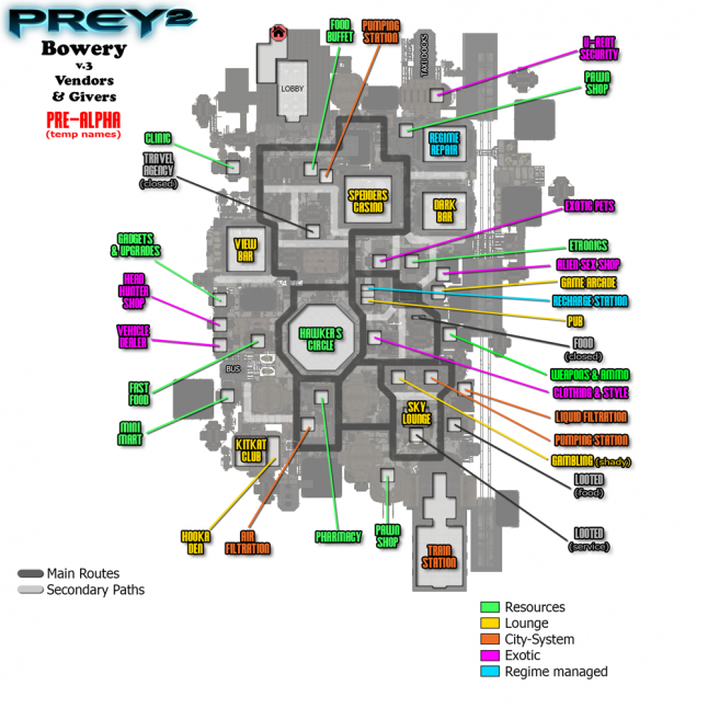
I found some more images I made for map screen reference. It's animated to give you a better idea of the layered gamespace.
Later in the project, we were told Prey 2 suddenly had a lot of quality issues. One of the ideas discussed was changing the beginning of the game. One had you start out at the plane crash site from the first Prey. Another one had you working with Tommy sabotaging a location before he appeared to sacrifice himself saving you.
One that I favored was getting the player in as quickly as possible without a series of tutorials. A bombastic James Bond opening. You play what you saw in Blur's Cinematic trailer made with Human Head’s direction. The video did a great job at introducing all the core mechanics. At the time it was a rare trailer showcasing what you could actually do in the game instead of a story cinematic.
Like a classic id Software game, just drop players in and let them figure it out. Similar to Temple Run or one of Uncharted’s running sequences, you quickly chase down a bounty dodging enemies and obstacles. (Of course this idea would need to be playtested!)
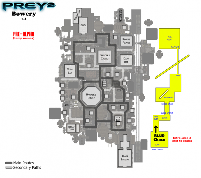
A more radical idea I did in the final days was to unravel the Bowery. Neighborhoods were easy to readjust because how they had been built and designed. Below is a comparison image to understand how areas were shifted between version 3 and 4. This was able to be playtested in less than a week.


The Bowery was no longer a big block of swiss cheese. It was now a ridge of buildings spiraling down to slums. Just beyond the slums was a massive Regime tower looming over the citizens.
Before − players were traveling to points-of-interests right in front or above them and anything far away was only in an unreachable skybox.
Now − this gave players longer vistas to locations they could reach. They were no longer in a box surrounded by other boxes. This was my favorite layout because it let the Bowery breathe and showcase all the diverse areas the team created.


This post also appears on my website at CuriousConstructs.com where you can find larger versions of these images.
Read more about:
Featured BlogsYou May Also Like