Trending
Opinion: How will Project 2025 impact game developers?
The Heritage Foundation's manifesto for the possible next administration could do great harm to many, including large portions of the game development community.
"We intend to evoke the feeling of missing someone or the difficulty of moving on through the level design."

How to Say Goodbye is a game about death. Or rather, it's a game about what might await us once we've shuffled off this mortal coil.
The poignant narrative adventure, produced by French duo Florian Veltman and Baptiste Portefaix and inspired by popular illustrated books, asks players to navigate through a liminal world-between-worlds inhabited by lost spirts and other more malevolent beings.
Here, the afterlife is disorienting and curious place filled with grid-based conundrums that exist outside of time and space. To reach the fabled 'other side,' players will need to solve those Rubick's-eque conundrums while grappling with themes of grief and acceptance, guiding their spectral companions to whatever lies beyond.
How to Say Goodbye is currently slated to release later this year, but ahead of the game's launch we caught up with Veltman and Portfaix -- whose previous credits include Monument Valley 2, Assemble with Care, and Oniri Island -- to chat about the art and design beats behind the mediative puzzler.
Game Developer: You've mentioned How to Say Goodbye is inspired by illustrated books, but how difficult was it to translate that art style to the game space?
Veltman and Portefaix: The decision to use illustrated books and the techniques associated with them as an inspiration came naturally from the prototype of the main game mechanics we built early on. We were reusing assets from a previous game, which inspired us to pursue this collage-like, print aesthetic.
The use of limited color palettes really completed the look we wanted to achieve, but it’s certainly made the process of making assets for the game quite convoluted. The color palettes require all our assets to be designed using CMY colors, which are then remapped to the palette’s colors. Any color that isn’t either cyan, magenta, or yellow is then dithered based on the amount of cyan, magenta, or yellow that is contained in this color. Using this approach, we’ve been able to achieve something that feels like superimposed layers of color, imitating a screen-printing aesthetic.
I'm intrigued by the use of color in How to Say Goodbye. Could you talk about how you developed the various palettes featured in-game, and why it was important to fill the world with such palpable hues?
In print media, colors are obtained through subtractive color mixing, which is something we reproduce through the post-processing effect we apply to the game. To obtain the tactile palettes inspired by printing techniques, we’ve been referring to well-known color theory books such as "Interaction of Color" by Josef Albers and "A Dictionary of Color Combinations" by Wada Sanzō. Of course, as we’re working on screens, we’re adapting these palettes to take advantage of the brightness of screen-based colors. This post-processing approach to our color palettes allows us to quickly iterate on the game’s tone.

Why did you want to tell this story through the medium of puzzles, and how did you design and implement those isometric, grid-based conundrums?
The game started as a prototype for a puzzle system where the player moves tiles on a grid, inspired by Rubik’s Cubes. We wanted to make the puzzles character-based, but as the tiles don’t really move through the environment (they push the surrounding tiles around like rows and columns on a Rubik’s Cube), we were wondering how to convey the character’s movement in the game. We came up with the narrative conceit of ghosts existing in this liminal space where time and space don’t really apply, justifying why the environment changes all the time. With ghosts as protagonists, we naturally thought of telling a story of grief.
What design considerations went into telling an impactful and emotionally resonant story about death and grief?
It’s common to convey the idea of death through a "game over" or a "reset" of the game world, equating death with defeat. We want to approach the subject of grief in a "death-positive" way, so it’s important to us that the game reflects this. Just like a Rubik’s Cube, the game never ends up in an unwinnable state. We intend to evoke the feeling of missing someone or the difficulty of moving on through the level design, for instance, by making certain parts of levels inaccessible
in the absence of certain characters. We also hope to create an emotional bond with one of the characters by having players customise their look and personality, with the intention of making certain story events more impactful.

From a technical point of view, what has been the biggest challenge you've faced (so far) when developing How to Say Goodbye?
The technical challenges we’ve encountered mostly come from difficulties conveying the gameplay systems in a readable and understandable way. As we mentioned before, the game is played by moving tiles along rows and columns, pushing the surrounding tiles as well as moving around immovable obstacles.
To do this, we create a "path" from the tile selected by the player, which loops at the edges of the screen. Initially, when the path reached an immovable obstacle, the path would automatically turn left, with exceptions like dead ends, which would cause the path to turn right. We hoped that this rule, which is fairly simple to describe to players, would translate into interesting puzzle-solving, as players learn to understand this simple rule over the course of the game.
In practice, this rule was hard to predict and understand for players, and this affected the way we designed the puzzles. We ended up reducing player agency by constraining the movement to corridors, which in turn made people interpret the game’s movement mechanic to rely on pre-established but invisible paths, instead of the Rubik’s Cube-like grid we have in the game. To solve this design problem, we settled on having the path tend as much as possible towards the direction defined by the player, using a modified Dijkstra’s algorithm that penalises tiles that don’t match the player-defined direction.
This results in paths that make more sense intuitively for players, despite being technically more complex. To further dispel the idea of the game having predefined paths, we’ve implemented various grid visualisation systems as well, such as generating a real-time Voronoi pattern representing the tiles as cells, as well as a mesh that is generated from immovable tiles. These systems were definitely pretty big undertakings, but together they now make the game actually readable to players while also reinforcing the game’s identity both visually and in its gameplay.

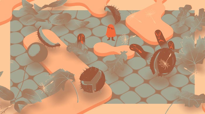
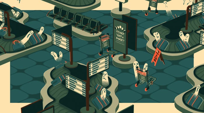
I also want to touch on your approach to environmental design. Each level seems to be littered with detail, from fallen leaves that rustle and crunch as the grid-based world shifts to a liminal Airport complete with creaking baggage carousels and posters selling trips to the moon. Could you talk about how you added those flourishes and what you feel they bring to the experience?
One approach to building a puzzle game is to really focus on the mechanical aspects and leave the story and art to a minimum. We’ve always been interested in narrative and bespoke environments, so making sure that the game allows us to express ourselves through the audio and visuals is a core tenet of the project.
So we naturally gravitated towards making How to Say Goodbye into a finite, story-driven experience, where each puzzle is filled with little clockwork, music box-like details. Despite the heavy themes and the puzzle gameplay, we’re hoping to make the game a fun experience for as broad an age range as possible, so adding lots of little details to break up the puzzles and give some breathing room seemed like a good way of making the experience enjoyable for people who aren’t necessarily there for the head-scratching.
You May Also Like