Trending
Opinion: How will Project 2025 impact game developers?
The Heritage Foundation's manifesto for the possible next administration could do great harm to many, including large portions of the game development community.
"There’s depth in the Death Trash world," says creator Stephan Hövelbrinks. "It's just consumed in a different way."

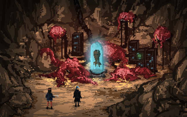
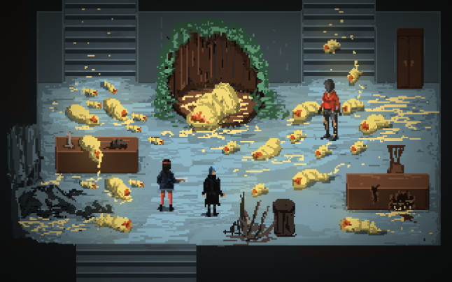
Death Trash, one of the games that stole the spotlight at Steam's recent demo-packed Next Fest, presents a world occupied by fleshy monstrosities, depicted in such detail that it's hard not to see it as beautiful in its own way.
The upcoming title started out as a solo-developer project from Stephan Hövelbrinks, and has since taken on a life of its own thanks to the help of Hövelbrinks' Crafting Legends, the studio created to continue work on the game.
Speaking to Gamasutra, Hövelbrinks himself pitches Death Trash as a post-apocalyptic action RPG that borrows inspiration just as much from old-school role-playing games as it does from modern indie action games, and aims to weave those sometimes contrasting elements together in a way that is all around fluid and fully, unmistakably Death Trash.
Death Trash has been in development for six years, much of that as a solo dev. Did you have trouble keeping focused during all that time? Have you managed to get help? How do you create all of the assets that a sprawling RPG requires with such a small team?
There were a few years as a solo developer before Death Trash, too. Making small projects on my own and occasionally collaborating, hoping to build a portfolio to finally get a job in the games industry. Keeping focus has always been difficult.
It got better with Death Trash though.

When it came into existence it had an immediate presence and pull on me. Since this was a personal dream game, there was always enough motivation.
Regarding focus: I was often enough working on solving major problems. Basic controls. Adding atmosphere. Adding combat. Building a few levels. Realizing current workflow for building levels is too painful. Programming a custom level editor.
On the outside it must have felt much more unfocused. “Oh, look, now he’s building tools again for the sake of building tools.” But it was, in reality, building the framework and improving the workflow, step by step, to be able to finish this game with a mini team at all.
Being unfocused happened much more through other areas needing attention and decisions, like business and marketing. Thankfully, the direction there is pretty clear now with the final decision of self-publishing.
And, regarding creating a sprawling RPG with such a small team: We’re two developers now, plus audio freelancer, plus marketing freelancer, and have all systems and workflow in place and even a polished gameplay slice with the demo. I don’t know yet how long it will take to build the rest of the game in the same quality, but we got a lot of work done in the last months, so right now I’m optimistic that next year is a feasible goal for the final release.
A lot of solo and small-team projects appear in Steam's catalog, the spotlight immediately goes out, and then, rapidly cooling, they are swallowed up by Steam's vast back catalog and are never seen again. It can be challenging to make your game stand out from the hordes. Not to jinx it, but Death Trash has so far managed to escape this fate. What's your secret? How do you handle publicity?
I don’t know if there’s a secret. I can tell you it felt like a lot of ups and downs throughout the years. The game got massive attention in the first few months, then dwindling, then a few bumps like around the PAX East in 2018, then dwindling again, and now a massive bump around E3 2021. Maybe dwindling again in the future?
If Death Trash gets people interested it’s mostly because of the game itself: its world and personality is immediately visible. People see some elements in it they are familiar with (post-apocalyptic, punk, flesh monsters, Death Metal imagery and topics) and then they see a spin on them that makes it fresh for them. Then they realize that the game will be coming to all platforms, has freedom in gameplay, has a range of usability considerations, active and caring developers, etc. That seems to make some of them stay for the long run, even for years.
It always felt to me like the game has a good conversion rate and its main marketing problem was to put it in front of more eyes. That’s a hard problem actually, because the existing audience might be interested in the game still, but they won’t talk about it anymore, they’re just waiting.
So I consider us incredibly lucky that our marketing strategy around E3 (working together with freelancer Marco Conrad) worked out so well. The announcement of a demo reactivated the existing audience, allowing videos ahead showed the quality of the game. Then [there was] good positioning of our trailers in the E3 events, and then the demo got released and was thankfully met with a lot of positive feedback.

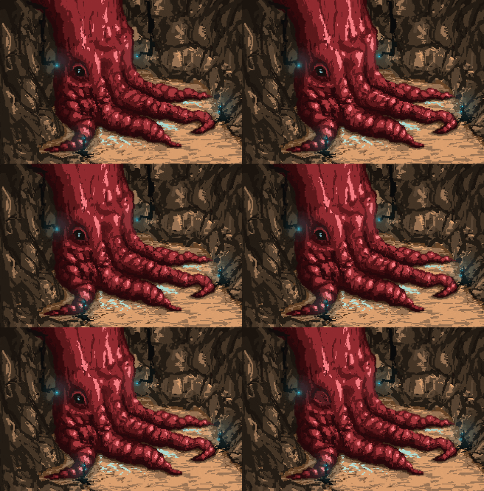
Death Trash has been compared by many to the Fallout games, although there are definitely differences: the game doesn't take place on Earth, and there are gigantic monstrous creatures about, like the Fleshkraken (a towering squid-monster god who's, to some degree at least, actually friendly). Those are obvious differences; what else distinguishes your game from those other post-apocalyptic RPGs?
The greatest difference is in the direct gameplay. We have action-heavy combat, needing player reflexes. The other big difference is that Death Trash features a combined genre of many things, done by a small team, so if you compare individual components like combat or multiple-choice dialogue against instances of other games where those were the focus, Death Trash might feel more shallow under that perspective. It makes up for it (in my opinion, it excels) by having all elements flow better together in a very organic experience, plus good pacing. There’s depth in the Death Trash world, it’s just consumed in a different way.
I personally think we’re also having some neat design solutions for specific elements, e.g. allowing fluid switches between point and click controls and WASD movement, that are new to the genre.
Then there’s the mentioned otherworldly layer to Death Trash, manifested in larger-than-life monsters that can be talked to, taking place on a different planet, and gameplay elements like mind items. It’s not some flavor, it’s a basic part of the world for this game.
One of the best qualities of this kind of CRPG is to create a character with some strong, but specific, abilities, and try to get them through the world. That would require a flexible design, one that allows characters to succeed at necessary tasks in different ways.
How do you design the game's structure: do you just provide a lot of uses for the skills and assume the player will make it through, or do you make "routes" for each ability and skill, and ensure that all characters are viable, at least to a degree?
The bigger and more professional a team, the more it can work on making specific multiple paths viable and satisfying. With our hard constraints though--only two developers and still inexperienced--we have to approach it with building a few useful optional tools like stealth for example, and then see how players are actually using these. Then we’ll incorporate what we learned into the next locations we build or new iterations of existing locations.
It’s no secret that we’re still figuring out a lot of the specific design. That's one of the reasons why we’re going the Early Access route, needing lots of feedback while still working on it.
One of my favorite things about the game is the overworld map, which brings me to mind the overland maps from the old Gold Box D&D games. I especially like how, when you click a destination, your character doesn't go there in a straight line, but finds and follows a path within the pixel landscape based on the terrain, following what appear to be invisible roads blazed in the wilderness.
To peek under the hood, how does the game handle pathfinding down at this level?
Under the hood you’ll find a very basic A* algorithm actually, same one as used for characters in the game, plus a drunken path algorithm to make it look more organic. It tries to remember paths between invisible nodes, so if you would click a second time from the same position it would follow the same organic path. There are some objects on the map like forests that increase pathfinding weight where they are, so if there’s no other way, the player marker would travel straight through the forest, but if possible, it tries to travel around the forest.
The most direct inspiration of the map was by the Realms of Arkania games, which had similar organic paths on a painted map, only there it was fixed routes. There was a similar implementation in Death Trash during its first years, too, until it got changed to freeform travel. The freeform travel felt like a much better fit for adding a bit more dynamic elements to the map, like wandering encounters.

Death Trash follows a strong pixel art aesthetic, a common style for indie games, which some people around the internet have been heard to complain about. I am not one of them, and I think it gives your game a look that harkens back to early Windows-era CRPGs, although considerably more detailed. How do you think Death Trash's atmosphere is affected by it?
First I’d like to clarify that I’m not painting retro art. The look of Death Trash is grounded in the here and now. The rough, dirty, painterly pixelart style is a perfect fit for Death Trash.
The art of Death Trash is organic, which is the main theme of the game.
The art of Death Trash is abstract and imaginative, needing the viewer to fill in the blanks, to create the full view of the characters in their mind. Which works perfect with the range of topics and the otherworldly elements we have in the game.
The art of Death Trash is up to interpretation, which works good for having sickening elements like blood and puke in the game, meaning the viewer has a chance to adjust the extremity of it in their own mind. Maybe take the edge off.
The colors of Death Trash are chosen so we have the grounding earthen tones of the wasteland but also a few pockets of very different looking locations (not so much in the demo). Above all, the gameplay is still very readable, characters easily identifiable in front of the scene art.
I’d like to mention here that there’s a lot of variation in pixel art games out there, much more than people give it credit, and the pixel art constraints (e.g. blocky grid or the low number of specific colors) are just one element of the complete art style for a game. I would like to encourage people to look beyond “it’s a pixel art game”. There’s much more to them.
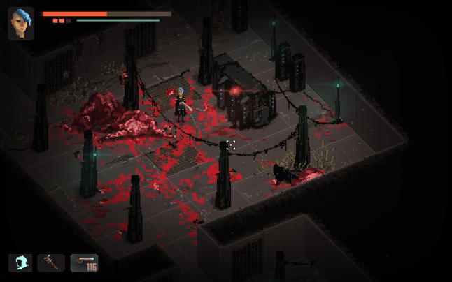
Early on characters can pick up the Stealth mode, giving them a second option for how to handle enemy encounters. Using it correctly is tricky, but rewarding. While in Stealth mode, the game displays enemy line-of-sight as red fields that interact interestingly with blocking terrain.
Touches like this, and the pathing mentioned earlier, give the impression of a highly polished game. Do you consider that important? Do you think it's helped Death Trash become so popular in a short time?
I consider the details of the game very important, up to very specific things in the usability, presentation etc. I wouldn’t call it perfectionist, as that sounds like the hunt for one very specific experience, but I believe that small elements add up and can have a large impact on the atmosphere, game feeling and believably of the fictional world. Or, what’s also important, removing small irritations or annoyances that pull people out of immersion.
Regarding marketing, I think it helped that people who were following along could see that the developers of Death Trash cared a lot about the game. It leaves a lasting impression on some people, in my personal experience.
But we’re only talking about a very small subset of an audience that will notice.

Death Trash has a Puke command! That isn't a question, it's just a statement. Death Trash's world is not for the faint of stomach. Vomiting is necessary to do a couple of things in the game, then using the resulting residue for solving a puzzle. There's big pulsing pillows of meat lying around the landscape. One particular cave contains a literal lake of blood. And of course, there is the Fleshkraken, which is actually kind of cute compared to the rest of the scenery. It gives your game a strong aesthetic. Is there an artistic statement you're making? Does this speak to a theme of flesh vs. technology? Is it just really cool?
It’s a bit of both, artistic and just really cool. Like most works long in the making, it’s a thick layer of things, all meshed together.
Of course there are philosophical thoughts woven into the Death Trash world. Some straightforward topics touched (e.g. monstrous-looking but having feelings) and lots more in the details.
But then there’s also a lot of messing around. The puke for example was more of a random thing, comic relief among the oppressive tones of the game. It kinda stuck though. From early on in development the game had a touch of what I would call “queer punks partying,” which surfaced here and there. If you have that, then partying, getting drunk and puking isn’t that far off. Then it looked funny in a GIF. And then, after making sure that it still fits with the whole vibe of the game, you begin incorporating it into the world building. Asking questions like “Why does it happen?”. So what begins as a random and silly thing gets layered in, part of the whole experience, giving color to it.
Death Trash has no specific artistic statements. I could call it a pledge or faith for humanity under inhuman conditions, and I’m sure that a lot of my humanistic beliefs bleed through a lot of the situations in the game, but there are lots of ways to interpret, and also, since the team is growing, it's not the work of a single writer anymore.
What's currently on Steam is just a demo, and one with a lot of areas, and a couple of features, locked-off. Without spoiling things unduly, would you like to tell us something about where Death Trash is going from here?
I don’t want to spoil the story elements, really. They are also still subject to change.
Here’s the general concept: The Early Access in August will launch with a third of the game, many elements of the Death Trash world already present. Then we’ll continue refining and changing, and adding another third with more wasteland locations, and then, shortly before the release of the final game (2022?), we’ll add the last chapter, which will also bring a change of scenery.
You May Also Like