Trending
Opinion: How will Project 2025 impact game developers?
The Heritage Foundation's manifesto for the possible next administration could do great harm to many, including large portions of the game development community.

Featured Blog | This community-written post highlights the best of what the game industry has to offer. Read more like it on the Game Developer Blogs or learn how to Submit Your Own Blog Post
A glimpse into the iterative design process, from community request to implementation and iteration based upon playtesting, while striving to create an innovative compass for Insurgency.

Originally published on our new company blog for New World Interactive, this post gives a rare glimpse into a game design process from initial requests by fans, through multiple concept iterations, iterating based upon playtesting feedback, leading to the final result. A compass is a staple for many military themed games, yet the indie tactical shooter Insurgency has lacked that sense of direction for players until now. And we never want to settle for what other games do - did we succeed with innovating a compass design?
How can one of the most immersive and intense shooters become even more epic? For Insurgency, the intensity is shaped by the combat narrative. When your character growls “F***!” while being suppressed, it often echoes the player in real life, cursing and flinching from fear of incoming rounds cracking by their head.
With the latest update to Insurgency, we’ve expanded the gameplay narrative with radial menu changes, new voice over, and a sense of direction provided by a compass. The elements come together brilliantly when players are acting and communicating like soldiers in combat, utilizing these new tools.
There have been many suggestions from our community to implement a compass in the game. We have had it on our to do list for a while, but it was just a matter of time until we discovered the right design direction and bring all the elements together. It’s a surprisingly significant shift to the gameplay, so when implementing a solution, it must feel like it has existed from the beginning.
Typically, suggestions are based on following the example set by other games. We strive to lead by example, so experimentation was necessary to discover a unique solution that works better than established methods. A compass is a staple heads up display (HUD) element in shooters and milsim games. Insurgency is celebrated for minimal design we established during the mod era as the NOBSHUD (No Bull**** Heads Up Display).
Hence the challenge becomes: implement a sense of direction with a compass, remaining unobtrusive within the NOBSHUD design principles, and be innovative. It took a few conceptual iterations and, most importantly, playtesting to further shape what the compass would become.
Concept One: 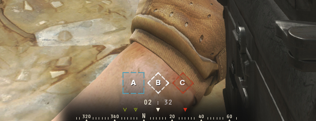
The first concept is by Brad, who designed the majority of the game’s user interface and HUD elements. While this concept looks very nice and fulfills many people’s expectations for a compass, its placement relegated at the bottom of the screen and small scale makes it impractical to quickly reference in the heat of combat. It also resembles how other games approach a compass, and I wanted to shift the direction into something more unique. The emphasis is on bearing numbers, while we primarily need cardinal directions to match voice over call outs.
Concept Two: 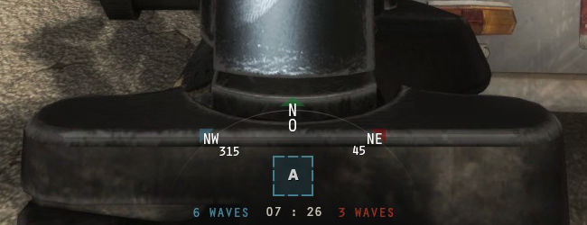
At first, we were designing with the constraint of not being able to program a circular rotating compass. This concept functions with the position of the bearing and directions remaining static, while the numbers and letters change dynamically according to what direction you are facing. I wanted to convey a sense of spatial awareness through a circular shape - the form follows the function.
Concept Three: 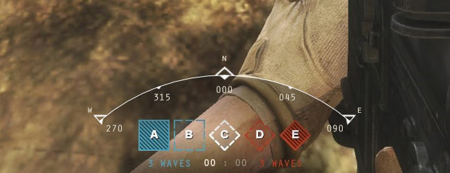
Another concept by Brad, with a low silhouette. However, with the flank positions not pointing in the correct direction to the actual flanks, it can be misleading what direction the player needs to face. It becomes apparent that a compass should be circular, as it is in real life, to maintain that spatial awareness.
Concept Four: 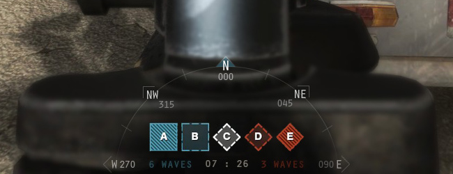
With 180 degrees being displayed, the flanking directions are clearly visible for the player to reference what’s happening around them. It encompasses the other HUD elements nicely, although the bearing numbers are crowding other HUD elements.
The most important part about designing the visuals is to ensure that it is functional and able to be coded within the VGUI framework of the Source Engine. Once the circular design was established, it was time to get it in game to see if it works in practice.
We redesigned the radial menu to incorporate commands suited for squad leader and subordinates utilizing the compass. The layout of the buttons have been adjusted so it does not obstruct the central field of view. Spotting the enemy is a primary purpose, and when a player triggers the ‘Enemy Spotted’ command, their character shouts ‘Contact!’ in the cardinal direction they are facing.
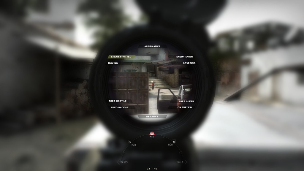 Radial menu redesign concept
Communication during combat needs to be clear and concise. After you’ve spotted and dropped an enemy, there is an ‘Enemy Down’ call out. There are some spicy lines when you get a knife kill, as heard at the end of the trailer.
The other commands are designed to respond to each other. For example, ‘Covering’ can be used responding to a teammate saying ‘Moving,’ or if the squad leader issues an order to move in a direction, the subordinates can respond with ‘Affirmative’ or ‘Moving’ or ‘On the way.’
For every voice command, there is also a suppressed version that enhances the urgency while under fire. This is where Mikee’s brilliant voice work and writing creates a gritty narrative. We also now have the same voice over line heard by everyone, including the enemy.
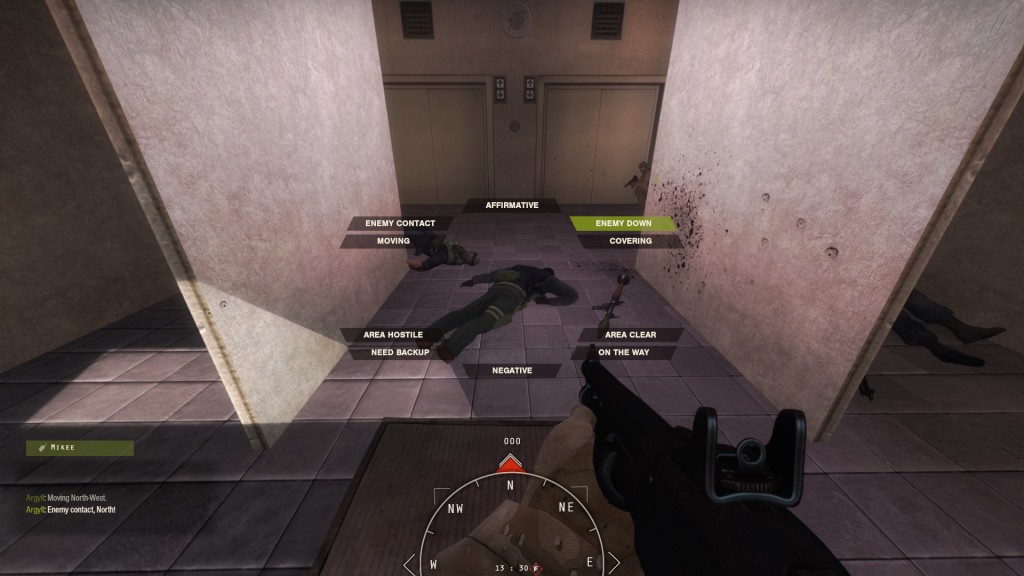 Radial menu final implementation
While concepts can always be revised and debated ad nauseum in theoretical terms, the most important part of the design process is testing it in game and iterating based upon feedback. We chose the circle design, with static numbers, as the starting point and wanted to see how well the compass functioned correlating to the radial and directional call outs.
This is a recording from one of the first development team playtests. Let’s break down the combat narrative, starting at 1:09 when the first enemy shots crack over the patrol’s heads, initiating an ambush in the darkness of Panj.
“Oh god damnit, they’re south-west!” the suppressed player shouts when he spots toward the direction of incoming fire.
“Hostiles, south-west!” another two players also report contact. Another burst, from the west.
“Squad leader is f***ing dead!” is automatically called out by a player who witnessed their leader go down.
“Hostile is down,” is triggered by a player who claims to take out that threat. But another hostile burst from the west takes him out.
“This area is hostile!” I shout to those left alive. It’s a full on ambush, as the gunfire has attracted enemy in the area.
“One of our men is down!” can be heard from the enemy in the bushes to the south-west. “We’ve got a man down,” reports HQ.
My team mates in front of me have died. “S***!” shouts my character, as I’m suppressed by hostile fire. I indiscriminately lay down shots in their direction, and attempt to break contact by pulling back through the trench.
My surviving teammate calls for backup, as I withdraw under the cover of his fire. In order to draw fire from the enemy’s position, I emerge over the parapet of the trench so my teammate can pull back.
“They are here!” he shouts. “Yeah, they’re south-west!” I spot in the direction of incoming machine gun tracer fire.
The sound of a grenade landing at our feet. “Frag!” I shout in the VOIP. We die instantly from the explosion.
From playtesting, a number of issues immediately become apparent. We also received feedback from our beta testers and community members forming an opinion based on videos or images of the design.
Issue: Repetition in direction voice over call outs.
Solution: Utilize non-directional voice over to avoid repetition for call outs in the same direction.
Issue: Too big.
Solution: Program console cvars to fine tune adjustments of scale and position for the compass. Reduce the default size to better encompass the other HUD elements.
Issue: Compass needs to appear in context to the call outs.
Solution: Display the compass on the HUD with the arrow indications for a short period of time to teammates in the immediate vicinity of the player who triggered the call out. Created an option to open compass when aiming down sights.
Issue: Needs to display outside of the radial menu, and displayed at the player’s discretion.
Solution: Create a bind to toggle the compass displaying.
Issue: Hard to reference static dynamically changing numbers for a sense of direction.
Solution: Create a circular rotating compass to emulate real compass behaviour, with more emphasis on cardinal direction and not bearing number.
Issue: Not all bearing numbers necessary.
Solution: Display one bearing number - the direct center of the player’s field of view. This allows for precise bearing call outs over VOIP if needed.
The last two issues influenced a shift in the visual design. John, our programmer working on the compass, implemented a rotating design that immediately felt more intuitive and provided clarity for its purpose than the original static design. Iterative design is about being open to new ideas and working within the constraints of the technology, yet maintaining the integrity of the intent. The rotating compass for the circular shape fulfills the intent more so than the initial misconception that a rotating design was not possible.
The previous implementation for the squad leader issuing orders required precision in marking locations for movement or grenades. The enemy spotted command obstructed the field of view with the radial menu, and depended upon detecting an enemy’s location, which could be viewed as exploitive in competitive gaming. It also would draw a red box over the environment that might obscure where the enemy actually was located. Overall, it was clumsy to use during the fast pace of combat. With a radial menu revamp, we had another look at the squad leader’s menu for issuing orders to the team.
The squad leader’s orders are simplified to simply point everyone in the same direction. Open Fire command is tied into the Enemy Contact command. There is also a Watch Area command (yellow indicator) and Move orders (green indicator), pointing in the cardinal directions.
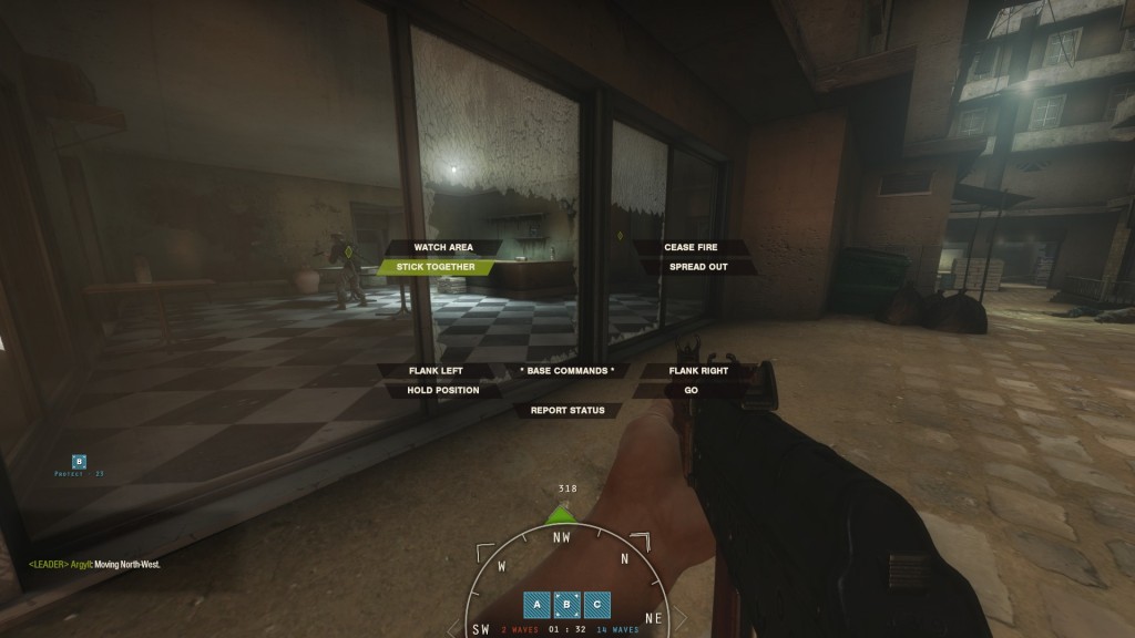 Squad leader radial menu
A secondary radial menu is used to issue orders as the squad leader, in addition to using the regular radial communication menu. We wanted to keep in mind support for ordering AI teammates to follow direction provided through the menu.
The gameplay footage speaks for itself. We knew this was the right direction when going back to playing the current build from the beta, and there was a noticeable difference in gameplay. Using the new radial menu was more fun to converse with players, the squad leader could quickly direct people, teamwork was enhanced, and the compass felt like it was there all along.
Finally, if you think compass elements should be more transparent, smaller scale, or positioned lower, here are the list of console commands to customize the compass appearance:
cl_hud_compass_alpha 255 Opacity of our entire compass
cl_hud_compass_bgalpha 0.85 Opacity of the background as a fraction of the main alpha
cl_hud_compass_scale 1.0 Compass size scale
cl_hud_compass_inset 0 Vertical compass inset
cl_hud_compass_show_always 0 Show the compass at all times
cl_hud_compass_show_ads 0 Show the compass while aiming down sights
cl_hud_compass_show_tacmap 0 Show the compass while viewing the tactical map
cl_hud_compass_appear_enemy 2.0 How long should the compass be visible for after an enemy was spotted
cl_hud_compass_holdtime 0.2 The compass sticks around for this long before starting fade
cl_hud_compass_fadetime 0.45 Length of time before the compass fully fades
Read more about:
Featured BlogsYou May Also Like