Trending
Opinion: How will Project 2025 impact game developers?
The Heritage Foundation's manifesto for the possible next administration could do great harm to many, including large portions of the game development community.
"Goals are anti-chill by nature." Shroomchitect developer Remy Devaux explores the chill-driven design of the bite-sized and chill builder game.

Shroomchitect is a chill game about building little mushroom houses for charming little mushroom people. The game gives its players freedom to let their creativity go wild as they build these homes with their little buddies’ help, but they’ll need to keep these creatures happy and social as they do it.
Game Developer spoke with Remy Devaux of Punkcake Délicieux, creators of this relaxing mushroom house-making experience, to talk about how a focus on creating a chill experience would influence much of its design, the challenges and thoughts that went into crafting the UI, and how feeling bad for little creatures was a far more effective way to motivate the player than goals and Game Overs.
Game Developer: What interested you about making a game about making mushroom houses and caring for little creatures in the forest?
Devaux: So, Shroomchitect is part of a project where Benjamin Soulé and myself (with music from Pentadrangle) make a new game every month. For January, it was my turn to make a game and I wanted to make something super chill. We'd been making really tight action games. I wanted to wind down.
And I wanted to make something out of this old 3D voxel tech I had built for an older project. I knew it would make for a unique-looking game, but I had no idea what the game should be. So, I started thinking about 3D shapes that could be interesting to play with, and that's when I thought of mushrooms! Mushrooms have this very recognizable shape that can still be super variable and feel very organic by nature. I love that.
I wanted a super chill game with voxel mushrooms. My voxel rendering is homemade, and I knew I would be working on it a lot for this project, so I wanted to make the most out of it. That sparked the idea of a creative game.
That's when the idea of the title struck. Shroomchitect. It basically came before the rest of the game. I took some paper and quickly sketched out a Dwarf Fortress-style 3D game with giant mushrooms and tiny mushroom people, while Shroomchitect was still echoing in my mind. Shroomchitect birthed itself at that moment.
What drew you to the visual style of Shroomchitect? How did it help build the mood and feel you wanted to capture for the game?
"Tiny mushroom people" just screams "cute" to me, and since I wanted to make something chill from the beginning, this was the perfect direction.
As I explained, the visual style with the voxel 3D was kind of a starting point, so decisions were made from it rather than to it, especially at the beginning. The rendering worked really well for colorful and shiny things, which is a good formula for making cute things, so I instantly went for red-capped mushrooms with a lush forest setting.
After a few days of development, I found the game lacked rhythm; it was too monotonous. My programming mind and my designing mind collectively decided that a day-night cycle would be both an interesting challenge and a solution to my rhythm problem.
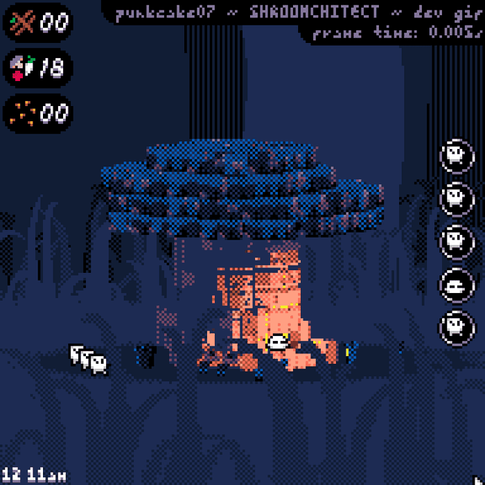
This is what I love about doing both programming and design and visuals for a game. All the different elements feed into each other: a design problem drove me to spend hours on programming a dynamic light system, which showed powerful coziness potential if I could just manage to give some color to that lighting. I did that, and eventually I had this screenshot:

This was about midway through development and it fit perfectly with my earlier vision of a cute settlement of tiny mushroom people!! I was happy.
Likewise, what thoughts went into the sound design for the game? In creating music and sounds that captured a peaceful woodland mood?
The music was made by Pentadrangle! Before I even started programming the project, I told him I wanted lo-fi hip-hop tracks for the game. I wanted to capture that vibe of the studying girl 24/7 lo-fi radios. You know what I'm talking about. I love hip-hop instrumentals and I truly think lo-fi hip hop is THE relaxing music of our age. I was going to make a chill game in a colorful neo-retro style; it was an obvious choice.
Now I literally stumbled on the woodland soundscape while browsing Bandcamp. I found this artist who has hundreds of recordings of different spaces and sells them for super cheap. I had recently made the graphics for the forest background in the game. I guess it was fate?? I grabbed a few recordings, selected some for the daytime and some for the nighttime, and edited them to make them loop seamlessly. It was perfect.
With these two high-quality elements, I just had to make a fancy audio system. I coded it so that it would make very slow fades from one soundscape to another at dawn and dusk, and I made it so that the music wouldn't play constantly but would stop for a few seconds after each track, leaving space for the soundscape which would get slightly louder during the pause. I'm really happy with the result. It's very relaxing, and it was genuinely fun to code!
What thoughts went into the mushroom house-making mechanics? Into giving players building tools that were easy to use, but would offer some depth to building their mushroom houses?
I love making creative games or toys. In my experience, you have to keep it as simple as you can to minimize friction and make something purely enjoyable for the sake of creativity alone. I wasn't exactly making a simple game, though - there was a colony of tiny beings to take care of and I wanted them to be the ones digging and building blocks. All your actions would go through the Shroomies, as I called them.
So, I had this complexity that was inherent to the game's concept, and all my decisions from there were about reducing friction while keeping the management side interesting. I stole quite a few ideas from The Sims game series, because those games are accessible. Same goes for Tamagotchis and also a lovely town-building game called Townscaper. Remember, this game had to be made in a month (it ended up taking more time, but still) so stealing and combining ideas from other games goes a long way in efficiently making something good and interesting.

What drew you to add the little creatures to live in the houses? How did you decide on the commands you could give them and the needs/feelings that players would need to try to satisfy?
When I had the idea for the game with the Shroomchitect title, I immediately imagined something that played like a simplified Dwarf Fortress. There's something extremely charming in creating something through small entities; I wanted to capture that. Caring for the Shroomies was another obvious decision for me - only a monster wouldn't want to care for cute tiny mushroom inhabitants. I like to think I'm no monster, and I make the games I want to play, so I went for it!
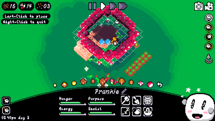
With the desire to reduce friction between the player and the game, I decided to keep things super simple while maintaining a level of interest in both the game's building possibilities and the game's management side. A lot of decisions were taken while designing the interface. There would be only as many building options as there's space in a horizontal line from one side of the screen to the other. Nothing would ever be more than two menus deep. Everything needed to be as accessible as I could efficiently make it.
That's also when I decided on having only four different needs for the Shroomies: hunger, sleep, social, and purpose. I just didn't have the space for more in the interface I was building, and it turned out these were just the ones I needed to keep things interesting. Hunger would drive you to start gardening, sleep makes you feel bad about leaving your Shroomies to sleep out in the open instead of in a comfy bed, social meant you needed to keep your Shroomies interacting which makes the game feel so much more alive, and purpose is simply the need to be doing stuff, so you would want to use all of your Shroomies and not just a few select ones.
The game controls solely with the mouse (except for naming the little creatures). What drew you to keeping the control scheme simple? What challenges came from keeping the control scheme simple?
For making a relaxing game, I have a huge focus on player friction. I want the player to have the easiest time they can have. Unfortunately, this is sometimes defeated by the voxel visual style I used from the start, as occasionally things turn into a mush of pixels that's difficult to parse.
But for the UI, there was no excuse. Mouse controls are super accessible: if you're a person using a computer in 2022, moving a mouse and clicking things is as easy as moving a body part. Keyboards and gamepads are good when you need to take rapid actions, but that's not the case for this game.
The main challenge from there was to make all the important elements of the interface accessible. Two solutions there: only keep the important elements in your interface, cut out the rest, and never bury things in menus more than necessary. In Shroomchitect, nothing is more than two menus deep, and the most common actions are either one menu deep or permanently on the game screen. All of this, and the more precise placement, comes naturally from always asking myself "how can I make this element as accessible as possible without hindering the other elements." Fitting all the interface elements together is like an open-ended puzzle, basically, and you want to find the best, most elegant solution.
The photo mode looks to have been an important part of the game. What interested you in including it? What ideas went into making it work well, in your mind?
It is! It's a feature I implemented very late, but decided on very early. Basically, I think all creative games should have a way for the player to capture and share what they created. As a player of those games, that's what I want, anyway. Plus I knew from the start I would spend a lot of time making the game look good and unique, so the photo mode was an obvious good decision to me.
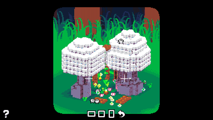
But I didn't implement it before the very end of the project! I was pressed for time, so I had to go for something simple. I looked up other games that have photo modes, like Pokémon Snap and Puperrazzi, and quickly decided on a transparent rectangle with rounded corners. I added short lines to indicate a grid of thirds for those initiated to real-life photography and the rule of thirds. With that, I decided to make the photography rectangle follow the mouse so that the player could place it just how they wanted.

But I think the most interesting thing is the zoom. The game doesn't have an actual zoom; the rendering system doesn't allow it at all. But I wanted a zoom for my photo mode, so I tried something with no idea if it would work. Zooming would simply make the photo rectangle smaller, effectively capturing a smaller zone. Then, after you take the photo, it would scale it up in a way that keeps the pixels nice and crisp. That worked extremely well. It turns out that when you're trying to make a cute photo, you absolutely do not care if it means moving a tiny rectangle in a screen that is otherwise entirely black! All I had to do was to make the controls responsive enough that you wouldn't have time to notice!
You chose not to have any sort of set goal or Game Over state for Shroomchitect. Why did you choose not to include those things in the game?
This is in part because of the time constraint, and in part a question of focus. Originally, I was supposed to make the game within a month, and I knew I wanted to make a chill, creative experience. There was no time to involve anything else. But also, I didn't want anything else, I wanted to focus on the chill and the creativity. I wanted to make the most of it.
Goals are anti-chill by nature; they pressure you forward. Game Overs even more so; they pressure you backwards!
In Shroomchitect, the worst that can happen is your Shroomies are super sad because you're not taking care of them. And that's punishment enough! They won't die because why the hell would I want you to experience grief while I'm trying so hard to give you a good time? Taking care of the Shroomies makes them happy, and with the right visual feedback, that's reward enough, too. Then, the game is about gathering resources, building things, and discovering new mushrooms. You're always moving forward in the game's progression; destroying things is always a deliberate choice from the player.
The only moment you really move backward is when you start a new game. But even then, I took the time to make a system where you could have as many parallel saves as you wished so that you would never lose your progress. Starting a new game is like getting a new canvas, it's inherently rewarding on its own, and this is magnified by the game's different mushrooms which you unlock as you keep on playing.
I tried to make the game as wholesome and positive as I possibly could. Objectives and Game Overs felt like they would go against that, so I threw them out!
You May Also Like