Trending
Opinion: How will Project 2025 impact game developers?
The Heritage Foundation's manifesto for the possible next administration could do great harm to many, including large portions of the game development community.
An eventful month for us; a new team member, laying a project to rest, and a deep dive on our next game!

Hello! As ever, we're reposting from our Patreon - happy to share it here (because sharing is caring) but if you want this glorious insight sooner, you know what to do! It's been a heck of a month once again, and we're striving to keep things moving. Lots to talk about, so let's go...
I’m reduced to teasing the name at this stage (omg what could it stand for?!), work still abounds, and we’re focused on making sure the content is as replayable as possible right now. Bugs are fixed, it’s just ensuring the thing is worth the time you put into it at this point! Go and wishlist (or review!) Tango Fiesta now, ahead of the excitement! More soon! You might be sick of hearing it, but it’s true :D
Happy to announce we’ve got some long term plans for King of Crabs, as Robot Squid are keen for us to continue helping them out on the Steam version! Expect daft streams on twitch, announcements about the upcoming updates, and all kinds of other good stuff! Someone may have bought a Crab costume...
We're also really excited to say we've added one Steven Hatchard to the Milky Crew! He's been working with us on and off for years, on Waterways, Lazarus, Stargrave, A Verdant Hue and a bunch of other bits and bobs as a 3D Generalist Artist, and he's going to take on that role plus Game Design and maybe even some production duties! It's a lot, but we love him and can't wait to level up our games with his help! He lives and works in Liverpool, and helps to nurse wild birds back to health in his spare time. What a star! Andrew S has personally known him since the age of about 7, so this is a particularly wholesome-feeling moment for them. Now we're at 4 core members, and have plans to grow even more, so watch this space!
Well well well.
It’s not often we announce a project!

We’re really stoked to be letting you in on this project - it’s the first result of some serious thinking & serious planning on our part over the past few weeks and months, plus frankly some serious luck in the quality of the interns that CAPA sent us for the Summer. First up, that team!
 Some random artist’s impression of the crew assembled for this prototype project.
On the left you’ve got the regular Milky Four. On the right are the exciting additions! We had Lina, Ashley and Joan with us for 6 amazing weeks over the summer, and we helped them out as they smashed Project Mercenary from a blank sheet of paper (almost literally) into a playable demo! These girls are absolute stars, and we’d be honoured to work with them again. As part of our new, more deliberate movement towards GLOBE SPANNING SUCCESS, we’re trying to build games that ideally we can ship with only one outsourcer brought in to help. We need to be making games in (far) less than two years, and we need to make creative and scope decisions that exploit our strengths and sidestep our weaknesses. After thinking through some creative goals as well as technical/strategic intent (essentially: let’s start building a franchise, game by game), and scoring various game ideas, we settled on the idea of making a tower defence game, but with a uniquely Spilt Milk twist. It’s an evergreen genre, one that can be enjoyed by a wide range of people, and is suited to PC, console, and mobile hardware in terms of controls and technical demands. It’s a genre that we enjoy playing, it’s also a genre that we can bring something to with our characterisation, imagination, sense of humour, and top-notch art.
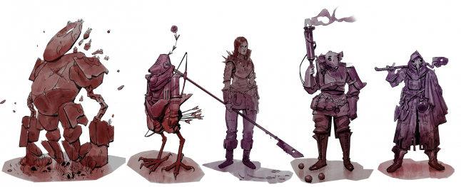
Some of the character designs we came up with during the process, drawn by Jake.
At around the same time, we had CAPA approach us with Lina, Ashley and Joan ready to spend 6 weeks working with us… and the makeup of their skills really lent itself to this nascent game idea we wanted to build.
So the stars had aligned! We kicked off the project with two aims. One was to ship something playable under the Spilt Milk Shake label so that our interns would have a real credit on a real game. The other was to see if the game design was fun, shippable within our desired scope/team size, and brought enough new elements to the tower defence genre that we felt it would excite gamers.
So what Is Project Mercenary? It’s a Tower Defense game where the Towers are Characters. That’s the one-liner. It’s also sort of a Tower Adventure game, in that we have a phase of play that is exploratory, between the waves of enemies. And it’s also a game about managing a Mercenary Company, and all the kinds of cool things that could entail. We decided that we don’t have the skills for detailed or intricate 3D character art, and are well equipped to show off our art style through 2D art… and also have the cops for some good environmental work. That meant we leaned towards a zoomed-out view to minimize the characters’ size onscreen, and set the game in a series of settlements and towns in a fantasy world, to reduce the environmental art scope, while giving us room for personality and flourishes of style. The game sees you commanding squads of troops as they move through a town, garrisoning key buildings to use as defensible locations in an attempt to fend off waves of enemies.
With that context, let’s take a stroll through some of the development of the prototype!
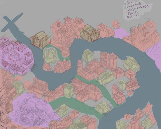 Planning how to ‘zone’ a city view into readable sections so the player knows where to pay attention.
The Intern team all started at once, with us Spilt Milkers wrangling and hopping in where needed, at various times and in various guises. Here we can see some early concept work from Joan that we used to help us figure out how the game might look with various colours denoting areas with different gameplay implications - you can see the key in the top right corner. Concept art of this kind - sketchy but clear - is so useful! It’s incredibly cheap to generate, and so can be (rightly) thrown away. Figuring out what NOT to do is as important/useful as figuring out what you do want to achieve once we’re working in-engine, and we spent a good chunk of time feeling out options and ideas on digital paper. Pre-production is important for the smallest project.
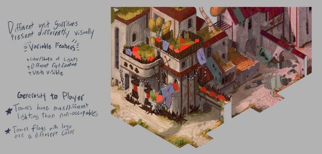 Joan also did some excellent work painting over Jake’s base art.
Trying out ideas for props and gameplay-relevant information like these flags that are hanged from buildings that are occupied by your troops. Where possible we wanted the game world to tell the player everything, but of course, we’re not too proud to fall back on UI and UX elements of a more ‘gamey’ nature when we need to. Also, this phase of developing the world details - the structure of buildings, road details, etc - helped us figure out how to sensibly approach the camera distance. The piece above was zoomed in compared to our assumed distance, so we could really get into some of the finer details.
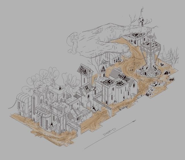 A giant stone hand, the dismembered relic of ages past, defines this ruined city.
We were very keen to give a sense of wonder, and a sense of history, to our game. As mentioned earlier we’re keen for this to be the start of a franchise so we were dedicated to adding detail and hinting at a world beyond the edges of the screen. Building a city to be believable (or authentic, or ‘not-a-game-level’), even when zoomed out, requires a lot of attention to detail, but we went further and used the time to play with the idea of history within this fantasy world. Here you can see a progression from the left edge to the right with buildings going from relatively well kept to completely dilapidated. Part of this is world-building and drives atmosphere, but also from a desire to have the player be certain at a glance about which buildings they could occupy and defend. Our favourite Tower Defence games offer the player a suite of choices of where to position towers as opposed to complete freedom, and there’s a challenge in that when we’re asking the player to explore a settlement and any building might be considered a good spot. Also explored here are the various heights of buildings (crucial when we’re talking ranged tower attacks!) and the types of materials used to build them - not to mention how they were lived in. We love the idea of rooftop gardens, so we took that as far as rooftop farms and then thought about what might happen to them when left untended for months or years.
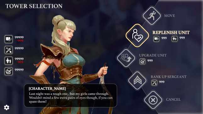
Ashley’s mockup of the Tower Selection screen (excuse the Pinterest-sourced archer image. Seems to be associated with the Pathfinder RPG but I can’t find the author’s details).
The same process was undertaken with the UX, UI, and menus for the game. We wanted to make sure the player is presented with everything clearly and stylishly, and in a way that puts our wonderful character art front and centre. On this screen, the player has selected a ‘Tower’, our Archer unit, and is presented with several options. Also, they’re given information on their resources (left-hand side) and access to options/settings. We want to make sure the game feels rich so the story and characters are really important here, so almost every action in the menu will elicit a response - or be given context - from the character they’re interacting with. Each Tower or Unit will be several soldiers of a given type, commanded by a Sergeant or Captain, with whom you interact and command. This keeps gameplay roles clear while allowing us to build the Mercenary company you’re a part of into a varied and intriguing bunch of real-feeling people. Other options for unit types include Spear units for blocking routes and a more advanced/magical unit type for AoE damage and the like.
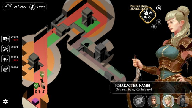 Work-in-progress renders of the in-game UX and UI.
Here we can see a mockup rendered over the ‘white box’ of the gameplay, as seen in Unity. Again you can see how we’re trying to keep the character art really central to the game’s appeal, while still giving plenty of room for that classic TD gameplay - a single screen is a single level, and we’ve played around here with what information about the Waves, and other units, to show the player. We’re designing the game around mouse controls at this stage, and generally, we can have quite a lot of information onscreen if we choose to, but it’s all a balance. Of course, the other key thing here is the fog of war. The player has to explore the game level between waves, uncovering new buildings to occupy, and figuring out what to do and where to go. Here we’ve got a simple solution that simply blacks out any area you’ve not seen, greys out areas you’ve been but haven’t currently got a unit ‘seeing’ the area, and then full colour where you’ve got 'eyes on'. This lends the game a unique flavour and atmosphere which matches the story setup… but we’ll leave it at those hints for now. You can also see a Skill button in the top right, which gives you an idea of the depth we want for players - not just plonking units inside buildings, but managing cooldowns on powerful skills, and timing various buffs, debuffs, and attacks across a level to keep the player leaning forward and tense.
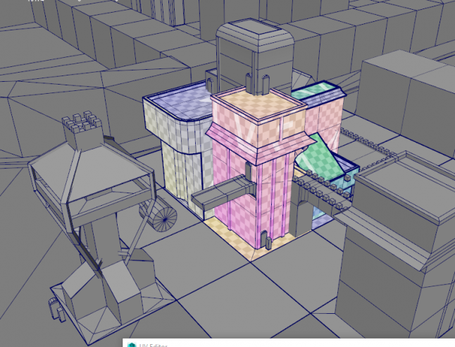 White-boxing is important, where you don’t spend time on textures before locking in your play space. But the time comes where you need to unwrap those UVs!
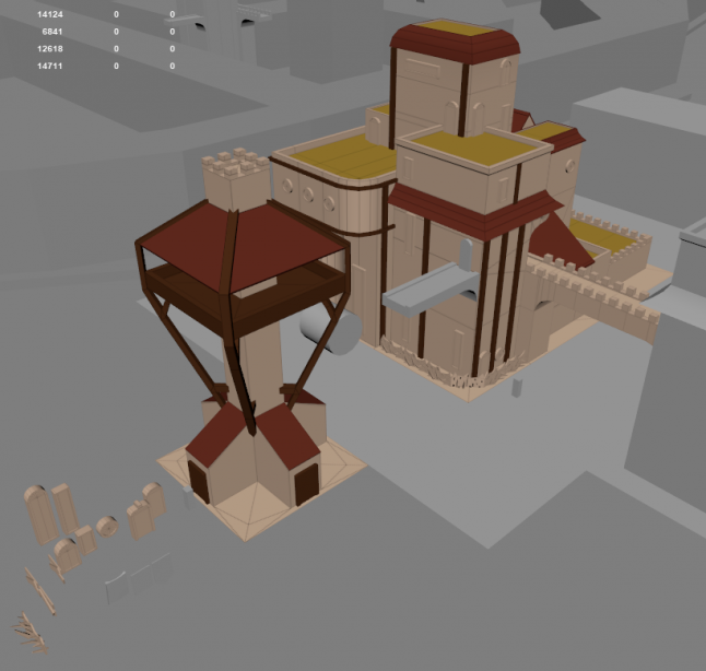 Colour can be applied early on to get an idea of how things come together from a purely artistic point of view but is also really useful in pre-production to call out little elements or families/groups of important information about which objects are what in a scene.
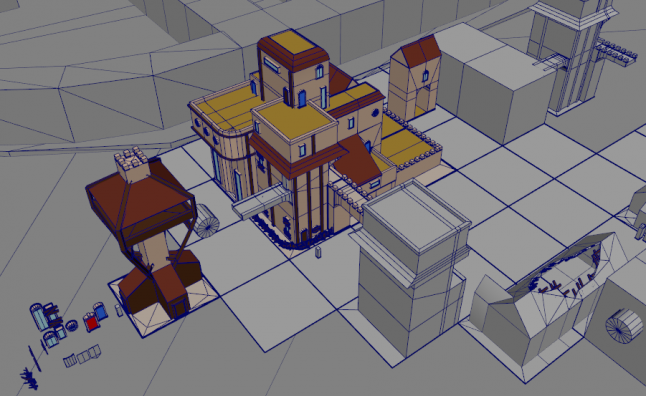 Here you can see the props & scenery mockups grow - sometimes devs will keep a scene that is essentially a movie backlot full of scenery chunks and other useful bits and pieces.
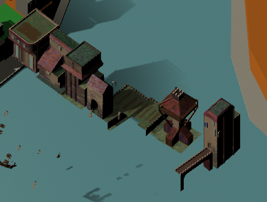
Joan’s first ever attempt at texturing a game in a 3D engine went incredibly well!
So we spent a fair amount of time iterating on the level itself. It was important we keep every ‘level’ as a single screen - not only does it keep the Tower Defence gameplay nice and clean and clear, but it limits the scope of details and features we can introduce. Focus is good for players and devs alike! One of the biggest challenges for this prototype was making sure we didn’t use too much detail in the textures because they take time, and won’t be seen by the players at the zoom level we’d settled on. It’s quite natural to noodle in on details - especially when creating something that is supposed to look ‘real’ (like a building) - but with enough iteration and oversight at this early stage of pre-production, the team can close in on the right workflow to get the desired results. Lighting does a lot at this detail level, so we’ve learned a lot about what should be geometry and what should be textural detail, plus how various shades, colours, and textures can muddy together or stand out more than expected. It’s a really fun process and we can’t wait to take it even further.
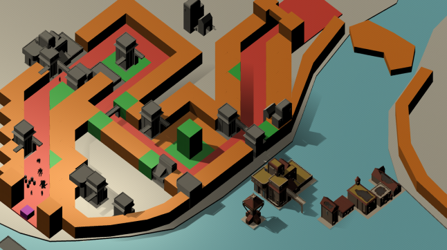 A shot of the whole level ‘white boxed’, with some more complete buildings for reference.
It’s a process of near-constant iteration, and so you can see us playing with buildings both textured and not while figuring out what size to have the units in the game when they’re on the streets. One thing we learned was that despite wanting everything to read as ‘real’ we’d have to slightly exaggerate the unit size to have them clear, but we found a nice balance. In the final game, we aim to have them more than just silhouettes, but for now, they do the job - each looks different, and they stand out nicely against each other and the environment. Notice as well we kept the ‘colour-coded’ chunks into this process, so we could keep it clear what areas served what function in terms of the gameplay.
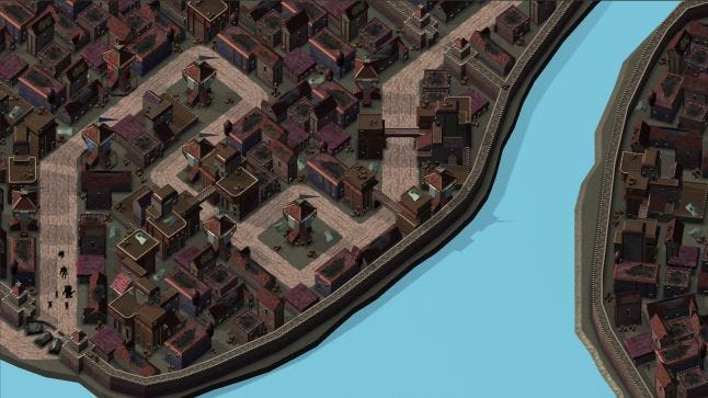 The end result!
So the whole level looks incredible, and we’ve got some work to do tidying things up and fixing bugs before we are ready to launch the prototype… but that’s exactly what we’re committing to do!
Right now, the character designs, general art, and even the mechanics we have in the prototype are not final, but definitely being made ship-shape and being shipped to Itch.io under our Spilt Milk Shake label. Much as with Peck N Run we’re trying not to fall straight into full production out of habit. We’re focused on accurately showing off the intern team’s amazing work, which means filling any gaps or adding anything we need to at the prescription level of quality and matching the style of the existing assets. Fundamentally this whole process went incredibly well - we’ve got a prototype that is engaging, and it proves out a lot of our decisions were smart, a lot of assumptions were accurate, and gives us a ton of answers to the questions we had around the viability of the game. So this prototype is best seen as a standalone project that absolutely delivered, and we could not be more pleased. Of course, a huge part of that is giving us the confidence to move into full production on this game! First up we’re aiming to get some playtest feedback ahead of the Itch launch, then we’re going to starting the project fresh, and with full intent to ship it to Steam (and Switch…?) next year! Starting fresh is a brutal-seeming thing to do but, as with all prototype work, you make decisions for speed rather than stability, and we want to make sure we put our best foot forward. Nothing in the prototype is perfect outside of fulfilling its very specific brief - even typing that seems to take a little away from the achievement which is not at all accurate but hey! The work done thus far, by both us and our interns, has been completely invaluable and an unqualified success. We couldn’t be more proud or more confident in Project Mercenary, and can’t wait to let people play, and then learn more about whatever it is we turn it into!
Stargrave is now officially shelved. What this means is that we’ve exhausted all of the options we considered to be worth pursuing, and are no longer actively pitching it. It’s a real shame, but it’s the right thing to do. If you don’t land a fish, try a different bait!
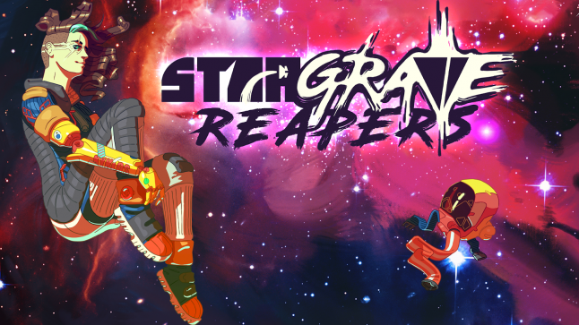
We fully intend to finish up the demo - there’s some work that needs to be done to get it ‘public ready’ - and once that’s done we can get all excited about releasing the pitch demo and materials to Patreon! Yup, it’s likely to be the first playable game that’s exclusive to our backers! There’s currently no idea for the timescale so don’t hold your breath… but it’s part of our mantra; to make sure efforts are recognised, credits are given, and unreleased games are released! A game is nothing without someone to play it!
As ever, thanks so much for reading this huge post! We’re really excited to keep you in on all the goings-on at Spilt Milk, and we can’t wait to see what you think of what we’re getting up to. Please leave a review for Tango Fiesta - you’ve no idea how valuable it is to us. Get your claws on King of Crabs (it’s free!), clobber some players, then leave a review on that too! Go play Super Doom Wall! Can you leave a review? I don’t know, but try anyway! Come and join us on discord, or follow us on twitter, and let us know your thoughts!
Love n pugs,
Andrew, Andrew, Jake & Steve.
We haven’t forgotten! We’re going to keep posting this section until we’ve done something more… Black Lives Matter
People are making a stand against fascism and the far right. We want to share the resources that we’ve found tremendously useful.
Uncomfortable Conversations with a Black Man - Episode 8 is out! A brilliant video series talking honestly and without judgement about the kinds of problems that Black people encounter in society.
Thread of Police Violence & Brutality - Content Warning, but important to share.
Funds:
George Floyd fund: https://www.gofundme.com/f/georgefloyd
Regis Korchinski-Paquet fund: https://t.co/MadTrrXQSv
Black Lives Matter: https://t.co/tOkyx98iAJ
Black Visions Collective: https://secure.everyaction.com/4omQDAR0oUiUagTu0EG-Ig2
Reclaim The Block: https://t.co/cbEoT4iTt8
North Star Health Collective: https://www.northstarhealthcollective.org/donate
Louisville Bail Fund: https://actionnetwork.org/fundraising/louisville-community-bail-fund?source=twitter&
Petitions:
Justice for George Floyd: https://t.co/nXBx6epGfc Justice for Breonna Taylor: https://t.co/7nsPcX5FVX Hands Up Act: https://t.co/YunKJK6MiS
Read more about:
BlogsYou May Also Like