Trending
Opinion: How will Project 2025 impact game developers?
The Heritage Foundation's manifesto for the possible next administration could do great harm to many, including large portions of the game development community.
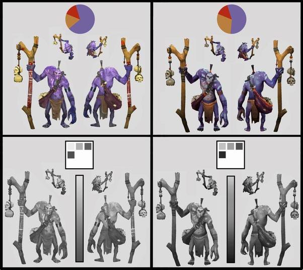
Valve has shared a detailed breakdown of how it designs Dota 2 combatants and its ripe with the sort of information game developers, artists, and designers will find interesting.

Valve has shared an insightful breakdown of the various design concepts its team keeps in mind when creating new heroes and skins for Dota 2.
While the intent of the newly updated document is to prove a useful tool for Dota 2’s community of custom content creators, the breakdown itself is ripe with the sort of information game developers, artists, and designers find useful.
With well over 100 playable characters in Dota 2, it’s no doubt extremely important that each possible combatant has an unmistakable look on the battlefield that quickly and clearly communicates its identity to friend and foe alike. To that end, Valve says that the page itself embodies the kind of general design concepts and principles that improve the readability and quality of Dota 2’s robust cast of characters.
The post runs through a number of guidelines for elements such as informative silhouettes, value gradients, value patterning, color and saturation, color schemes, character color key palettes, areas of visual rest, directionality, and much more. Following that, the breakdown shows character artwork for a handful of heroes in the game and describes how all the principles apply to each design.
The full rundown can be found over in Valve’s Dota 2 Workshop. If docs like this are your kind of thing, be sure to check out the rest of the developer’s workshop resources on a wide variety of topics from loading screens to visual item effects.

You May Also Like