Over the years I’ve had the privilege of creating levels at many great game studios. One thing that surprised me was that each of these studios had a totally different approach to level design, even though the basic content was extremely similar. Some had a logical, almost robotic approach to constructing levels, whereas others just threw as many ideas at the wall as possible, in the hope that something would stick. Whilst each approach had its advantages, it occurred to me that there must be a way of formalising the core elements of good level design in order to create levels that are both logical and innovative. I looked to my classic design background for inspiration, and was reminded of Dieter Rams’ Ten Principles for Good Design. Whilst these principles serve as a fantastic guide for product design, and, with a bit of creative interpretation, high-level game design, applying them directly to level (and mission) design required slightly too much force. Instead, I’ve used them as a loose template, to create ten Ramsian principles for designing compelling videogame levels (with the occasional detour into the realms of systems and narrative design) supported by some examples of great games in which you can observe these principles at work...
Good level design is fun to navigate
In most cases, the player’s core method of interaction with your level will be navigation – the process of actually traversing the level. Careful layout, lighting, signage and other visual cues should create a natural “flow” to the level that guides the player instinctively through it. From an aesthetic aspect, a game’s levels should all work together to create a consistent visual language, through the use of colour and form, that the player can learn, to progress intuitively through the level (Fig. 1).

Mirror's Edge
Figure 1: Mirror’s Edge - in DICE’s seminal 1st person parkour game, the entire art style is geared to guide the player elegantly through the level. Even the screensavers on office computers help to point the player in the right direction.This may seem like a fairly obvious guideline... but here it is important to understand the difference between “intuitive” and “fun”. Whilst basic progress through the level should be effortless, navigational gameplay can also be used to create fun. It is entirely appropriate to hide areas from the player, to add depth and replayability through exploration (as long as you provide the necessary visual or narrative clues), or to create areas where the player feels lost or confused, to create a sense of dramatic tension (Fig. 2). 
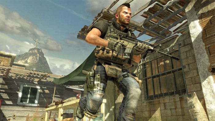
Modern Warfare 2
Figure 2: Modern Warfare 2 – the Favella level in MW2 is a maze of crazy buildings, with enemies coming at you from all sides. Is it easy to find your way out? No. Is it tense and exciting? Absolutely! Modern Warfare’s Favella level is also an excellent example of verticality in level design, which can be an important aspect in making a level fun to navigate.The main caveat while designing fun navigability is that it should not come at the expense of your other gameplay elements. Imagine the intense combat of Modern Warfare 2 in the crazy parkour levels of Mirror’s Edge... the navigational and martial elements of the level would be completely at odds with each other. There’s a good reason why DICE kept the combat in Mirror’s Edge nice and light.And be careful not to fall into the same trap as Khan... always be sure to think in three dimensions when designing your level, and use verticality to keep the space interesting and fun to navigate!Good level design does not rely on words to tell the storyA mentor of mine once told me that a good piece of communication is like a broken circle. The author creates this circle, but leaves a small gap for the readers to fill in themselves. But care has to be taken with this gap! If it is too small, the reader won’t notice it; too big and you risk losing the reader, who won’t be able to connect the circle. So how do we create the circle and the gap in a game level? First it is necessary to understand the three key narrative aspects at work in a level...Explicit – this is anything that is called out by text or speech, e.g: a mission objective or cut-scene
Implicit – this is the story told by the environment through mise en scène (Fig.3).
Emergent – this is the story told by the player as he goes through your level

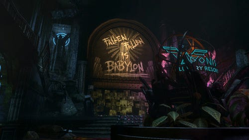
Bioshock
Figure 3: Bioshock – the city of Rapture, and the story of its demise, is brought to life in the player’s imagination through careful use of narrative props (posters, graffiti, corpses, environmental damage, picture walls, etc...)Whilst the level designer should take care in crafting the explicit narrative, as it is this that forms our “circle”, it is the latter two elements that create the all-important “gap” and really make a level stand-out. The use of mise en scène physically integrates the story into the game world and stimulates the player’s imagination with implicit narrative, while emergent story is written by the player through the medium of gameplay choice: which weapons to use, which route to take, which style to solve a problem with, etc... (Fig.4). These elements allow players to fill in the “gap” with their own actions and imagination, which is much more rewarding than having everything handed to you on a plate.
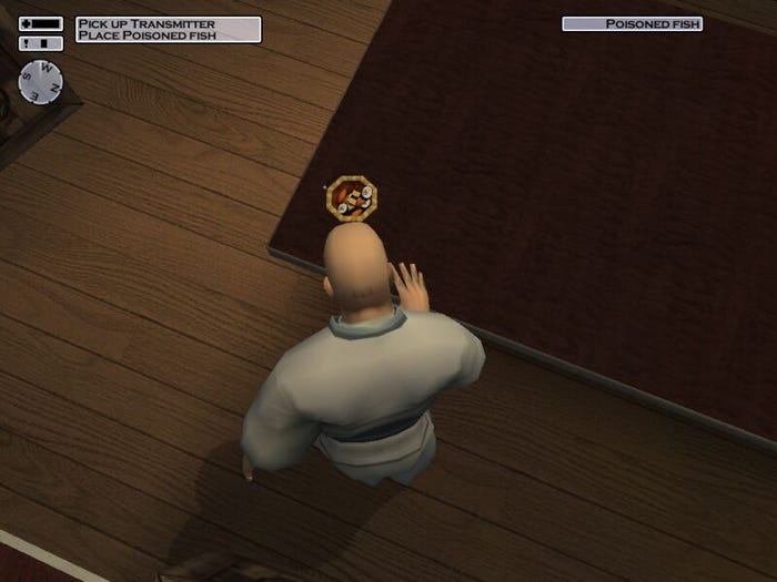
Hitman 2
Figure 4: Hitman 2 – the player decides which story to tell: go in guns blazing and wipe everyone out... or sneak in, poison the fish and get out before anyone even notices you’re there.Good level design tells the player what to do, but not how to do itHaving been given the power to tell his own story though choice of mechanics, the player must never be in any doubt as to what their objective is. This clarity is typically created by simple, explicit, text-based objectives, proper use of waypoint markers, and any other navigational aids you may have; your level’s objectives should be visually distinct, using location, form, lighting and animation to make them clearly stand out from their surroundings.Having said that, as with navigational gameplay, there is some fun to be had with more open-ended objectives. Compelling challenge can be created through obfuscation of the means to completing an objective... as long as the actual objective is clear. This is another example of the “broken circle”. E.g: “Assassinate Vittoria Vici” (Fig.5)... the what of this objective is crystal clear... the how is not.And on the subject of “how”, players should never be forced to use a singular technique to solve an objective; how they complete the challenges laid-out should be up to them, and players should never be punished for improvising a solution to the designer’s meticulously thought-through scenario. This is another requisite for good emergent narrative.
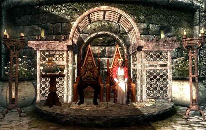
Skyrim
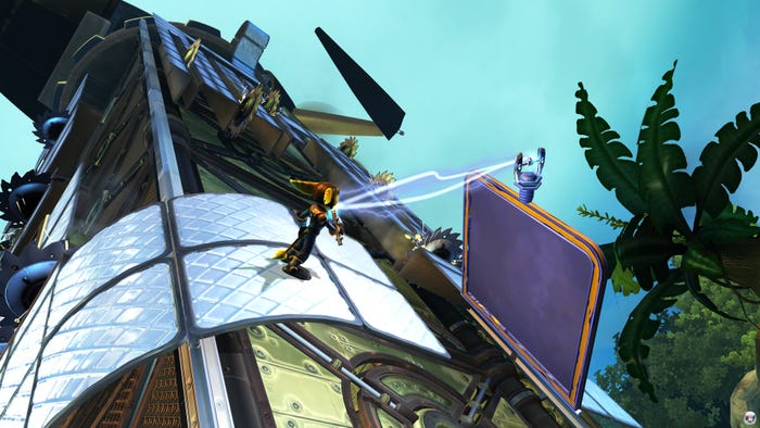
Figure 5: Skyrim – the Dark Brotherhood missions in Skyrim don’t specify how you kill your marks, just that you kill them. They also give additional, bonus objectives (like hiding the body afterwards), empowering players to set their own level of challenge.Veteran game designer Mark Cerny tells us that the player should be presented with a number of concurrent objectives, which can be completed in any order, with the reward for each one providing an advantage for subsequent objectives. This approach gives players power over the order in which they complete their tasks, creating the feeling of control (albeit an illusory one). You can see this approach in his work on the Ratchet & Clank series (Fig. 6).
Ratchet & Clank
Figure 6: Ratchet & Clank – in the original Ratchet & Clank, the player was presented with a number of planets to explore in any order they choose. The completion of each planet resulted in the collection of a gadget (e.g. magnetic boots) that allowed subsequent planets to be played (or re-played) differently, through level design that included unlockable mechanics not necessarily available on the first play-through.Good level design constantly teaches the player something newIn his book “A Theory of Fun”, Raph Koster explains how the human mind enjoys processing information from the world around it into patterns for easier processing later. In gameplay terms this implies that a large part of the fun is generated by the learning, and subsequent mastery, of your various mechanics. Koster cautions that if players understand the pattern and master the mechanics too easily, they'll quickly become bored and stop playing. This risk of boredom can only be avoided with good level design.
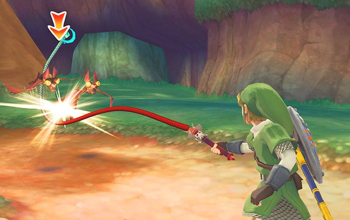
The Legend of Zelda
Figure 7. The Legend of Zelda – every dungeon in every Zelda game is a tutorial for the new piece of equipment you find in it... with the dungeon’s boss being the final test (always with a clever little twist). The game’s final boss battle usually requires the player to use every single piece of his equipment to win.A good level should either introduce a new game mechanic, or put a spin on an old one to make the player re-evaluate his or her established paradigm. On a larger scale, this constant learning should be measured out across the entire game, to make sure that each level delivers fresh gameplay. Bethesda’s Todd Howard outlines the Learn - > Play -> Challenge -> Surprise loop used to pace Skyrim in his DICE 2012 Keynote Address, which is not only a great extension of this principle, but leads nicely into the next one, which is...Good level design is surprisingThere have been many articles on how to use classic Aristotelian techniques to pace your game, and this approach has served books and movies well for aeons. Whilst the standard “roller-coaster” curve of high vs. low intensity, exploration vs. combat, rest vs. action, etc... serves as a good base-line for level design, and is important for maintaining player engagement, its constant repetition can quickly become de rigueur. There are pacing techniques that are more appropriate for an interactive medium, but even with great pacing levels will have trouble being memorable without the sudden spike in intensity that comes from surprise.Surprise does not necessarily have to be a big shock or a plot twist... at its core, surprise could be considered as a rapid surge in uncertainty which, according to game design visionary Alex Mandryka, is the very essence of fun. In terms of level design, surprise could take the form of a unique setting, a moment that teaches the player something new about a mechanic they’ve already been using for a while, turning the corner to see a beautiful vista, or a radical change in pacing (Fig. 8).
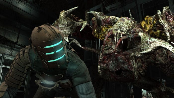
Dead Space 2
Figure 8: Dead Space 2 – when Isaac returns to the Ishimura in Dead Space 2, he doesn’t encounter another necromorph for about fifteen minutes. This change in pace creates extreme tension... Surprisingly, this excellent design came about as a happy coincidence: the monster this level was designed to showcase was too big to fit anywhere in the original Ishimura layout, and so the level designers couldn’t use it until the player reached the central transport core... which was half-way through the level!Level designers should not be afraid to take risks with their design! Don’t just replicate a level from your favourite game... take an existing trope and turn it on its head! It’s only through trying something unusual (Fig. 9) that a truly innovative and surprising experience can be created. The trick is knowing how to manage these risks – design on paper... picture the final product in your mind’s eye... and create a playable prototype (A.K.A. grey-box) as early as you can. Show that your crazy ideas will work as soon as possible... or watch them get cut as your Alpha Milestone catches up with you!
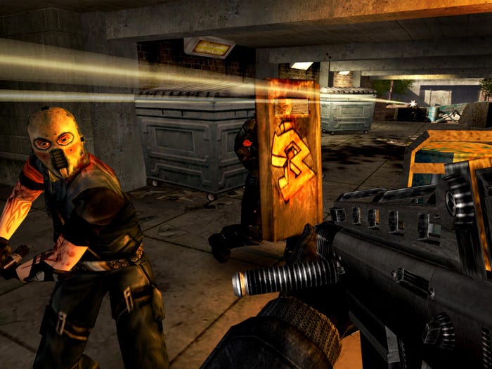
Urban Chaos
Figure 9: Urban Chaos – after you complete the game, and sit through the credits, the game suddenly starts back up, and you find yourself getting some much needed R ‘n’ R at home. Unfortunately, all the gangs you busted in the game know where you live and decide to exact their revenge! The player has to scramble through his home, grab his trusty sidearm from under the sink, and finish off the criminal scum once and for all! This post-credit surprise was beautifully executed... it’s no wonder that the developers, Rocksteady, went on to bigger things.And that's the first 5... be sure to check out the remaining principles in Part 2!


