Trending
Opinion: How will Project 2025 impact game developers?
The Heritage Foundation's manifesto for the possible next administration could do great harm to many, including large portions of the game development community.

Featured Blog | This community-written post highlights the best of what the game industry has to offer. Read more like it on the Game Developer Blogs or learn how to Submit Your Own Blog Post
A Ramsian-style breakdown of how to create world-class levels, which distills the art and science of level design down to a concentrated set of fundamental principles for innovation, engagement, and immersion.

Following on from the principles discussed earlier in Part 1, let's get stuck in to the final five, starting with...
Good level design empowers the player
“Dream no small dreams for they have no power to move the hearts of men.” - Goethe
Videogames are escapism... pure and simple. Why would players want to escape to somewhere more mundane than their existing lives? Level Designers should never ask players to do something that they can easily do in real life – your mission objectives should shun banal and repetitive chores, and always be interesting and exciting! This may sound obvious, but even the best game developers can sometimes lose sight of this basic principle, as comedian Dara O’Brien points out. 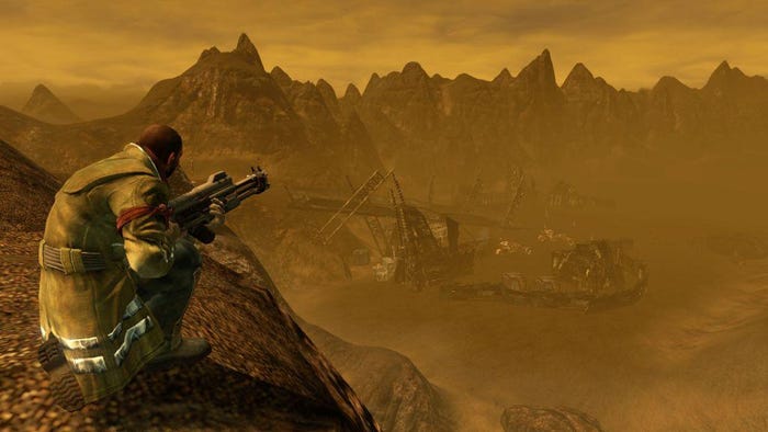
Figure 10: Red Faction Guerrilla – taking out a bridge’s support struts with the concrete-eating nano-rifle is, quite frankly, freakin’ awesome.
For players to experience true empowerment, their actions must have a noticeable effect on the game world. On a low, immediate level this could be the interaction with (or, more usually, the destruction of) objects within the environment, but, if you don't have the immediate gratification of destructible scenery, like Red Faction (Fig. 10), you can script your levels to reflect the player's influence in other ways, like the citizens of Empire City and New Marais in inFAMOUS (Fig. 11).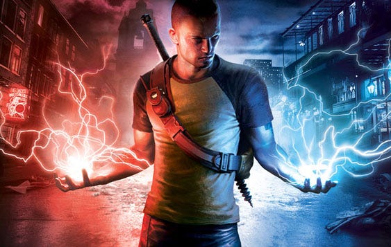
Figure 11: inFamous – the karma system is fully integrated into the open-world level design, with scattered side-missions that force the player to make moral choices (diffuse the bombs and save the citizens, or detonate them to absorb their power), and a populace that will throw rocks at your enemies... or you, depending on your play-style.
For Medal of Honor Heroes 2, we wanted to make the secondary objectives more than just a shopping list of hidden Nazi dossiers, so we created side-missions where the player could rescue allied troops, trapped at certain locations hidden throughout the level. These troops, once freed, would fight alongside the player, which made him/her feel that there was a direct consequence, and reward, for his/her actions.
Good level design allows the player to control the difficulty
The difficulty of games is one of the hardest things to get just right. The standard technique of having Easy, Medium and Hard difficulty settings feels particularly arcane when you consider that players are asked to make this decision before they have even attempted the first level, and thus have no idea of which setting is appropriate for their skill level.
A systematic approach to this is to implement dynamic difficulty, most noticeable in games like Fallout & Skyrim, where the enemies become more powerful (and treasure more valuable) based on the player’s experience – thus adjusting the challenge on the fly, to suit the player’s competence.
However... such systems are not always available, and so a well designed level must allow players to manage difficulty themselves, through clever use of risk and reward. The basic path through your level or mission should be properly paced for a player of moderate ability, with the appropriate peaks and troughs of challenge (along with a splash of surprise), but there should be areas off the main path that present a clear opportunity for the skilled player (or an easier option for those less adept). Whenever the player has to make a path choice, both the risk, and resultant reward should be clearly called out using the level’s language (as mentioned earlier), enabling the player to make an informed decision (Fig. 12).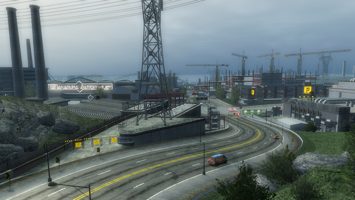
Figure 12: Burnout Paradise – Skilled players can take a risk and aim for short cuts, which are clearly called out by yellow barriers (a recurring motif). Difficulty is indicated by the narrowing of the track, and the reward, which may not be obvious from the in-game camera, is a reduced time and a sweet bit of air.
Whilst the manifestation of this principle may be obvious for a racing game, it is still equally applicable to other genres, like shooters or RPGs, where these high risk/reward areas might take the form of a powerful weapon that is in a tricky to reach (but easy to see) spot, or a flanking route with a guard whose back is turned, allowing players skilled in stealth the opportunity to sneak past. These side-paths can also constitute a puzzle, requiring a little more cerebral skill to access (Fig. 13), and can even be worked into optional, secondary objectives (e.g. Find the U-boat commander and kill him to unlock the enhanced Luger), making them more apparent and extending your replayability.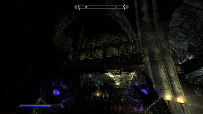
Figure 13: Skyrim – The chest is clearly visible from the main path, but has no obvious access; players have to use a dragon-shout to leap a chasm (an advanced technique) and pick a lock if they want to collect the treasure. All the clues are clearly visible for the keen player who is ready to put in a little extra effort to get some cool swag.
Good level design is efficient
A game only has a finite amount of resources to draw from, ranging from hardware limitations (like system memory) to production realities (such as art capacity). It’s the designer’s responsibility to maximise the use of those resources, and create efficiency through good design. In level design this means not only using the whole animal, from nose to tail, but doing it quickly, and more than once...
Modular design is your friend – a smart designer won’t design a level, he/she will design a series of modular, mechanic-driven encounters, that can be strung together to create a level. And another level. And another level.
By applying simple modifiers to these modules you can create variation, building more levels with less work, and less risk. This technique also creates a series of familiar encounters that the player can use to learn and master your mechanics, while the modifiers applied to these encounters keep them fresh by providing increased challenge and surprise.
Take time out to play with any of Bethesda’s tool-kits for Skyrim or Fallout and you can quickly see how a relatively small team were able to create so much awesome content... it’s all modular. Such a high level of modularity might not work for every game, but it can certainly be applied to any game in varying degrees... For Medal of Honor the Producer tasked us with creating “Battle Moments” – sections of intense combat gameplay, ranging from 30 seconds to 5 minutes, which we could rapidly prototype and iterate on, before stitching them together in different contexts to make a number of exciting levels. This enabled the designers to build a lot more content in a lot less time, and still keep it interesting.
Your trusty art team will spend a considerable amount of time making your levels look amazing, when most of the time the player will plough through their beautiful work in a matter of seconds. Reusing areas of your level not only gets you more bang for your art buck, but alleviates the amount of level geometry you have to keep in memory. This can sometimes be referred to as back-tracking, which has a somewhat derisory connotation, and so, as a designer, one must be careful to make sure such spaces are designed for bi-directional gameplay, preferably with a key modifier on the second pass (Fig. 14). 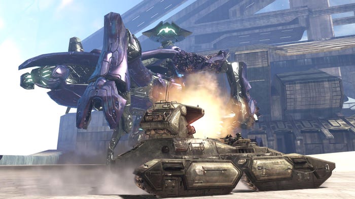
Figure 14: Halo 3, Mission 6: The Ark - In this level, Master Chief fights his way along a large stretch of desert... and then all the way back again! But, as you’d expect from a team like Bungie, they keep it fresh... by giving the Chief a super-powerful tank to make the return journey in, thus using the same space for very different gameplay.
A good designer should use every last bit of the level, by providing implicit objectives that require exploration to complete – the skulls in Halo 3, the COG tags in Gears of War, the feathers in Assassin’s Creed... all designed to extend the gameplay time with no extra hit to level production.
These collectible elements, along with the risk/reward paths and secondary objectives mentioned in the previous principle, will all contribute towards your game’s replayability, generating further efficiencies. But be sure that there is a long-term incentive for completing these gameplay objectives like a significantly different play-experience or a clearly telegraphed reward (new power-ups, weapons, etc...). Better yet, give them context by integrating them into your narrative like Astro Boy Omega Factor(Fig. 15).
Figure 15: Astro Boy Omega Factor – This GBA title is still one of the best examples of replayability ever made. Upon finishing the game on the first play-through, you get a somewhat unsatisfying ending... but you are flung back in time so you can use all the power-ups you have collected to access new areas of old levels, unlocking more levels and power ups, and the true, extremely awesome ending.
Good level design creates emotion
Recently, the U.S. Supreme Court officially classified Videogames as art... which, according to the dictionary, makes them “the quality, production, expression, or realm, according to aesthetic principles, of what is beautiful, appealing, or of more than ordinary significance”.
But this is slightly pragmatic analysis of what constitutes for art. From a purely subjective stand-point, I would posit that art is anything specifically created to provoke an emotional reaction; paintings, sculpture, photography, music, movies... are all created to encourage some kind of emotional response in their recipient. This is particularly true for videogames.
The classical art form that is, perhaps, most analagous to level design is architecture... and architects have been messing with people's emotions for centuries. For example, architects will vary the height of windows depending on the emotional response they are trying to evoke: place them below knee-height, and widows create a sensation of power and voyeurism... place them above shoulder-height, and they create a sense of persecution and encarceration.
Architects have adapted Mazlow's Heirarchy of Needs (which are defintely too abstract for direct application to level design) into a series of very useful architectural concerns that can help deigners create an evocative space. These theories, along with the more traditional use of spatial metrics, can be used to create what I like to call "spatial empathy" witihin your levels, something which this year's Tomb Raider does with aplomb (Fig. 16). 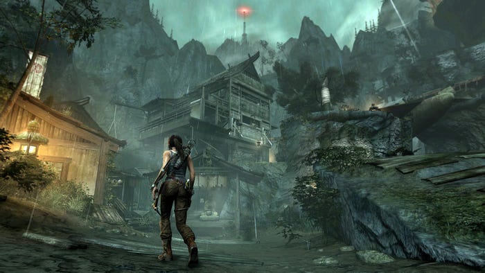
Figure 16: Tomb Raider – In her latest adventure, Lara Croft is taken from narrow, claustrophobic caves, through sprawling, epic jungles, to vertiginous mountain ascents... with each space carefully selected and crafted to elicit a range of varying emotions.
In fact, the player's desired emotional response to your level is so important, that it should always be the starting point of your design. From there, you can drill down and select which spatial metrics, narrative elements and game mechanics can be deployed to best create that response. Want to create a feeling of persecution? Place enemy AI that actively hunts the player. Want to create a feeling of exhilaration? Engage the player in a high-speed chase on the open road. Want to create a feeling of desperation? Give players a time-limit and an almost insurmountable objective (Fig. 17). All of these devices, and more, have been used in games with the express intention of eliciting an emotional response through the game's mechanics.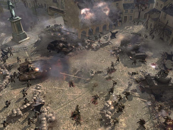
Figure 17: Company of Heroes – Carentan – In the final act of this mission, the player’s squad are forced to fall back to a church. Trapped in a corner, the player has to hold off the Nazis until reinforcements arrive. What dictates when this will happen? A timer? No. The number of Nazi’s remaining? No, there are infinite enemies... it’s the player’s squad’s health. Reinforcements will only appear just as the player is about to die. A little unfair, perhaps... but this gameplay conceit creates a palpable feeling of desperation against overwhelming odds. And extreme relief when finally rescued!
Good level design is driven by your game’s mechanics
“Books let you imagine extraordinary things. Movies let you see extraordinary things. And videogames? Videogames let you do extraordinary things” - unknown
Above all else, great level design is driven by interaction - the game’s mechanics. Game levels don’t just provide context for mechanics, they provide the very reality in which they exist.
I like to describe a game level as the meta-physical medium through which gameplay is delivered. This may sound fancy and contrived, but what it really means is that your level should be a gameplay delivery system, whose primary function is to leverage your mechanics to create a great experience. Topology, architecture, objectives, interactions, combat scenarios, etc... should all be designed first-and-foremost to highlight all your great gameplay systems.
To do this successfully, it’s important to have a thorough understanding of your game’s mechanics before embarking on your level design. This is not always possible when systems and levels are being designed concurrently... but you should at least have an idea of the sort of systems that are being built (as well as a trust that they will be built, so that you don't find yourself wasting time designing around incomplete features that aren't quite ready yet). The up-side in this situation is that the relationship works both ways: if you have a cool idea for your level, you can request the necessary gameplay systems to make it work.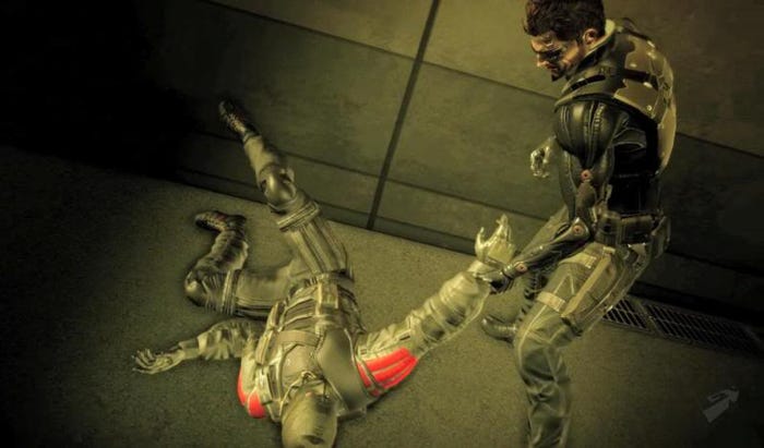
Figure 18: Deus Ex Human Revolution – the side-quests in this game were designed to highlight specific mechanics; in one mission the player has to use his ability to drag unconscious bodies to pull a drugged victim over a cliff and make an assassination look like suicide.
And when I talk about systems, this includes AI... something that can easily be overlooked, creating untold problems. A surprising amount of a level designer’s time is taken up with bending mischievous AI to his or her will! Develop a relationship with your AI team... so you know what clever features they’ve got planned, and they know what issues you are having. Who knows... if you ask them nicely, they may even create special behaviours for that cool sniper ambush you designed. 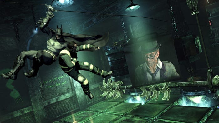
Figure 19: Batman Arkham City – the Riddler challenges spread throughout the open-world, cleverly reuse existing mechanics, encouraging the player to find new ways to use his equipmet. This makes for some great design efficacy , as well as creating cerebral gameplay that fuels the fantasy of being the world's greatest detective, and not just some guy in a cape who's really good at beating people up.
Always remember that interactivity is what makes videogames different from any other form of entertainment: books have stories, movies have visuals, games have interaction. If your level design isn’t showcasing your game mechanics, your players might as well be watching a movie or reading a book.
And that’s ten! I want to be clear that in no way do I consider these principles to be definitive... but hopefully they are a good start to creating a base-line standard of quality and innovation in level design. I expect them to be continually refined and tweaked, much like a game itself.
To conclude, here are the 10 principles, summed up in my poor imitation of Rams’ succinct, simplistic style, for quick and easy reference when building your levels.Good level design...
Is fun to navigate – It uses a clear visual language to guide the player along the primary path, and creates interest through verticality, secondary paths, hidden areas and maze elements.
Does not rely on words to tell a story – Aside from the explicit narrative called out by story and objectives, good level design delivers implicit narrative trough the environment, and provides players with gameplay choice from which to create their own emergent narrative.
Tells the player what to do, but not how to do it – It makes sure mission objectives are clearly communicated, but lets players complete them any way they like, and, where feasible, in any order.
Constantly teaches the player something new – It keeps the player engaged by continuously introducing new mechanics all the way through the game, and prevents old mechanics from becoming stale by applying modifiers or reusing them in unusual ways.
Is surprising – Classic Aristotelian pacing is not always appropriate for an interactive medium, and it is not enough to simply pace all your levels to the standard “rollercoaster” model. Good level design is not afraid to take risks with the pace, aesthetics, locale and other elements to create an experience that is fresh.
Empowers the player – Videogames are escapism and, as such, should eschew the mundane. Furthermore, good level design reinforces players’ empowerment by allowing them to experience the consequences of their actions, in both the immediate, moment-to-moment gameplay, and in the long term, through the holistic design of all levels.
Allows the player to control the difficulty – It gears the main path toward players of basic ability, presenting advanced players with optional challenge through clearly communicated opportunities of risk and reward.
Is efficient – Resources are finite. Good level design creates efficiencies through modularity, bi-directional gameplay and integrated, exploratory bonus objectives that make use of the whole play-space.
Creates emotion – it begins at the end, with the desired emotional response, and works backwards, selecting the appropriate mechanics, spatial metrics and narrative devices to elicit that response.
Is driven by the game’s mechanics – above all, it showcases the game’s mechanics through the medium of the level, to reinforce the uniquely interactive nature of videogames.
References
Ten Principles for Good Design - Dieter Rams
A Theory of Fun - Raph Koster
DICE 2012 Keynote Address - Todd Howard
Beyond Pacing: Games Aren't Hollywood - Jacek Wesolowski
Fun and Uncertainty - Alex Mandryka
Motivation and Personality - A.H. Maslow
The Metrics of Space - Tactical Level Design - Luke McMillan
Read more about:
Featured BlogsYou May Also Like