Trending
Opinion: How will Project 2025 impact game developers?
The Heritage Foundation's manifesto for the possible next administration could do great harm to many, including large portions of the game development community.
"This game is trying to build bridges between the art and the game world."

Please, Touch the Artwork is an experimental puzzler that poses a singular, tantalizing question: What happens when you DO touch the artwork? The answer is squirrelled away in a virtual gallery where abstract paintings demand attention, letting players add color, lines, and more with a flourish in search of a deeper meaning.
Described as an "aesthetic journey to the origins of modern art" by creator Thomas Waterzooi, Please, Touch the Artwork combines procedural generation with three unique sub-games (each containing multiple puzzles) in a bid to deliver a uniquely personal experience to each individual player.
There are no time limits. No pressure cooker scenarios designed to make players sweat. Just a smooth jazz soundtrack and stylish puzzles intent on sparking *something* in players. It's an ambitious vision, and we recently sat down with Waterzooi to chew the fat and learn more about his influences and approach to game design.
Game Developer: What appealed to you about the concept of an artful puzzler?
Thomas Waterzooi: I chose to tackle abstract art because it had always been a difficult topic for me. What should I feel? Could my little brother actually do this? After reading 'What Are You Looking At' by Will Gompertz I got a deeper insight and although my feelings about art are still very fluctuant, I do see why it's so important for the world.
You go on a journey and read about where these artists lived and worked, who their friends were and what drove them to make their art. It was the period after post-impressionism -- the period of cubism, suprematism, the style -- that attracted me the most. The avant-garde abstract artists are considered one of the pioneers of modern art. They reflected the rapidly industrialising society. All artists portrayed their own inner criticism and opinions on that society, thus their art became very personal. It is precisely that aspect -- the emergence of the path of the artist -- that I found so exciting about this period.
This game is trying to build bridges between the art and the game world. It's trying to make the art-world accept games and help gamers to explore art. Research has shown that young adults no longer 'feel at home' in museums. With gaming becoming a more pertinent part of young adult culture it only makes sense to introduce more interactive game-art in modern museums. That's why I'm (next to the mobile & PC/Mac releases ) also working on two art-installations, which will be placed in galleries and museums.

Mechanically speaking, how did Please, Touch the Artwork's puzzles evolve during development?
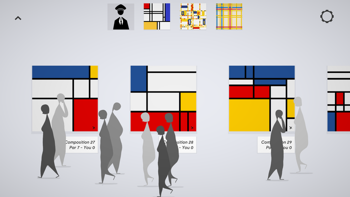
Please, Touch the Artwork consists of three different games. I won't call them mini-games because they could almost be separately released, so I will refer to them as sub-games. Each sub-game is based on a different painting I like.
Design-wise I took what I call a 'visual-first' approach, which works as follows:
Pick a (well known) abstract painting
Generate it procedurally with enough parameters for variation
Add gameplay/mechanic/interactions
Add story
The reason for choosing a well known painting is twofold. On one side it might trigger modern art lovers to explore the games because they love Mondrian. On the other side I believe these paintings have survived the ravages of time because they have a certain 'universal attractiveness' which will hopefully cause gamers that don't know the art to be drawn to it as well.
The idea was to apply this method to three different painters -- Mondrian, Kandinksy and Malevich -- because they were of the same generation avant-garde abstract artists. And three is usually better than one.
While working on Malevich, I fell in love with another Mondrian painting (Broadway Boogie Woogie) so one Mondrian became two. Now that I had two Mondrian paintings I decided it would be better to create a third and make it a Mondrian/De Stijl game.

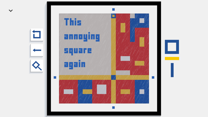
As a third one I wanted to highlight a work from before he started painting abstract. Mondrian started his career painting landscape paintings and I wanted to tackle The Red Tree, a famous landscape painting that already used his later well-known primary color scheme. In the game you would get an assignment e.g. 'Draw an ear.' You could then try to draw a line in the shape of an ear and I would generate a tree, based on that line. It worked really well but there was no real 'game-loop' and the game felt too different from the other two, which were rather puzzle focused.
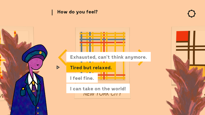
I then came up with a fourth one, based on New York City, which by the look of it is clearly based on the New York City street-patterns. I immediately saw a maze-like structure in it and used an existing algorithm called "Randomised depth-first search" and adapted it to the painting's visual style. I decided not to throw the "The Red Tree"-game away, but rather incorporate it in a real-world art-installation.
You mentioned that Please, Touch The Artwork contains three sub-games based on three unique paintings. How did you lean into those disparate styles to create puzzles that are both mechanically satisfying and emotionally resonant?
The first puzzle was the easiest one. I decided to take my laptop and create a Mondrian-generator based on his famous Compositions in Red, Blue and Yellow, as an exercise. I then thought it would be cool if the player could add colors to the painting by tapping on one of the squares. Then I added the rule that colors could overwrite each other. This is how the mechanic of the first game was born.
At our monthly developer meet-up event called Brotaru it turned out that people really liked the puzzling aspect of it, mainly because I didn't tutorialize and let them figure it out themselves using trial and error. I imagined this is how it would have been for Mondrian (or any other creative for that matter). You try out stuff, see if it works, change some stuff, is it better/worse, and repeat. Maybe it's the 'creative thinking' that resonates with people? I only added the story for this one at the very end (a couple of months ago) because the two other games had a clearly defined story and this game was more 'mechanically' inclined. I decided to use the biblical Genesis story and replace 'God' with 'We' and 'The Earth' with 'The Canvas' to write a semi-anecdotal origin story of abstract art.
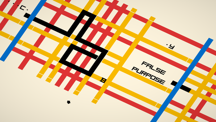
The second one (Boogie Woogie) was much harder. Because of the simplicity of creating the first one I got anxious about creating another, and I wondered if I should apply the same mechanic or a variation of it. This painting was way more complex (visually) and had more small working parts. I tested out color-swapping mechanics first, but found them too confusing, I had to make it simpler. It required a lot of trial and error, but I eventually scaled down the painting and came up with the idea to use the yellow stripes as lanes to guide the player to a target (which just like New York City feels like it was greatly inspired by New York's street pattern). To incorporate the colored blocks on the lanes I came up with the idea to influence the players path depending on what kind of block the color had. For the story part it made sense the blocks were characters in a city and the player was a block that wanted to reach a certain target: his/her/their lover.

The third game idea (New York City) came easier and was going to be way more poetic. I wanted to experiment with randomizing text to create a procedurally generated poem. The player would be picking up the letters of this poem while moving through the maze. I tried setting up lists of nouns, adjectives, verbs and combining them. It worked until a certain point, but I wasn't satisfied with the end result. I knew the poem would have to be about the excitement that moving to a new big city brings, but also about the feeling of being homesick and missing your loved ones at the same time. It's a semi-autobiographical poem about when I moved to Copenhagen to work on Hitman and my partner stayed in Belgium. I ended up just writing out a poem and hardcoding it to the levels.
Each game follows the same structure, it starts with a small version of the painting (which doesn't really look like the painting it's based on) and gradually grows looking more like the original version
The music was very important in this game. It's a zen puzzle-game and music can be very distracting when you need to think so I really tried to keep it to the minimum. I wanted to create the feeling you were in Mondrian's workshop in 1921, listening to jazz-music playing on the radio. There is a main track looping and it gradually builds up throughout the game. I start with a contrabass, then add a little piano and then a saxophone. When you touch the painting there's a random set of drum kit sounds playing.
What was your design mantra throughout development and how did it influence the finished article?
It took a long time for me to really have a mantra. That was part of the problem: what connects all of these games? What's the thread? In one of Rami Ismail's videos he talks about a concentric circles design pattern. At the centre you have your core game idea and the circles around it should point back/support the core. The problem was I didn't really have a core, apart from this notion of 'calm games based on abstract paintings.' However, since I gradually started introducing a story in each game, I came up with 'every painting has its story,' which is written on a post-it hanging on my screen.
How did you add procedural generation to the mix? What do you think it adds to the experience?
I'm a solo developer, so I wanted to save on time where I could. I thought generating things procedurally instead of having to draw each level manually would save me some time. In hindsight, it didn't quite work out that way. It might have helped me at the start to quickly get some visual feedback, but the moment I wanted to customize levels (to make room for text or make a very specific puzzle) or tweak the difficulty curve, I had to start hacking in my process to override unique aspects.
Ultimately, I ended up employing a data-driven approach where I used a scriptable object (Unity) to hold custom-level data combined with some shared generation algorithms in the back. This still wasn't perfect, however, because for some levels I just wasn't satisfied with the layout and had to overwrite the seed (used to initialise the randomizer) to get a proper result.

For the next game I will immediately take on this data-driven approach and utilize more tools to actually edit the levels. Having said that, I am using the procedural features to implement an 'infinite zen-mode' where you will be able to play an infinite amount of puzzles set to a certain difficulty. A bit like a sudoku-a-day.
You've spoken about how accessibility is key to the experience. What steps did you take to ensure Please, Touch the Artwork can be enjoyed by everyone?
I wanted to focus on making a really accessible, relaxing experience that was aesthetically pleasing. My games are not about skill or high-scores. They are about relaxing, playful tinkering, and being moved while enjoying the story and aesthetics (nowadays also often referred to as 'wholesome').
When I say accessible I'm not only talking about barriers that prevent people with a range of impairments from accessing or enjoying the game. At first I wanted to make a game for 'non-gamers.' Of course, this is a paradox, a non-gamer will simply not play your game. While lots of indie-developers leave the mobile market aside I wanted to address it. What's the most available game console in the world? A smart-phone, of course. After three years I started to understand that mobile development is super hard because of the free-to-play culture that reigns supreme, and a thousand games released a week. Still, I decided to go against the grain and committed to a premium release. I might backtrack on that decision later, but at least I tried.
Mobile has many other limitations -- screen size and input surface being some of the main ones -- so I always kept those in mind when designing the puzzles. I took my iPhone 7 (one of the smaller devices) to measure how big my finger was in relation to the screen-height and adjusted my input-regions accordingly.
Since the text had to be big on phones anyway, I decided to go all the way and meet the official standard for vision-impaired people. The default text is high contrast and font size is at least 1/20 (46 pixels on 1080 screen) the height of the screen and in an easy to read font. This enables legally blind visually impaired players to play. On PC the text has the same size, so people will probably have to get away from their screens a bit, but I like the graphical design aspect of it. It fits the artistic nature of the game.
Since most of the gameplay is color based it would also be unethical not to implement colorblind support. I researched the different types of colorblindness and downloaded a tool from the Unity Asset store (CVDFilter) that mimics how colorblind people see your game. Instead of changing the colors of the game I decided to overlay them with patterns. This was a one feature fits all solution.
Please, Touch the Artwork is available on Steam, itch.io, Google Play, and the App Store.
You May Also Like