Trending
Opinion: How will Project 2025 impact game developers?
The Heritage Foundation's manifesto for the possible next administration could do great harm to many, including large portions of the game development community.

Featured Blog | This community-written post highlights the best of what the game industry has to offer. Read more like it on the Game Developer Blogs or learn how to Submit Your Own Blog Post
Lead Artist Åukasz SaÅ‚ata and Chief Game Designer Daniel Gizicki talk about the of My Brother Rabbit and share with fellow developers the process and challenges of creating a game that has no verbal communication.

Lead Artist Åukasz SaÅ‚ata and Chief Game Designer Daniel Gizicki of My Brother Rabbit – an upcoming exploration adventure and puzzle game from Artifex Mundi that mixes reality with the surreal world of a child’s imagination. Both of them have previous experience in creating hidden object puzzle adventure games that until recently was Artifex Mundi’s specialty. After releasing more than 60 games in this genre, the company has decided to branch out and pursue different genres in the triple-I segment.
In this post, we wanted to talk about the development of My Brother Rabbit and share with fellow developers the process and challenges of creating a game that has no verbal communication. We hope that sharing our experiences will provide the community with some valuable insights.
To give you some context, this is what the game’s about: a loving family discovers that their daughter has fallen ill and while her parents set out to get her the treatment she needs, her determined older brother turns to the power of imagination to help them cope. While the outside world offers a harsh reality, these innocent children create a surreal fantasy world that gives them the play and comfort they need. The player embarks on a grand journey to five different lands filled with puzzles featuring incredible robo-moose, floating baobabs, giant mushrooms, and clocks melting to the rhythm of passing time.
When asking this question, one needs to realize that there are many factors and consequences that need to be considered before answering it and that this simple question splits into several different ones.
We wanted to create a game that is accessible to everyone, regardless of their age, the language they speak, or their cultural background. This idea was based on our belief that the world of imagination speaks though images rather than words, and we wanted to create a game that shows this is real. Obviously, not having to pay for writing and voice overs was also saving us money, but this was never our chief consideration.
If this is a classic point-and-click game paying homage to LucasArts and Sierra, then probably, yes, you would at least need the dialogues. But if your game is more focused on exploration and puzzle solving, then not necessarily. Many successful games fared very well without using too much text (or any for that matter) – the prime examples of which are Tiny Bang Story and Amanita Design’s games.
When we approached the design of My Brother Rabbit, we already had a certain vision in mind: to create a game that will use universal language and the sort of intuitive understanding that is rooted in human imagination but especially visible in how children perceive the world. You can actually notice how similar children’s drawings are, regardless of the culture of the place they grew up in the world.
Our vision keeper and Lead Artist Åukasz SaÅ‚ata observed his children in how they interact with the “grown-up” world and how they perceive it through their eyes, creating a kind of imaginary world in the process. That was fascinating, and we wanted to make a game about that. When it comes to budgeting, not having to pay extra for voice actors and VO directing was nice, but in the case of My Brother Rabbit, it was never a chief consideration.
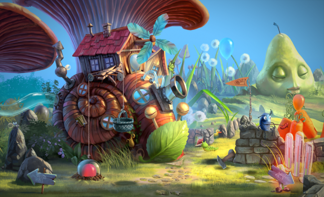
It may sound obvious, but first you need to plan ahead and have it all outlined before you even start with the development.
You need to consider how the game will guide the player and on what you will base the game narration. Will it be art or gameplay? In the case of My Brother Rabbit, the obvious choice was art, as the hand-drawn 2D graphics are the strongest feature of our game. Be prepared for the game designer to shack up with artists, as they will have to spend a lot of time together.
With My Brother Rabbit, the gameplay was influenced by the art to the point where they both needed to be created simultaneously. In this manner, we worked out every element of the game (apart from perhaps the music), like choosing the visual elements for each chapter of the story, or inventing physical objects that can telegraph their functions through their looks alone but at the same time fit in with the surreal game world. Part of it was also figuring out how to convey the bigger, more abstract ideas, e.g. feelings, or the sense of passing time. We’ve done all of this for My Brother Rabbit.
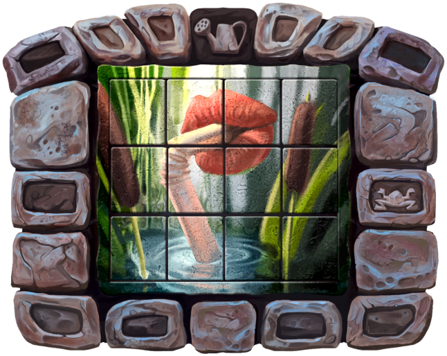 We chose the setting of a lone island in Chapter X to emphasize the feeling of loneliness and abandonment that we wanted to convey.
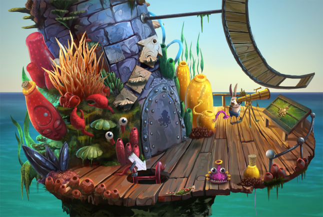
Here you can see how by choosing the object to be round, we created the notion that it can, and should, be rolled in order to solve the puzzle, but still retains its “surreal” look. Pretty much every object in our game was designed to be transparent for the player in this way. We wanted the “form” of every item or object to indicate their “function”.
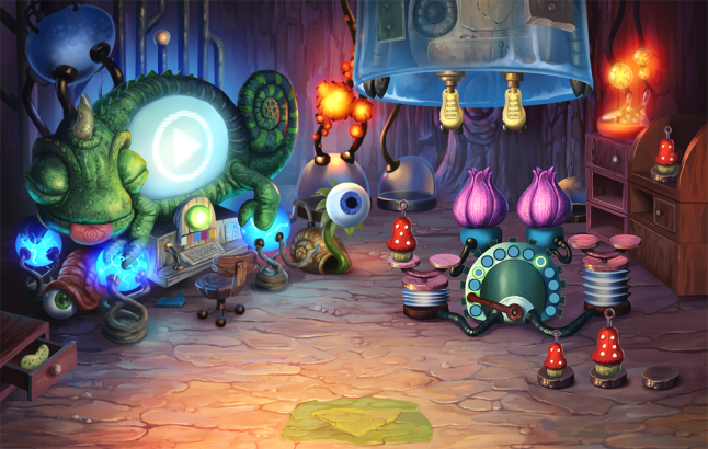
Telegraphing abstract ideas is never easy, but the surreal world setting is actually pretty forgiving in this regard. You can always use something taken straight from Salvador Dalí’s art and build on associations.
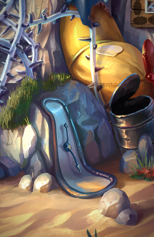
The lack of words doesn’t have to mean total lack of feedback or hints in the game. Iconography is one of the best ways of communication and is easily understood by everyone, even children.
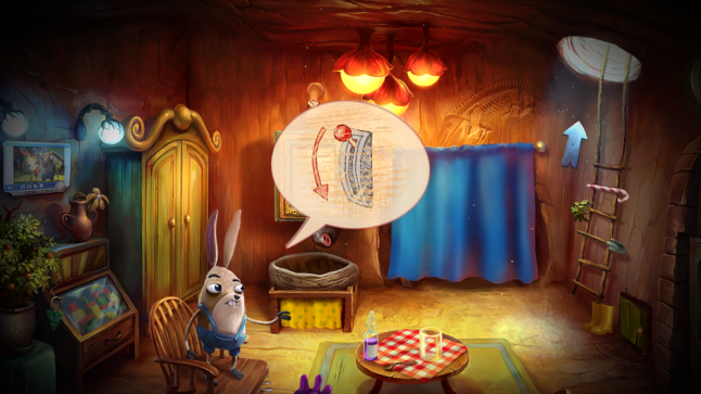
This was by far one of the hardest parts of design. There was no room for confusing the players when it came to basic things like how to navigate the game. Sometimes we had great ideas (at least that’s what we thought) but had to tweak them, a prime example being the initial 3-color HUD system that we later abandoned because it was confusing.
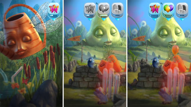
As one of the most important mechanics in the game is based on finding objects, it’s imperative that the player has some kind of clue where to look for them. In the original version, green signified the state “item is here in this location”, red meant “item is not in this location”, and yellow was supposed to mean “item is in this location, but currently not accessible”. The problem was nobody could grasp that without prior explanation.
So, after many tests and trials we decided to switch this model to one where there are only two states: the item is either here, or it is not, and the “inaccessibility” was shown plainly in the actual location by a physical object that barred access to it. That was our eureka moment. Communication via colors is pretty universal, but you have to keep it simple if you can’t provide additional feedback via text.
We thought we were, but in the end, we had to make some concessions. From the very beginning of the development process we were looking for the optimal form, one that will be intuitive, legible, and not too complicated. We experimented with a non-verbal menu and tutorial, but we couldn’t reach the level of clarity in communication that we thought was necessary for this kind of game. So, we decided to include the text in the menu and tutorial.
It’s easy to come up with purely graphical representations of buttons for “Play”, “Leave Game”, or “Options”, but when you try to create concepts for “Begin new game”, “Continue”, there’s a good chance that the players will get lost in a maze of symbols they don’t fully comprehend. It was a choice between an idea and game functionality. It almost felt like a betrayal of the core value of our project, but in the end, we decided that ensuring a smooth entry into the game for the players took precedence.
.png/?width=700&auto=webp&quality=80&disable=upscale)
We never wanted the kind of hints that hold the player’s hand and tell them explicitly what to do. We developed a hint system that only gives the most important pieces of information: where the task was taken and what objects are needed for its completion.
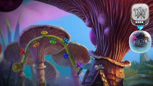
But we also wanted to create this sense that the game is talking to the player, even without using any words, just by giving subtle hints. It could be a character trying to draw the player’s attention to a certain place or item, or it could be a firefly, hovering over a place of interest.
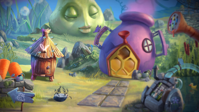
In the absence of VO and virtually any verbal communication, the attention of the player’s ear is turned entirely to the sound effects and music. So, we had to make sure that there would be an equally important layer of sounds complementary to the game world.
The sounds vastly help to navigate the world and even solve puzzles – one of our favorites is a minigame where the player puts together different sounds to create a melody. From the vocal expressions of our protagonists to the variety of sounds in the background, the sound effects help to shape the game world and become a living part of it. If you plan on creating a game without words and VO, the sound effects and music are building blocks that should be of the utmost importance to every developer.
About My Brother Rabbit
My Brother Rabbit is a beautifully drawn exploration adventure and puzzle game set in a surreal world that mixes reality with a child’s imagination made by Artifex Mundi. Its release is planned for September 21st, 2018. More info at My Brother Rabbit website.
Read more about:
Featured BlogsYou May Also Like