Trending
Opinion: How will Project 2025 impact game developers?
The Heritage Foundation's manifesto for the possible next administration could do great harm to many, including large portions of the game development community.

Featured Blog | This community-written post highlights the best of what the game industry has to offer. Read more like it on the Game Developer Blogs or learn how to Submit Your Own Blog Post
The average traditional 2D fighting game has usability problems most modern games try to avoid. To help newcomers learn the genre, fighting game developers need to acknowledge the issues and the attempted solutions and work towards a new genre status quo.

Traditional 2D fighting games have problems, problems that most modern games have made every effort to avoid. To get only a chance to play a game they might be good at, newer players must surmount steep knowledge and execution barriers created from poorly structured tutorials, overly complex inputs, functionally nondescript control schemes, and an illogical lack of conveyance. While these issues impede learning and understanding, the intended audience of fighting games navigates around them through sheer hard work and determination. As such, developers aren't under as much pressure to implement solutions, leaving fighting games esoteric, something to be understood only by a specific audience. Over the years, some developers have partially or wholly solved these issues, but the rest of the genre has failed to implement those solutions consistently. To create fighters that, from day one, truly welcome and help newer players learn and grow in skill up to the higher levels of play, we need to acknowledge the issues and the solutions that have been attempted and work towards a new genre status quo.
Most of the issues with fighters fall under the realm of usability. In their paper “Heuristic Evaluation for Games: Usability Principles for Video Game Design”, David Pinelle, Nelson Wong, and Tadeusz Stach define usability as “the degree to which a player is able to learn, control, and understand a game”. To assess usability within video game design, Pinelle, Wong, and Stach used a technique called heuristic evaluation. In this approach, evaluators test an interface against a set of usability principles. However, most video games don’t have principles for usability, specifically, so the three researchers read 108 PC game reviews from a popular website, noted and categorized reported usability problems, then distilled them into ten principles:
Provide consistent responses to the user’s actions.
Allow users to customize video and audio settings, difficulty, and game speed.
Provide predictable and reasonable behavior for computer-controlled units.
Provide unobstructed views that are appropriate for the user’s current actions,
Allow users to skip non-playable and frequently repeated content.
Provide intuitive and customizable input mappings.
Provide controls that are easy to manage, and that have an appropriate level of sensitivity and responsiveness.
Provide users with information on game status.
Provide instructions, training, and help.
Provide visual representations that are easy to interpret and that minimize the need for micromanagement (Pinelle, et al., 2008).
To illustrate how the esoteric design of fighters plagues the general audience, I will discuss issues with fighting games and tie them back to usability heuristic violations and other modern design principles.
Most modern traditional fighters aren’t easily picked up and played at first by the general audience (TheBigBruce, Lee). A large part of that inaccessibility comes from high expectations and inefficient teaching. Traditional fighting games expect the player to be fluent in too many elements and mechanics to maintain control of the character. In the average fighter, the player needs to know how to, know when to, and be able to move, perform most of their attacks in a sequence, utilize multiple defensive mechanics, and adequately guard/counter their opponent’s options. If players are missing any one of those skills, they increase the risk of getting hit and having control of their character taken away via hitstun. In comparison, shooting games are much simpler and more forgiving, only requiring the player to know how to and be able to move, aim, shoot, and utilize any special abilities (grenades or ultimates, for example). Getting hit, in most cases, doesn't take autonomy away until the player dies. To help players, fighting game developers create a litany of tutorials that cover how to use the controls and mechanics. However, the ways in which fighters present their elements and mechanics are ineffective compared to modern standards. Fighting game developers throw one tutorial after another with little time to instill application. Even if the tutorials are extremely helpful, like in the case of Lab Zero’s Skullgirls with intricate breakdowns and demonstrations of all its systems, mechanics, and characters, the player must sit through, and possibly revisit, a plethora of them to learn the game (see Figure 1).
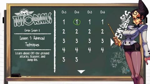
Figure 1. Skullgirls has 7 chapters of 4-10 tutorials covering basic to advanced mechanics and character usage.
In games from other genres, designers lead players through experiences that intuitively incorporate the learning into the gameplay. Often with an on-screen explanation and the penalty of failure lessened or eliminated, mechanics are presented one-by-one with sections of the game dedicated to ensuring players master them before new mechanics are taught. In his paper titled “Learning By Design: Good Video Games as Learning Machines”, researcher James Paul Gee outlines a number of different learning strategies games can employ to help teach players. There, Gee mentions how humans have a hard time taking a load of soon-to-be-pertinent information in and applying it in the situations to come. He recommends games provide information “on demand and just in time” for better assimilation of the subject matter (Gee). Frontloading mechanics via a list of 15+ tutorials is, by comparison, archaic and inefficient at teaching mechanics. Players just can’t take on that much information at one time and reliably apply it later. Even if failure is minimized in these front-loaded tutorials, players would still benefit from more situations where they could be introduced to and test mastery of the mechanics in more bite-sized, engaging ways.
Take Ninja Theory’s 2013 reboot of Devil May Cry, for example. Being a combo-focused action game with a move-list and a training room to practice any of the moves at main character Dante’s disposal, one could argue that Ninja Theory didn’t need to include intuitive in-game tutorial sections, but they did. In DmC: Devil May Cry, when the player learns the base mechanics or acquires a new weapon with a pivotal function like breaking guards, the game pauses with a tooltip denoting the ability when it can be first-used and won’t resume until the player attempts that action (see Figure 2). Additionally, designers placed these sections in encounters with weakened enemies in bare minimum numbers, sometimes just being one enemy. Fighters could stand to do this. Players could fight an opponent that jumps in excessively, with the game pausing to show the proper anti-air timing, for example. This way, players learn what to do when the time arrives and how it applies to the moment-to-moment action, all within an engaging, potentially story-driven, experience.
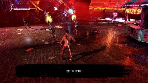
Figure 2. DmC hits the jackpot with regards to teaching players.
Some fighting game developers do include mechanics specifically designed to help ease players into the experience. NetherRealm Studios’ Injustice 2 features a gear system with stats attached to equipment. Stats-wise, it functions like a handicap system, an intentionally lopsided stat increase meant to provide less skilled players the advantage in health and damage. While stat increases help make a more level playing field for players to learn on, they don’t directly help the player learn. In fact, it could be argued that it does the opposite; Increasing stats give players a reason not to learn, as it reinforces the behaviors they were previously doing. Why attempt to find higher damaging combos when you receive gear with better damage stats over time? Why learn to block your opponent when turning up the handicap setting increases your defense? With handicap systems, the player need only maintain that numerical stat advantage, trading in mastery of fundamentals and mechanics for number management.
In other fighters, primarily the flashy, movement-heavy “anime” fighters, “Simple” or “Stylish” control modes drastically lower the player’s need for perfect combo execution and knowledge of combo structure. While these help the player compete in the short term in a match, for the long term, they often don’t help them learn the game, namely the combo structure. “Stylish” control modes bypass player learning since most don’t allow the player to grow while using them. Most iterations of these Stylish systems assume the player doesn’t understand the combo and defense mechanics and compensates for that. For example, Arc System Work’s Blazblue: Central Fiction’s Stylish mode does two things: It maps special attacks to a single button press, which smartly eliminates the need for complex inputs and universalizes key special inputs across all characters, and it also converts the player’s normal attacks into full combos if they keep pressing any attack button. This seems to be a good approach, except this conversion keeps happening even if the player learns their own combo and tries to input it. This means Stylish and “Technical”, the normal/traditional input system, has no middle ground when it comes to normal attacks, the main combo filler. Despite being a system designed to help beginner players, Stylish having no middle ground makes learning difficult. Assistance mechanics and systems should make learning easier and let the player grow with them in every capacity without needing to turn them off to apply basic lessons learned.
Along these lines, a system like Blazblue’s Stylish system, with auto combos off some or all inputs, would be more ideal for player learning if instead of converting from any pressed consecutive button it converted into a combo only if the same input was pressed more than once. That way, if the player realizes that, let’s say, their standing medium attack (M) confirms into their standing heavy attack (H) but doesn’t know the rest, they could input MH then continue to input H for a full combo conversion. The more conversions players learn from intuitive playing, the less they need the system, until they don’t need it at all or can capitalize upon what it has to offer. Arc System Works seems to have caught on to that design philosophy in their game Dragon Ball FighterZ. The popular title employs auto combos off two of its three attack buttons, replete with air versions, super conversions, and the ability to cancel them into one another. Most players abandon auto combos in favor of more optimal combos once they reach the intermediate levels, yet, the system remains intact for players to use.
Of course, alternate, simplified combo systems and control schemes wouldn’t be necessary if the execution barrier for most fighters wasn’t so high. Fighting games have the player pressing a lot of buttons, the most difficult being complex inputs involving multiple directional inputs and then a face button press for special attacks and supers. For example, to perform a standard Fireball, players traditionally must move the analog stick a quarter circle forward and press a punch button. These complex inputs were initially, and ingeniously, made to allow more moves, and subsequently more gameplay options, to be put on characters in the original Street Fighter, which was limited to the 6-button and 1 joystick arcade cabinets (Leone). However, from there, developers made the movements more complex to balance and include more powerful moves, leading to nasty inputs such as pretzels and full circles. Making inputs with high possibilities to fail for balance’s sake essentially blames the player for the developer’s design decision to make a move powerful, violating the usability heuristic of “intuitive input mappings” (Pinelle, et al). Although the timings have become much more lenient over the years, the idea that some players are expected to fail for attempting something good still exists in some moves such as Iron Taeger’s double full circle command grab super in Blazblue: Central Fiction. To help alleviate input complexity for balance’s sake, developers should find other ways to balance powerful or effective moves.
Note, however, that simplified inputs may prove too risky for some games as it will change the pace and style they have built over the years. In those cases, the answer might be to simply remove any input more complicated than a half circle, with double quarter circles being the only exception. I’ve seen most newcomers execute quarter circles easily and implement them into their game plan with little practice. Half circles, while not the easiest input, would then round out the needed inputs for a fighter as the traditional command grab input. Alternatively, in place of half circles for command grabs, quarter circles plus the use of the throw button can be used for a more consistent throw functionality, as seen in AOne Games’ Omen of Sorrow.
Going forward, developers should try to avoid using overly complex inputs. Inputs like full circles, pretzels, and triple complex combinations of halves and quarters are too complicated and heavily violate good usability principles. For the simpler complex inputs, developers could take a page out of NetherRealm Studios’ book and let the player toggle between traditional and simplified complex inputs. In NRS games, simplified, “Alternate Controls”, remove diagonals from complex inputs, turning quarter circle back into down back or a half circle into back forward, for example. With as many complex inputs as there are in the average fighter, an optional alternate control scheme just addressing them can always help.
While the problem of ease of understanding and use can be solved largely through restructured learning sections and more lenient input systems, intuitiveness, or ease of learning through use, of the gameplay systems presents a much larger hurdle. Reviewers seem to like to use the word “intuitive” to describe a fighting game that makes it easy to perform attacks in. However, without training and tutorials, are fighters really intuitive? Multiple sources lauded Namco Bandai’s Tekken 7 for its “intuitive” battle system that mapped one of four buttons to each limb, with IGN outright stating it is easy to mash buttons in (Fahey, Brown, Maki, Huskey). While it may be simple to control the character, basic control isn’t where the intuitiveness of an entire combat system should be judged at. Fighting games revolve around controlling space and chaining hits together into combos to deal large amounts of damage. With that being the optimal and appropriate way to play, intuitiveness should be judged by how natural or obvious it feels to control space and/or perform and defend against combos in general across the cast.
Given that definition of intuitiveness, looking back at Tekken 7 then, we see the button layout doesn’t readily convey how to play optimally, a problem most fighters have. Buttons labeled only as Left/Right Punches and Kicks in a combo-focused fighting game doesn’t help anyone understand the combo structure or even what buttons to use in neutral (see Figure 3). How do punches flow into kicks? Where is my anti-air? How can I hit my opponent when they are that far away from me? With such nondescript button names, this naming convention falls flat in providing those answers. In comparison, most action games name their buttons appropriately, enabling the player to gather how to play the game just from the controls. In the best cases of this, such as Rocksteady’s Batman: Arkham Knight, showing just the control screen can help the player figure out what they would do from a single screenshot of play (see Figure 4). While the genre differences and competitive nature of fighting games keep that a difficult goal, it should at least be a goal to convey as much as possible in the button names. Punch, Kick, Slash, Front/Back Attack on their own are missing some sort of relational detail, like Light/Medium/Heavy or A/B/C which denote a use or flow.
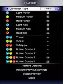

Figure 3. Given those controls, how do you deal with Ken jumping at you?
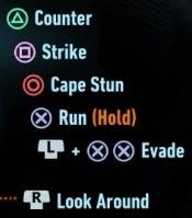
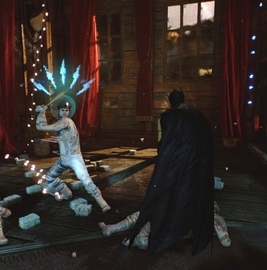
Figure 4. Even just given the face buttons, how do you deal with this situation if the blue icon means an incoming attack?
In addition to the individual inputs for attacks, how the input system of a fighting game demands players connect consecutive inputs to form combos determines a great deal of how easy a fighting game is to understand and learn. For fighters, there are three types of input systems for connecting buttons into combos: Chaining, Target, and Linking. The Chaining input system cancels one type of button into a loosely defined next type, cutting off any recovery frames. For example, Light attacks chaining into Medium Attacks into Heavy Attacks into Special (launch) in Capcom’s Marvel vs Capcom 3. The Target system is essentially chaining, except, rather than defining types of buttons, the Target system defines which specific inputs can chain into one another. For example, in NRS’s Injustice 2, Batman’s Medium Medium Heavy chains, but not Medium Heavy. The third type, and the most non-intuitive, stands as the Linking system seen in Street Fighter. To connect attacks in the Linking system, players must execute one attack then wait for its recovery frames to end and execute another attack that has less start-up frames than the hitstun frames applied from the previous attack. Even just in explanation, that is more complicated than the other two.
Execution-wise, linking attacks amounts to a lot of trial and error to get moves to connect, as the player only has single-digit fractions of a second to input the next move in most cases. This stricter timing requirement makes it less intuitive since the player can input all the right buttons when they see the animations come out but if they don’t have the exact timings, they won’t get the combo. This issue is lessened with the design decision to keep those combos shorter and to keep the games more about managing spacing and gaining advantage in a close-quarters situation via single attacks, a state of play called “footsies”. Considering the difficulty in the linking system, neutral and footsie heavy games with short combos, should be the only places where linking presents itself as the most common input type. Chaining and target combos are much more intuitive as they don’t have the player climb as large of an execution barrier each time they attempt a combo. However, timings still exist in juggles and follow-ups from combo extenders and large hitstun periods for increased, but not necessary, combo efficiency. Chains and target combos also more closely follow rules as to how a combo can be formed and progressed. Once that rule or rules are conveyed, the player can more easily form their own combos around that structure without further training.
After employing their necessary inputs, normals and specials typically provide inconsistent combat functionalities between characters. Anti-airs, neutral tools, and combo extenders aren’t usually on the same buttons across the cast, requiring the player to find them for each character before playing them. These differences create a usability heuristic violation of “providing consistent responses to the user’s actions” (Pinelle, et al). Naturally, developers want their characters to feel different, which explains the spread-out inputs for each character, but that can be achieved while still providing a familiar and consistent feeling of control. For example, some functions can be only partially universal across the cast. In fighters by NetherRealm Studios, such as Mortal Kombat X and Injustice, every characters’ anti-air normal move, super, main combo crux, and, to an extent, forward advancing moves are all on the same inputs across every character. As such, picking up a new character is made easier and the combat system feels more intuitive, while having each character still feel different through unique special moves, use of their normals, and the secondary functions their moves have. Similarly, Ubisoft’s For Honor, while non-traditional, puts all unblockable attacks on a button aptly named Guardbreak. The neutral press of the Guardbreak button is the traditional thrown function, but complex presses such as back + Guardbreak or executing Guardbreak after a specific action for certain characters will yield an attack that is unblockable in some way, making the button 100% consistent in response. Dragon Ball FighterZ’s (DBFZ) choice to include a Light Medium Extender combo chaining structure, universal combo extender button, auto combos, and only quarter circle motions for every special move and super across all characters makes it incredibly easy to pick-up new characters and play at a basic level almost immediately. Additionally, while most, if not all, characters have similar combos, their uniqueness comes from the functionalities and potential contexts of their moves. These very different games presenting varying degrees of universal mechanics shows how every fighter could benefit from the improved learning universal mechanics brings within their own design.
Beyond consistency, combo structures should also work to keep their most integral and commonly used combat functions accessible in as few inputs as possible. I call this being “on the surface”, as you can look on the controller and see that function represented as one or two buttons, needing to look no deeper. Conversely, complex special inputs such as quarter circles and half circles create buried functions within the combat system, effectively being buried under multiple button presses. If a hopeful Street Fighter player doesn’t look at the move list, they wouldn’t ever know that Ryu has a “get off me” or dragon-punch (DP) type move, the Shoryuken. Of course, this assumes the move list tells the player the move’s primary purpose, which it doesn’t, but let’s imagine. While not knowing of this move isn’t particularly difficult to overcome, its non-intuitive to have to look up and memorize moves when they can be more apparent and taught simply from looking at the controls, like all DPs being mapped to a single button press in Arc System Works’ Persona 4 Arena. This non-intuitiveness becomes especially apparent when there is little rhyme or reason as to why some moves are assigned some inputs and similar functions aren’t on the same input for each character. Just like inconsistent combat functions, this violates the usability heuristic of “providing consistent responses to the user’s actions” (Pinelle, et al.). Again, a little universalization of mechanics can help the game feel consistent and familiar. Most fighters put their throw on two button presses, so, if they have the controller layout space and means to balance it, I don’t see why certain character types couldn’t have playstyle-defining functions on the same button(s) to provide consistent responses to a surface action.


Figure 5. Same situation. 2 different inputs for a DP anti-air special.
While tutorials, assistance mechanics, inputs, and combo structure prove to be issues integral to the intuitiveness of fighters, by and large, the biggest problem plaguing every fighter is conveying what moves do, are doing, and are meant for. More than anything, fighters need a status quo for conveyance. Being an aspect every existing fighter can improve on with relatively minimal resources, every developer should aim to improve conveyance. With better conveyance, players can feel confident enough in their understanding of the game to grow unimpeded, which can alleviate most of these issues, or at least the feeling that these issues create of being left to figure out what is going on without help from the game. Additionally, presenting information can also create affordances, qualities of an object or environment that lets the user know an action is possible. As mentioned on the game design series “Extra Credits”, intuitive systems use affordances to make interfaces and actions feel natural, such as wear and tear indicating a wall can be climbed (Portnow & Floyd, Affordances).
A lack of effective affordances and conveyance violates the usability heuristic of “providing users with information on game status to inform their decisions in-game” (Pinelle, et al). For example, the fact that no traditional fighting game I have played in the past 7 years, and I play almost everything, has ever consistently conveyed invincibility has baffled me to no end. The number of times I have had to ask, “Is that invincible?” or “Is that plus?” is far too high. Upon searching, the player can find further tutorials and conveyance information, such as move effects, usage, and frame data, outside the game in community-made content. However, the player should not have to look outside the game they paid for to figure out how to play it at a basic to intermediate level. That is an archaic holdout from the arcade days, a usability heuristic violation of “providing instructions, training, and help”, and something that should have been long gone when fighters reached a solid footing on home consoles (Pinelle, et al.). Now, fighting games have a myriad of places they can improve on with regards to conveyance, but the big three categories are: the move list, helping the player find what they want in the menus via buzzwords and iconography, and gameplay transparency mid-match.
Firstly, move list depth is inconsistent across every game in the genre, with many lists lacking critical information for understanding how a move should be used and what it is useful for. Every move is designed the way it is for a reason. Why not let the player know those reasons by putting them in the game in a concise fashion? Yes, players like to discover depth on their own, but the depth in fighting games comes from how you use a move, not just from finding what it is used for. NRS stands as the best example, with consistent move list functionalities across their games for the past few years. Looking at their example, we can see an information-rich structure every developer would benefit from replicating. Move lists should have an obvious structure to it, preferably with pages the player can switch between that encompass all the moves a character has, including normals, command normals, specials with any possible follow-ups, special character attributes, and super moves. Move lists should let the players inspect the entries for more information. That information should start with a basic and brief description of the move, starting with its primary function, if applicable. For example, “A projectile that moves forward at a medium speed” or “An invincible on start-up rising uppercut”. Blazblue: Central Fiction has a fine example of this, despite inconsistently listing the primary functions or effects for every move. To the side or upon hover or click, frame data should be available. Most aspiring high-level players reference frame data and it helps inform players on move usage, so it should be in the game. Next, the primary function(s) should be listed because every player wants and needs to know what their moves do. Lastly, any special properties should be listed. Having a special property such as Guard Point or Invincibility can make or break a move or even a character. The player shouldn’t need to test every move or hunt down this information via external sources. Simply tell them the properties of the move. Beyond these inclusions, all other properties should be listed if it doesn’t result in clutter.
For examples of excellent move lists, the aforementioned NetherRealm Studios leads the pack for excellent fighting game move lists (see Figure 6). Each move can be highlighted to show all the pertinent frame data, with the additional inclusion of Special Cancel frames, and, in some cases, descriptions of the moves. What’s more, they even let the player stick move inputs to the screen. That way, the player can see them while they play a match to help get them accustomed to the inputs and moves of their character. Besides NRS, in Ubisoft’s For Honor, every character has their move list divided between their moves themselves and character specific attributes/abilities. The character specific side informs the player of actions that are unique to character, often acting as an explanation to the move icons on the move side and to provide a bit of strategy. If those don’t help, the player can watch one of two in-game character specific tutorial videos, covering basic and advanced usage, respectively.
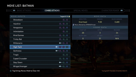
Figure 6. Everything you would ever want to know, number-wise.
Helping the player find what they want could also use improvement. While providing sentences describing move intricacies and explaining functionalities helps players that want to read, most players don’t want to read. As such, developers should utilize buzzwords and symbols on help screens, tutorials, character select, and move lists to convey critical information. At the very least, for moves, there should be symbols to denote Invincibility, Parries/Reflects, Projectiles, Command Movement (via arrow in the actual direction), Dodge properties, and whether a move is a Combo Extender (Stuns/Captures, Knock-Ups, Crumples, etc.). These could even just be capital letters in a box. Developer Sloclap has a truly excellent example of this in their game Absolver, a fighting adventure game where the player makes their own character, assigning pre-made moves and cosmetics. With over 100 different attacks and abilities to choose from, conveying what each one does is incredibly important. To this end, Sloclap used symbols on the move icon, which cleverly displays a silhouette of the attack, to denote important effects to make searching and choosing a move quick and easy. Similarly, and just as helpful, Ubisoft’s For Honor possesses a legend of icons for every effect and places all applicable icons on moves in the move list, making it rather simple to piece together a game plan for some characters, such as the Valkyrie, who’s easily spotted knock down properties on her moves make it clear what the player should be playing around (see Figure 7). For Honor also uses buzzwords such as “Long Range” and “Counter-Attacker” to describe characters on the character select screen, making it easy to find new characters to play that fit one’s preference.
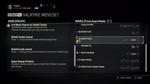
Figure 7. I started playing Valkyrie because the variety of symbols on her move-list indicated she was versatile, my style.
Lastly, improving conveyance of moves and effects occurring mid-match should increase gameplay transparency, aiding players and spectators alike. Developers should showcase effects just before and during active frames, if the knowledge of the effects is something a mid to high level player would already know: Armor, Guard Point, Invincibility, Unblockable or Guard Break, etc. With the win-state of fighting games simply being the depletion of the opponent’s life bar, displaying what gets through the opponent’s guard becomes critical. As such, for attack orientation (Overhead, Low, Standard Grab, Command Grab), show it only after the character gets hit by the move, like Blazblue: Central Fiction. However, if using symbols, be sure to explain what the symbols mean. Alternatively, the game could display partial or full words denoting the orientation near the hit from the guard-breaching attack, similar to training modes in NRS fighters. Along these lines, frame advantage should have better visual representation for both punishable and plus frame moves. It shouldn’t be entirely knowledge-based as that adds to the already high knowledge barrier. Bandai Namco’s Tekken 7 had the excellent inclusion of visually representing frame advantage in its training mode through colored player models. Capcom went on to implement that in Street Fighter 5: Arcade Edition’s training mode as well, with the inclusion of different colors denoting plus/advantage (blue) and minus/disadvantage (red), a UI element showing the overall frame (dis)advantage, and a progress bar counting down the recovery of both characters. This overlay creates an affordance, helping players learn when they can safely go on the attack and alleviating the problem of the non-conveyance of when a player can press buttons.
Take note that these display effects don’t need to and shouldn’t always be on, as that can take away from the competitive nature of the game. However, for offline modes, online player matches, and private matches, having toggleable overlays or effects that help convey this information to players that want or need it could be implemented. The goal of such overlays would be to help the player help themselves. Even if an overlay displays how plus a move is or when to anti-air, it should still be up to the player to perform the corresponding action.
The myriad usability problems of fighting games are a large part of the reason why fighters remain such a niche genre of games. There aren’t too many people that want to play a game that requires what feels like work to reach and maintain the fun. Many fighters have made strides to solve the issues of the difficulty of learning, use, and understanding, but very few developers have been consistent with their solutions or quick to implement new systems that help newer players, with most happening well after launch. If we are to make easier to learn and more intuitive fighters, paying close attention to the solutions that have been attempted and replicating what has been successful is key. Restructure tutorials and assistance mechanics to help the player learn to play through play over time, with them slowly abandoning those mechanics at their own pace without ever being forced to opt-out to play “correctly”. Shift the focus of intuitiveness of gameplay systems from controlling the character to playing optimally and work towards more apparent naming conventions and control structures and easily accessed and consistent combat functions. Make it as simple as possible for players to access the most important combat functions, while working towards some level of consistency across the cast. Above all else, ensure that players have all the information they need to grow conveyed within the game, with a focus on fully detailed move-lists, eye-catching symbols and buzzwords, and enlightening mid-match gameplay conveyance. As modern game designers, from day one, we should have a product that welcomes newer players and helps them learn and grow in skill from beginner to expert. We should have a product that every player can understand, a product that every player can use. At the end of the day, our product should be a game that every player enjoys, not one that they have to kick themselves to use.
Works Cited
AOne Games. Omen of Sorrow. AOne Games, 2018. PlayStation 4.
Arc System Works. Atlus. Persona 4 Arena. Arc System Works, 2012. PlayStation 3.
Arc System Works. Blazblue: Central Fiction. Arc System Works, 2016. PlayStation 4.
Arc System Works. Dragon Ball FighterZ. Bandai Namco Entertainment, 2018. PlayStation 4.
Bandai Namco Studios. Tekken 7. Bandai Namco Entertainment, 2017. PlayStation 4.
Brown, Peter. “Tekken 7 Review.” GameSpot, CBS Interactive Inc., 5 June 2017, www.gamespot.com/reviews/tekken-7-review/1900-6416694/.
Capcom, Dimps. Street Fighter V. Capcom, 2016. PlayStation 4.
Capcom, Dimps. Street Fighter V: Arcade Edition. Capcom, 2018. PlayStation 4.
Capcom, Eighting. Marvel vs Capcom 3: Fate of Two Worlds. Capcom, 2011. PlayStation 3.
Fahey, Mike. “Tekken 7: The Kotaku Review.” Kotaku, Gizmodo Media Group, 6 June 2017, kotaku.com/tekken-7-the-kotaku-review-1795813976.
Gee, James Paul. “Learning by Design: Good Video Games as Learning Machines.” E-Learning and Digital Media, vol. 2, no. 1, 1 Mar. 2005, pp. 1–12., doi:10.2304/elea.2005.2.1.5.
Huskey, Darry. “Tekken 7 Review.” IGN, IGN, 2 June 2017, www.ign.com/articles/2017/06/02/tekken-7-review.
Lab Zero Games. Skullgirls: 2nd Encore. Autumn Games, 2015. PlayStation 4.
Lee, Gerald. Analysis: Why Fighting Games Are Hard. YouTube, Core-A-Gaming, 13 Feb. 2016, www.youtube.com/watch?v=AGrIR_jlLno.
Leone, Matt, and Takashi Nishiyama. “The Man Who Created Street Fighter.” 1UP, IGN Entertainment, 14 Dec. 2011, www.1up.com/features/the-man-who-created-street-fighter.html. Accessed 13 May 2018.
Maki, Jonas. “Tekken 7 - Review.” Gamereactor UK, Gamez Publishing A/S, 31 May 2017, www.gamereactor.eu/reviews/539553/Tekken+7/.
NetherRealm Studios. Injustice 2. Warner Brothers Interactive Entertainment, 2017. PlayStation 4.
NetherRealm Studios. Mortal Kombat X. Warner Brothers Interactive Entertainment, 2015. PlayStation 4.
Ninja Theory. DmC: Devil May Cry: Definitive Edition. Capcom, 2015. PlayStation 4.
Pinelle, David, Nelson Wong, Tadeusz Stach. 5-10 Apr. 2008. “Heuristic Evaluation for Games: Usability Princibples for Video Game Design” “SIGCHI Conference.” SIGCHI Conference on Human Factors in Computing Systems, pp. 1453–1462, dl.acm.org/citation.cfm?id=1357282.
Portnow, James, and Daniel Floyd. Affordances - How Design Teaches Us Without Words - Extra Credits. YouTube, Extra Credits, 29 Jan. 2014, www.youtube.com/watch?v=QCSXEKHL6fc.
Rocksteady Studios. Batman: Arkham Knight. Warner Brothers Interactive Entertainment, 2015. PlayStation 4.
Sloclap. Absolver. Devolver Digital, 2017. PlayStation 4.
TheBigBruce. “Why do you and others have trouble with Fighting Games” Reddit, 25 Jan 2013, www.reddit.com/r/truegaming/comments/17a6ff/why_do_you_and_others_have_trouble_with_fighting/.
Ubisoft Montreal. For Honor. Ubisoft, 2017. PlayStation 4.
Read more about:
Featured BlogsYou May Also Like