Trending
Opinion: How will Project 2025 impact game developers?
The Heritage Foundation's manifesto for the possible next administration could do great harm to many, including large portions of the game development community.

Featured Blog | This community-written post highlights the best of what the game industry has to offer. Read more like it on the Game Developer Blogs or learn how to Submit Your Own Blog Post
We need an unique game, with rules that set it apart from a generic platformer. Now it’s time to take you through the journey that has been designing Toto Temple as an unique game!

*This blog post has been written by Alex, our lead programmer. You can read his original post on our website.
You can follow up with all the posts from the series :
The Making of Toto Temple Deluxe: Platforming (Part 1)
The Making of Toto Temple Deluxe: Platforming (Part 2)
The Making of Toto Temple Deluxe: Collisions for Platforming
The Making of Toto Temple Deluxe: The Unique Experience
Up to now, we discussed on a lot of very small details, but in fact they make up for at least half of the experience as they are the base for a great platformer. But now we need an unique game, with rules that set it apart from a generic platformer! Now it’s time to take you through the journey that has been designing Toto Temple as an unique game up to this point!
The original design was made for the 8th edition TO-Jam, which theme was “uncooperative”. We thought that a game we made way back in our first jam ever “Dan vs Dan” nailed that theme and wanted to see how we could improve the thing. So the game was all about collecting the most coins to be rewarded with traps that you could place and after a while, the level would be filled with traps that have been placed by all the players. Joining the theme “uncooperative” by making the players cooperatively make the arena harder to navigate. When the game was ready for it’s first impression test (at the middle of the jam) we thought the game was boring because there were absolutely no interaction between the players: everyone would get his bunch of coins, then place a trap, the action never occured between two players and that felt dull.
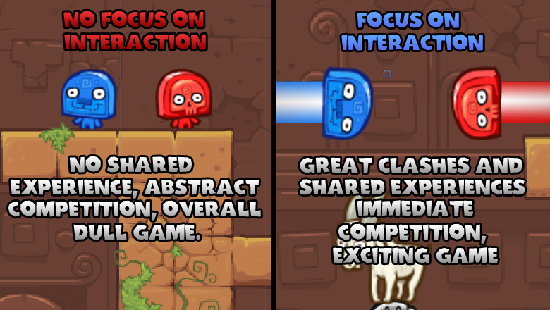
To summarize, in an arena game it is better to focus on interaction between players.
If you wonder how the first toto prototype felt, just imagine Bomberman without one-hit kills and exploding blocks. Everyone would do his little thing in his corner, gathering power, to trap other players with the power they gathered. And in my opinion, having recently played Bomberman, I don’t find the game all that exciting...
We then remembered all the fun we had with the build in progress prototypes for the basic platforming system, just chasing each other and we thought that there was something to do with this chasing system, we then focused on an “oddball” (Halo term) approach: to make points, you must keep an orb in your hands, making you unable to fight back, only try to flee. To scatter the action a little and because we wanted someone not successful at all at the task of catching the goat to be able to do something entertaining too, we included coins. With some coins obviously better than other, we created important prime targets that create instant excitement and obvious reward. This is where the theme became “endless race” for us; there is always a significant target, the switch is fast and the goal is to be the first to reach it. At this point, the endless dash was pretty appropriate as it would further diminish the importance of proximity to a target and let every player be excited to try to reach a point before the others even though he may be farther. Inversely, in slower games, you have time to analyze who is nearest, if you are not, then it is easy to give up the target in favor to another so the opportunity for a micro-competition is lost. We wanted it to be clear where why and how the coins appeared, making an explosion of coins that spreads when the goat is stolen appeared to be a logical choice as it is a reaction to the players action, we must also make the coins untouchable when they first explode, so the people near this explosion don’t gather all those coins without any challenge. They also have enough time to spread far enough, in this case, it needs visual feedback. This is how the idea of the eggs hatched, enclosed in an untouchable egg that has not much visual emphasis, a coin is there, waiting to appear in something that resembles a firework flash!
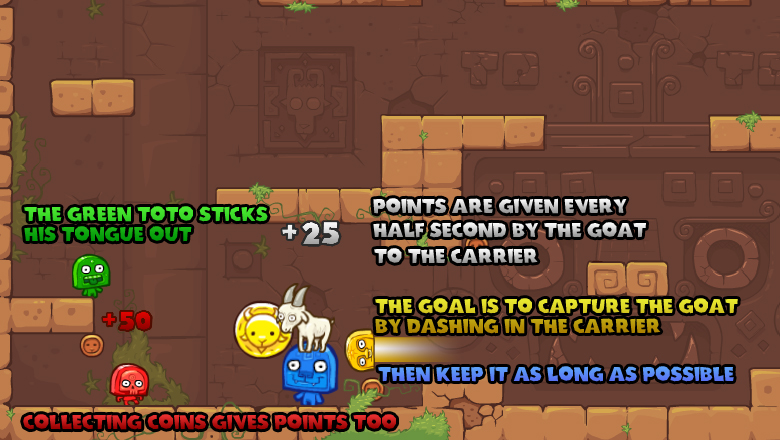
The basics of Toto Temple in a picture.
The score hud is rather minimalist, it is because, aside from making it pleasing, we wanted there to be suspense: with only the best player’s score being “revealed” (in the form of a bar under the rankings of each player) we don’t know how far behind the others are, it often offers surprise overtakes or the sensation that the match is tighter than it really is. This, like many other things, is designed in order to offer excitement and simplicity! (This is a fine looking hud with a nice input upon hte gameplay, but since then we changed the hud because too many people thought the progress bar depicted time and they would not understand that you need a set amount of points in order to win, more details in a future post)
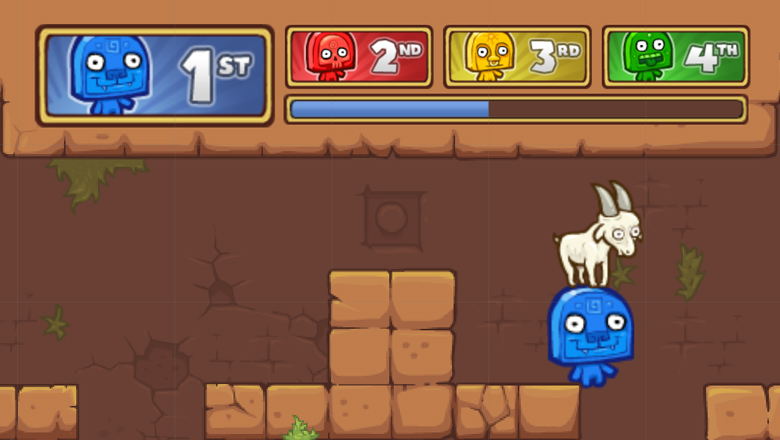
This is how the scores are displayed in the game at its first iteration. It is minimalist and fits in an enclosed space, with no number aside from the rank in it. Leaves much space for imagination in good and bad ways.
In addition to the goal of the game, dashing in a straight line until you hit something is a rather uncommon mechanism. It may look pretty straightforward, but as always, under the hood it is much more complex than this!
In a dash, there is one important phase that we’ll call the preparation. In this phase, we stop the character for a few instants (6 frames or 1/10seconds in Toto Temple), this stop is important to create a feeling that it is the character that dashes and not that it is kind of dragged around by a mysterious force, by creating anticipation, it also serves as a warning to other players so they may have more time to react. On top of aesthetics, there is the controls, within those six frames, we gather infos on where the player wants to go. If the dash was instant, there would be many occurrences of the character going left or right without the consent of the player because the press of the dash button would be done before the decision of the orientation. With this pause, the player can comfortably aim the wanted direction. Some players are pretty fast and hit the direction they want to go to then release the pad before the toto has launched, giving an invalid data of no direction when it is time to launch, so we have something that remembers the last relevant direction that has been pointed.
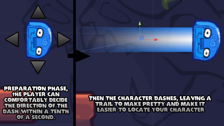
Picture showing the dash mechanism
There again, the controls are crucials and they have been tweaked much. As you can dash multiple times, cancelling the old dash, a dash in the same direction won’t start a new dash. But if you press the dash button keeping the same direction as your dash, then change direction within the next tenth of second, it will begin a dash. Again this tweak serves as a patch to fix the fact that some times a hands are not perfectly synchronized for moves that requires simultaneous input.
Vector2 vec = getDashAxis();//get the direction the player points to
if (pointsGoodDirectionToDash(vec)) {//if the direction is not the same as the dash direction...
    dashControl();//normal dash control (do a dash if the player hits the dash button)
} else {//if the direction is the same as the dash direction...
    if (mp.GetButton(ControllerButton.X)) {//if the player hits the dash button…
        pup.SetUpdate(updateJoystick, "checkIfDashDiffDir");//begin a dash if the player points to another direction in the next few frames
    }
}
Also, we need the character to react differently to physics: no gravity, no normal controls, no friction, the collisions too are changed! In fact, physical collision of a toto are a little more slim when dashing, also we remove all reaction to a collision with a surface parallel to your direction, because it can happen if you hit a corner, it could be interpreted as a ground even if you were going horizontally. With this tweak, the character would just be moved on the edge of the collider, otherwise ignore the collision and just dash on.
There are four ways to end a dash, you begin another dash, you jump, you hit the enemy with the goat (the public version of Toto Temple allowed to dash into any opponent, but it was too confusing, more on a subsequent post!) or you hit a wall. As the later happens often, we had to make decisions over this case: we make a brief stop (1/10 second again) where the character just hangs where he hits the wall, to create a comfort zone where the player can analyze where he wants to go from this point that also serves as a transitions to the moment where the gravity comes back, and gives the impression that the toto has really made an impact and not merely bounces off. Furthermore, the decision of leaving a trail does more than make it pretty, as the visual mass of each toto is really small and much happens at the same time, and when a toto dashes, he is swift, the toto would be hard to follow without it.
This was the special treatment that Toto Temple received, why it is an unique experience and manages to please players with this novelty. In there are some design decisions that belong only to the game that is Toto Temple, but the basics that led to these decisions can apply for several kind of games! From now on we’ll build upon these basic principles and flesh them out to create an accessible, full fledged game and not only an ephemeral crowd pleaser!
Read more about:
Featured BlogsYou May Also Like