Trending
Opinion: How will Project 2025 impact game developers?
The Heritage Foundation's manifesto for the possible next administration could do great harm to many, including large portions of the game development community.
"I like discovering a structure or relationship hidden in plain sight, and the blurring of reality and the surreal."

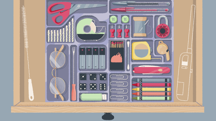
Organize your stationary, stack some paperwork, and reshuffle that bookshelf. That's the core premise of A Little to the Left, a cosy puzzler from indie studio Max Inferno that has players sifting through household items while watching out for a mischievous cat intent on undoing their handiwork.
The laid back sort-em-up looks to be the latest in a growing number of wholesome titles attempting to find catharsis in overlooked aspects of everyday life, following in the footsteps of Unpacking, Coffee Talk, Kind Words, and more.
After playing the brief demo -- the result of a prototype that emerged during a 48-hour game jam -- and finding myself inexplicably contented by the simple act of straightening pencils and rummaging through paperwork, I sought out Max Inferno co-founders Annie Macmillan (illustrator and animator) and Lukas Steinman (programmer and designer) to learn how they created A Little to the Left's wonderfully tactile puzzles.
Game Developer: There seems to be a growing affection for cosy puzzle titles that turn seemingly mundane chores into a sort of digital therapy. Why do you think players are being drawn to the genre?
Annie: I like to learn about other people's seemingly mundane preferences, pet peeves, and small joys, and often this is facilitated through things/objects. It's remarkable how we can relate through our idiosyncrasies. Maybe the genre you're describing is presenting content that appeals both on a universal and personal level, allowing people to feel connected to others, while celebrating their individual experiences.
My own interest in observation is one reason why I am drawn to working with seemingly mundane objects. I like discovering a structure or relationship hidden in plain sight, and the blurring of reality and the surreal. The mundane items become puzzle pieces, and the solutions reflect the preferences and particularities of the individual you are playing as. This logic for structure is what you're attempting to predict, through the objects presented to you in their home. This base level expectation is fun for us to work with and also to defy, in order to surprise and delight the player.
As the creators of the game, we often wonder who our player-character is. There are bits of us in there, for sure, but it's not an autobiography. We intentionally wanted to leave the identity of the protagonist open ended. Players can imagine their own reasons and rationalisations for straightening pencils, peeling off fruit stickers, and stacking paper into descending size. We think there's a niche group out there who'll find solace and meaning in those tasks.
How did you conceive of the core mechanics behind A Little to the Left and iterate on them throughout production?
Annie: The initial prototype for A Little to the Left emerged from a 48 hour game-jam, so the basic mechanic of picking up and moving objects from a top-down or profile view was designed to be extremely focused out of necessity. We think it's great to have constraints like this. The creative process was in imagining the contexts -- What are the objects? How would this person arrange them? As we continued working on the game beyond the game-jam, we considered new ways to engage with certain objects. That's what pushed the technical mechanics along. We go through phases where the technical process informs the creative side, and other times where the creative demands new technical requirements. This seems like a pretty typical workflow, but I think it's important to call out. We really believe that you can do a lot with very little, and that it's important to make a game that fits the scope of your means (time, energy, budget, experience). We should cherish the games crafted under unique life constraints, because that's where we see different points of view emerge.
Lukas: The theme of the game-jam was "Out of Control", and instead of taking that literally to make a set of mechanics that limited player control, we approached it conceptually. Our prompt for ourselves was how do we cope with the feeling of being out of control? We looked at our own behaviours and saw that we would focus our energy on fiddling with things in our space, shuffling furniture and reorganizing our bookshelves. From this realization, we were able to notice that there was a huge source of inspiration right around us.
From a game design perspective, we can approach developing puzzles and interactions by taking a verb or noun and extending from there. This isn't new in game design, as Mario can "run" and "jump", and everything else builds upon those actions. For us, we started our process by defining the verbs that we would undertake when tidying up, such as "tilt", "drag" or "sort", and then we would search for how to apply that to a noun in our house, like a "picture frame on the wall" or "books on a bookshelf". This process can work the other way around too, by picking an object and thinking about how it fits with our defined verbs, which can lead to some surprising interactions. This was our initial entrypoint to discovering the basic mechanics in A Little to the Left.
What goes into building one of the game's pastel-puzzle vignettes? Could you break down that process in detail?
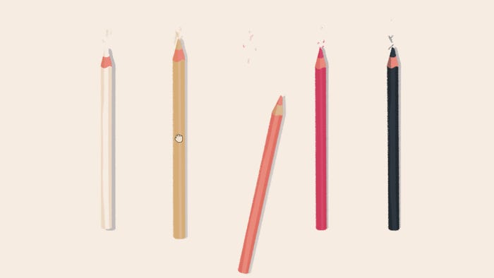
Annie: We both conceptualize the puzzles and keep a list of ideas that we continually sort and rearrange. Often the idea isn't fully fleshed out until I start working on the artwork. We may just know in general that we want a level with candles, and then we need to consider the interactions that candles uniquely offer: they melt, they have a flame that can be blown out, they come in different shapes and sizes and colours, they change the ambient light, they offer a certain mood, etc. We pick and choose which aspects we want to work with, and start thinking about the look. We look at candles in our own home, we look at images of candles online, and we think about what kind of candles this person might have, and how they might use them. I create preliminary sketches and then try to discover based on the decisions we've narrowed in on what the solution could be. Sometimes this feels like a very backward way of working, where I am trying to solve a puzzle that doesn't have an answer yet. It's a push and pull process, where I've limited my pieces, and I'm trying to fit them together within the constraints we've devised. This sometimes lets me see a new relationship if I just change one thing in the design. We try to keep the solutions rooted in the theme, always tying them back to some sort of design principle (scale, alignment, symmetry, colour, shape, etc) which is contextualized as "tidying up", but actually pushes that concept. Like, how do you tidy-up burning candles? The image you see through a telescope? Those stacked boxes that already look perfectly tidy? I like pushing the absurdity of the action of tidying by trying to apply it to things where it doesn't really fit. At one point the player "tidies" some wilted flowers, trying to "un-wilt" them by propping them up. Moments like this are fun for us.
After the sketch is designed, I make the final artwork. We use a consistent colour palette of about 10 colours. I provide all the assets to Lukas to implement and will have to let him speak to that process.
Lukas: This is where the push and pull happens: Annie will start to design the aesthetic and composition of a puzzle using the objects we decided would be interesting to explore, finding ways to apply our defined verbs and principles. She then shares with me rough sketches of potential directions we could take, and as the programmer, it's my job to figure out how to realize those into something playable with clear and actionable player feedback. I'll assess how the puzzle visually communicates its intention and possible direction to the player, and what types of actions it will take to resolve the puzzle into a solution. There may be actions that could compliment each other and present us with an opportunity to further explore, or actions that complicate and complexify into making a single object need to do too many things. We usually try to limit each object to a single action; this allows our puzzles to communicate more clearly, but also makes the programming easier. If I find that any of the interactions or solution requirements conflict in implementation, or it pushes too far from our defined set of core mechanics and requires all new logic, we'll discuss how to simplify the puzzle or push it in an entirely different direction. We want to make sure that every puzzle delivers on its promise, and that it's easy to understand what to do but still interesting to discover how it unfolds.

A Little to the Left started life as a short demo before it was turned into a full game. Could you talk through some of the design challenges that came with turning the concept into a more robust experience?
Annie: The demo/prototype was never intended to be long, it was just a small thing. We love short games that are focused in scope. We don't have a lot of time to spend on very long games, and we like experiencing variety in content rather than spending many hours of dedicated game play. But in order to market A Little to the Left we figured it needed to be longer. We have a million level ideas, so this isn't the problem. We talked about the idea of adding a structured narrative to drive the playing experience, but decided to leave that point-of-view and their reasoning for structure open to the player's interpretation.
Instead of a linear narrative, we focused more on creating variety in puzzles and the interactions with the cat. We organized the game into themed chapters which look at different areas in the house. The last chapter starts to play with some of the expectations established, and then we designed an ending that's delightful and surprising. I really can't wait to share it!
Development has gotten exponentially more time consuming from the initial prototype; this is a very common issue a lot of game developers run into. We have growing expectations for ourselves, and the scope doesn't seem as strictly limited so we continue to dream bigger and add in more detail. It was tough to learn to say "no"... Or at least "not right now" ... and find that balance between adding value to the game, making something we are happy with, and getting it into the hands of the players.
Lukas: One thing that was surprising was that while the demo/prototype came together mostly over 48 hours, with another month beyond to polish up into a sharable vertical slice, we had a bit of a distorted view of how long it would take to realize these puzzles. Initially, we thought, "oh, we conceptualized and implemented 10 puzzles in a weekend, this game will be done in no time!", but there's so much work that goes into making a really solid, stable game framework with proper systems and player feedback, controller support, seamless music, save games, accessibility, localization and settings, the list grew exponentially.
And of course as we continued to iterate on our initial puzzle concepts into deeper, more interesting and refined puzzles, we started to unlock further potential from the initial concept. We found it unraveled into something so much more intriguing to work on, and we just want to explore it to its full potential. Our best ideas have come late in the development process which makes it hard to pull in the reins on, because as Annie said, we can't let the scope increase beyond sustainability.
We've iterated on those simple puzzles from the demo numerous times, honing feedback and refining the puzzle mechanics, learning as we go what draws players to A Little to the Left and chose to focus on those aspects as our guiding principles. The response from the demo has been absolutely amazing, and we continue to push the game as far as we can reasonably take it without getting bogged down into an ever shifting set of expectations.
There are a huge variety of objects in A Little to the Left, from books and jars to postcards and pencils. What art, animation, and audio techniques did you use to make them feel so wonderfully tactile?
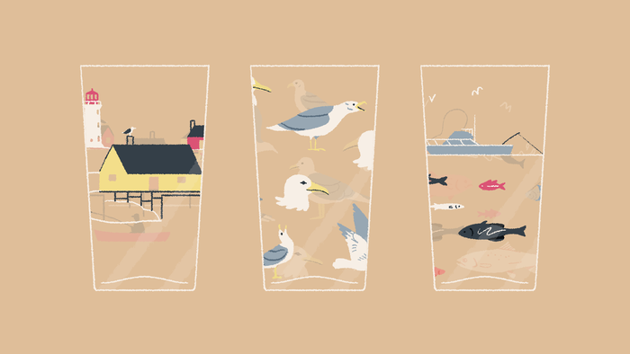
Annie: Maybe one factor in the artwork seeming tactile is that it rarely ventures stylistically very far away from reality. The forms are pretty close to what I find on my desk, in the basement or kitchen counter.
I sometimes worry this is a bit boring or unimaginative but then realize it reinforces the concept of the game, which is working with subtle, hidden structures. Things need to look realistic, so that it feels magical when you realize they're design works out perfectly to solve the puzzle.
It wouldn't make sense to draw too much attention to or to infuse a fork or bolt or matchbox with a very unique stylized look. For this reason a lot of the artwork is based on objects in our home (a clock on the mantle, a lamp, our plants, etc) or objects I could imagine in this person's home.
We wanted the audio design to also follow this logic, and so gravitated towards sounds that are rooted in daily life. Sliding paper, the ticks of a rotating dial, glass, metal, and wood, etc coming in contact with each other. The exceptions to this are more musically produced sounds to highlight achievements or transitions, which I think complement the more diegetic sounds.
The game uses a range of animation techniques, from 3D, 2D, puppet rigging and traditional frame-by-frame animation. I tend to mock up how things will move in After Effects, and if it is an element that needs to be dynamic, Lukas uses those references to animate the assets in Unity. We have these unique animations for the chapter titles that are a blend of 2d and 3d. I wanted them to feel special, but also within the same realm of our game's style.
Lukas: The sound effects play a huge role in the tactility of the objects in the game. A Little to the Left's art style is somewhat flat, and so there's very little in the way of environment or depth, but the space is implied. The realistic sound design, which is often compared to ASMR, is a way to describe the space and material that the objects are in. This brings the fantastic style into the real world, and makes it feel like you're actually there.
We have also concentrated on having immediate feedback provided for every object interaction or placement. Clicking on an object will cause it to grow, lift, and tilt, to let you know that it is free to move, and the other objects will react according to the perceived space or material being presented.
There was a unique design problem that came out of our flat art-style and the lack of onscreen UI or described environment, as the backgrounds are generally a solid swatch of colour. In our prototype, the biggest complaint from players was that they didn't know where the objects were supposed to be placed, and it led to some trial and error, which was not particularly fun. We solved this problem early on in our development through the exploration of many different interaction feedback designs, and have developed a library of devices that we can pull from depending on the puzzle requirements to help the player through.
Our most utilized feedback device is a handy "snapping" mechanic that guides objects into valid placement locations. This mechanic does a lot of heavy lifting that a typical puzzle game interface (grid, HUD, counters, etc) would do, as it not only indicates where pieces can be placed, it also allows us to get those objects nice and tidy with pixel perfect positioning and relationships. The snap movement also alludes to the weight and material of the object, adding further to its tactility, and indicates the friction of the implied surface the object is on.
As they sort, stack, and shuffle objects, players will need to contend with a rambunctious cat intent on undoing their hard work. Can you break down why you brought that mechanic into play, and how you designed the furry chaos merchant?
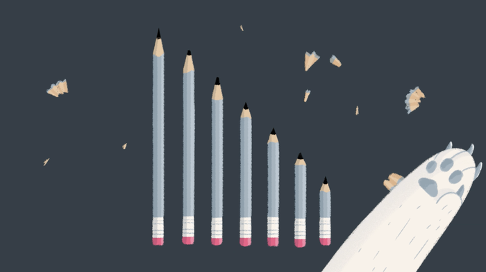
Annie: We thought it would be fun! The cat is irreverent about your careful placements, and this offers some slap-stick comedic relief. Our cat, Rookie, helped inform this cat character. In fact, Rookie "inspires" us every morning when he tries various tactics to wake us up for his breakfast.
The cat punctuates your gameplay, sometimes as a surprise, other times as a playful opponent. The cat offers contrast in the game; they are neither a villain nor a hero, just a different set of intentions colliding with the main gameplay.
Cats can get anywhere and into everything, and we wanted there to be some external factors to contend with. The cat is unpredictable and becomes the perfect antithesis to the act of tidying. Without a traditional narrative, we wanted some sort of subtle conflict.
Even though our focus is on making gameplay that feels satisfying, calming and not stressful, the cat was a reminder to ourselves to lighten up, to realize all of these rules are our own subjective inventions, and that there are other motivations to consider.
A Little to the Left will release for PC, Mac, and Nintendo Switch in August 2022.
You May Also Like