Trending
Opinion: How will Project 2025 impact game developers?
The Heritage Foundation's manifesto for the possible next administration could do great harm to many, including large portions of the game development community.

Featured Blog | This community-written post highlights the best of what the game industry has to offer. Read more like it on the Game Developer Blogs or learn how to Submit Your Own Blog Post
"Bloodborne is user unfriendly", "Bloodborne proves your job isn't needed", "People like you are why games aren't hard like they used to be". As a Games User Researcher I have seen these comments many times. They are understandable but inaccurate.

I work in the area of Games User Research. That is to say I work with game developers to help them achieve the game experience they are after. To do so I use my background in human factors psychology to run playtests, to carry out heuristic analyses based on usability and player experience principles, and to generally just try to help out as much as my expertise allows.
One thing that I often hear, am told, and/or read online is that the existence and popularity of "hard" games like the Souls games, and more recently Bloodborne, means my job isn't needed. Or as it is sometimes more strongly put, that my job leads to what is "wrong" with games that aren't like Bloodborne.
This is an understandable misunderstanding. But it is a misunderstanding. And I want to tell you why by using the example of Bloodborne (which, yes, I completed without guides, but no I didn't get the "true" ending - just in case you want to stamp my gamer cred card or something).
There are two major misunderstandings here. The first is that usability is about making games easy. The second is that games like Bloodborne don't have core elements of good usability in them.
GAME USABILITY IS NOT ABOUT MAKING GAMES EASY
It is natural to associate usability with ease of use because when it comes to standard commercial usability ease of use is a major factor. Your phone should be easy to use. As should your microwave, operating system, car, or nearly any other labour saving or assistive technology. They should just work without having to make you think or exert more effort than is needed. Usability is essentially about removing (or at least smoothing down) barriers.
But the great thing about games is that they can be challenging. They can get in your way. They can make you think, get lost, become frustrated, and feel a whole range of emotions - positive or negative. They can have barriers that restrict the player and/or have to be overcome by the player. The idea of a game is to give you certain experiences, but those experiences do not have to be easy ones.
That games don't have to be easy (but also can be) is why I find working in Games User Research, compared to other areas of User Research, so compelling. I get to help game developers check to see that the experiences they want players to have are coming across to the players and that nothing is unintentionally getting in the way of this experience. Those unintended blockers and stumbling blocks are the barriers I want to help overcome. The unintended barriers that get between the player and the experience the game is meant to deliver. But, I want to help leave up the barriers that hold that player experience together. The barriers that make gameplay decisions interesting.
To paraphrase Tron. I fight for the player experience.
This applies just as much to games like Bloodborne as it does to something like Monument Valley or Candy Crush. It is all about achieving the desired end player experience.
THE USABILITY OF BLOODBORNE
When people talk about Bloodborne and the Souls games they like to talk about how user unfriendly they are. It is easy to talk about these games as being "hard" or "user unfriendly" because they can be a bit clunky in places. This clunkiness stands out and demands attention. As does the mystery the game wraps around some of its mechanics. But as the cliched saying goes "the thing about good usability is that it is like oxygen, you only notice it when it is gone."
So, if you take a look you will find that Bloodborne, like the Souls games that came before it, has plenty of good usability practices.
Consistency, consistency, consistency, and consistency.
The first one is the big one. Consistency. Consistency is one of the a pillars of usability and is basically that things work the way they worked before and do so predictably. This is fantastic for usability because brains love patterns, particularly predictable consistent patterns that match expectations. Consistency leads to learnability.
Consistency is at the absolute core of Bloodborne and the Souls games. Within each life, with very few exceptions (e.g. Insight related changes, the deaths of bosses/enemy hunters, and story related changes), the exact same enemies will be in the exact same place, acting in the exact same way they were when you first encountered them. Enemy attacks are similarly consistent and consistently telegraphed. The AI is relatively basic and predictable. This consistency applies from the smallest starting mob to the biggest baddest boss. It also applies to your character. Within each weapon the way your character moves is the same. As is how equipment is used. Predictable. Consistent. Usable.
This consistency is found in and out of the game. One out of gameplay example of constancy in Bloodborne comes right from when the game loads to the main menu and the player *must* use the dpad to navigate the menus. The sticks do nothing only the dpad works.
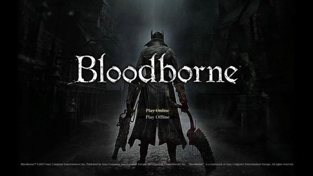
The DPAD is for menus, all menus
This may initially seem weird and non-standard compared to other games, but why this dpad only restriction is imposed becomes apparent once you get into the game. In the game you can't pause, therefore you must use the dpad to navigate menus and your inventory because the sticks are still controlling camera and character movement. By making the player use the dpad right from the start Bloodborne is just trying to force the player to learn the rule - menus are for dpads.
Basically, when it comes down to it Bloodborne isn't hard. Rather, it is just deeply consistent.
This consistency, regidity, does perhaps make it inflexible and perhaps demanding, but does not make it user unfriendly - it in fact aids in learning and is what makes the game feel so rewarding. Bloodborne simply lays out consistent rules and expects the players to follow them - and it does so in a pretty clear fashion.
Please note. This is not to say Bloodborne doesn't have its mysteries or unclear mechanics. But rather I am just pointing out that the core of gameplay is based on very learnable consistent rules, environments, enemies, player behaviours, and mechanics. This isn't a game of random, unpredictable, unfair, changing variables and situations. It lays out its core rules and simply enforces them consistently.
Other nice usability touches in Bloodborne include, in no particular order:
The note and shade system
Thanks to being able to read (and leave via developer defined templates) notes, I don't think I have played a game with so much, nearly constant, available tutorial/guiding information in a long time. Even the most casual of "hand holding" mobile games don't have the sheer amount of help text that was scattered about in my playthrough of Bloodborne, even on the evening of launch day in the UK. The difference being that players, mostly, created and voted on that text rather than it all being developer driven. Meaning that, apparently, if you give players the option they will chose to hold each other's hands (isn't that nice?). Of course, reading the notes (and watching shades, or even playing online at all) is optional. The player chooses, and player perceptions of agency are another important factor for game experiences.
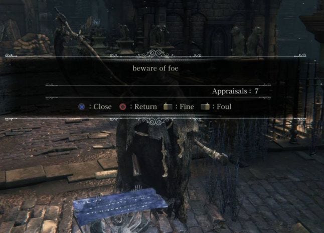
Helpful text everywhere! And it has a trust rating!
Clear player prompts and feedback
This is basic stuff. But it is worth noting that Bloodborne has pretty good usability practices when it comes to in-game interaction prompting. When you can interact with something you know it and know exactly how thanks to the picture of the X button on screen with accompanying text. Also if there are multiple things to interact with in the same space the game usually prioritizes the most useful/important with a clear message about how to swap interactions. Once you have interacted Bloodborne tends to also help out by, for example, leaving the pickup dialog clearly on screen until it is dismissed by another clearly prompted press. Or giving a clear message telling you that a door has opened somewhere (i.e that you have achieved something). The messaging for your storage being full is also face slappingly clear - with the item also being clearly left on the ground.

Can't get much clearer than this...
Storage auto filling
That consumable items, like blood vials and bullets, go to storage when you can't carry more and then auto restock into your inventory on return to the dream is a nice, helpful, labour saving touch. Even if the "being put in storage" indication icon on pickup isn't that clear.
The corpse run mechanic
Another keystone of usability is being forgiving and allowing for error recovery. Bloodborne doesn't allow much flexibility outside of its core, consistent, rules, but the corpse run mechanics do give players a second chance. Especially given that dropped blood echoes (that drop when you die) tend to be placed a bit back from where you actually died. They also are friendly and spawn at the top of cliffs/bottomless pits. The assigning of blood echos to enemies can add a wrinkle to this (particularly if they patrol), but again Bloodborne clearly shows this has occurred via the glowing eyes and also is nice enough to not have bigger monsters and bosses absorb your blood echoes in this fashion. Personally, I recovered my echoes more often than not. After-all, I had already got to the spot where I dropped them before and given the consistency of the game it usually wasn't too hard to get back there. Then of course, there is the huge full screen message when you reclaim your echoes. Unmissible feedback for an important moment. Good stuff.
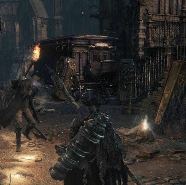
I wonder who has my echoes... (yes, my new game plus character died so you could have this screenshot)
Can't sell equipped items
There is nothing worse than selling junk items in an RPG only to realise that you just sold half the gear you are actually using (and now have to get them back at a premium, or worse, they are gone forever). Bloodborne doesn't allow this error to occur because equipped items simply don't show up as being able to be sold.
Health recovery mechanics in combat clearly signposted
The new mechanic introduced in Bloodborne where you can get health back if you can land a blow fast enough after being hit is clearly shown in the user interface. After taking a hit a white line shows where your health will drop to if you don't take action. Your actual health then starts to drain down towards this spot. But the stops and recovers (accompanied by a distinct in-game red flash) if you manage to hit back. Or slams down if you get hit again and this window of opportunity is lost. This is another element of forgiveness and error recovery in the mechanics.
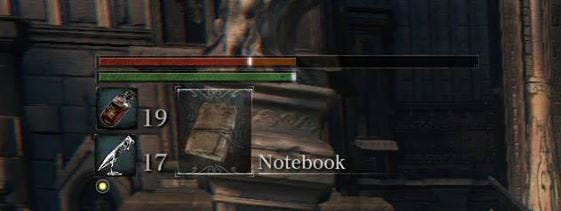
Strike soon, while the white bar is hot
Lock on and enemy health bars
This is a simple one, but the fact that you can lock onto enemies and see how their health bars react to damage goes a long way and shouldn't be overlooked as adding to the usability of the game.
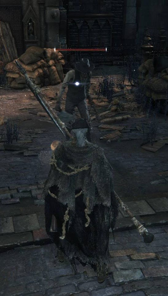
A simple lock on and health bar goes a long way
Invincibility frames
While they can take some time to learn Bloodborne does provide invincibility frames, such as when rolling, that can be used to dodge damage that otherwise looks like it should hit. They are in fact quite generous, much more so that other "not hard" AAA games I have played.
Clear loading and check pointing indication
When the game is loading or check pointing this is clearly shown via an on-screen animation. In the case of check points this lets you know your progress is being saved. With loads the constant loading animation, that doesn't freeze or stop flashing in and out, lets you know something is happening and the game hadn't hung. I know this sounds basic, but you would be surprised how often even simple stuff like a loading animation is overlooked.
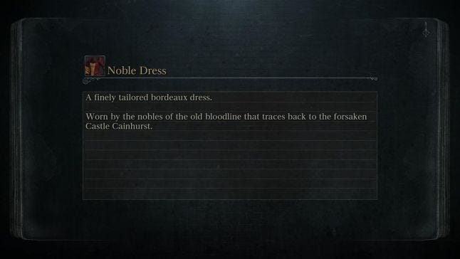
The loading animation in the top right lets me know something is still happening.
Yes/No prompts with least destructive option as the default
When Bloodborne offers you a Yes/No option, such as when choosing to return to the Hunters Dream, the least/non destructive option (in this case "no" as everything respawns if you go to the dream) is selected by default. Another standard usability error prevention touch that Bloodborne implements.
--------------
The examples above are just a few of the nice usability touches I noted down while playing. But there are more. However, that is not to say there aren't elements in Bloodborne, and the Souls games that aren't clunky and get the players way. But to hold it up as an example of a game, or as part of a series of games, that disproves the value of usability and games user research is a fallacy. Game User Research isn't about making games easy, and intentionally punishing games can still have plently of nice usability touches.
Although, I do have to say that printing the controls for "Run" incorrectly in manuals that ship with a game is perhaps being a bit excessively unfriendly ;)
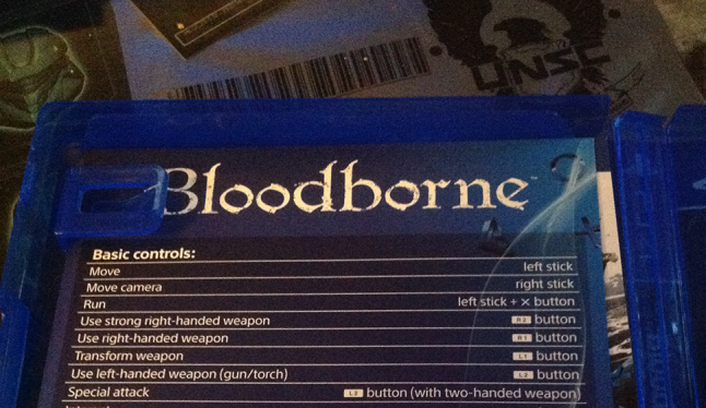
Run is actually left stick + the O button...
Read more about:
Featured BlogsYou May Also Like