Trending
Opinion: How will Project 2025 impact game developers?
The Heritage Foundation's manifesto for the possible next administration could do great harm to many, including large portions of the game development community.
Once envisioned as a hidden object game, Moncage instead uses "the act of connecting" as a powerful vehicle to tell its wordless story using dimension-bending perspective.
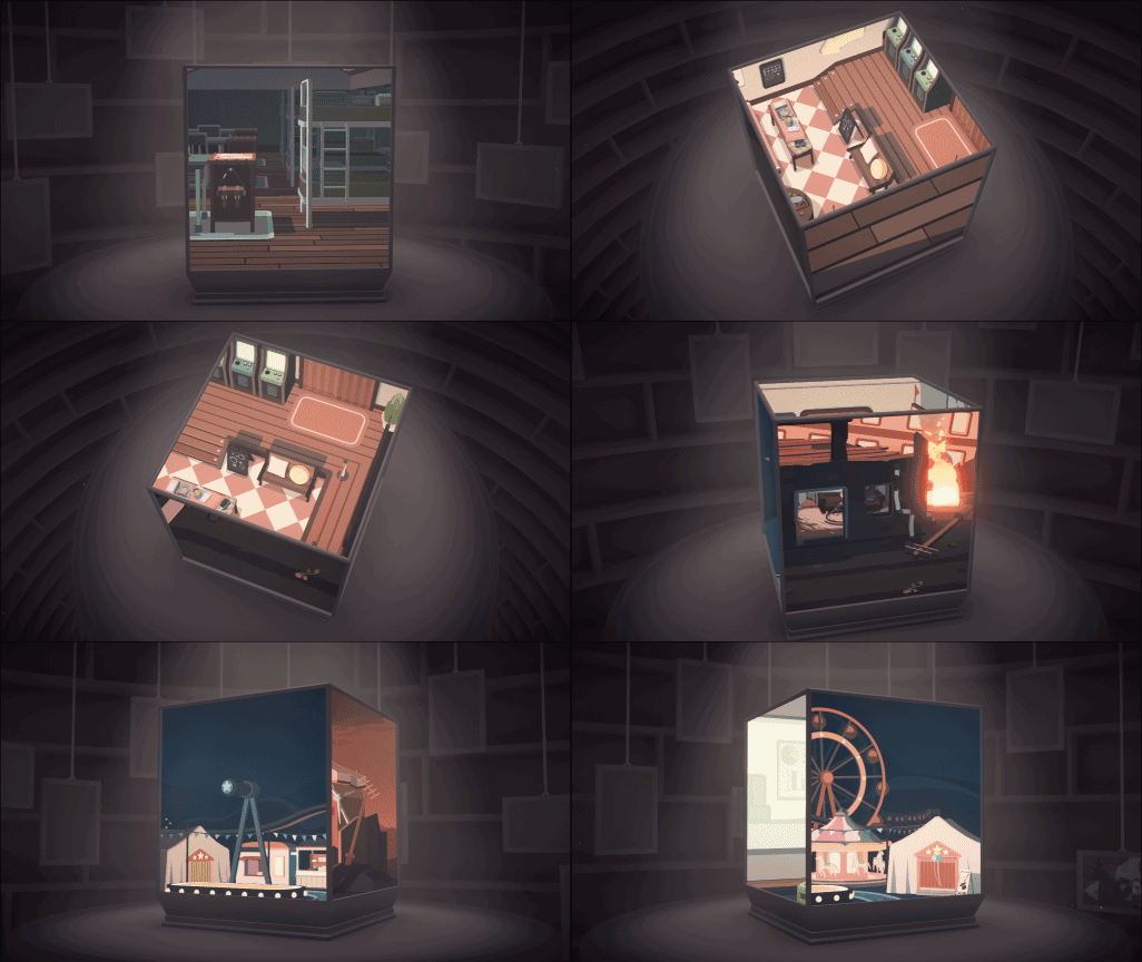
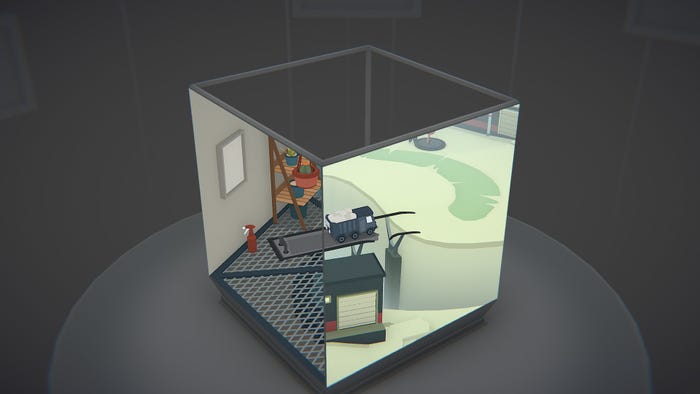
Moncage is a mind-bending puzzle game about a rotating cube that carries whole separate worlds on each of its faces. Within those unique places, though, are connections that the player can bring together if they turn the cube in just the right way. In doing so, they’ll explore a story that brings these seemingly-disconnected, silent places together.
Game Developer spoke with the team from Optillusion about how a video on stencil buffer inspired them to create their cube filled with puzzles, the challenges that came from giving players control over so many places all at once, and the difficulties that came up in designing the puzzles that would connect these varied places.
Where did the concept for Moncage come from? What inspired this puzzle game?
A while ago, we came across this video about stencil buffer, which showcases a cube containing a distinctive model on each face of it. We were so fascinated by this idea and decided to recreate it in Unity ourselves and played around with it quite a bit, and that eventually led to Moncage.
The way that each face of this 3-dimensional cube displayed a different scene made us feel like we were looking through parallel worlds. And we thought to ourselves, “How mind-blowing would it be if we made it possible to connect these parallel worlds?”
What thoughts went into creating the various worlds and places that exist on the sides of the cube faces? Into telling a story with these places without saying a word, or picking which places to show that would tell that story, but also work well as puzzles?
We worked on the narrative alongside the game development process. We would come up with parts of the story, and then design some puzzles to integrate them. We wanted the game to be a coherent experience in which every little aspect shares some form of connection with others, and this translated to the series of puzzles that are connected by an overarching story.

Moncage creates puzzles by having players find connections between these worlds. Can you tell us a bit about your design process here and about how you chose/created scenes that would connect to one another in various ways?
Oh, we definitely had a helluva time with the design process. It wasn’t rare at all for us to be stuck on a new puzzle for several days, sometimes even a month; we would just sit in front of our desks and stare at the project, brainstorming about different possibilities. It was hysterical. The only thing we could do was wait, until suddenly the light bulb would light up over our heads and the creative juices would start flowing. Rinse and repeat.
Not everything we had come up with would make it in the game, of course. We would try to do some rearrangement or even introduce new elements into the game to somehow make sense of these bizarre ideas, but sometimes we simply had to accept that not all of them would make sense for Moncage. And this was probably the most frustrating part.
How did the game change over the course of designing and developing it?
The photos in Moncage were initially designed to be mementos and figures, and the whole game was actually more like a hidden object game, as we wanted to create something beautiful with some cool optical illusions based on the stencil buffer. We eventually came to realize that the act of connecting was so much more powerful and offered a significantly more compelling experience over our initial design. So, we went ahead and built the main gameplay around these connections, and just kept the collectible photos to help tell the story.
Visually, how did you set up these scenes when you had some connections in mind? How did you choose what to put in a scene, and how to frame it, so that you could hide connections for players to find?
We first had to build out the puzzles; those were the foundation. From there, we’d add a layer of props and items for the ambiance and storytelling. Then there were hints - the suggestive elements to nudge the player in the right direction to locating key objects. Finally, we’d give these key objects a “glow up” with particles and glow effects, so that they stood out even more.
What challenges did you face in picking out the elements that would best convey the story? In finding the exact items that would help tell your tale without saying a word?
Not all ideas were useful. During the creative process, we had to discard many of our ideas because their contexts or sizes didn’t fit the game, or they just didn’t look cool enough. We had a major plotline in mind and just tried to come up with as many ideas as possible to make it fuller. A story can be told in many ways, we just had to find the one that felt most natural.
There is a moment in the game where the poppy flower in a sketchbook becomes real. This is for sure one of the more symbolic moments, as the flower represents multiple things: it’s a flower to lay on top of a gravestone, and it also marks the start of the war. So, not only is it a puzzle, it also serves as a meaningful storytelling device.
Can you walk us through the creative process behind one of the specific puzzle moments? How you picked the objects and combinations for that specific puzzle?
The lighthouse. We wanted to create a puzzle that would require a bit of thinking outside of the box, and we came up with this idea that some properties of an item would be affected by certain changes in the scene. Color was one of the most obvious choices for this, and one way to change the color of something would be to change its surroundings. And there was the final product: a piece of battery that changes colors with the day/night shift.
What challenges came up when designing the game's visuals and in having several different places rendered and moving in 3D on the various sides of the cube?
When it came to visuals, it was all about perspective, or object sizes. The in-game cameras do perceive depth, which means they’d render objects in the front bigger, and those in the rear smaller. This turned out to be quite the challenge for us to keep everything consistent and proportional with the different camera angles.
How did you overcome the challenges that came from keeping objects consistent and proportional in the various camera angles?
We created a custom tool in Maya which allowed us to freely move and scale an object without affecting its appearance from certain perspectives. With this tool, we were able to create the puzzle pieces first, and then switch to a regular camera to adjust their sizes and proportions.

Moncage can be almost disorienting as players affect multiple realities by turning the cube. What work did you put in to keep this visual effect from becoming overwhelming for the player?
In the earlier prototypes, we actually had the cube just floating in the air with all 6 sides, but this design was far too overwhelming for the player as they would easily lose their sense of direction, so we ended up removing the bottom face of the cube and placing it on a table. We also made everything inside the cube with distinctive colors and textures, so that the cube always looks brighter and more dynamic than its surroundings.
The game features a helpful hint system. Can you tell us about the thoughts that went into this? In finding a careful balance in showing players what to do without directly telling them and in giving the player a variety of hint styles to try?
There’s a lot going on in the game, and it can certainly be a bit challenging for the player to have to solve every single puzzle on their own as they are constantly being tested by optical illusions. So, we knew we had to offer some form of assistance to alleviate the struggle, but in a delicate, non-intrusive way so that it wouldn’t take the fun and “aha!” moments away from the player. The end product gives the player multiple options to unlock progressive hints, so they still feel very much in control of their own experience.
What thoughts went into creating the various levels of hints? How did you choose to break up the hints so that they wouldn’t spoil the whole puzzle for the player?
First we’d try and figure out the possible ways for how a player would approach the puzzles, and what the steps they would go about solving the puzzles. We’d identify these steps and then progressively reveal the intentions behind each puzzle. Basically, we put ourselves into the player’s shoes and did the thinking for them.
Why was it important to you to offer a complex hint system in your game?
Like the answer to the previous question, it was about maintaining a careful balance between helping guide the player without spoiling their experience. The purpose here is to leave the decision to the player, so they can actively choose to what extent they’d like the hint system to help them while still feeling in control.
You May Also Like