Trending
Opinion: How will Project 2025 impact game developers?
The Heritage Foundation's manifesto for the possible next administration could do great harm to many, including large portions of the game development community.
Void Bastards game designer and programmer Farbs takes us through some of the design decisions that brought Blue Manchu's latest game to life.

At the end of May, Australian studio Blue Manchu released Void Bastards, a strategy/shooter hybrid that casts players as a rotating group of prison convicts conscripted to explore a deep space nebula to repair their prison ship.
It's a fascinating game with procedural elements that do a great job varying the player experience. On one run, the player character might be color-blind, but the ship they board has one group of friendly enemies. On another, the ship might have random power-outages, forcing the player to double-back to the ship's generator to keep the lights on. Combined with a clever oxygen system to encourage player action, some cheeky Commonwealth humor later, and you have one of the year's most fascinating indie releases to date.
Blue Manchu collaborator Farbs (just Farbs) was kind enough to drop by the GDC Twitch channel a week after the game launched. Farbs (who famously quit his job at 2K games by making a small Mario game) was kind enough to share some design insights from the making of Void Bastards, including what influences it takes from System Shock 2, how it approaches randomized levels, and how it creates his unique look.
This is entirely head-canon for me, I wasn’t in the room I don’t really know what happened. But in my mind, System Shock 2 kind of had two leads designing it and that would have been Ken Levine on one side thinking about the story and the narrative and how that all fits together, and then John thinking up all of the different systems that actually run within that game and how they interact with each other.

If you look at the lineage of that game- so you’ve got Bioshock which was built as this spiritual successor and there’s been what…3 Bioshock games now? As you look at that you see that the Ken’s side of it’s really been built on time and time again and John’s sort of helped out a bit but they haven’t been John games. They’ve been Ken games.
This was really about having John have his turn at what if you know, there’s a story, but we approach this whole thing from: here’s a game system, and another game system and another game system and we let them all run and try and find a way for them to all work together in exciting ways.
That’s in my head what it is. It’s like an alternate reality Bioshock. What if instead of branching down in this direction it went that way. So it’s like an [alternate history] after System Shock 2.
I don’t know if [my role is] lead programmer or tech director or something like that but yeah I get the harder programming problems. That’s sort of my day-to-day on the project. When we started this project we staffed up a bit over time but when we started it was just three of us sitting in a room— well, not even in a room, three separate rooms.
Everything was just collaborative. I guess another way to think about this is we started with extreme grey boxing, right? Literally grey levels but very simple game systems and kept adding them and adding them. The early phases of the game was all just prototype, prototype, prototype.
To the point where the main game project is still in a folder labeled “prototype”. In terms of design contributions and things it was all sort of early on thinking about things like, you know “Do we need oxygen systems to speed you along?” “Do mines really work in this game or do we need to not have mines?” “What’s the game loop?”
We all spent a lot of time trying to figure that out. Like what are the actual penalties for death, what do you keep, what do you not keep…how do we want all that to work out? So It was interesting before the stream you both used the word rogue-like and that’s something we tried very hard not to make.
I mean you’ve got to think, at the moment people have started to talk about rogue-likes and rogue-lites...I think this falls on the rogue-lite side of the spectrum but that distinction was a lot less obvious back four years ago.
And so you know for us hearing the word rogue-like just meant oh yeah permadeath, you get one shot at this, its impossibly hard, and for us all of those games it was something that you’d play for a little bit and go “it’s going to take me 30 hours to play that first level again before I get good enough to actually win this game. I don’t feel like it.”
Whereas we would look at things like Rogue Legacy was a really helpful point for us there, where every time you play it you get a bit further because you’re banking your progress. And so that was something we really want to get from the start.
So our focus really was to not do that through the levels. You’ll notice that...the ships have actually been handcrafted and then there’s randomization within each one.
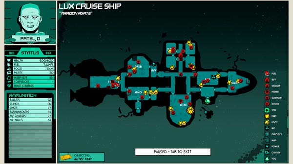
Sometimes there’ll be a wall here, sometimes this door will be locked. Sometimes there’ll be containers over here sometimes there won’t. The way that game engines really like to work is not very friendly for procedural generation. You want to bake your pathfinding data so that you don’t have to generate that at runtime.
You want to bake your occlusion data so you’re not drawing bits of the scene that should be occluded by geometry. All that kind of stuff runs better as an offline process as opposed to real time.

So our focus really— although you know, Jon Chey did a good job of varying things a bit and making sure that they can be randomized and mixed up. So I think the helms are a really good example of that. They all feel a little bit different because you know, maybe there’s a wall here, maybe there’s not. Maybe there’s a char, maybe there’s not.
With tweaking things like that, the navmesh and stuff at run time, but most of our randomization comes from all of the other systems. And so it’s from where do you actually enter? You’ll notice that each ship has multiple airlocks and so that gives a very different feel.
Where are you going? Like what part are you looking for? You can think about you now the easy ones like the FTL nozzle what’s going to be in the FTL drive? And so you don’t actually have to go to the helm for a map or anything you can just look at it, think about it, and go find it.
But that draws you to different parts of each ship. Our goal really as well was to create a game where you don’t most of the time try to clear each ship. When you go in you’ve got specific things you want to do, you go to those locations maybe you change your plan on the way and then you duck back out.
So that again is a way of varying your experience with each one. Cause you might go to a particular ship with the aim of getting fuel and the next time you’re there you go to get food and you don’t need the fuel.
And then we vary the enemies, and then we vary the ship traits, we vary the character traits, and all that stuff changes. And that’s what we did to try and create that sense of not always being in the same space doing the same thing all the time.
We also wanted the ships to make sense, right? To always have the drives at one end, the helm at the other. Stock them full of stuff that they would be full of. It was good to be able to do that by hand.
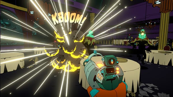
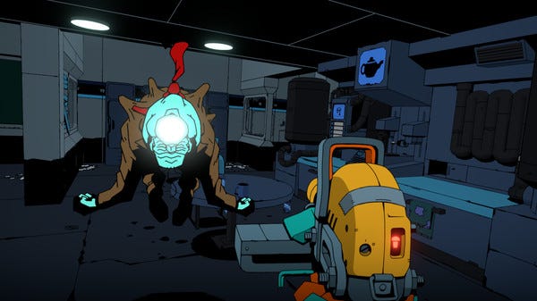
The first thing we can’t do is full, 3D animated characters. It’s not gonna work. But we’ve got Ben Lee here and he can draw real good. So that’s why all of the characters in the game— well, most of them anyway, are sprites. And that seems to have worked out fine.
We were a little nervous about doing that at first, we thought people are gonna look at it and go “Oh it’s some shitty retro game” but we thought if we make it high-res, we make a modern attempt at doing sprites then that’s going to help.

So that kind of gave us a start. And as Ben started working through the concept of the game, like drawing environment concepts and characters and having ideas about what things might look like, it started to get kind of that comic book look. I think that’s partially through virtue of a style that he’s developed.
And not long after he did some concepts for what the world might look like using SketchUp, and when you make models in SketchUp you’ve got big, flat panels of grey and you have this line work everywhere. We saw that and just thought “yeah, that looks exactly right.”
We want the line work— which is a shame because that’s not a thing 3D engines like to do. So we then had to invest quite a lot of time in trying to figure out how to actually draw that stuff. And I think that’s a big part of what’s given the environment of the game its own distinctive look.
If you look down a corridor, you can see that the line near you are about one and a half pixels thick and they head off into the distance and they stay one and a half pixels thick, almost as if they’ve been drawn by the same pen. That’s part of what gives it its comic look. Normally in a game you know, something closer will be thicker and get smaller.
That’s one of the things that kind of helped us to do that. The other thing that I think really helped was we went into this project knowing that we wanted a distinctive visual style. We saw that that helped us a lot in Card Hunter, it seems that that had helped with Bioshock.
If you ever happened to walk past a video game magazine at this time it had a BioShock screenshot on it and just from the colors alone you could go “oh! I know what that game is.” We wanted something that straight away you could see it and go “that looks different. That looks interesting. Maybe I’ll check that out.”
You May Also Like