Trending
Opinion: How will Project 2025 impact game developers?
The Heritage Foundation's manifesto for the possible next administration could do great harm to many, including large portions of the game development community.

Featured Blog | This community-written post highlights the best of what the game industry has to offer. Read more like it on the Game Developer Blogs or learn how to Submit Your Own Blog Post
How I designed the levels in The Sentient Cube, and how that has given me a better understanding of the underlying mechanic of the Katamari series.

[Cross-posted from Omiya Games blog]
Designing the levels for The Sentient Cube was a fascinating exercise, and one that provided a great insight in how Katamari Damacy was designed. Both games have very lenient win conditions, and as such, have equally lenient level design that can be both creative and flexible. Broadly speaking, there are two types of object placements used in The Sentient Cube: the breadcrumb and amphitheater formation.

Breadcrumb Formation
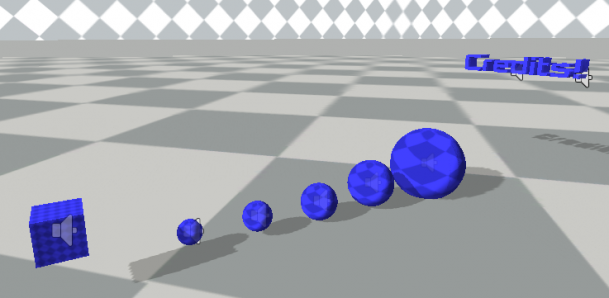
The breadcrumb formation is the easier one to understand, yet harder to setup. In short, it’s a placement of increasingly larger objects placed into a trail for the player to follow. It’s purpose is simple: to lead the player towards a specific point of interest. This is most obvious in The Sentient Cube under the “How to Play”, “Level 3″, and “Credits” levels where they’re designed to introduce the player a new concept. In “How To Play”, the breadcrumbs literally lead the player to the goal. In “Level 3,” it leads the player to the rockets, which they can use to traverse through the large expanse very quickly. Furthermore, the rest is intended to lead the player to the goal, much like “How To Play.” Lastly, the “Credits” leads the player to each text in the game, making it more likely that they’ll spend the time to read it.
One interesting tidbits I learned from using the breadcrumb formation was that making a simple, straight trail was actually the worst way to implement this idea. With the exception of the “How to Play” where the player needs to be guided to the goal, a straight trail feels too easy and boring. Instead, it’s better to have the trail curve, and even place obstacles around those curves to emphasize it. This is most evident in “Level 2″ where I zig-zag the breadcrumbs; “Level 3″ where it creates a small ‘C’ to lead you to the rockets; and “Level 4″ where obstacles obstructs your view from seeing the next breadcrumb.

Amphitheater Formation
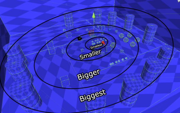
The amphitheater formation is a little less easier to understand, yet easier to implement. In this formation, objects are placed in concentric circles with each layer consisting of similar sized objects. As the layer gets farther away from the center, the objects gets bigger. The formation is like that of the breadcrumbs, but in all direction. Unlike the breadcrumb formation, amphitheater is flexible enough to allow quite a difference in size for each circle, which gives the level designer some flexibility. This is seen in “Level 1″, “Level 2″, and “Level 4″ where the objective is simply to grow big enough to roll over walls.
Similar to breadcrumb formation, variation in sizes within each layer is a lot more interesting to the player than the same size. Additionally, each layer should increase in size exponentially rather than linearly. Other than that, you can be pretty creative with it, making it square-shaped, putting objects at different elevations, putting gaps between cross sections, or even making them bounce.
Conclusion
Honestly, this game genre is surprisingly simple when it comes to level design. With its loose restrictions, it’s easy to get creative on what kind of setting you’d like to create, let it be in Japan, USA, underwater, in space, etc. Hopefully this will help and encourage others in exploring this great idea.
Interested? Try The Sentient Cube here, and please rate the game!
Read more about:
Featured BlogsYou May Also Like