Trending
Opinion: How will Project 2025 impact game developers?
The Heritage Foundation's manifesto for the possible next administration could do great harm to many, including large portions of the game development community.

For the past 2 years, I’ve had the opportunity to work on my company’s upcoming indie game. It presented several challenges as I was filling in multiple roles: lead producer and UI artist. Our design struggled to be solidified time and time again as the type of gameplay we were trying to create was a combination of genres, so we had very little to base our concept on. However, it taught me an important lesson regarding leadership and decision making. Don’t fall into the trap of eternal ideation, make a choice and try it out.
Make a choice/Develop a Design
Create a bare bones prototype
User test
Adapt your design
Repeat
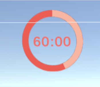
The first iteration of our UI bar in game lacked a lot of stylistic decision. My goal was to use UI to determine how the game should add pressure and goals for the player. The best way to quickly determine this was to add in a timer.

We liked how the timer worked in playtesting and moved forward by adding in complexity. So, I created a bar that filled when the player collected pick-ups, but consistently lowered at the same time to simulate a timer. I also made the decision to add in simple theming to make the UI feel slightly more unified with the game.
Next, I had to work with the team to tackle a new design issue: multiple pick-ups.
This is the part of the design where our game was undergoing some key design choices. It was very hard for the team to settle on one UI direction, so I finally made the choice to move forward with a concept.
We wanted to convey to the player that they were collecting multiple objects at different rates, so I created 4 bars. To test if the concept was clear, we decided to remove the timer.

I put them all together in one pot and user tested. This user test was interesting because before this point, gameplay goals had never been vocalized as extremely unclear. Additionally, the UI took up way too much of the screen and demanded too much visually from the player. So, I went back to the drawing board.
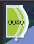
I decided to rework the design so that it would require 2 UI elements: 1 that tracked the collective pick-up count and one that tracked each individual bar that the player could refer to on their own time. This was done because the design goals for the player were becoming much too complicated for a single element. The number of pick-ups had became important knowledge, so I cut the old UI in half to make it look more like a bar. This was met with mixed reviews. The counter-bar did its job and made the player goal much clearer, but the intention behind the art was lost on the player.
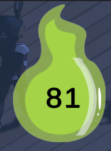
Finally, I settled on a flame that also nodded to our theme, but worked much better for a counter. To make the goal clearer and more challenging I worked with a programmer to put locks on certain items that would only disappear when the player reached the number count presented. This user test went very smoothly and let us know that we could now move on to polishing the art. In the meantime, we decided to start workshopping the individual pick-up bars that would be displayed on a separate menu. That has yet to be implemented, but I am excited to see how that process will go.
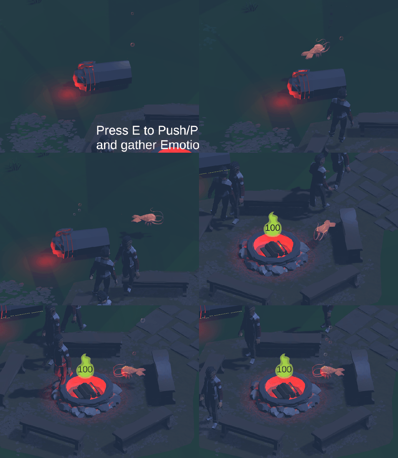
This entire process has reiterated to me time and time again how important it is to playtest concepts as much as possible. Many of the designs above worked in one moment, but failed when new elements were added to the game. In addition, I would like to note the importance of testing for accessibility. I discussed the color choices for this first pass art with many color blind testers to solidify that the game my company is making is accessable to all players. But overall, the biggest lesson my design team has had to endure during this process is don’t rule things out before you’ve tried them. Sometimes, the most complex design isn’t the best one. There are more solutions than you’ll see the first time around.
Read more about:
BlogsYou May Also Like