Trending
Opinion: How will Project 2025 impact game developers?
The Heritage Foundation's manifesto for the possible next administration could do great harm to many, including large portions of the game development community.

Featured Blog | This community-written post highlights the best of what the game industry has to offer. Read more like it on the Game Developer Blogs or learn how to Submit Your Own Blog Post
How should we sort out the information content, which appears at different times? This article mainly analyzes from two dimensions of space and time, and talks about the role of hierarchical unfolding thinking in game UX design.

The rapid development of the video game industry in recent years has been accompanied by higher requirements for the background, story structure, and art graphics from players of video games, which inevitably makes the information elements and structure become more and more complex. However, too much information may become a burden to the players and affect their gaming experience. Since player's awareness in the interface will come first and then their interactions with the interface, if the information is not guaranteed to be clear and easy to understand, impatient players will be lost quickly and naturally will not produce interface behavior.
So how should we sort out the information content, which appears at different times? This article mainly analyzes from two dimensions of space and time and talks about the role of hierarchical unfolding thinking in game UX design.
01 Spatial dimension
The spatial dimension refers to the structural setting of the game interface, which can be divided into horizontal structure, which is the way information is arranged in the two-dimensional interface; and the second is vertical structure, which is the stacking and hierarchical relationship between interfaces. The former is the player's perception of the order of information; whilst the latter mainly shows the logical relationship between interfaces. The two constitute the skeleton of the interface, and the various types of information are the flesh and blood attached to these skeletons. What are the ways information can be presented?
1. Interface tabs
The first priority of the interface is to present information so that players can quickly find the information they want, followed by the artistry and fun of the game. The essence of tabs is to show the subordinate structure of the interface, and the switch of tabs will change the state of a panel. When there is too much information to be presented, sorting the information by tabs can reduce the complexity of them.
For designers, sorting through tabs is an opportunity to reorganize the presentation of features, and it will directly affect the player's perception of the system structure. Most games put tabs on the left & right side or top and bottom of the interface. It is convenient to click, and also conforms to the natural visual pattern of the human body.

2. Multi-level interface
Hierarchical design is a common method to handle a huge amount of information. If you can't show all the information at once, then show part of it first, and then show the other information in the next level through hierarchical classification.
As the vertical structure is the state of different interface layers stacked together, we need to plan well for each interface layer of the stack, which has two main purposes: (1) to avoid blocking conflicts of different information ; (2) to ensure that players clearly understand the interface structure and shape a quick and convenient interface use experience.
- Parent Hierarchical Interface
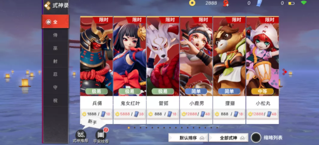
The handling of the secondary interface displayed in the parent interface can be called parent hierarchical interface design. It is expressed in the form of not popping up a new interface but changing the display of a certain area of the parent interface.
This method can reduce the interface layer to a certain extent and avoid frequent interface switching, so it is widely used in all kinds of game interfaces. However, it should be noted that this method will also increase the complexity of the horizontal structure, and needs to be combined with dynamic effects and interface effects to make players recognize that it is a secondary interface. It is also necessary to pay attention to the difference between the parent hierarchical interface and switch & tab.
- Drawer interface
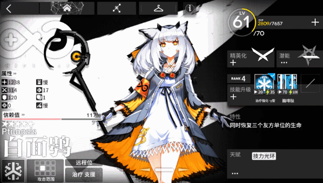
The drawer interface is a way to connect interfaces that actually have a parent relationship through intermediaries and sliders, allowing players to maintain the experience of checking only one interface. This approach does not actually reduce the number of interface layers, but in the player's perception, due to the existence of intermediates and dynamic effects, the parent and secondary interface will be seen as one layer, establishing a clear perception of the interface.
- Pop-ups
Pop-ups are generally used for in-game events and rewards interfaces. This setup not only adapts to the interface logic as well but also allows the player to see information about the system interface through sub-functions, which also allows the player to have a clearer perception of the hierarchy.

3. Filter and drop-down lists
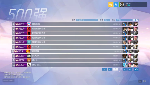
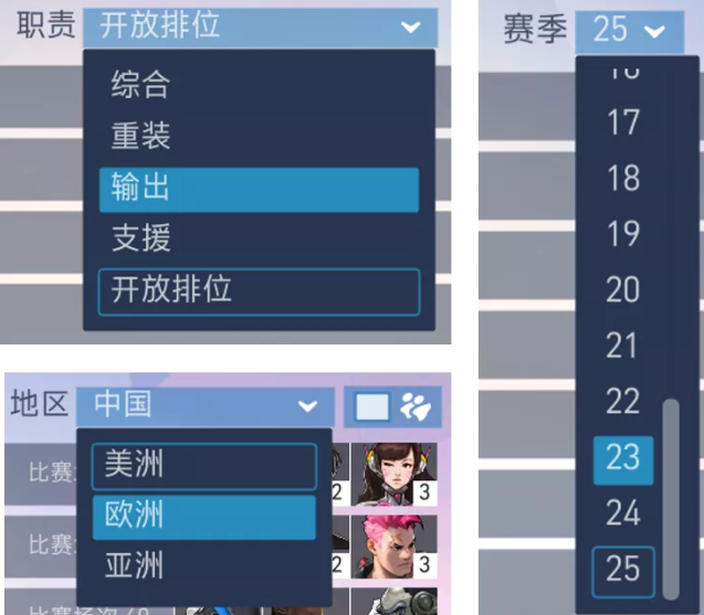
When you need to present a large amount of information or solve a problem with the information, you need to group the information into categories. If there is a pattern to its classification, it can be accommodated into a filter box and click on it to bring up a drop-down box for selection. This approach helps the interface to be displayed in a concise manner.
02 Temporal dimension
The spatial dimension is to show the information clearly and intuitively to the players, while the Temporal /time dimension mainly focusing on the order of content presentation.
As a designer, first of all, we should be clear about the connection points between players and each part of the game, and translate the connection points into corresponding interface information. And most games are based on the typical task flow and player selection weights to design the information architecture, as well as arrange the interface information.
1. Game level unlocking
Presenting information to people who are not interested or not ready for it becomes a distraction. For new players, information appears only gradually when it is needed, and the content in it is easier to accept and absorb.
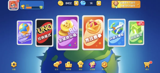
For example, in the interface of the game " Uno", players need to unlock new gameplay and functions step by step. After mastering the basic gameplay, as the level increases players slowly get hands-on more gameplay and skills to make it easier for players to get started. This will reduce the chance of players being discouraged by the complexity of the game at the beginning.

2. Tutorial guide
It is difficult to meet all the needs of new players, and non-mandatory tutorial will make players complain, not knowing what they should do; too detailed guidance, on one hand, maybe too tedious and interrupt the process, and on the other hand, affect the immersion in game. How to convey the basic gameplay and important information to the players in a limited time, and at the same time, ensure the consistency of the game process and attract the players to continue to explore the fun of the game?
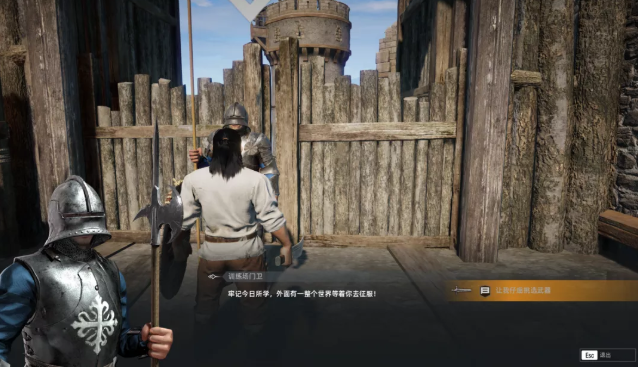
As a UX designer, first of all, it should be clear that interaction is not a form imposed on the basis of the story, but a form of transformation of the player's behavior throughout the story, a closed-loop, complete "story" is the embodiment of hierarchical unfolding thinking.
- In terms of in game controls, the most basic functions are shown first. Let people play the game first. Advanced or other features will be shown later when they are needed.
- In terms of tasks, guide the player to experience and explore, and gradually trigger higher-level skills and tasks.
- In terms of stories, the player's psychological expectations are met through a reasonable storyline. The beginning, development, climax, ending is gradually processed, rather than the beginning of all the information will be exposed to the player.
03 How to do hierarchy optimization
When planning the hierarchy and layers, you need to go through the decision of full screen/window, return/close system, the location planning of general tab area and function area, the story flow and etc. How to optimize the hierarchy and highlight information to reduce the learning cost of players while ensuring a clear interface?
1. Area Color
Players entering an interface will habitually look for visual focus and parent relationships to know more about the interface structure and decide the order of reading. And it just happens that some art techniques in graphic design can help players understand these better.
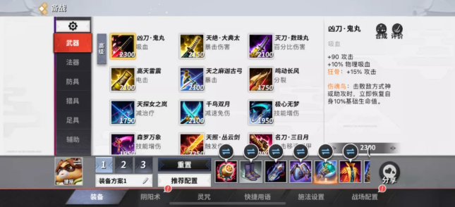
The saturation of the interface color, grayscale will affect the player's judgment of the hierarchy and layers. Generally speaking, in the natural world, due to the effect of light, grayscale is more of “white” to indicate "closer" objects, and the darker it is, the "further" it is from the player. Therefore, if you want to represent the parent hierarchy in the interface, you can use color blocks to help players understand the interface structure at a glance.
2. Simulation of physical objects
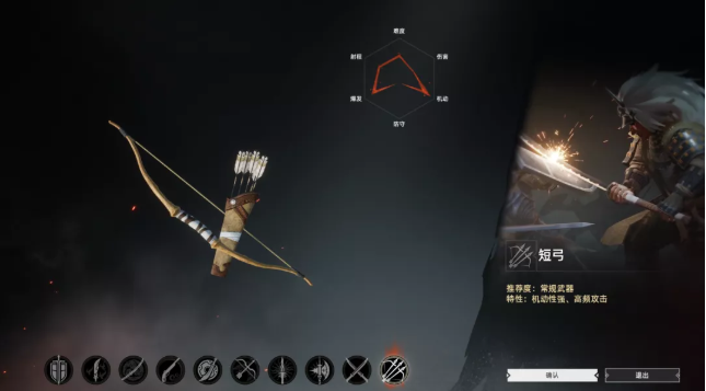
If you want to show the interface order, in addition to the abstract method, the stacking relationship between physical objects, we can also directly use the reality of the existence of things. It helps achieve few costs of guidance and it's more natural for players to perceive the information and hierarchical relationship.
3. Tab placement rules
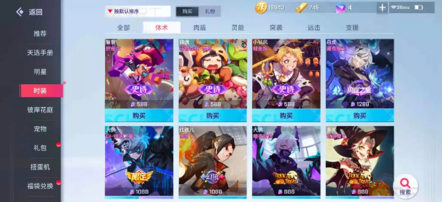
In the face of tons of information, we need to set up general rules for the interface structure and standardize the information to reduce the learning cost of players. When multiple tabs are placed together, if they are not distinguished, it will affect the player's judgment of the hierarchy. In order to distinguish which is the first level and the second level in the same interface, there are generally two ways to deal with it. The first one is as follows: one tab on the side and one on the top or bottom of the second tab. Players can easily understand that the left is the first level tab and the top is the second level.
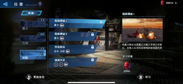
If you want to put the first and second tabs on the same side, you will generally distinguish them by shape, color, size, etc. to prevent the information from piling up.
4. Interface animation effect
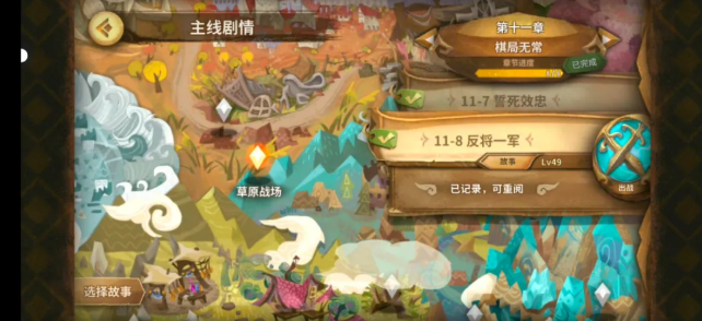
The key areas of the game need to be "emphasized" by using animation effects or special effects. The order of animation effects is generally in accordance with the order of the interface structure, with the main content/parent object/page tab appearing first, and then sub-level objects, subsidiary areas, and so on. Players who pay attention can usually clearly perceive the interface structure.
5. loading interface
As the size of the game becomes bigger and bigger, it becomes difficult to load all the resources needed at once. Therefore, when players switch map scenes, they will inevitably need to experience a long loading time. However, for many games that focus on an immersive experience, such a rigid interruption in the game flow is undoubtedly a great threat to the game experience.
The purpose of designing the loading screen is to enhance the player's experience at this stage and to relieve the player's boredom during this time. In the beginning, most of the settings of the loading interface were still static, but later, in order to further optimize the loading interface experience, some smooth and comfortable transition effects were gradually added to the interface, which not only makes the interface look more vivid, but also help users understand the logical relationship between the front and back changes of the interface. The spatial sense of the whole system is reflected by animation or special effects.
For example, in God of War, if players want to move across kingdoms, they need to pass through the World Tree as shown in the picture below. Players enter the center of the World Tree through a door and select the kingdom they want to go to, after which the center of the World Tree begins to carry out very gorgeous and lasting animation and special effects, as if to tell players that time and space are shifting. After the end of the animation, the vines leading to the gate extended. Players approach the gate, and when the gate is opened again it would be another kingdom.

6. Traction interface
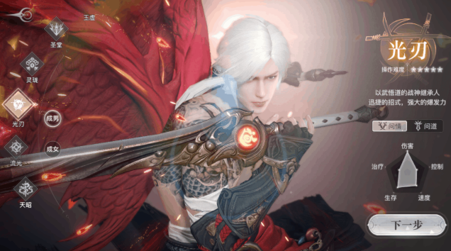
After binding a subject to the interface, switching the interface will change the perspective and form of the subject at the same time. Using the change of the subject to help players remember the contents of the interface, plays a role similar to a page indicator. This kind of interface is called a traction interface.
Traction interface is most commonly used to connect with characters, such as differential reinforcement of equipment parts, character role switching, etc. Compared to the effect of the ordinary tab, traction interface is not only much more intuitive but also helps the game character or world view immersiveness.
Read more about:
Featured BlogsYou May Also Like