Trending
Opinion: How will Project 2025 impact game developers?
The Heritage Foundation's manifesto for the possible next administration could do great harm to many, including large portions of the game development community.

Featured Blog | This community-written post highlights the best of what the game industry has to offer. Read more like it on the Game Developer Blogs or learn how to Submit Your Own Blog Post
The design principles for PSVR game 'RIGS: Mechanized Combat League' that was covered in my talk in a design panel at Eurogamer EGX 2016, at the Birmingham NEC, UK.

Two years ago today on October 13th 2016 ‘RIGS: Mechanized Combat League’ was released as a launch title for PSVR. As it was the last game I worked on before moving to Naughty Dog, it got me thinking about the VR design lessons and best practises that we learnt.
I gave a talk at Eurogamer EGX in September 2016 as part of a panel of 4 designers where we spoke about various design elements, my section being about ‘Multiplayer Design for Virtual Reality’. This talk was not filmed, and Guerrilla Cambridge was shut down (RIP) in the January after the release of RIGS, so our findings were unfortunately never developed upon, nor passed on.
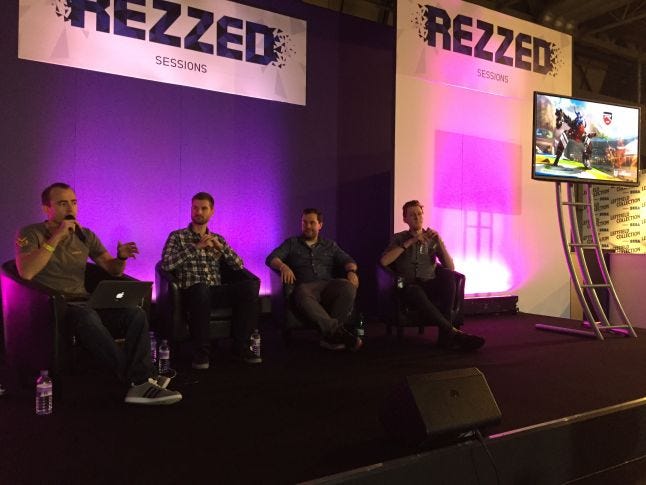
From left to right: Myself (then Guerrilla Cambridge, now Naughty Dog), James Cooper (then Naughty Dog, now Insomniac Games), Michael Barclay (then Cloud Imperium Games, now Naughty Dog) and Sam Howels (then Deep Silver Dambuster Studios, now Sledgehammer Games).
The following is my talk from EGX, plus 2 extra sections that I had to cut from the original presentation to fit into the 15 minute time frame. Although I am no longer working on virtual reality titles, I thought it would be interesting to share our design principles on RIGS to see if it could help any current VR developers. I would also like to see if these VR principles have been further developed in the last 2 years and see a discussion on whether they are relevant today or if alternative principles have been discovered. At the time that we were developing RIGS there were hardly any AAA developers writing articles about their work, rather it was the indie scene sharing the knowledge. I hope some current VR developers might find this work on VR from a AAA studio useful.
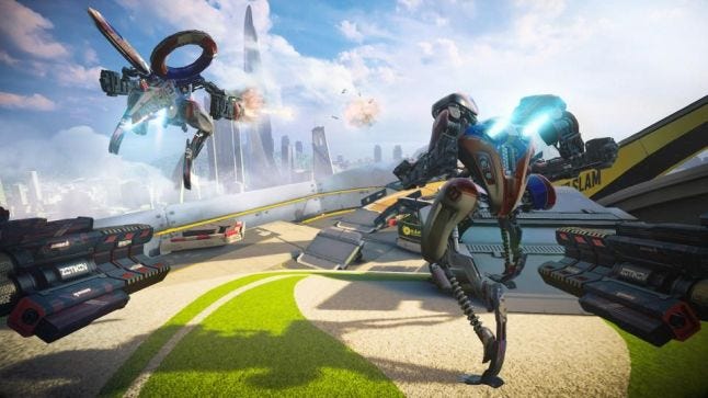
RIGS is a first-person arena based shooter set 50 years in the future. It’s a celebration of technology and sport combining elements of gun play with motor sports to create the exciting extravaganza of the future. RIGS pilots are the superstars of the future and they drive huge mechs to compete in custom arenas.
As with any good VR experience, it’s built from the ground up, specifically for Playstation VR. VR is a game changer for design, so we have to do things differently, which I’ll explain with the following topics:
What PRESENCE is, and why it’s important for VR
Why it’s important to get the player’s PERCEPTION of themselves in VR correct
How we have considered TACTILE FEEDBACK through the dual shock controller with relation to the action you see
The importance of SCALE for understanding yourself and your environment
What OPPORTUNITIES we get in VR that we don’t with normal TV SCREENS
And I’ll conclude with some of the best VR PRACTICES we have learnt
PRESENCE – THEORY EXPLAINED
One of the most important elements we need to consider and create is ‘presence’, as presence directly affects immersion in VR. You may have heard the buzz word being thrown around a lot lately, but what is it? Presence is the perception of being physically present in the virtual world, that you take your sensory stimuli from this virtual environment over that of the real world. So for example if you encountered an object that was flying towards your head inside the VR world you would react to it as you would the real world; you would take actions to avoid it.
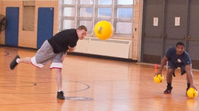
If we haven’t managed to create presence for you, then you may not believe in the flying object, you wouldn’t feel you needed to avoid it, and the immersion would be broken. So why hasn’t presence been mentioned previously? After all we have all heard the term immersion or immersive being thrown around for years. Well presence is a form of ‘spatial immersion’ which is where you feel you are really there in a virtual environment. This can only really be achieved by influencing the visual senses using a fully encompassing stereoscopic display, such as the PlayStation VR headset.
Yes we can get a really high level of immersion through the current generation of games on tv, where we get caught up in the narrative, have empathy for the characters and we get lost in the drama, but we don’t believe we are actually occupying the same space.

For example, we can get a lot of information from a novel, they are very powerful at conjuring up an imagine in your head and describe the sights and sounds really well, but if you were reading ‘Lord of the Rings’ you don’t think you are physically there in Mordor at the time.

Even when Peter Jackson shows us in a film what Mordor looks like we don’t think we are physically there, it’s all just in our imagination.
This is why presence makes VR really unique, and to create it, it’s critical that we surround you in an engrossing environment which has consistent visual, audio and tactile stimuli with each other. It’s all about getting your expectations correct – what you’re seeing should fit with what you’d expect.
PERCEPTION – EXPECTATION OF PLAYER’S AVATAR
How you perceive yourself in the virtual world and how you perceive that world around you are critical for creating presence. Let’s start with how you perceive yourself.
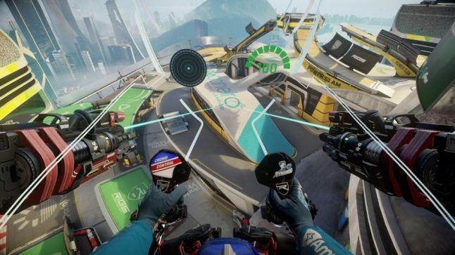
In RIGS we wanted you to feel like you are the actual pilot of the Rig, so we had to consider the avatar in relation to the position of the player. Firstly, we assume you’ll be sat down whilst you are playing the game (most people would be sat on a sofa at home), so we positioned the avatar in the seated position - this is where you’d expect your body to be.
We also know that to control the Rig you would be using the dual shock controller, and from this we know the hand position of the player. If you look down, this is where you’d expect your hands to be. We match the movement of the joysticks in the Rig 1:1 to the input of the thumb sticks on the controller; this takes your actions in the real world and incorporates it into the virtual environment which helps you to believe the world we are creating for you
TACTILE FEEDBACK
Additionally, we consider the vibrations used in the dual shock controller as this is our tactile feedback – the stimulus of touch. In RIGS we have designed the cockpit to support a number of critical features - because we are unable to mirror the feedback to your person in the real world we actively avoided performing physical acts to the player’s avatar, this is where the cockpit comes in.
Damage applied to the RIG is felt through the Dual Shock by proxy of impacts to the cockpit and RIG itself rather than directly to the player. If we had not done this then it would be immediately obvious that you hadn’t felt anything real and this in turn would break the immersion and thus the presence. For example, if you had a melee attack where you were being gun butted, or grabbed you’d notice the disconnect between the action you’re seeing and the lack of any feedback. The expectation does not match and this damages your sense of presence.
---------------------------------------------------Extra 1-------------------------------------------------------
The use of a cockpit was also an anchor point for the player’s reference. In VR you get the most amount of detail within 1-2m of the player’s position; objects that are roughly around arms reach tend to feel more real in VR because they have a very high level of parallax and stereoscopy. You get strong 3D signals from them so they tend to seem very convincing compared to things further in the distance.
We included the UI in a physical form within the cockpit rather than as 2D elements as these tend not to work well in VR. Everything needs a physical shape and 2D sprites are hard to gauge and are jarring, unlike on a tv screen or monitor.
The cockpit was also extremely important for trying to reduce motion sickness as much as we could. RIGS was a fast-paced shooter so to allow for rapid movement we put the player into a cockpit in an attempt to make them feel like they weren’t actually moving themselves, but rather they were moving a vehicle. The idea was much like riding a train; everything else outside is moving but you are sat still. We found this to be the best way to reduce feelings of nausea, and many other VR games that included player movement at the time also featured a cockpit. Motion sickness is of course different for different people, so I’ve heard the whole range from people who couldn’t get past RIG’s introduction, to people who could play for hours without noticing a thing. How successful we were in reducing motion sickness depended on the person, and how to allow nausea-free movement is still a hot topic for VR development, one of which I’m keen to see the developments in.
------------------------------------------------------------------------------------------------------------------
SCALE
Scale inside VR is incredibly important as this is how you understand your surroundings and your place in it. This is doubly important in RIGS because we want people to feel that they are in a big machine and this impression would get lost if everything around you was also scaled up, especially considering our arenas are built to accommodate big machines so they are huge ramps and giant obstacles.
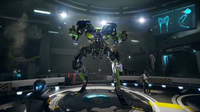
We have to continue to reinforce to the player that you’re sat in a big RIG off the ground throughout the game, not just here in the pits, so we need to put scale reference into the levels too.
A good scale reference that everyone understands is the scale of a person. Yes we all differ slightly in height but generally if you see a person in the scene you get a better understanding of the scale. For example if you take this room from the Tate modern:
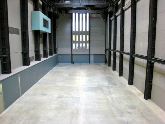 How big is this space? It’s hard to tell from the pillars, and the doors; are they for people or for vehicles? And yes there's windows in here, but windows are an arbitrary size and can’t be relied on. You add in the people, and then you get a much better understanding of exactly how huge this space is.
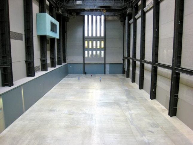
So in RIGS, using people for height reference fits well with our thematic of it being a sport that’s watched by crowds. Also smaller details like door handles and little things like that would have been lost from up at the height of the cockpit and the distance you are away from walls. What’s more, as it’s a multiplayer game you are spending your time focusing on your opponents and the action in the level rather than spending time looking at fine details, so it was important that our scale reference was easily identifiable.
In terms of level design and level building we had to consider crowd placement right from the very start during the blockmesh/greybox phase. We don’t just consider whether they their location is realistic (like would the people who have paid for those seats be able to see the action?) but we also consider where you as the player will see the crowd frequently so that you get to see this scale reference. Also we think about how we can use these places as landmarks for orientation, learning the map and call-out positions to your team mates, so the crowd placement becomes a tool for the designer to use.
---------------------------------------------------Extra 2-------------------------------------------------------
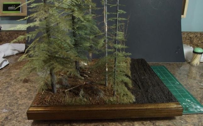
Scale is incredibly important for VR, not just for knowing how high you are in the Rig, but it’s important for giving correct parallax. Parallax is where you get the apparent movement of objects depending on their distance from you when you move your viewing angle. For example, in this park scene, if you were there and you moved from side to side, the closest trees would appear to move the most, whereas the trees further away would appear to move less. This is how we gain information about our surroundings and the distance we are from objects, as well as their proximity to other objects.
 If you then consider the trees in this second photo, if you were at the table and you moved side to side they would all move pretty much the same amount as they are positioned close to each other, even though in their diorama they seem fairly far apart for their scale. Imagine if we had a virtual environment where the ‘real-world scale’ was wrong; although objects would have relative distances, the parallax would not be correct and it would be very noticeable to you that something wasn’t quite right.
I learnt the importance of getting your scale right from an anecdote from a friend of mine, Jon Dadley, the head of Sea Green Games. When he was developing his first VR title, Stage Presence, he felt something wasn’t quite right at the start. He couldn’t figure out exactly what was wrong until he realised the scale was inconsistent between the 3D software and the engine he was using the head set in. Everything was scaled up to ten times what it should have been and so the parallax wasn’t right. When he fixed that, he fixed the issue of the environment not feeling quite right!
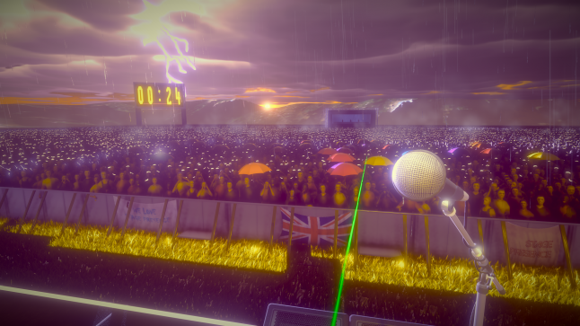 "Stage Presence" by Sea Green Games
------------------------------------------------------------------------------------------------------------------
OPPORTUNITIES IN VR THAT AREN’T IN CONVENTIONAL GAMES
One of the things with having an all-encompassing visual field with the head mounted display is the extra peripheral vision and field of view, both horizontally and vertically. This is different to games on TVs where we are restricted to the field of view on the screen, where we have to consider the position of our enemies in this tighter view to keep the game being fair. What do I mean by this?
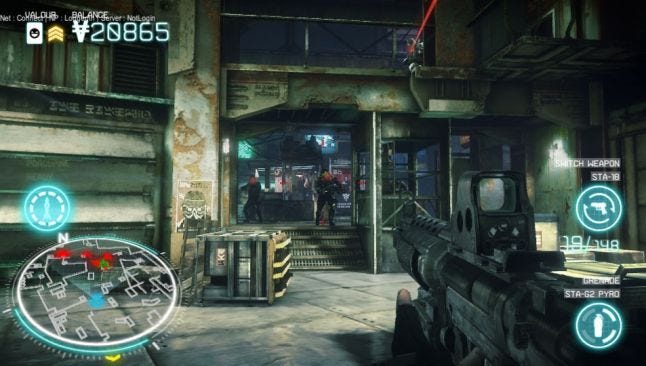
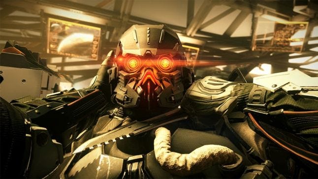
Well if you look at this scenario from a level I worked on for Killzone Mercenary, the player’s focus is ahead of them on the two Helghast who are running towards you. But did you notice the sniper up at the top? in the game he has a red laser sight that gives his position away but if he didn’t have this laser sight he could have easily have been missed by the player given his elevated position. When he appears on the balcony we made sure he was inside the camera frustum - if he was any higher up he would have been shooting the player off screen, and this would have felt really unfair.
But with Playstation VR you now get this greater field of view that you don’t with TVs and this massively helps with target acquisition. Combine this with the immediacy of looking up in VR and you can open yourself up to much vertical environments. This has allowed us to create more open maps with fewer roofs so that the levels compliment the rigs themselves as these big machines are capable of jumping up through multiple stories. This also works well with our eject and spawn system where you are ejected up into the sky when your rig is destroyed, and you then get to look down at the environment to choose where you want to spawn in next.
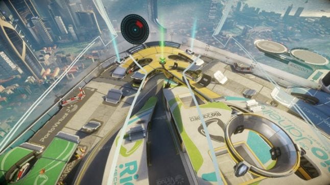
If there where lots of roofs and geometry that hide the action then it would be hard for you to make tactical decisions with your spawn location. This ‘looking down into the environment’ also ties in with our open sports arena theme where we have crowds watching the action – You wouldn’t want to go and watch a football game if the pitch had a low roof on it and you couldn’t see anything from the stands!
READABILITY
Even with this increased awareness it doesn’t take away from the need to design readability in the levels. VR is amazing but it can be overwhelming when you first enter into it as you can look everywhere; it’s a really unique and exciting experience. Because of this we have found that some design fundamentals are even more important inside VR.
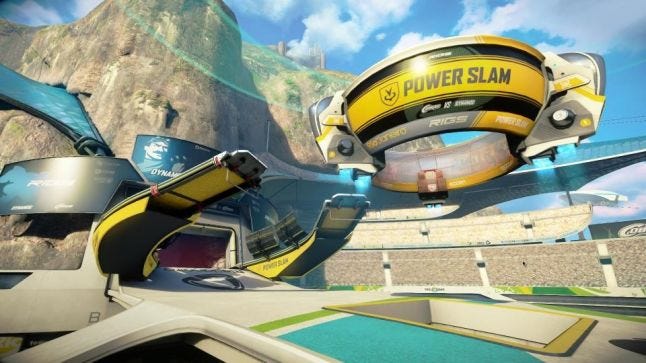
In RIGS we have a game mode called powerslam where you have to defeat 3 Rigs from the opposing team, this earns you enough points to go into overdrive where you can then run to the goal to score a point for your team. It’s a bit like basketball where you jump through the hoop. Hiding the goal isn’t part of the sport; we want to people to know where it is. We have a strong use of colour to draw people’s attention to it and to highlight the important routes.
We use yellow to signify scoring; the yellow ramps feed the player to the Powerslam goal, and we use yellow as the colour on the HUD to tell the player they are in ‘overdrive’ which is the state they need to be in to score. We also mark players with a yellow trail to indicate when they’re in overdrive; we use a consistent visual language throughout.
To further improve the readability of the routing we have calmed down detail in certain areas so that they are less distracting which helps with the player focusing on and understanding the layout easier. The brightness and contrast of our environments is also carefully considered with regards to readability.
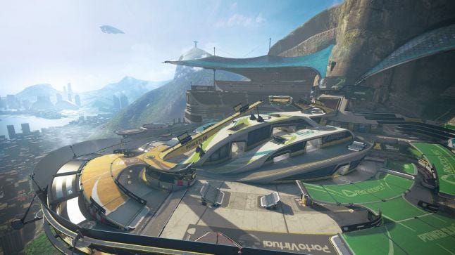
For example, if you can see the tunnels through the centre structure, you can see that they have lights inside them above the entrances. Not only that, but the surrounding walls are darker shades so by contrast the tunnels stand out to you. All together this means that if you quickly skim the environment you can understand the routing and choke points clearly.
SUMMARY
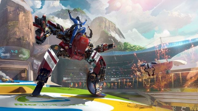
‘Presence’, the perception of being physically there in the virtual world, is incredibly important and unique to VR. It is created by surrounding the layer in an engrossing environment which has consistent visual, audio and tactile stimuli, so much so the player takes their stimuli from the virtual world rather than the real world.
The player’s avatar was greatly considered to match the assumed playing position of the player as to match their expectation. We also avoided performing physical acts to the player’s avatar so that there wasn’t any disconnect between the action they were seeing and the lack of any feedback.
Scale is extremely important in a virtual environment, and we used this to our advantage by using human reference inside the levels, which played well into our ‘watched future sport’ as well as reinforced the belief player’s were in a 6m high machine.
The immediacy of being able to look around in VR allowed for more verticality in our level design whilst remaining fair. This influenced the level layouts from the start during the blockmesh/greyboxing phase.
Readability is still extremely important inside a virtual environment, so it is still important to maintain the core principles in your levels. We also maintained a consistent visual language with colour to signify gameplay elements and the systems to the player.
The take away for any professional, indie or aspiring designer is that when you’re designing for VR you must do it from the ground up, and tailor your game to that specific piece of hardware, in our case it was Playstation VR.
Read more about:
Featured BlogsYou May Also Like