Trending
Opinion: How will Project 2025 impact game developers?
The Heritage Foundation's manifesto for the possible next administration could do great harm to many, including large portions of the game development community.
From Software's industry-defining hit with Dark Souls has spawned a new subgenre, but for this post, we're going to talk about the areas that everyone keeps messing up on with making a soulslike.


As part of my book on roguelike design, I’m dedicating some time to discuss the growth of the “soulslike” that have become almost a subgenre itself in recent years. There is so much to talk about with this kind of design, but for today, I want to focus on what everyone gets wrong when trying to build a souls-like of their own.
The souls games were the first to do a different kind of storytelling than what we see traditionally in videogames. Most titles are about the story and focus on the player character and/or other characters and how everything revolves around their struggles.
The souls games don’t care about your character: the world is lost, the good guys are dead, there is nothing to save; you’re simply trying to move things along and hope that everything is better the next time (spoiler: it’s not). The anthesis of this would be RPGs like Mass Effect, the Witcher, or Skyrim—where the player takes an active role and affects the world around them. What that means is that the Souls games are about the lore of the world, and not so much the story of the character.
We can see this with the infodump of detail listed on every item in the game. That boss you just struggled with for 30 minutes? There’s probably a huge backstory of how they came to be and their downfall listed on their drops.
With that said, an area where developers slip up is leaving things too mysterious. Not only is there very little detail about the character, but there’s no lore to discover about the world itself. Simply having environmental storytelling—letting the player piece things together from the details in the environment—is not enough. Recently I tried the game Hellpoint that has the hook of being a futuristic Souls-like with a Dead Space/Event Horizon theme to it. The problem is that there’s nothing about the world or lore for the player to wrap their mind around.
Descriptions on items are kept short, bosses don’t drop anything with lore on them, and the only thing you get are text logs that aren’t stored anywhere for repeated viewings. What made the Soulsborne games work in this aspect is that the detail is there if the player wants to explore it. There are tons of videos and discussions online from people talking about what the lore means to them and trying to piece together the narrative.

Piecing together the lore is an important part of the storytelling
There is only one non-From Software game I played that did this right, and that was the indie game Gloom. Gloom is a shorter experience designed around 10–15 minute plays. Every item and boss has lore that goes with it. One improvement I did appreciate was that the lore book was separate from the inventory so that you could view things in order without having to pour through your inventory.
For our next point, we have something that I’ve yet to see a developer manage to come close to From Software on.
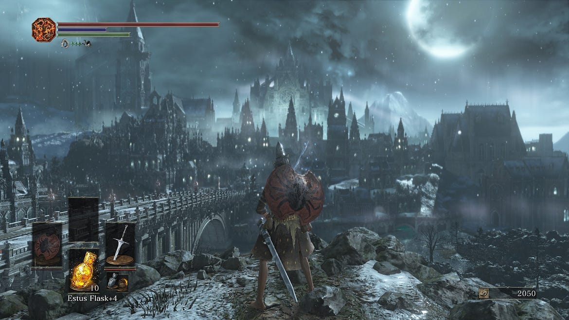
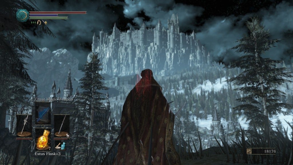
In a post I wrote a long time ago, I spoke about the differences between the environmental and level design. Level design is about building the obstacles and challenges, while environmental is about architecture and space. The combination of the two was a huge part of the success of the Soulsborne games. It’s not just about designing challenging obstacles courses but building a space that fits the world and theme of the game. There’s architecture to the world in these games, not just moving from one corridor to the next.
Every area has a unique aspect to it that stays in the players’ mind, making it easy to create a mental map of what’s going on. There’s a sense of progression in each area of the game: moving from one challenge to the next, and most importantly, the world is not a giant maze. I can look from one end of an area to the other in a Soulsborne and be able to chart where I want to go from there.
Every other soulslike I’ve played just creates a mishmash of corridors with very little care to how things are supposed to connect. Oftentimes, paths will lead to dead ends with nothing in them, and every area looks the same. Before anyone comments, having a ton of fast travel points does not make this acceptable.
A frustrating example of this would be the Surge and how confusing it can be to get around. Part of the problem is that many developers focus on very enclosed areas — where the player can’t see the world around them. When you’re moving from one enclosed area to the next, you can’t easily determine how they’re related to each other. It’s the difference between walking through a neighborhood and seeing the different buildings and businesses vs. being in an office complex and walking through hallways that all look alike.

Good world design allows the player to use it when creating a mental map
In Dark Souls, you can stare from the top of Blight Town and look down at the mass of shanty areas and pathing that you will be doing over the next few minutes. In Mortal Shell, the very first area is a confusing swamp where at one point I can somehow find a shortcut that somehow wraps around from one complete side of the area to the other.
Developers often will focus on either environmental or level design, whereas to make a good soulslike the two must be one in the same. Guiding the player through the world is an example of masterclass game development and would be too much to get into here.
Finally, I want to talk about how frustration is the most frustrating aspect developers and consumers get wrong about Soulslike design. Demon’s Souls did something special when it blew up over a decade ago: it brought difficulty back into the conversation among AAA developers.
For many, they view difficulty as a badge of honor: something you need to work for and earn to feel proud about. Unfortunately, many people don’t understand the nuances that come with designing a challenging game. There is a fine line between challenge and frustration, and hard games aren’t automatically considered good.
Making a game that is frustrating to play doesn’t make it a challenge, it just makes it frustrating. I’ve lost count now on forums of videogames when people ask for quality of life features that fans attack them for “not getting it.”
Frustrating elements and pain points are bad design, full stop, and are one of the major reasons why I stop playing a lot of games. There is not one videogame in the history of the industry that should be proud of having bad design. I’ve seen comments from people saying that the frustrating elements serve a purpose to prove that someone is committed to playing a game, and that is just nonsense in my book.
The motto of Soulsborne isn’t “Prepare to Die”, but “Tough, but Fair.” Making it harder to appreciate the core gameplay loop of a title with frustrating or confusing aspects doesn’t add to the game but take away from it. Is Soulsborne perfect from a user experience standpoint? No, but it gets more things right than it does wrong compared to games that try to imitate it.
One such example is moving away from having punishments or difficulty increases for players who do poorly at the game. This was one of the complaints about the world tendency system in the original Demon’s Souls and how unaware players would make the game harder without realizing it, and I’m very curious to see what From Software does with it in the Demon’s Souls remaster.
When a game gets its playability right, then it doesn’t need to have arbitrary difficulty settings to make things easier or harder, which I’ve always been against. Having a focus on user experience (UX) design doesn’t make a game “dumb down” but easier to enjoy and approachable. To further elaborate, it’s important to pay attention to the people who are arguing about difficulty design. If less than 50% of your player base is making it past the first hour of your game, that should be a clue that something is going wrong in the onboarding process.
One QOL issue that I’ve seen in two different games lately is the lack of easy fast travel in Mortal Shell and Hellpoint. Both titles have important resources and services back at the player’s home base, but neither one makes it easy to head back. Hellpoint gives you a limited consumable to create fast travel at the rest points, that you must farm in special areas to get more of.
Mortal Shell does allow you to warp items and shells to you, but these are consumable items that the player needs to find.
As a developer, you need to be mindful of listening to the vocal minority and avoiding the echo chamber effect that comes with it.
Soulslikes have become an interesting off branch of the challenging nature of roguelikes. However, just like roguelikes, developers need to learn that onboarding and playability are important if you expect to grow a franchise and a genre.
People who only look at Dark Souls and say its meant to be difficult are missing the details of these games. Recently I talked about Doom Eternal which was another game with polarizing opinions on its difficulty and design. Understanding what the game wants you to do is just half the puzzle, the other half is figuring out what tools are at your disposal to win. These are games that have a higher skill floor compared to other games, but they do a better job compared to some of the other soulslikes I’ve played in terms of getting the player acclimated to things.
We’re not done talking about pain points, and in an upcoming piece, we’re going to talk more about how detrimental they are to a game’s success.
If you enjoyed my post, consider joining the Game-Wisdom discord channel open to everyone.
For more on my thoughts on roguelike design, my third book Game Design Deep Dive Roguelikes will be out by the end of the year and acknowledgments are currently open on my Patreon
Read more about:
BlogsYou May Also Like