Trending
Opinion: How will Project 2025 impact game developers?
The Heritage Foundation's manifesto for the possible next administration could do great harm to many, including large portions of the game development community.
Accessibility is a popular topic among developers and game dev discussions, but today's post talks about the design trap of only thinking about accessibility and not UI/UX, and ending up with a game all the worse for it.


One of the hardest skills to pick up when studying game design is being able to think outside your own skill set and knowledge base to see how someone else can figure out, or get stuck, at a game. This also leads into the discussion of game balance and UI/UX (user interface, user experience) design. I want to talk about something that is going to sound very weird at first, but it’s a design trap I’m starting to see that people aren’t talking about. For today, we’re going to discuss when a focus on accessibility without approachability can make an accessible game inaccessible.
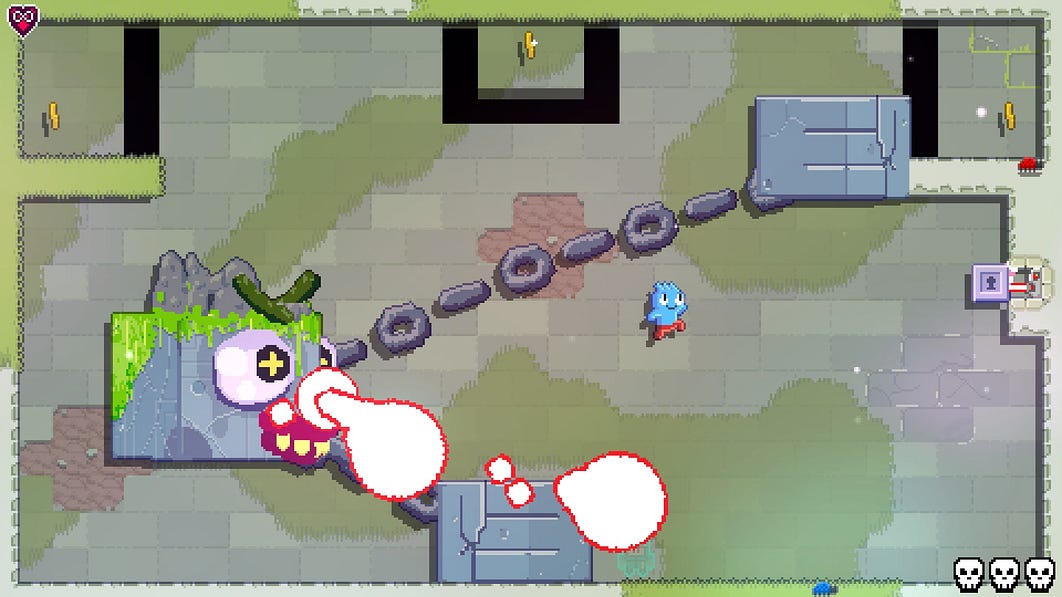
I’m working on either a video or written review for the game Toodee and Topdee by Dietzribi. This is a puzzle platformer built around the idea that you can switch between side-scrolling and isometric viewpoints that affect how objects and enemies behave in the world. While the funny story and great art may lead you to think that this is a casual or easy experience, it is anything but.
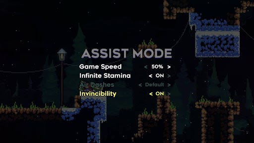
The puzzle logic required for playing is advanced and combined with a lot of tricky platforming and one-hit deaths. One hit deaths, good story, tricky platforming… that should sound a lot like another indie platformer that was released in 2019. Just like Celeste, Toodee and Topdee feature an “assist mode” in the form of a difficulty setting. This allows you to turn on infinite hits, increase jump height, and other features designed to make the game easier for people who want it.
Except there’s one problem, people aren’t doing that and instead are dropping out. At the time of this piece, it’s still too early in the game’s lifecycle to fully analyze its achievement and completion rates, but the downward spiral of churn can be seen quite easily. The difficulty spike going from chapter 1 to chapter 2 is immense for this kind of game, and at this moment, the game lost almost 70% of its player base in less than an hour. Down the road, I am going to do a deeper look at the completion rates for my show Completion Critiques, but this is not what you want to see the opening week of a game. The exact moments of frustration I had with the game are almost directly related to where I see the churn rate spiking on the achievements page.

assist modes do not correct or fix pain points in a game’s design (image from accessibility guidelines)
This can also be seen in Celeste that had high churn spikes despite having a mode that let people who got stuck literally turn off any difficulty with the game.
And that raises a question: Why do games with complete accessibility tied to their gameplay not helping people finish it or have high clear rates?
I can’t think of a catchy title for this phenomenon just yet, and if you can, let me know in the comments. What happens is when a game when trying to be as accessible as possible ends up doing the opposite and making an experience that is not retaining its player base.
Both games mentioned make use of their accessibility features outside of the core gameplay loop and UX. As I’ve spoken about many times, the core gameplay loop and UI/UX of a title are more important than anything else when it comes to the success of your gameplay. If those three elements aren’t working right, no amount of story, aesthetics, or even accessibility, is going to keep people playing.
With both games, I could see issues with how they onboard and guide players through the mechanics, and I feel that both could have done a better job with their skill curves. Having an assist mode is no substitute for UX or onboarding. With Toodee and Topdee I got stuck at a puzzle primarily because the puzzle used a rule that was not explained prior and expected the player to know it ahead of time. The lack of an undo feature, in a game where one incorrect move could cause a restart, is a noticeable quality of life issue. I felt like instead of learning mechanics and interesting solutions, the puzzles felt more like fighting gimmicks in the design. Speaking of fighting, the boss fights combine both puzzle-solving and platforming and can easily lead to frustration as the game does not onboard the player to the elements and boss behaviors of these fights prior. In fact, the skillset required to beat the bosses is oftentimes different from what you’re going to use when solving the stages.

Games with high difficulty will have higher churn, but good UI/UX will often lead to more fans finishing it
The issue is when an assumed focus on accessibility with the UI/UX being ignored or downplayed in a game leads to it not retaining people who grow frustrated with the problems. Accessibility does not course correct issues or pain points in a design. No amount of accessibility options will save a game with systemic problems.
A great design and solid UI/UX, with accessibility built from that point, is a far better experience for everyone. What we’ve seen from consumers is that given the choice of turning on assist features or quitting, a lot of people are just going to quit, but there is a better way of presenting these options.
In a previous post talking about difficulty and how it must be factored into a game, I said that designers don’t have the luxury of ignoring difficulty. Assist modes, or in-game cheat options, are like trying to fix a hole in a ship with band-aids. The best ways of implementing difficulty options to make things easier or harder involve integrating that directly into the game.
This can either be done implicitly or explicitly based on the design. Many games that allow the player to customize their characters into different classes or roles can have intrinsic difficulty settings based on their complexity. In Monster Hunter World and the series, every weapon type has its own unique gameplay that requires the player to learn the rules of using it. Maining with the hunting horn is a far different experience compared to using the great sword. In RPGs or team-based games, oftentimes healing classes are less strenuous to use compared to attackers, letting someone contribute to their team without needing the best skills.
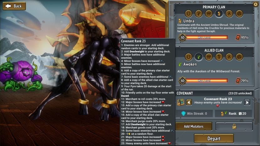
What we have seen from roguelikes and roguelites over the last few years has been integrating not only the concept of a roguelike directly into the story, but the difficulty and progression as well. Systems like progressive difficulty in Slay the Spire, or the ability to fine-tune the difficulty in games like Bastion and Hades, are all about giving the player control over what aspects they want to make harder. I can’t stress this enough, difficulty design is not only about figuring out ways of making a game easier, but interesting challenges for players who want to go for something harder. There are players who want to make use of all the systems and mechanics in your game, and if the game doesn’t give them the opportunity, they’re going to leave the game disappointed.

Roguelikes and Lites have been giving players more control over their difficulty; tailoring the experience to multiple skill levels
Better examples of difficulty are not about having the difficulty exist as a menu setting but putting it directly into the game. By changing the difficulty, the world around the character changes as well or having an NPC who can make the game easier or harder. If you can provide a different experience for multiple skill levels that feel right for each, that is a great way to go. The key takeaway is that these elements are within the game space, not on a menu the player must go to. I don’t have the psychology background to delve into this, but I do wonder if there is a stigma among consumers when it comes to leaving a game to tweak the difficulty as opposed to it being in-universe.
With that said, however, there is one other point that I need to mention. If you are looking at making your game “consumer-friendly” it is far better to have difficulty settings, even if they aren’t the most balanced, than not to have any at all. On Completion Critiques, I’ve noticed that games with multiple difficulty settings will typically have higher clear rates and less churn compared to a title with just one blanket difficulty setting.
Accessibility features are an important part of making a game more available to a larger audience and should be included as standard features, but they are no substitute for UI/UX design and improving the playability and approachability of a game in terms of player retention. While plenty of people will praise accessibility features in titles, there is very little discussion about how UI/UX and approachability options can greatly improve a title. Returning to Monster Hunter World, one of the goals of the design team was to dramatically improve the onboarding and UI/UX of the game compared to the niche prior entries. While I wouldn’t say that MHW is perfect, it was still far easier and enjoyable to get into compared to trying some of the older titles, and the proof that worked came with it being considered the best-selling game Capcom has ever made to date.
What can become problematic is using accessibility and assist modes solely as a way of dealing with your pain points inherent in the core gameplay loop. Your game should not be balanced or designed in a way that the assist options are the best way to play it due to frustrating elements. When I played the game Ikenfell by Happy Ray Games, while I really enjoyed the story, the combat and general gameplay wore on me to the point that I just turned on “auto victory” and blazed through the game. In the end, I did finish the game, but I finished a game completely divorced from the act of playing it. I eventually reached the point of frustration in Toodee and Topdee that I turned on the infinite health option to get through the game.
Some of you may say that both examples were a victory of the accessibility options, but I would argue that was due to problems with the design. As a designer, you should always be looking for ways to improve the UI/UX of your game, and if you’re not, then you can start losing customers for your future projects.
I’ve said this before: when a game does UI/UX right, no one will say a word about it, but when they mess up, you’re going to hear it from the rooftops. If you only focus on accessibility and ignore playability, you’ll end up with a game that everyone can play, but no one will want to.
For the reader, what do you think are the unsung heroes of playability and approachability in a videogame? Do you have any good examples of UI/UX that greatly improved your experience in a game?
If you enjoyed my post, consider joining the Game-Wisdom discord channel. It’s open to everyone.
Read more about:
BlogsYou May Also Like