Trending
Opinion: How will Project 2025 impact game developers?
The Heritage Foundation's manifesto for the possible next administration could do great harm to many, including large portions of the game development community.
The phenomenon of players turning “a blind eye” to certain points is more related to selective attention mechanism.

In game research and development, there is a common phenomenon: when some players start new games or new gameplay modes, they often complain that the game's tutorial is unclear and they don't understand how to play; on the other hand, game planners feel very confused because there is clearly a large section of gameplay introduction in the beginning, so why do players feel that the tutorial is not enough?
Some experienced players feel that new ones are particularly "clumsy" when they team up to play, even if the information is obvious, new players will sometimes say they didn't see it.
So, how does this kind of "blindness" of players occur? Are they really unable to see, or do they just not want to see it?
When players are playing game tutorial, they need to go through the following steps in order to eventually master the gameplay: see the tutorial---know what needs to be done---complete it---learn it. If any of these steps are missing, players will not be able to master.

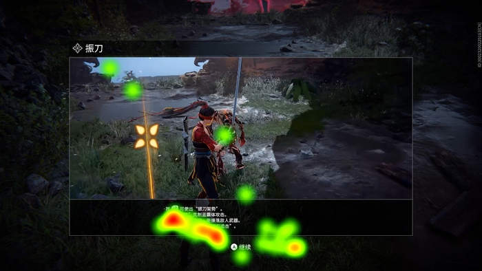
In the initial expectations of a research project, we believed that players who are stuck in the beginning stage may have more difficulties in "completing the tutorial", that is, adjustments need to be made to the task settings. However, eye-tracking tests showed that more players were stuck in the first two steps, meaning that players did not even see the guidance, and this is not because players are unwilling to watch the tutorial text or video. In playtests, even if players were asked not to skip the tutorial and to follow the prompts step by step, they still miss a lot of information. Psychological research also confirms that this "invisibility" of players is not only common but also innate and related to selective attention mechanisms.
If human brain is like a television, then external information is like various television programs, and attention is the process of selecting television programs. Only the television programs that finally appear on the screen can be consciously perceived by the audience. Although people can consciously choose what programs to watch most of the time, there are also many situations where this selection is subconscious. Among them, what people can naturally pay attention to without conscious effort is called involuntary attention. For example, it is difficult not to hear a ringing mobile phone all of sudden in a quiet meeting room, and a red flower in a green lawn will be more eye-catching than a green flower. Attention that requires conscious effort and active engagement could be called voluntary attention, such as reviewing for exams, learning new and useful but dull knowledge, etc.
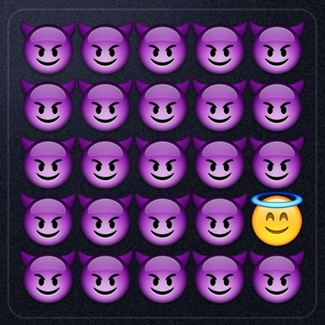
There is a theory that suggests that involuntary attention is a subconscious response that does not consume psychological resources; but paying attention intentionally requires the player's mind resources. Therefore, when receiving multiple external information, due to limited cognitive resources, players will make selective attention, that is, only looking at what they want to see and the most important information, ignoring some other information.
In games, players not being able to see the tutorial means that the current guidance may occupy too many psychological resources, causing players to exert too much effort to play the game. To attract the attention of new players in the game, it is necessary to manage the player's attention well and try to attract their attention without being too intrusive.
The features of information itself are unique and distinctive.
For example, it could be something that is not commonly seen happening in a game, or a distinct difference from the surrounding game scenes. When helping players learn dodge control in a game, there is usually a prompt in the form of text or visual effects. If the boss is going to deal damage, the screen color or brightness changes noticeably, such as a bright red circle appearing to indicate the skill range, the player will immediately pay attention to it without any additional effort. However, if there are only text prompt changes, some players are likely to miss it. This is because the tutorial prompt in the game is usually fixed on the left side of the screen, and when it appears in this state, the area lacks changes in the player's line of sight and has low distinction from the surrounding scene, so it will be instinctively ignored.
The information aligns with one's own state, interests, and needs.
It means the more the information matches the interests of the player, the more attention it can attract.
For example, when a new player starts a new type of game, he/she may have some questions and expect a proper tutorial to let them into the game smoothly. At this time, the pop-up guide will be more easily noticed. On the other hand, an experienced player who is playing the game may not expect or have a need for tutorial and may act before consciously thinking, making it more likely to miss many relevant instructions in game.
How can the above and related features guide the design of tutorials? The following are just a few interesting examples.
What is the better form for tutorial?
Common tutorials usually include text, pictures, and videos. Based on actual life experiences, we tend to believe that a picture is worth a thousand words and a video is worth more than ten pictures. Research also shows that focusing on pictures can improve learning outcomes more than focusing just on text. However, other studies suggest that the superiority of pictures over text is not absolute, and that the contrast effect should also be taken into account.
Contrast Effect 1: Players see the pictures in thousands of texts; they tend to look at texts inside pictures. Highlighting the differences is essential.
When observing surroundings in the real world, our attention is always drawn to the text embedded in these scenes, such as the text on signs or billboards. A study of travel photos found that people tend to focus more on the text in the photos, regardless of the content of the text.

When conducting eye tracking playtests on Naraka: Bladepoint, we unexpectedly found that players' gaze duration on text was significantly longer than images displayed simultaneously in the game. This means that people always tend to pay more attention to information that stands out. Whether the game chooses text or image tutorial needs to be determined based on the game's feature.
Contrast Effect 2: Less is more. The more white space there is, the easier it is to be seen.
When there is too little space between a logo and the main title, people will spend more time looking at the logo rather than the title. However, when the spacing between the logo and title is increased, people's attention on the title text will be enhanced. When two buttons are too close, they will compete for attention. After changing to only one option, people's visual attention is improved.
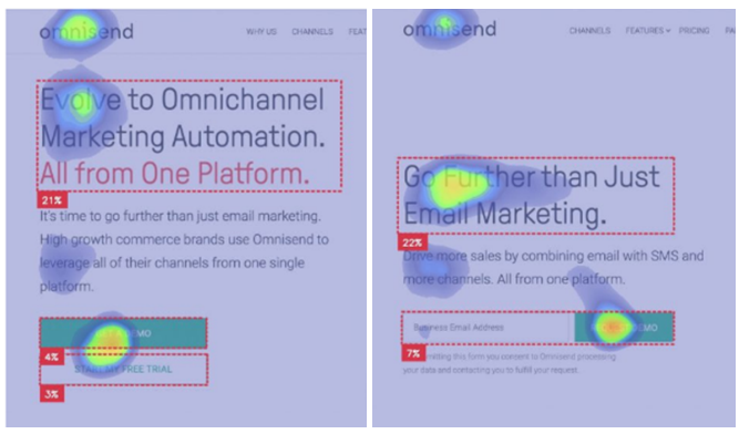
In games, in order to avoid competing for attention, extra space can be added between important prompts and buttons, while it is necessary to avoid presenting important information densely in a block of text.
Besides bombarding with visuals, what else can tutorial do to attract attention?
For the common problem of players not understanding the tutorial, developers may easily want to "write more detailed guidance/introduction to offer more information" to help players obtain gaming skills. However, the contrast effect has pointed out that dense text can cause players' attention to be distracted, and highlighting the key points requires more white space. So, what else can be done?
Multi-form present: Visual and auditory multi-sensory presentation.
Compared with players who only focus on visual or auditory cues, players who simultaneously focus on both visual and auditory process information faster and more accurately. Auditory information can attract a player's visual attention to the direction indicated by the audio signal and enhance subsequent information processing efficiency.
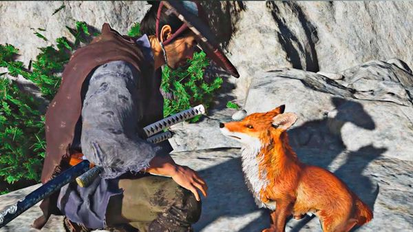
For example, in Ghost of Tsushima, when players are near the camp, they may hear singing, drumming, and playing of the horsehead fiddle. They may also hear the sound of a pipa being played, which can lead them to the storyteller and guide them towards a new mission. Foxes in this game are another example, as their short and sharp calls have managed to capture the player's attention early on, making it less likely for players to miss the guide and ultimately leading them to the shrine.
Clue guidance: Any form of suggestive clue can lead players to focus on the key points more quickly.
Proximity Effect: The closer the text and image, the better the learning effect.
The position of pictures and text can also affect people's attention to learning materials. The closer the picture and text are, the longer people will look at the learning material, resulting in better memory of the learning process afterwards. Moreover, when pictures and text are adjacent, people switch their gaze between the pictures and words more frequently. This means that the adjacency effect affects people's attention allocation and thus improves learning efficiency.
Human eyes tend to follow arrows, and key points can be highlighted by hand-drawn arrow cues.
Designers always hope to use visual cues to try to guide users' browsing direction on web pages. So are visual cues more effective than others? Research has tried different forms such as hand-drawn arrows, photos of people (looking at or away from the table), line cues, and adding border outlines. The final results show that visual cues do affect users' attention, with hand-drawn arrows most effectively directing users' attention to tables.

The phenomenon of players turning “a blind eye” to certain points is more related to selective attention mechanism. The features of attention determine that people only see what they want to see. Game design should give care to attention management of players and try to trigger their involuntary attention, rather than forcibly instilling it.
Read more about:
BlogsYou May Also Like