Trending
Opinion: How will Project 2025 impact game developers?
The Heritage Foundation's manifesto for the possible next administration could do great harm to many, including large portions of the game development community.
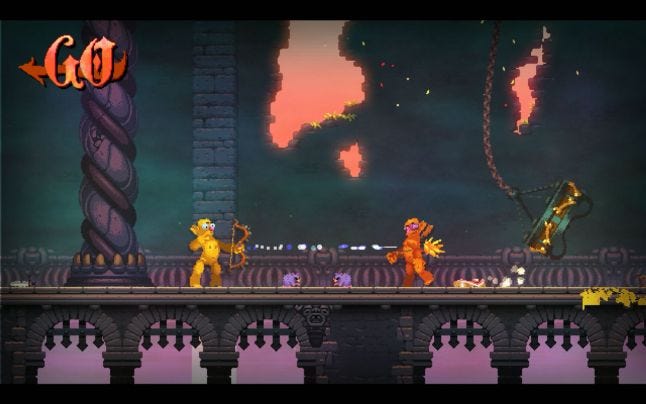
The 2014 Nidhogg was a minimalist duel between two monochromatic stick figures. The sequel adds more graphical detail and more weapons, but tries to maintain the accessible simplicity of the original.

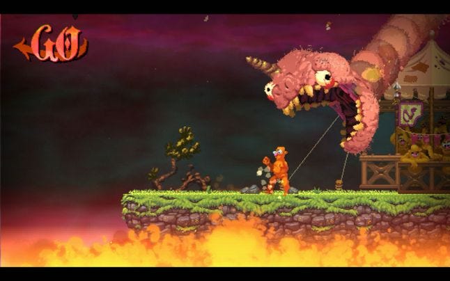
Messhof's 2014 game Nidhogg is a tense side-scrolling fencing battle. Two simple stick figures armed with swords press fleeting advantages, trying to land a kill shot that reduces their opponent to a shower of monochromatic blood. Deaths are temporary, giving you a few seconds to race towards your goal. Reach the far end of the level, and you are rewarded with a glorious fate--being devoured by a giant mythical serpent.
The simple-looking, yet incredibly deep game was a great success, winning awards through the IGF and Indiecade and accruing hundreds of thousands of sales (according to SteamSpy.) Many singled out the directness of the controls and the minimalist aesthetic as the key to its charm.
We just got a first look at the sequel, due in 2017. It employs a more detailed graphical style, and presents players with an array of weapons to choose from. Why this departure from the stark simplicity of the original?
Mark Essen, half of the team at Messhof, says that these additional features are things that he and co-developer Kristy Norindr have had in mind since they were working on the original. "There were a lot of things that didn’t make the cut, either because they would take too long to make or because it was unclear how they would fit in with the existing move-set in a way that made sense," he says.
"Since release, the list hasn’t stopped growing and Kristy and I would often find ourselves asking each other 'Well, what if x didn’t do this but instead did this!' and then little by little things clicked into place and it felt like it was time to start implementing those ideas."

Essen had a very clear idea on what it was that made Nidhogg appeal to so many. "It’s a great spectator game-- much like a fighting game there’s no hidden information or split screen," he says.
"You can start watching a match at any point and quickly find your bearings. We absolutely wanted to keep this aspect."
Nidhogg (right) was easy for beginners to just pick the game up and know how to fight. "We also wanted to make it easy to learn by limiting the number of buttons and keeping away from canned combo moves and complicated controller input sequences." says Essen.
While a player may know how to play, knowing how to play well would require time and experience. A simple series of button inputs did not mean that the interplay between moves was simple.
As such, the game's complexity is derived from its interplay. How the player interacts with the opponent with their moveset, how their positioning in a given arena affects combat and attacks, and in knowing what the opponent can do given a singular set of abilities is what gives Nidhogg its challenge and depth.
Nidhogg is a very delicate dance between two fencers, and the game is designed around the interplay between the player's capabilities, their relative positions in each arena, and the weapon's abilities. To add another weapon or location would mean balancing it all within the existing parameters of the game, making radical changes to its current interplay.
Despite that very specific balance, the thing most people wanted was to add more things to it. "Probably the most requested features were more levels and more weapons," says Essen.
"We are still limiting ourselves to a minimal control scheme of six buttons (4 directional, attack, and jump) [for the sequel] but we are adding new weapon types, each with their own nuances," says Essen.
"We’re trying to add complexity primarily through new weapons that play off of each other in interesting ways. More weapons means more combinations to consider, more strategies to remember and expectations to subvert. Right now we have four weapons and we’re working on a few more, with many more on paper!"

Still, adding throwing knives and axes and bow and arrows drastically changes the way the sequel would play compared to the original, as the game would no longer be about the interplay of a single weapon's abilities in the hundreds of specific situations the player could find themselves in.
"Sometimes the weapons have gotten a bit too complicated in terms of stances. Others have felt like you need input combo sequences to use them and we’ve had to scale them back." says Essen.
"At its core, the game is using the mechanics of the original Nidhogg, so when we show it to veterans of that game they pick it up instantly. We’re being careful to add variety without totally throwing out the metagame of the original."

With the increase complexity of the weapons, Essen felt it was only natural to communicate that increased depth with the game's visuals.
"We wanted to make a bigger game and alter all aspects, so it made sense to get help for the art," says Essen. "We found Toby Dixon during our hunt and together we came up with a look for the new game that felt like an evolution of the world that was hinted at in the original."
Still, Essen didn't just create a new art style for the sake of making something new. Given the importance of the spectator aspect of Nidhogg, Essen wanted to add in more details and things for players to watch.
The characters have facial features now, and they react to being wounded and stomped in ways that the stick figures of the original game couldn't.
"We wanted to try something new and make a higher resolution game," says Essen. "With more pixels to play with, we were able (with Toby’s help of course) to create more visually interesting scenes that are packed with small details that you might not notice the first few times around."

Nidhogg 2 appears to be a partial departure from the its predecessor's spirit, moving away from single weapons and sharp, monochromatic characters, to goofy, animated characters and multiple weapons.
But like the original, there is a great deal of depth beneath what people see at a glance, and this new look and new weapons hide the same carefully-paced and thought-out interplay of the original. Every element may appear new, but it just builds on what made Nidhogg complex, dramatic, and fun.
You May Also Like