Trending
Opinion: How will Project 2025 impact game developers?
The Heritage Foundation's manifesto for the possible next administration could do great harm to many, including large portions of the game development community.

Featured Blog | This community-written post highlights the best of what the game industry has to offer. Read more like it on the Game Developer Blogs or learn how to Submit Your Own Blog Post
How do you make action combat feel fair when players face insurmountable bosses? Lessons from Elden Ring, Sekiro, Death's Gambit, and techniques used to increase difficulty without sacrificing readability.

We released Death’s Gambit in August of 2018. It’s a notoriously difficult game and we liberally classified it as a Souls-like, for better or for worse, before the media went rabid with the term. Most people correlate Souls games with difficulty, so to Gamasutra, we were uniquely suited to talk about how we designed a game that expected you to die. I’ll link to the original article here. 4 years later with an Expansion and DLC under our belt, I thought it would be a good time to revisit the first question we were asked. How do you design difficulty to be challenging and rewarding, rather than frustrating?
(For an audio version you can listen to this article on Medium)
Difficulty stems from a myriad of variables depending on the genre. In the context of action RPGs, difficulty is how likely you are to die. As a designer on Death’s Gambit, I’ll be using my experience to focus on one topic: readability. Readability is what makes a fight feel fair and how you subvert player frustrations. Thank you for coming to my GDC talk.
Readability can be broken down into telegraphing (what happens before) and expectations (what happens after), and arguably has the largest impact on frustration (assuming controls and hitboxes are tight and well tuned). If a player can’t tell something is going to kill them and it does… queue the rage compilations.
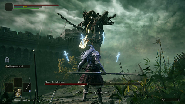
Readability is about giving players an opportunity to recognize patterns and their countermeasures. If movesets are all the available actions of a boss, patterns are their repeated behaviours. Large gestures, color coded attacks, voice and sound cues, are all forms of telegraphing that can signal the start or stages of a pattern. Take Morgott’s iconic line from Elden Ring — “Well, thou art of passing skill.” It signifies a phase change and his ensuing pattern is always the same. As he soars through the air with a holy hammer twice your size, you’re probably thinking ‘I should run away,’ because it’s the most obvious and safest countermeasure.
It takes mental energy for players to break down patterns until their solutions start feeling like “muscle memory”. This act of “chunking” as it’s known in cognitive psychology isn’t just about reaction time. It’s about off-loading learned patterns so your brain can expend energy parsing new ones. The more complex the pattern, the harder it is for players to chunk, but the more rewarding it will feel to master.
The ultimate balancing act of designing difficulty is giving players enough time and information to chunk patterns before they get bored or give up. How you tune this depends on your target audience. Most players get bored if they are deciphering patterns faster than the game introduces new ones. And most players give up when they feel they’ve exhausted all their options to try and counter a pattern without success. This is where expectations in readability becomes paramount.
Expectations are about establishing a visual language that matches the expected outcome and remains consistent. Take Morgott’s leaping hammer attack. You expect it to crush you, so you opt to create distance. What you learn from the Morgott fight will carry over as a viable countermeasure every time you see an enemy leap into the air. Visual consistency is incredibly important and can be as simple as ‘doors with a red light cannot be opened’ or as complex as ‘hammer attacks when glowing red cannot be blocked’. You can have doors and hammers of all shapes and sizes, but if they glow red, the expected outcome should always be the same.

It’s also important that the relative damage numbers match the perceived danger. If the player dies from stubbing their toe, expect to receive some strongly worded DMs. If the player dies from a meteor that craters the land, still frustrating, but at least it was epic. A notable caveat here is that if players perceive an incoming attack as dangerous and it does less damage than they expect, it’s a brow wiping “PHEW” moment. But you’re also making your boss less threatening. A few games including Elden Ring have a feature where there’s a chance players survive a killing blow with 1 hp. It’s a great way to subvert expectations in the player’s favor and really get the adrenaline pumping without undermining your boss.
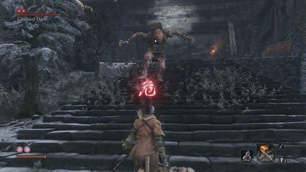
Sekiro introduced the 危(danger) symbol to specify that perilous attacks required specific counters. The symbol and sound cue warned players to pay attention to the readable elements of an enemy. A thrusting pose meant you were to mikiri counter. Open hands meant you were to side-step their grab. Reeling their weapon back meant you were to jump over their sweep. The visuals were consistent with the expected behaviour. An open hand never meant they were suddenly going to switch into a sweep attack. Not every game needs the 危 symbol, but FromSoft probably realized there was only so much players could parse in their blade frenzy of a game before every enemy attack started looking the same. Even with the warning it’s still challenging to counter in the heat of the moment. The lesson here is not to make patterns too subtle or more complicated than your players are capable of chunking. And if you do, give them a crutch (危).
Patterns repeat, but until you recognize the repetition it’s just noise. Don’t compromise readability as a means to increase difficulty. Instead, here are some suggestions:
Challenge learned behaviour. Patterns that string together, and patterns that change their timings both do this. They are usually triggered through phase changes after the player has chunked a portion of a boss fight so they’re not overwhelmed.
Shorten windows of opportunity (WoO). Players are ultimately learning patterns to figure out when they can counter attack. WoO are their reward for parsing patterns. The more downtime between patterns, the easier it is. Conversely, the less downtime, the harder it is. This can be a real test of patience however, as the longer players have to wait for their chance, the more prone they are to frustration— especially if the “waiting” requires minimal skill or a lot of skill. The length of time players need to wait should be proportional to the WoO they get. Look no further than Letho from Witcher 2 as an example of what not to do.
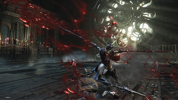
Add modifiers. FromSoft loves to do this, whether it be elemental enchantments or larger areas of effects. The patterns usually stay the same, but they become deadlier with longer range or damage affinities that target specific resistances. A side effect of increasing range however, can be a narrower WoO because players spend more time running in and out of the bosses range.
Increase the speed. This is a cheap and simple solution. Just make sure you’ve given the player ample time to chunk patterns before going turbo mode on them.
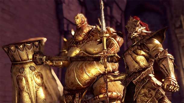
Introduce a partner. Ideally this should be reserved for entities that you fight individually throughout the course of the game. Players need a chance to get familiar with their patterns before you suddenly put two of them together in an enclosed room. It’s much harder to chunk two different patterns at the same time. That’s why Ornstein and Smough were so impossibly difficult, but ultimately memorable.
Clone them. The reason this is separate from “Introduce a partner” is because when you clone a boss, they share a moveset. You still only need to learn one set of patterns. It’s just coming from two sources now.
Add a timer. Players tend to hate this, but it really depends on how you implement it. A timer should force players to think more deliberately about their actions because they’re against a clock. They can’t afford to dilly dally baiting out attacks or circling around trying to find the perfect moment. I’d say so long as the countdown doesn’t signify your unavoidable death, it’s alright to have.
Resource management. You see this a lot in MMOs, whether it be health or mana drains that require specific actions to mitigate. In Death’s Gambit we had Death suck up your soul energy (the main resource for your abilities). If he absorbed enough, he’d become empowered dealing 9,999 damage with each swing. The minigame here was expending your soul energy consistently so he’d never have the chance to syphon it.
By no means is this an exhaustive list, but hopefully it gets you thinking about creative ways to increase difficulty. Leave a comment about other creative ways you’ve seen difficulty implemented.
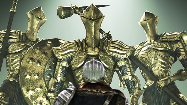
Readability is about making a fight feel fair. But at the end of the day, everyone will have a different threshold for frustration. So try to set expectations early and design for your intended audience. Readability is information. As long as players are registering that information, they should have some idea of their available options. Teach your visual language properly, enforce the expectations, and keep it consistent. Smart designers will also be thinking about ways to alleviate frustrations outside the boss fight itself. But that’s a topic for another time.
Any challenge that feels fair will be satisfying to overcome. It doesn’t hurt to reward players with sweet loot and experience too.
Follow me on twitter @keikube
Read more about:
Featured BlogsYou May Also Like