Trending
Opinion: How will Project 2025 impact game developers?
The Heritage Foundation's manifesto for the possible next administration could do great harm to many, including large portions of the game development community.

Featured Blog | This community-written post highlights the best of what the game industry has to offer. Read more like it on the Game Developer Blogs or learn how to Submit Your Own Blog Post
Learning any video game is all about an effective onboarding process and providing the player with the right amount of feedback and information. For today, we're going to talk about how much is the correct amount of info to give to the player.

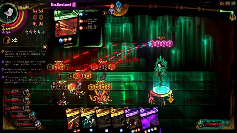
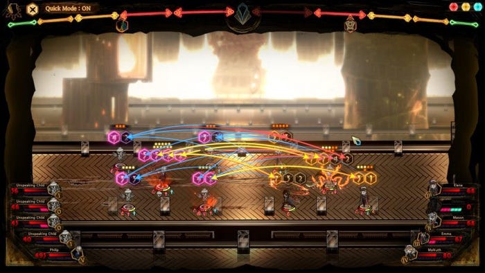
I’ve wrapped up my play of Library of Ruina and there is one consistent problem with the game, and I’m sure one of the major pain points for everyone who played it: A lack of feedback. When it comes to learning a video game, feedback is one of the most important teachers and must be integrated into the UI for it to work. For today, I want to talk about the line between too little and too much information, and where developers need to fall on it.
When it comes to playing video games, feedback is an essential part of the learning process. While tutorials can certainly teach someone the basics, the use of feedback is required for them to understand the consequences of their actions.
In previous posts and videos, I explained that a tutorial needs to explain the following to the player:
What am I Doing?
How Do I Do it?
Why/When do I do it?
Without those three questions answered, the player is not going to be able to understand what is happening in the game. This is where feedback comes in, and why it differs based on the genre and design.
The golden rule when it comes to feedback is that you want it to be immediate — the player does one thing, they immediately get one response. Therefore action-based design is often easier to learn or grasp compared to abstracted. If I’m playing a platformer, I can often extrapolate multiple jumping angles based on how I push down the jump button in milliseconds. When you mess up in an action game, it’s very easy to see the results of your mistake:
You jumped too high and hit your head on spikes
The giant lifted his ax above his head indicating that it was going to smash it in front of it
The green titles meant it was a spike trap
The problem with abstracted-based gameplay (RPGs, strategy, etc.,) is that feedback is not 1:1. I can attack an enemy, the attack can connect with its body, and I still get a “miss” result. Good UI design is about hiding the confusing elements and rules from the frontend — this was a major aspect of mainstreaming CRPGs in the early 2000’s — but when this comes at the cost of learning the game, it becomes a problem.
With Library of Ruina, so much of succeeding in the game is about finding ways of boosting your dice rolls and damage. This comes in the form of buffs and passives you can attach to characters. The problem is that when it comes time to see the results of your rolls, none of those extra features are mentioned, and the ones that do barely stay on the screen for a few seconds; making it almost impossible to figure out why something worked or not.
There is a line when it comes to too much and too little information, but game developers need to learn where to draw it for their games.
To figure out what to do in a video game, the player needs enough information to make an informed decision. With too little information, the player won’t understand what is going on and be able to follow the gameplay. If there’s too muchinformation, then the game is effectively playing itself without need of the player to interact.
When I think about important information the game needs to tell the player, it falls into two distinct groups. The first is information that is a memory challenge — or fixed information that’s only a mystery one time. There are plenty of games that have information that is only there to be a roadblock to first-time players. This category includes any fixed outcomes to choices or those that require memorization. If the solution to a problem is simply having a wiki open, then you’re not challenging the player with gameplay, but how well their memory works.
In The Binding of Isaac, there are now over 600 unique items that can show up during a run, and there is no way you’re going to remember all of them without having access to the wiki. This is why one of the mods people install lets you see what an item does before you pick it up, and why subsequent action roguelikes give the player this kind of information.
The second category is the information required for decision-making. This isn’t about telling the player the correct option but informing them what their actions will do and let them make the decision. There is a difference between telling the player to do X and telling them what will happen if they do X, Y, or Z. Games like Monster Train that feature dynamically updating UIs allow the player to see what every card’s impact will be during a run — taking out any guessing on the player’s part.

Decisions that require math calculations, looking up rules, or anything that is going to factor into the success or failure of the action should be spelled out. The worst thing is for the player to make an action and have no idea why they should do it or what will happen. If there is some randomization, such as a damage or defense range, the player should still be given a good estimate as to what the outcome will be.
This also applies to events that have random outcomes. You’re not telling the player what the outcome will be, but what are the possible outcomes that can happen. This was a problem for me with FTL and how rewarding and punishing the events could swing, but the game doesn’t spell that out for the player. It is far more interesting to force the player to decide between different “bad” outcomes vs. the player making a choice and having no idea what will happen.
The point for today’s post is that making the player guess is not interesting from a gameplay perspective and will come back to hurt your game’s experience and approachability. Look for areas where your playtesters or general consumers are confused about when playing and see if you can improve the UI. If there is any information in your game that requires the player to look outside of it for an answer, try to have that referenced in-game.
Not every game can be designed around this level of granularity, but the more you can explain what is happening in-game, the better it will be for approachability and the new player’s perspective. If the player understands at the end of a turn, or after a fight, exactly what happened and why then you did your job.
For the reader, can you think of games that did an amazing job of explaining to the player how things work and the results of their actions?
If you enjoyed this story, consider joining the Game-Wisdom discord channel. It’s open to everyone.
Read more about:
Featured BlogsYou May Also Like