Trending
Opinion: How will Project 2025 impact game developers?
The Heritage Foundation's manifesto for the possible next administration could do great harm to many, including large portions of the game development community.
.png?width=700&auto=webp&quality=80&disable=upscale)
A selection of coverage from some of the industry's most accomplished artists and animators, from their GDC 2023 panels.

GDC 2023 was ripe for in-depth talks on art, animation and related visual disciplines. While the Game Developer staff wasn't able to attend every art/animation talk (unfortunately, that's impossible, and we'll be looking on vault for the rest of the year), here are a few highlights from our coverage. We've included deep dives on the cinematics of Horizon Zero Dawn and Gotham Nights, the overall aesthetic of Supermassive Game's horror projects, interview notes from IGF-nominated-and winning projects such as NORCO, Afterglitch and RPG Time: The Legend of Wright and much more.
"Before we get into defining these tools and having examples, I want to use the visual metaphor of a theme park," said Auray after he presented the two gameplay clips. "In a massive open-world game with cinematics, there are sometimes the main quests that will feel like a roller coaster, where it's a high-quality, exciting ride with bespoke cameras and animation."
Continuing with his metaphor, he explained that Horizon Zero Dawn was a combination of roller coasters and "spinning teacups" (the more relaxed ride), which worked for main quests and smaller events, respectively. He stated this was necessary on the original, as the first game's cinematics were produced around leveraging solid voice-over talent rather than having extensive mo-cap performances with the actors.
NORCO takes players to a futuristic vision of Norco, Louisiana, digging deep into the look, sound, and feel of the place as it tells a story of a missing sibling.
"A lot of the visuals were informed directly by the landscapes of suburban New Orleans, having spent years photographing and painting the region. The visuals also got a massive boost when Jesse Jacobi came on board. He’s a very talented traditional painter and applied his skills to pixel art without a hitch."

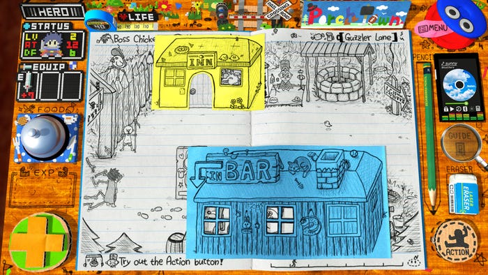
"Instead of a skilled, experienced visual designer, a level designer who didn't do so well in arts and craft classes (yours truly) was the one creating the graphics, which naturally lead to a style that looked very childlike. Because the development period was very long, I was concerned that I may have gotten better at drawing or modeling and that might detract from the childlike style, but unfortunately (or not) I never did improve as much and so that issue never came up."
"The aesthetic for [Until Dawn] was a horror movie, a kind of B-movie slightly cheesy horror movie, but the top-level design idea was a horror movie that you can play," said Heaton about the appeal of Until Dawn. "It was a notion that was delivered something that was quite close to survival horror, but what we wanted was something that looked and sounded and was plotted like a horror movie – we wanted to fool people that suddenly walked into the room to think that you're watching a movie."
WB Montreal's Wilson Mui discussed how Gotham Knights' cutscenes were made with its four heroes in mind, while ensuring they maintained their own individuality.
"Part of the cinematic process involved working towards capturing "the perfect take," which he described as the “best technical, audio, and artistic performance, including body and facial data.” Shooting those perfect takes with each of the four leads lightened the load for film management and outsourcing needs. But before those particular takes took place, Mui brought up how the cinematics team would do an “ugly but functional” first pass to identify what was missing or not working entirely."

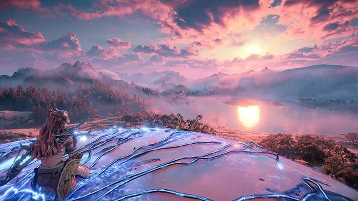
Guerrilla Games' lead living world designer Espen Sogn explains how the team worked to make each tribe in Forbidden West feel unique, and crucially, persistent.
"In order to realize that "living world" the second time around, Sogn's team created tribe-specific animations and resisted the urge to use them everywhere. The team wanted to avoid leaning on "information booth" NPCs to dump exposition on players, and hoped that by ensuring each of Forbidden West's tribes interacted with the world and other NPCs in visibly unique ways, it would hint at rich histories and cultures."
"'If you can't get an idea about who these people are by walking around and observing them, I don't think we'd have done a good job,' explains Sogn. An example of one of those interactions is how sub-faction of NPCs in the Tenakth tribe will draw their knife from a different place, subtly emphasizing their status as warriors."
Afterglitch takes players on a spiritual journey through an almost-overwhelming vision of extradimensional utopian space.
"The utopian sci-fi aesthetic appealed to me. Aesthetics are very important in games for me. It was probably shaped mainly by sci-fi illustrations from the 70's and 80's. I was influenced by the work of Czech painter Zdenek Burian and also by Salvador Dali. Dali's famous work Corpus Hypercubus from 1954 became the basis for Afterglitch. It shows Jesus Christ crucified on a spread-out tesseract (hypercube). This led me to the fourth dimension and to think about how to portray it."
To Hell With the Ugly adapts the Boris Vian novel of the same name into a game of solving your own kidnapping in the boiling heat of 1950's L.A.
"The fans are spinning, we're in L.A., the mercury is rising, and Rock Bailey has "a chaud aux fesses" (a narrow escape) in this story. All of this reminds us of warm colors! The bright colors and strong moods also serve to refresh and make the artistic direction attractive. Also, the flat areas of bright color for the skin bring an original and modern touch and allow the identification of the characters in the more nuanced décor."
Read more art and animation coverage from Game Developer here.
Read more about:
FeaturesYou May Also Like