Trending
Opinion: How will Project 2025 impact game developers?
The Heritage Foundation's manifesto for the possible next administration could do great harm to many, including large portions of the game development community.
With the latest content drop for A Total War Saga: Troy, I figured it was a good time to talk about how user testing and community feedback have helped us evolve the UI/UX of Troy both pre- and post-release.

The Gamasutra Deep Dives are an ongoing series with the goal of shedding light on specific design, art, or technical features within a video game, in order to show how seemingly simple, fundamental design decisions aren't really that simple at all.
Earlier installments cover topics such as building an adaptive tech tree in Dawn of Man, achieving seamless branching in Watch Dogs 2’s Invasion of Privacy missions, creating the intricate level design of Dishonored 2's Clockwork Mansion, and the tech behind Gears Tactics.
In this edition, Alex Tokmakchiev, Lead UI/UX Game Designer at Creative Assembly Sofia, shares how user testing and player feedback helped inform the UI/UX driven design of A Total War Saga: Troy's 'End Turn' button.
Let’s start by looking at one of the most important UI elements in turn-based games - the End Turn button. For a long time during development, our End Turn button looked and behaved very much like it does in Total War: Warhammer II. It used an hourglass icon and if you had pending actions it would show you a different icon for every action.
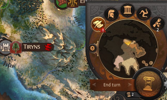
The end turn button represented by the hourglass.
When you clicked on the button, it would select a game object or open a panel to prompt you to act on the corresponding action before ending your turn.

An example of the Royal Decrees notification shown on top of the End Turn button.
This was a good quality-of-life feature that helped remind players of all the actions they hadn't yet completed, but it also had a downside. We would only display the End Turn button after you had resolved or skipped all of your pending notifications, which in mid-to-late game meant that you might have to go through 20+ clicks before even seeing the End Turn button.
However, we didn't give this much thought since we had gotten used to this behavior ever since WH2. Our core players had also seemingly gotten used to it, but then we started doing user tests and quickly ran into unexpected problems.
One of our tests was with a group of gamers who had never played a Total War game before and had little to no experience with turn-based strategy games. Now, I know what you'll say. "Why would you test people who've never played Total War when you have people who've been playing it for 20 years?” Don’t worry, we asked them, too. But Troy was initially released for free on the Epic platform which meant that we'd have a huge influx of players who were completely new to the franchise. We needed data on what the player experience would be for those people.
Spoiler alert - it wasn't great.
So, we prepared a build, organized the test, invited people and started observing them as they played. At this point we were feeling pretty confident with the game, but then people started playing and reality hit us in the face.
One person has spent 40(!) minutes on their first turn because they couldn’t figure out how to end their turn.
Another asked "What do I do now?" after they've done most of what could be done on turn one.
A third recognized the importance of the End Turn button, but because they had pending actions, they were seeing an icon to issue a Royal Decree. Once they did that, they completely ignored the button for the rest of the playthrough because they thought it was a button for decrees, not for ending a turn.
Obviously, this was not the first time user experience we were hoping for. New players had a hard time ending their turn. In a turn-based game.
So, we started scratching our heads and it turned out we were facing a few key issues that all contributed to people not ending their first turn.
Issue 1: It turned out that showing a bunch of notifications and having players go through them before they can end their turn was rather confusing. Regular Total War players were used to it, but new ones? Nope.
Solution 1: We explored two solutions aimed at detaching notifications from the End Turn button so we could have it visible at all times.
The first was simply to make a separate button for notifications and move it next to the End Turn button. It looked a bit like this:
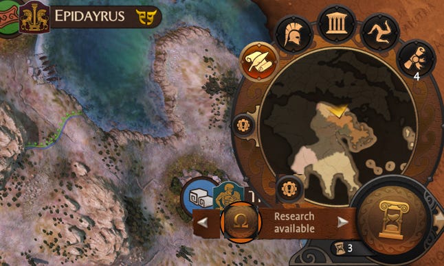
An initial mockup of notifications alongside the end turn button
Solution 2: The second solution was to move all notifications to a new menu and treat it as a "to-do" list. Ultimately, we went with this because we felt it would be more valuable for players to see them all at once instead of clicking through them one-by-one. It also allowed us to expand the text strings and be more specific. If previously we had "Hero not moved" as a notification, now we'd also show the hero's name, so players could quickly scan and decide which ones they wanted to move and which ones they didn’t.
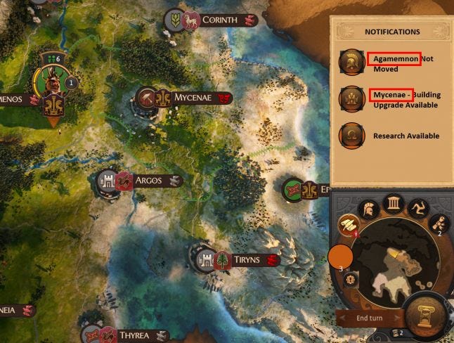
An initial mockup of the 'to-do list' style of notification menu
However, this change also meant we no longer had anything to stop players from ending their turn IF they had pending notifications. Sure, there was a list of them, but there was no guarantee they'd open the list in the first place, we just assumed they would.
We implemented the change, even adding some animations and states to the new Notification button, thinking that would be enough to catch players’ attention.
Issue 2: Remember how I said that initially our End Turn icon was an hourglass?
Now ask yourself: if you see this ⌛ on a button, what would you assume that button's function is? One of our QAs raised that question shortly before release and my jaw dropped.
I organized a quick survey to ask people exactly that. 100% of the answers were "loading", "waiting", "buffering", "in progress", "speed up time", "slow time"… You get the point. It was right in front of our eyes, but we couldn't see it because we were so used to it.
One of my explanations was that as gamers, we somehow collectively agreed that the hourglass would represent the end of a turn when Heroes 3 used it back in 1999 and we just kind of rolled with it. But for someone who hasn't played Heroes or another turn-based game it could be very confusing.
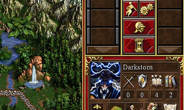
A screenshot of Heroes of Might and Magic, showing the hourglass icon used to end your turn
Solution: We changed the icon to a right-pointing arrow like the one used in every media player ever to show the action of "Next". We were so used to how things were that someone had to actually ask "Why?" to make us even think about it. This is what we ended up using:
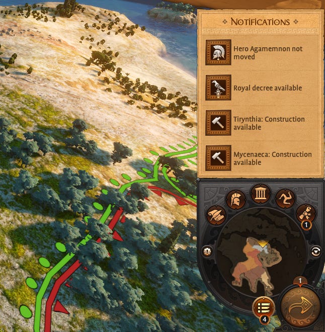
The notification list alongside the new arrow icon used for ending a player's turn
Then came the release. TROY was claimed by over 7.5m people and we were ecstatic for them to finally play it! They did and they started sharing feedback. Players no longer had a problem ending their turns, but now it was so easy to do it that we started seeing them ending a turn just to then say "Oh, wait! I forgot to move my army!".
Naturally, regular TW players noticed this and said "Why did you remove my end turn notifications? It helped me when I was playing and now I forget to do things constantly!". And they were right! We made a mistake by removing a useful feature just to fix another issue.
The problem was that the notifications were still in the game, BUT, players just weren't opening the list to see them. And why would they? We didn't make any effort to draw their attention to the list.
Once again, we went back to the drawing board and it turned out the solution was quite simple.
All we had to do was to look back at the original implementation and take what was good about it (in this case, the contextual button before the End Turn button). Only this time, we'd show it just once, with an exclamation mark icon and upon clicking it would open the notifications list. Done.
This allowed us to resolve both issues at the same time - not obfuscating the End Turn button behind 20 other ones, while still retaining the "hey, don't forget these things you can still do" functionality. We also implemented a little improvement to the layout of the Notifications list - we introduced notifications groups.
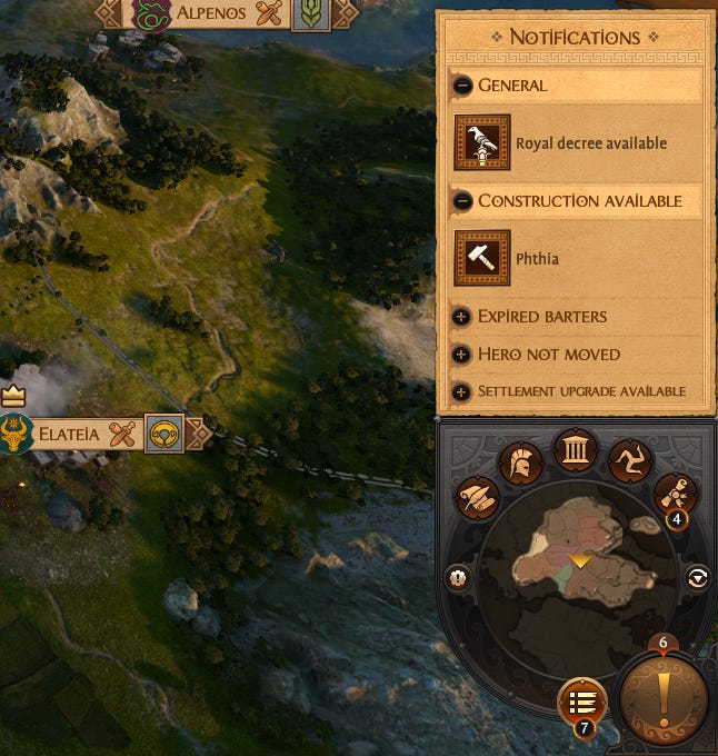
The current implementation of the End Turn and Notifications list in the game
Because of the time it took to ship these final iterations, (three months had passed since release) we knew that some players would've gotten used to how things now worked and it wouldn't have been right for us to force this new iteration on them. So we added it as an option instead.
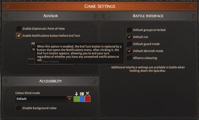
The new notification menu option found in Game Settings
And this is where we are now. It’s a good place. Or so we think for now.
Hopefully this story shows you how one UI element can take so many iterations to get right, as well as share some of the lessons we learned along the way (or at least reinforced our knowledge of) such as:
User testing will show you things you haven’t even considered
Never assume
Look for solutions that work for all types of players
While getting your design right first time should always be the objective; iteration is a necessity to make improvements and to truly achieve a good design solution!
If you can, give players a choice, don’t lock them into your judgement of what’s right
And we are done! I’ll see you next time.
You May Also Like