Trending
Opinion: How will Project 2025 impact game developers?
The Heritage Foundation's manifesto for the possible next administration could do great harm to many, including large portions of the game development community.

Featured Blog | This community-written post highlights the best of what the game industry has to offer. Read more like it on the Game Developer Blogs or learn how to Submit Your Own Blog Post
The Fear and Loathing of one no-budget mobile game production. How we failed and why.

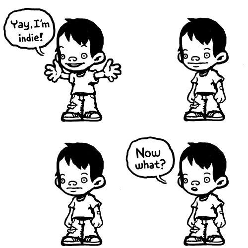
Hi everyone, my name is Nikita Pavlov and just recently our team hit a major milestone – the first indie game release. A trivial, to be honest, mobile runner game took us 2.5 years of “in the spare time” production. The result – a complete commercial failure, with CPI over $1 and R1 lower than 30%. If these terms are not familiar to you, just know that with such metrics your hyper-casual game will sink right to the bottom of the Mariana trench. So to cool down a little and, I hope, to lower your chances of repeating the same mistakes, I’m going to tell you our story.
After a nearly endless row of unfinished projects, we made an oath – this time we will take a REALLY simple concept and push it to the finish line no matter what.
Since 3 of us (out of 4) are game designers, we decided to make a prototype battle. The winner was a vertical runner made with Construct 2, starring a cute piggy in a helmet. For those of you who are curious enough – you can play it even now, right in the browser.
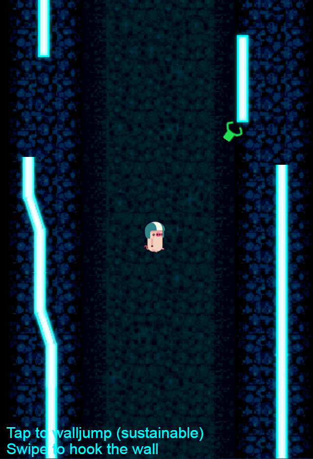
What can be easier than a good ol’ runner game, really? And to make it even simpler, the grappling hook from the prototype was removed, as well as holes in walls were replaced with just a solid tunnel. Walls, by the way, are not even moving anywhere – they glued to the camera and go upward with it. As for the engine, we chose Unity.
The thing is, the most important part so far isn’t even a concept – it was our aim, “to finish this project no matter what”. The goal itself is okay, but not when you switch it with “make a commercial successful game” in the middle of production. There is always a chance, of course, but it would be much wiser to start with proper market analytics, selecting target audience, coming up with USP, and all other good stuff we haven’t done back then.
A little word, yet so painful…
And the most painful was a lack of understanding the goal. We constantly drifted between “make as easier as possible” for a casual audience and “invent something new” in gamedesign field. Double jumping, down sliding – heck, we were even ready to put some run&gun elements to the project.
Captain Obvious reminds – the smaller the game, the more refined must be its core mechanic. This statement is especially true for hyper-casual games, so that’s why we’ve spent tons of hours tuning controls, run&jump timings, power-up obtaining feedback, and such. Especially controls – I was dead sure that swipe is a better gesture because it’s more immersive, yet playtests showed that people want just a good old tap.
Same story with down sliding. We tried to implement semi-puzzle gameplay based on this mechanic – the player does not always need to rush through the level, but sometimes slowing down or even sliding back to pass safely the most tricky parts of the level. Sad but true – the audience at DevGamm’19 showed us that sliding controls are hard to use (you needed to drag down if my memory serves me well), so most of the people didn’t even recall this feature. And because the game was designed around it, Neon Climber failed to produce an action-packed experience, too. In the end, we cut off sliding, raised the character speed, and rebalanced all the levels to make the game feel and look more action-focused. It’s always painful to do a feature cut on something you worked on long and hard, so we kinda saved sliding as character being hit feedback.
Speaking of audience. The adequate evaluation of the playtest is another stone we stumbled over. We were freaking happy that Neon Climber passed to DevGamm19 and successfully attracted people to our booth. We also visited SpeedGameDating on the first day of the conference, where most of the publishers were interested in our game, yet advised us to switch from endless mode to level-based one to match the trend. But most importantly – they all wanted to test Neon Climber to see its metrics. And what do we did? Right, we kept the game from everyone, instantly dived into a long hard road to level-based mode, instead of testing what we already have here and now. So we spent almost an extra year only to realize that the game’s core doesn’t hit the hyper-casual audience. That’s, as one speaker said, a “total wrong”. Don’t be like this.
DNK and Roller showing off Neon Climber on DevGamm19
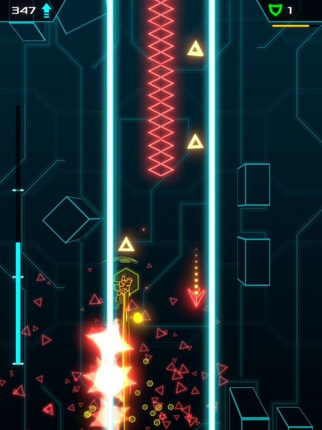
The style and setting of the game is already in its name, but even so the road to final graphics was rough. Because none of us are artists, we had to deal with art workflow in the blind trial and error way, despite the good and accurate references, such as Rider, Geometry Wars, and of course TRON.
First things first. We decided to start with the background. It needs to be pretty, but not distracting from the foreground. A single color variation without glow was our best try.

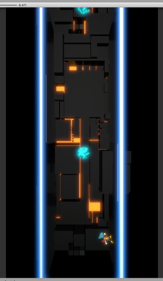
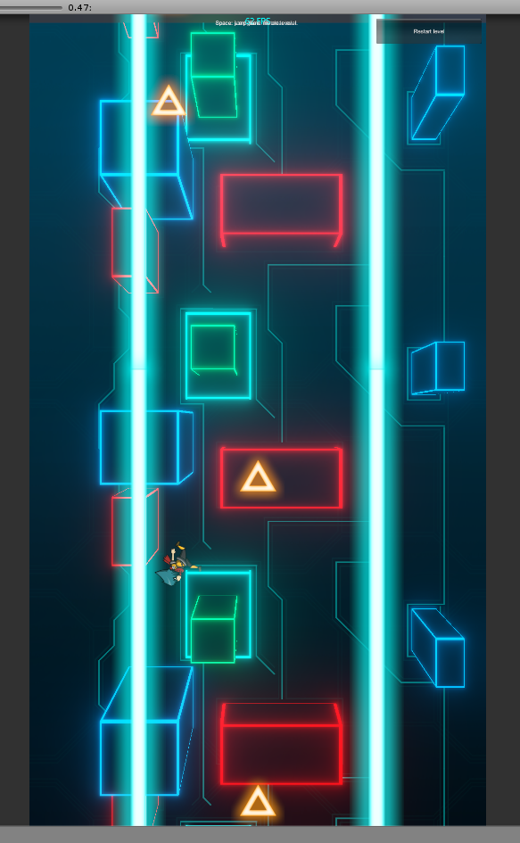
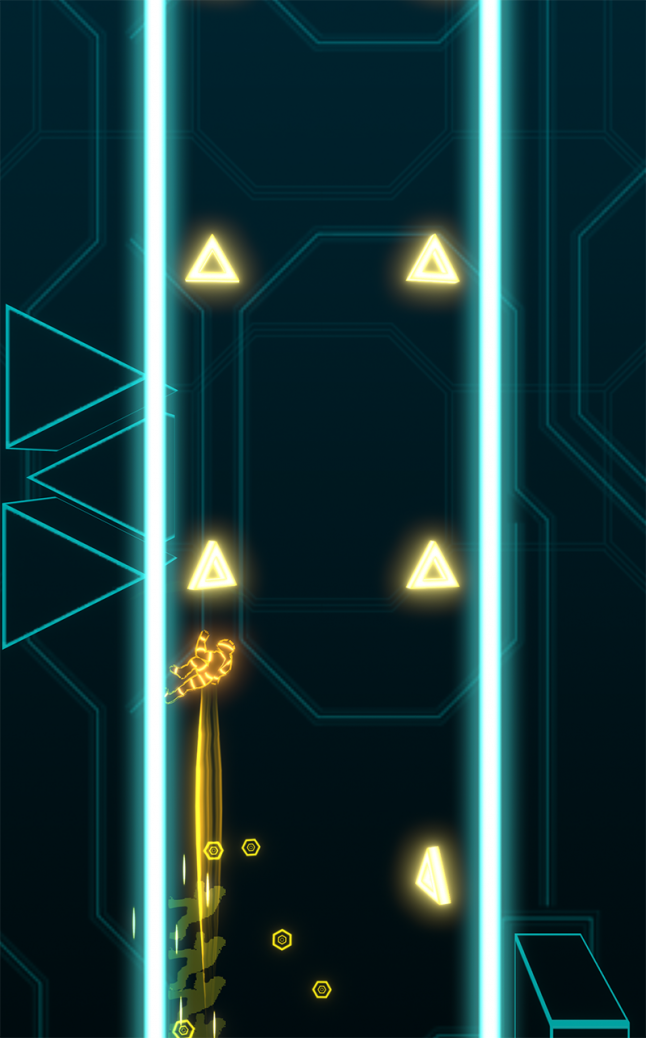
The main collectible item. In our case, it’s just a plain coin. Various donuts and bubbles stepped aside before 3D triangular, accenting upward movement.
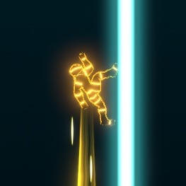
Main hero. Again, got inspired by the TRON series. Concept art from a fellow artist, the 3D model with our own hands, animations from Mixamo (most of it). The most pain in the ass was running animation. It’s hard to find one that suits our wall-running concept, so we tuned it countless times.
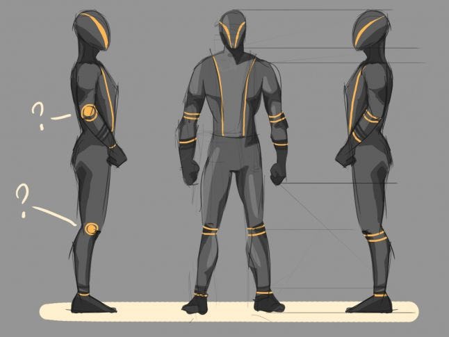
A very big special thanks to Daria Kalinova for hero’s concept-art.

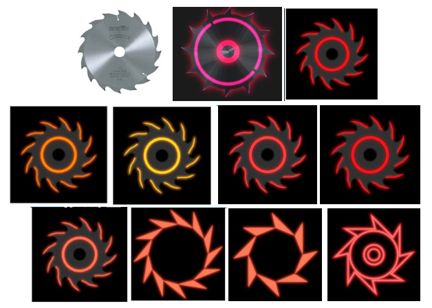
Enemies and power-ups. Funny, that the trivial saw took us most of the time. After we figured out the suitable shape, designing everything else was a cakewalk. For some objects, we used sprites, for others – 3D meshes made in Blender.

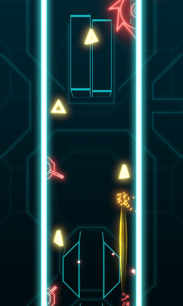

Last but not least – UI. Got inspired by the new Deus Ex series, in terms of colors, border style, and such.
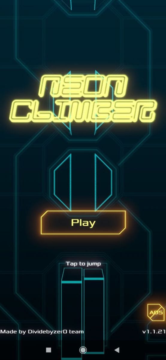

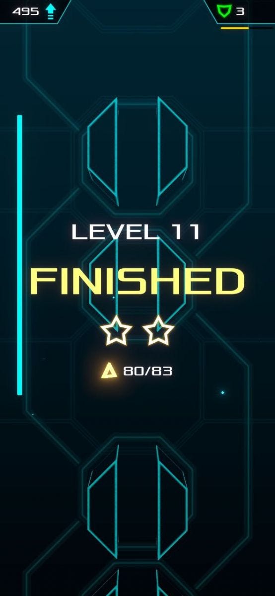
The whole art workflow was unevenly distributed between the team. Someone dug into a character production, other tried himself in FX or background, and so on. The choice was based on experience or at least on desire to acquire it.
In the end, we are pretty happy with the results. It’s still giving me a smile, how the audience on DevGamm19 praised our «artist», with me correcting them – “actually, we have 4 of them!”
Every enthusiasm has one, sad feature – sooner or later it's running out. In Dividebyzer0 it takes 2-3 months to consume all power-ups from a «fresh start» effect and, after this, a long hard road of overcoming drill and boring and laziness starting up. We found two things that help us to deal with this problem:
Organizing all tasks as week-long sprints. In Trello, for example.
Gathering up offline to work together. It doesn't really matter what it will be – a cafe, a friend's flat, or public coworking – anything will work.
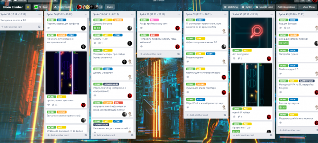
Neon Climber's Trello board. Don't get too excited – such productive sprints are rare birds for us.

Hanging in coworking. Nothing can replace real-life communication!
Sure thing, if your team is more than 2 people, you have to be ready to face some management issues. From our experience, I can outline these tips:
Assigning roles. In a “no budget” project you need to take into account not only the skills of a particular teammate but his/her desirable field as well. For example, our coder is a Blender enthusiast, so he asked for and did some tasks in 3D.
Tasks priorities. It's deadly important to not let bottlenecks appear. Try to shape your game's pipeline in a way that won't have situations, in which one teammate's tasks hold back the rest of the crew.
Of course, not everything went smoothly. Heavy yet unused features (like the ability to download new levels on device without reinstalling the app), various minor inconsistencies, and lots of problems with commits – we killed a good amount of time just on resolving conflicts after pulls on a “dirty” repository.
And if the guy in charge of “no-budget project” happens to be you... well, I can't say I envy your shoes. I am far from management genius, but there is one thing that I learned and want to share with you above anything else - every soldier needs an individual approach. It may be the truth as well even for projects with payrolls, even though money itself is a good stimulant for most of us. As for our case... get ready to find a key to each of your teammates, to find out what lights them up and try to keep this fire on.
Another unpleasant yet expected surprise waited for us right before the finish line. It’s been quite a long time since we tested Climber on real devices. And of course, when we finally did that, the build ran at low FPS even on medium-tier phones.
Thank heavens, we quickly found out the root of all evil - it was the blur effect from Unity’s Post-Processing Stack, which we used to simulate the glow effect on meshes. Tried countless plugins from the Unity Store, and even tried to switch from 2018.4 to 2019.3 version of Unity for trendy Lightweight Render Pipeline - no luck. We also tried to teach the game to calculate the performance on a particular device and change graphic settings accordingly, but we didn't find an easy and fast solution.
In the end, we came across MK Glow plugin and finally got the acceptable fps out-of-the-box.
Game development of any kind is a risky way, especially if you aim for commercial success (and even riskier if you don’t but still hoping for commercial success). And though our Neon Climber didn’t reach the summit of app stores, we are proud of the game itself. It was a priceless experience, though sometimes exhausting.
We aren’t dropping the spirit and already sorting out ideas for the next game - and that's what we want to wish for everyone, whose games didn’t hit the top.
You can try Neon Climber here:
Our games: https://dividebyzer0.itch.io/
Twitter: https://twitter.com/dbzteam
Mail author: https://www.facebook.com/xxdnkxx
Read more about:
Featured BlogsYou May Also Like