Trending
Opinion: How will Project 2025 impact game developers?
The Heritage Foundation's manifesto for the possible next administration could do great harm to many, including large portions of the game development community.

Featured Blog | This community-written post highlights the best of what the game industry has to offer. Read more like it on the Game Developer Blogs or learn how to Submit Your Own Blog Post
This article is a review of the map art of a successful Match-3 game: Mystery Match,from the angle of an art producer.And you can borrow the good ideas from this game, if you're preparing maps for your game.

- Characteristics of a few mobile game maps - Part 5
Please note: in this post I would use art works from some popular games to elucidate the ideas of the article. As our team also create map art, please don’t mistake that the art work in the post are created by our team. And a big thanks to those developers who had released those great games!
Today almost every mobile game has a map, in this series of posts, I would evaluate the characteristics of maps of a few popular games: Bubble Witch 2 Saga, Jelly Splash, etc, from the point view of an art producer. If you’re a game developer who’s planning to have a map for your game, or an artist, this series is for you.
This is Part 5 of the posts, let’s travel around the world in Mystery Match.
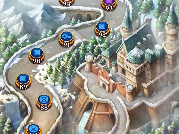
Mystery Match is a story driven Match-3 game, it’s set in the 1930s, and the heroine Emma would trace a mystery cult around the world. It has a vertical scroll map, each zone features a famous city/site in the real world.
Today cartoon and vector style are very popular for mobile game maps, for they look fashionable and cheap in making. Mystery Match doesn’t go after this fad, instead it features rich and classic style paintings, a good choice for the story.
So far, these are the most richly painted mobile maps I have ever seen.
Nothing fancy, the production solution is digital painting all around. You can find the procedure of making a digital painting in my previous article.
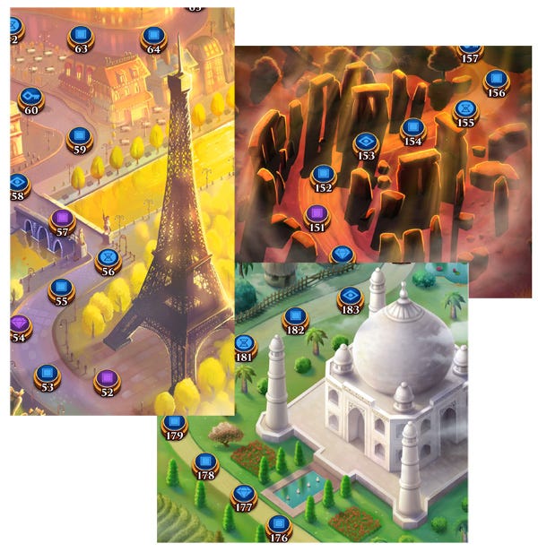 Each zone features a famous city, or world heritage site. Typically, a zone would have two monumental buildings in it, complemented by minor structures in the area. For example, in New York zone, they are Empire State Building and the Chrysler Building; In India zone, Taj mahal and the Buddha statue.
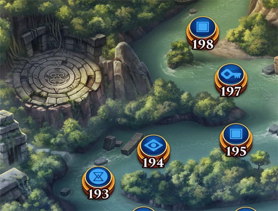
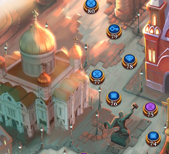
Overally each scene is nicely composed by big elements like buildings and monuments, and carefully dressed with smaller items. If you play ipad version, you can see the organic placement of small things in every nook and cranny.
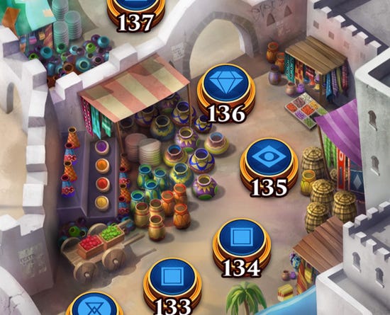
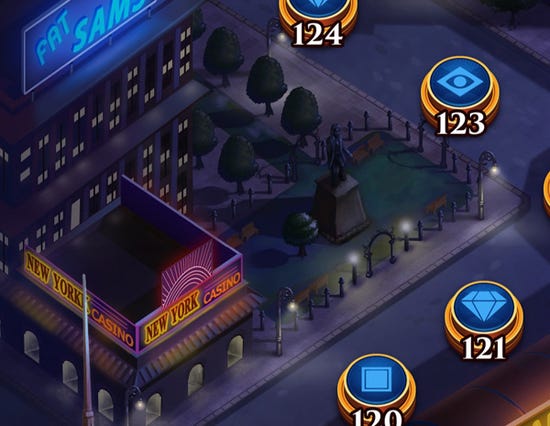
The game has a “Mystery” in its name, right? You can see how much the designers take it into the maps. Most zones are with dark lighting, or in foggy twilight.
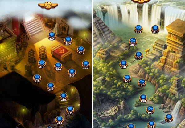
The maps should be a representation of 3D space, that there should be layering, there are things in the front and back. However, there’s an unwritten rule for mobile maps, that is, regardless of spacing, the level nodes should always be on the top most layer.
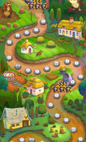
So map designers would try to avoid using high buildings, for they don’t wish path to go behind them. You can see in Farm Heroes, there’re almost flat structures:
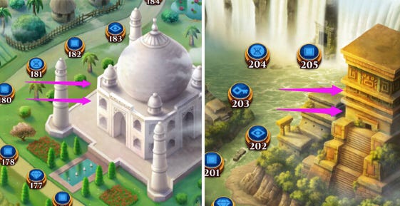
In Mystery Match, since it’s world traveling, it can’t avoid to have monumental buildings. In these cases, the tall or massive buildings are always put to the side of the map, and path go round them, then above the top, to make sure the path doesn’t go behind.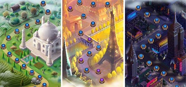
In vertical map format, the level node size should be carefully chosen. The developers wish it to be big enough, for the screen of phones is small; But if it’s too big, the levels and path would take much of the screen space, leaving little freedom for design.
You can see on the left is a zone from Mystery Match, the node size is a bit small for a phone, but it gives great freedom to the layout, it can even afford to have widely laid out structure such as the Stonehenge; On the right is map of Juice Jam, the node size is ideal for phones, but too big to the layout, it can only have small cluster of buildings placed at the turn of the road here and there.
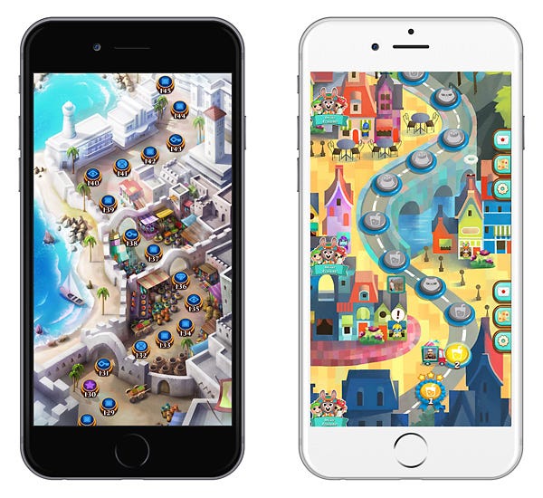 We can be convinced that Mystery Match is much more made for ipad. For it has great detail in design and small level nodes.
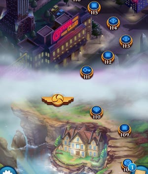
It’s smart for the MM team to cover the transition with clouds: reason No.1, it would take considerable map length to paint the transitions; No.2, it would look weird to have the plateau of Tibet run down to the houses in Venice. Clouds would give a good sense of going through space and time.
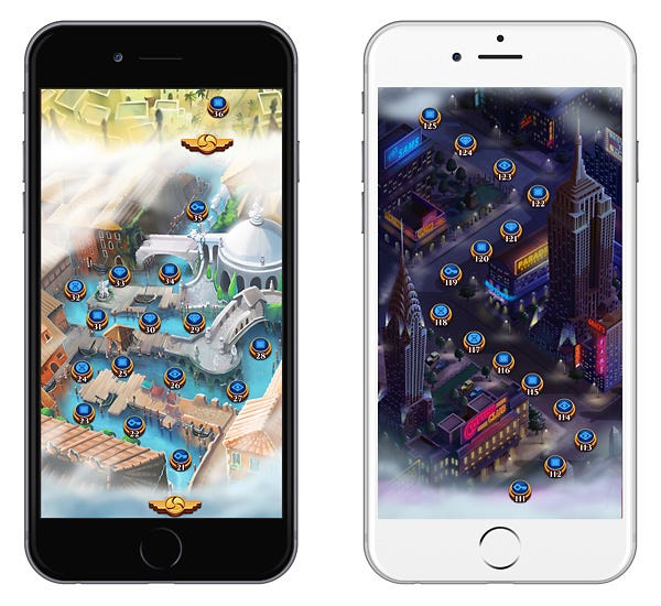
You can see save the level nodes keep constant size to the end, no two zones have exactly the same scene scale. It’s not a big problem, for there’s no people and animals on the map to give intuitive reference; And there are clouds to separate zones, a travel through space and time, space could be relative.
We should note that, in many other games, zones are physically connected, and the scene scale is uniform.
It uses mostly soft side lighting, giving great sense of modeling and very flattering look.
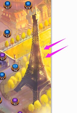
And the iron tower is of dark material, it’s good idea to use the back side light, to create the beautiful rim light.
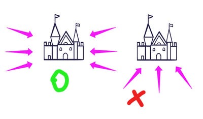
Here is a reference of which key light directions are good for maps.
We need to note, that the key light direction is different across zones too. It’ s not a problem, going through space and time. And in other games, for example Bubble With 2 Saga, the key light direction is constant.
I’m not sure how much time MM team spend on each map, but I can give a time estimation to the production of a sample map zone, in a general sense, with breakdown of each stage’s work:
Each map zone would accommodate 20 level nodes, it seems to be the norm for lots of freemium games.
For this zone:
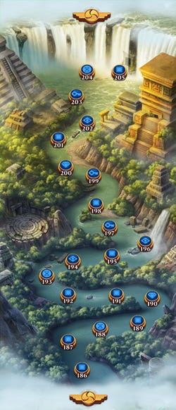
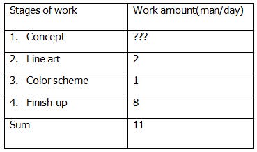
It would take a lot to come up with a concept in the first place, so how long this step takes, really depends on your team. So I leave this step blank.
In this Series:
P1: Developer’s General Concern
Read more about:
Featured BlogsYou May Also Like