Trending
Opinion: How will Project 2025 impact game developers?
The Heritage Foundation's manifesto for the possible next administration could do great harm to many, including large portions of the game development community.

Featured Blog | This community-written post highlights the best of what the game industry has to offer. Read more like it on the Game Developer Blogs or learn how to Submit Your Own Blog Post
Maze are mysterious... but we almost always see them as black and white grid cells. This basic vision we have hides an other beauty mazes can have. The art of chaos.

As a game programmer I work on very cool things every day. Sometimes it’s all about optimization and technical stuff, some other times it’s about user interfaces. But there is something that appeared mysterious, although basic, to me, that I didn’t know until last week: Maze Generators.
I always saw maze generators as a topic you could approach when you study programming or game programming, even if it wasn’t the case for me… In the back of my head I always thought every game programmer had already programmed a maze generator… every game programmer except me.
But I always liked mazes. Not only for the challenge they propose but more for the intrinsic beauty they offer. It’s (often) all about geometric shapes following a complex path, so complex that it’s confusing for the eye. Parallel and geometric but confusing, the maze paradox.
Last week-end I decided it would be cool for my programming culture to make my own personal maze generator and learn how this beauty works from the inside.
I won’t talk too much about algorithm because it’s pretty easy and you can find good literature everywhere on the Internet. But there is something that blew my mind when I started working on my own generator. The only real important thing to realize, the only one that is not necessarily obvious when you have never worked on maze before is: mazes are graphs.
They are often displayed as a grid, but their very nature is more about graphs. Every cell is a node which is connected (or not) to other nodes. In a classical 2D maze a node can be connected to up to four other nodes (west, north, east, south), but in the real world the sky is the limit.
So I quickly managed to create my first fully random maze. And it was aMAZEing (sorry for that)! But for debug purposes I needed to know the “walk distance” (the number of steps you need to take from the maze entry to reach a specific node) of every nodes. It’s a simple increment, nothing too hard to implement: every time you enter an unvisited node, you increment the walk distance (don’t forget to decrement when you go back to try other paths). But displaying hundreds of walk distances on screen for debug wasn’t very usable, that’s why I converted the walk distance into color. As the minimum walk distance will always be 0, you just have to store the maximum walk distance, and you’ll have everything you need to make a linear interpolation between two colors.
And… the magic happened (my mind exploded).
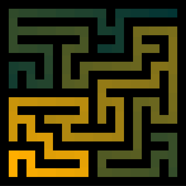
This is what I call the hidden beauty of mazes. We always see mazes displayed as black and white, surely because it’s easier to read and play, but adding colors can change everything. From a simple game to art.
After that I made a couple of tests on bigger mazes.
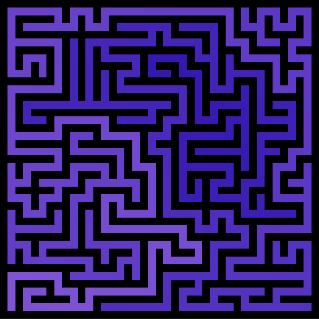
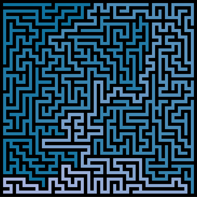
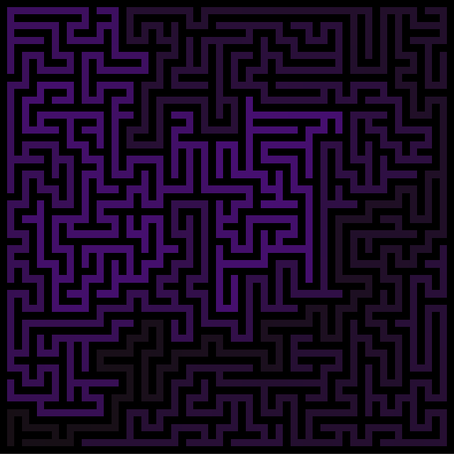
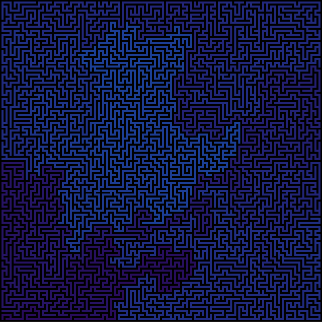
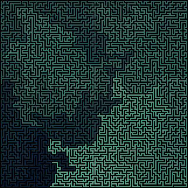
And then I stopped rendering walls. I like to think this is the art of chaos (as everything, including colors, is random).
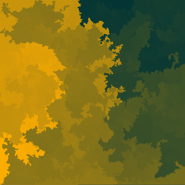

I’ve tried coloring different shapes of mazes, but the flat one is, to me, the best way to visualize the color.
.png/?width=700&auto=webp&quality=80&disable=upscale)
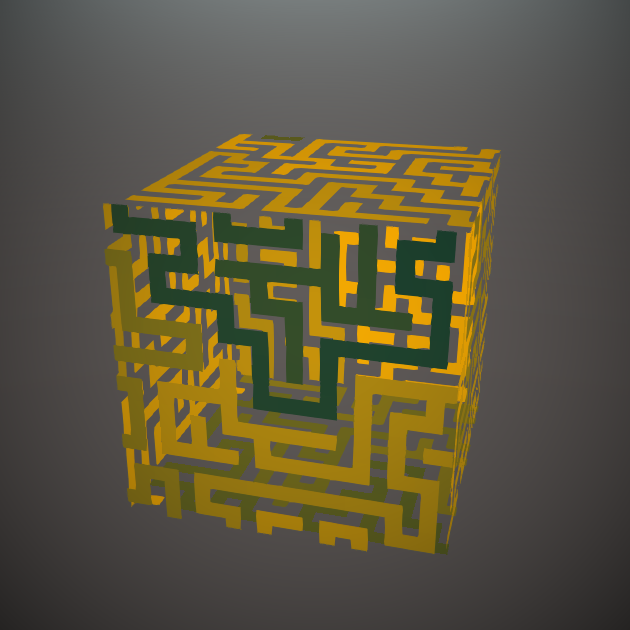
Finally, after all this beauty, I remembered that mazes are graphs.
With that in mind I wondered what would be possible to do using an external texture to generate the initial graph.
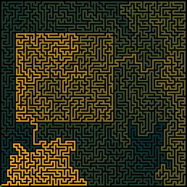
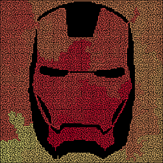
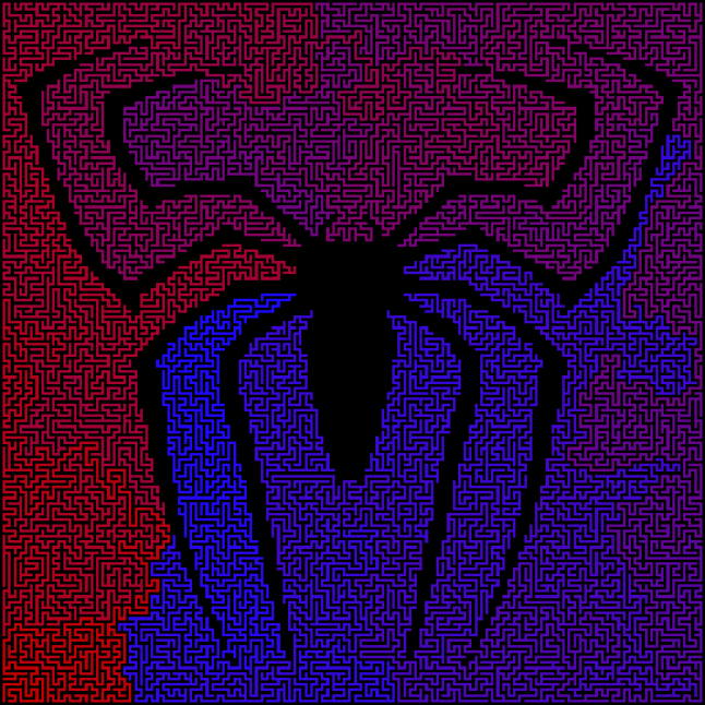

This is how I discovered mazes hidden beauty: the walk distance. I hope it gives you game ideas :)
Read more about:
Featured BlogsYou May Also Like