Trending
Opinion: How will Project 2025 impact game developers?
The Heritage Foundation's manifesto for the possible next administration could do great harm to many, including large portions of the game development community.
Dealing with asset scaling in 2D games can be confusing. There are many ways to handle it. The choice depends on what you expect. The problem is, you usually do not know what to expect from a responsive interface. So, I created this guide with animations.

This post is shortened to focus on the general scaling method and not how-to do it. The original, which includes working code and details, is available at 6x13 Games devlog.
Dealing with asset scaling in 2D games can be confusing, to say the least. There are many ways to handle it. Which one to chose depends on what you expect. The problem is, you usually do not know what to expect from a responsive interface.
So beware, most scaling strategies don’t respond well to display ratio changes. They will seem to work on your test device, then they will fail you. I will now explain one asset scaling strategy that worked great for us in all 4 games we released so far.
Now, there are three things you expect from your engine to handle for you.
Choosing the most suitable set of graphics according to display resolution.
Globally scaling the selected graphics to fit the screen.
Letting you ignore all these and totally forget about the display while coding the game itself.
We will pretend we use Cocos2d-x engine and rely on its terminology. But Cocos only provides a basic set of transform policies, so the same idea applies to any 2D engine. Let's see the relevant variables.
This actually has nothing to do with resolution. It is about framing.
Cocos2d-x will autoscale the whole scene to somehow fit the frame. Resolution policy is where you tell the engine what your understanding of “fit” is, what kind of behaviour you expect from it.
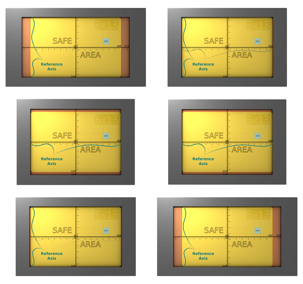
You need a safe area! An area that is not only guaranteed to be shown to user, but also guaranteed to cover as much screen space as possible. So I present you, the safe area:

Anything but the yellow area is just decoration that prevents the user from seeing black border. You never, ever put something that user really needs to see outside the Safe Area.

This is the response we expect from our framework.
The safe area is the center 480×320 units portion of our 570×360 units game area -not pixels, units. It has an aspect ratio of 1,5f .
How do we guarantee that?
We calculate the reference axis from the display aspect-ratio. Then we either choose the Fixed Height, or the Fixed Width policy, according to the reference axis. If the Reference Axis is y-axis, we choose Fixed Height, otherwise Fixed Width.
In order for Cocos to fit the scene contents into the frame, it needs to know which portion of the scene we actually consider to be “the scene”. Hence, the Design Size. In our case, Design Size is the dimensions of our Safe Area.
The moment we set the Design Size and Resolution Policy, the engine will start acting like an adult. Below is how it reacts to both ratio and physical size changes.

Cool animation, right? I made it in Blender, yay!
To sum up:
Cocos will scale to fit.
Resolution Policy tells it “how” to fit.
Design size tells it “what” to fit.
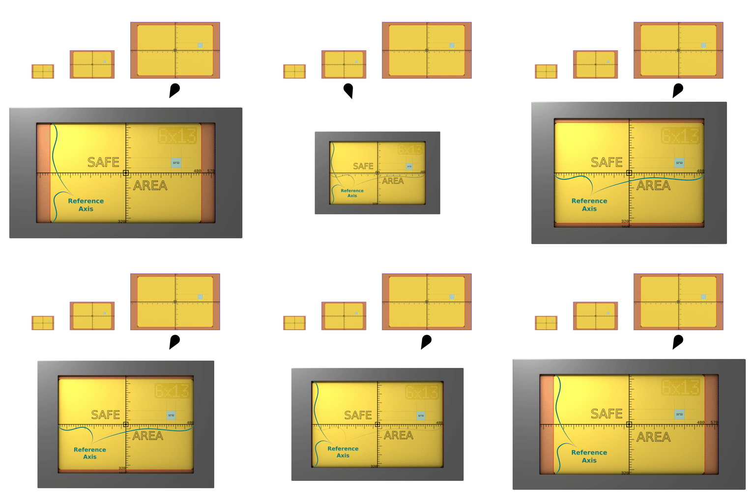
We also need our runtime assets to be fast to process, fit the video memory nicely, and be effected from the least amount of aliasing possible during scaling. In order to do that, we export multiple resolutioned versions of each of our assets, and we put each set of assets in a different resource directory.
We pick the best possible size according to the display dimension of our Reference Axis, in pixels. After that, there is no special procedure to “pick” the directory, you simply add that particular directory to the Resource Search Path of your engine, omitting the others so they will not even be visible to the engine.
We also associate a scale factor with each of those directories, so that the engine knows how the assets map to the design size. It is simple. For example, if the assets in “medium” are twice the definition of your Design Size, the scale is 2.
As of this point, we can totally forget about the asset selection, resolution and PPI variations, retina displays, weird aspect ratios etc.
We just pretend the screen size is 480×320 when coding, except the few times where you might want to put some fancy, decorative animations outside the Safe Area.
Below is how the engine handles everything.

Ok, you are all set! Now you need to fill your scenes with beautiful assets.
If you want to know how to achieve this behaviour, with code examples and production tips, visit 6x13 Games devlog.
Also, do not forget to follow @6x13games on Twitter
Read more about:
BlogsYou May Also Like