Trending
Opinion: How will Project 2025 impact game developers?
The Heritage Foundation's manifesto for the possible next administration could do great harm to many, including large portions of the game development community.

Featured Blog | This community-written post highlights the best of what the game industry has to offer. Read more like it on the Game Developer Blogs or learn how to Submit Your Own Blog Post
Character design is a tricky beast. I mean, you want your characters to be memorable; you want them to be distinctive. You want them to be icons, something or someone that an audience or a player can get behind, wholeheartedly.

Characters need to be able to be picked out of a crowd, they need to have a clear, defining characteristic, whether it be improbably spiky hair, or a gianormous “Buster” type sword that never leaves their side, even putting a red jacket on a character and making sure that color is used *nowhere* else in the visuals is a useful trick to keep that character distinctive, visually apart from the rest of the world and therefore easy for a player to keep track of and make a connection with.
When you start pushing more and more into the “photo-realism” area of design, something that is part and parcel of the whole “immersive” experience, you start to lose that. In the quest for perfect, believable detail, we are losing one of the most important aspects of making a connection with the audience. A character that you can see and identify with against the backdrop, and that’s something that I am finding harder and find in games and film these days.
As an example, I really love the new look of the Transformers. I mean, I loved the original series as a kid (still got my original Optimus Prime tucked away in a box somewhere) but there is one issue I have as a games artist that really flips my trigger every time I watch (or rewatch) the new films.
It’s really frikkin hard to *see* the robots! The new designs are sweet, they do an effective job of giving us a believable form, I love the segmentation and shardi-ness of all the pieces, thousands of smaller slivers of metal that can be arranged or rearranged as needed. If you get a “close” look you can see the excruciatingly high level of detail/thought that went into how these robots assemble themselves.
However, this is also the key problem I have with the overall character conception and design. Because of the physical complexity, in many of the shots (particularly the longer ones) the forms are broken up, they lack the broad areas of color that help to clearly define the different body areas and we are left without even a really cool looking silhouette, but it’s hard to tell who is who in many of the scenes.
It’s less of an issue, I admit, in the closer shots, particularly on the more brightly-painted characters like Optimus and Bumblebee, but once the action gets going it’s almost like watching a shadow-play where everyone is using the same puppet. It takes too long to determine whether it’s Starscream or Megatron, for example, or even whether we are seeing whether it’s a Decepticon beating an Autobot to death with its own arm or vice versa.
Character design is a tricky beast. I mean, you want your characters to be memorable; you want them to be distinctive. You want them to be icons, something or someone that an audience or a player can get behind, wholeheartedly, whether it be an evil villain, a giant alien robot, or an angst-riddled teenage underdog whom nobody really understands.
In traditional animation, ink-and-paint stuff, there is a goodly amount of thought that goes into making the characters distinctive. They used to tell me in art class that if you can’t clearly identify your character in silhouette, then you need to do a redesign.
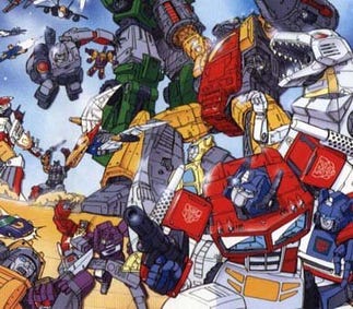
If you take a look here at stills from the Transformer’s history, it helps illustrate the different thought processes:
In the original Transformers and the current “anime” styles Transformers. Technically questionable (though they certainly pulled it out of their hat for the functional toy designs) each character is visually distinctive. The forms are simple, the colors are bright. When they mix it up there is no losing track of which is whom and the other way ‘round.

Marketing image from: www.transformersanimated.com
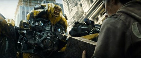
In the next images we have a two stills from the first Transformer’s movie. The silhouettes arehard to parse, if it weren’t for the bits of color here and there we would have no hope of figuring out which characters we are looking at. The robot here on top of the building could be Starscream, or Megatron, or any of the Decepticons.

Production still from imdb.com Even in the closeup shot of Bumblebee, we can’t see his face very well, we can see his eyes fairly clearly in some shots, we can tell by the yellow on the top of his head and the roundness in general that’s he’s Bumblebee, but what we look for in a face simply is lost in a jumble of little pieces and dark coloration, that connection we are looking for is lost in a blur of detail.

Production still from imdb.com
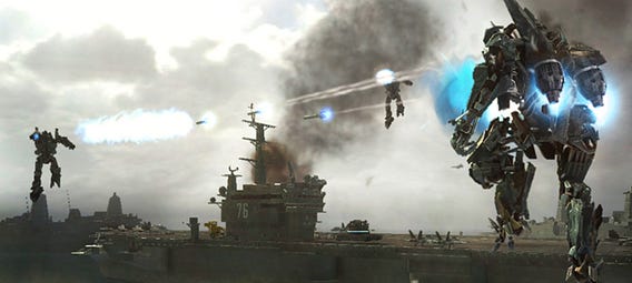
In the third image we have a still from Transformers: The Game. This one actually serves as one of the clearest illustrations of what I am talking about. We have here three “Bots” all fighting over an aircraft carrier. But which three? Who are we looking at in this scene? None of them is visually distinct enough for us to clearly identify them.

Screenshot from: www.transformersgame.com
I know we are pushing for more and better realism, we want these character to *look* like they are a real, living, breathing part of our world, but in the pursuit of that, we are forgetting one of the basic precepts of character design, to create a visually distinct element that sets them apart from all the others. It’s not a new problem, it’s the reason all the members of a soccer or football team wear the same colored jerseys. It’s a problem of identification that has been examined and solved over and over again, but as media pushes into making things look “photoreal” we keep having to go back and revisit.
Read more about:
Featured BlogsYou May Also Like