Trending
Opinion: How will Project 2025 impact game developers?
The Heritage Foundation's manifesto for the possible next administration could do great harm to many, including large portions of the game development community.
This in-depth postmortem tackles the new remake of Gabriel Knight: "we wanted to make sure we did it right -- that this game got the love, attention and hard work it richly deserved."

Written primarily by Katie Hallahan, with input and feedback from Cesar Bittar (Producer), Richard Flores (Technical Director), Jane Jensen (Designer/Director), Aaron Light (Programming Lead), Emily Morganti (PR Consultant), Mikael Palsio (Video Editor), Elisa Pavinato (2D Art Lead), and Wayne Sung (QA Lead)
Even compared to other indies, Phoenix Online Studios has an unusual origin story. We started out as fans of adventure games who wanted to make our own -- but had no idea how. We worked for 10 years on an unofficial King's Quest sequel that survived two cease & desist orders to finally release episodically as The Silver Lining.
We then moved into commercial development with Cognition: An Erica Reed Thriller, and last year we started an indie publishing branch to release other developers' games alongside our own. As fans of adventure games and Sierra games in particular, though, two of our most exciting projects have been the games we developed with Jane Jensen: Moebius: Empire Rising, and the 20th anniversary remake of Gabriel Knight: Sins of the Fathers.
Jane Jensen is a writer and game designer who got her start at Sierra On-Line in the 1990s. She worked alongside Roberta Williams on King's Quest VI, then went on to create the Gabriel Knight series, which was recognized at the time as being one of the first dark, mature adventure games with a complex story and characters.
Jane made three games starring the reluctant "shadow hunter" Gabriel Knight before Sierra shut down in 1999. Over the years she tried unsuccessfully to pitch new Gabriel Knight games to Vivendi and later to Activision, who had acquired the rights to Sierra's IP, but when those didn't pan out she figured the Gabriel Knight era of her life was over.
In 2012, after almost a decade designing hidden object games, Jane wanted to get back to full-scale adventure game development and crowdfunded Moebius. The success of her Kickstarter campaign caught Activision's eye, and the company approached her about doing a 20th anniversary remake of the first Gabriel Knight game, Sins of the Fathers, with the goal of introducing the series to a new audience on mobile devices as well as computers. If the remake came out well, the new Gabriel Knight game Jane had long dreamed of making could finally be a reality.
As huge fans of Jane's work, we at Phoenix were all extremely excited to be a part of the next page in this series' story. At the same time, it was a huge responsibility and we wanted to make sure we did it right -- that this game got the love, attention and hard work it richly deserved.
1. The Game Itself
When you're remaking a classic adventure game, you can't ask for a better game than Gabriel Knight: Sins of the Fathers. Sins of the Fathers was a surprise hit for Sierra when it released in 1993: Critically acclaimed and honored with awards like Adventure Game of the Year from Computer Gaming World and Best in Show at CES (the precursor to E3). Even two decades later, it's a fan favorite that regularly shows up on Best Adventure Game of All Time lists. If you've ever heard the line "What can you tell me about... Voodoo?" in Tim Curry's over-the-top N'awlins drawl, this game probably has a special place in your heart.

If you're one of the few unfamiliar with that iconic phrase, here's the game's premise: Gabriel Knight is a roguish womanizer, writer, and bookstore owner of middling success in New Orleans. While investigating a rash of serial voodoo murders as material for his next book, Gabriel uncovers secrets not only about a real voodoo cult in New Orleans, but also his own family's supernatural history. He also falls for the rich, beautiful, and mysterious Malia Gedde, who herself has a connection to the world of voodoo. The more he learns, the more entrenched he becomes, and before long Gabriel's life and the lives of those he cares about will be in danger if he can't accept his destiny and put a stop to the murders.
Compared to family-friendly fare like King's Quest and comedies like Monkey Island, Gabriel Knight was one of the first adventure games to have a dark, adult-oriented storyline. Jane's storytelling skills are readily evident, from the well-researched voodoo history and New Orleans settings, the complex and memorable characters, and the witty dialogue and banter, to the equally compelling plot: a dangerous set of murders, a forbidden love story, family secrets, unshakeable destiny. Composed by Robert Holmes, the music is consistently wonderful, with the Gabriel Knight main theme on the menu screen getting the game started with a bang. And the puzzles are thoughtful, with every action you take moving the story along and revealing more of the mystery.
While the graphics and interface of the original were dated, the real magic of Jane's games is the story, and this story had already stood the test of time, and that's why we were so excited to develop this remake.
2. Working with the Original Designer and Composer -- and with Activision
Working on this remake with Jane Jensen (series creator and designer) and Robert Holmes (the original composer and producer, and now Jane's husband!) was a huge benefit. The game, characters, and world are all close to Jane's heart, and she was excited about working with them again. She's very particular and detail-oriented -- she knows what she wants for a scene or character, and if there was ever any question of what something should look like, sound like, and so forth, we had the best possible source immediately available to us. We couldn't have had a more motivated creative director. Robert, too, was excited to recreate and improve the music that a generation of adventure fans had fallen in love with.
Jane was very hands-on throughout development, meeting with all of the teams weekly and constantly sending notes on the cutscenes, the animations, and the builds, giving feedback on the execution of the new puzzles, suggesting tweaks that could be made to improve the game from front to back. Any changes that were made from the original we were all confident of, because they were being made with the direct input of the original designer. More information on this is in point number 3.
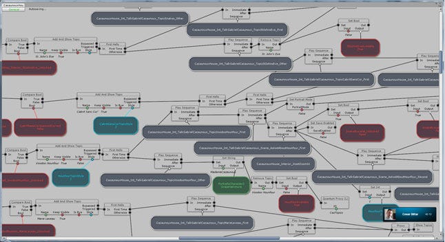
The logic of Gabriel Knight - click for larger version
Overall, throughout the process, Jane and Robert were not only dedicated to improving the game with their ideas, but very open to hearing ideas from our team, too. Robert notably worked with a lot of feedback from some members of our team on the score; in the end, he went through at least 59 revisions of the score in his quest to get it right!
And then there was our experience with Activision. It's not uncommon to hear horror stories about working with a big company -- and the Sierra franchises have had a long history of sitting on a shelf with the license holders not being interested in them.
But in our case, Activision's involvement in this project was a big part of what went right. Without the company's belief in its potential, there never would have been a Sins of the Fathers remake at all. Activision was extremely responsive and supportive during development, and trusted Jane to know how to handle her game.
All of the additional material we used in promoting the game leading up to release was quickly approved, and Bob Loya, the head of the new Sierra indie branch, personally gave his support by mentioning the game in a number of interviews as we approached its release. We really couldn't have asked for a better partner.
3. Minimized Design Time Gave Us an Opportunity to Fine-Tune
Since we had an almost complete design doc from the original game, the pre-production design -- which could have taken six months or longer for a brand-new game -- only took about three months. The script was written, the puzzles were planned, the scenes and characters were designed, and even the music had already been composed.
That's not to say there wasn't still design work to be done: The script had to be trimmed down to fit the updated game interface, working in a much higher resolution meant new details needed to be planned and added to scenes and characters, and the MIDI required some re-orchestrating as well. Having a mostly complete GDD from the beginning meant we had more time and bandwidth to make these changes and add in a few new puzzles.
One example is in Day 6 of the game, where Gabriel has to break into his friend Mosely's office in the police station. In the original game, this involved some cop clichés and the New Orleans equivalent of a donut shop -- amusing and not a bad puzzle, but it broke the sense of seriousness that the story had taken on by that point.
 The new cutscene
In Jane's novelization of the story this scene played out differently, so we changed the gameplay to more closely match that, which also added a new cutscene to the game. We ended up with a puzzle that achieves the same end, but better supports the story by adding to the creepy atmosphere and reinforcing just how much power the voodoo cult had over the city of New Orleans.
We were also able to use the original scenes and characters as references for the new ones, and able to provide references and suggestions for updating the graphics to include a lot more detail, now that we were working in high-res. Not starting from scratch had its advantages and allowed us to focus on those details early. It allowed Jane to be able to get the characters and screens to finally look the way they were meant to, to her -- the definitive looks.

Gabriel's various looks
Gabriel, for example, has three very different looks in the original games, and his final model in the remake has aspects of each. His grandmother and Wolfgang's assistant Gerde also got makeovers. For the backgrounds, the location that got the most updating was Schloss Ritter, which rather than looking like the huge stone castle of GK1, was made to look more like castle seen in GK2.
4. Animation Pipeline Improvements
Our previous games have taken hits for the animations needing improvement -- not an inaccurate critique, and we knew that.
With Gabriel Knight, we finally got to work almost entirely with motion capture, rather than creating every animation from scratch, and this resulted in huge improvements in the look, flow, feel, and realism in our animations.
This not only included using clips from motion capture libraries, but also saw the beginning of our very own built from scratch, indie-tastic motion capture studio.
Our lead animator Gareth Fann invested in a number of Sony PlayStation Eye cameras and set up a space in his garage, meaning we were also able to create new animations custom-tailored to what the game required.
With the dialogue portraits being used extensively in the game, we also began working with Face Robot to get more realistic facial expressions, something we're continuing to use going forward, with plans to start recording voice actors' faces when they record their lines.
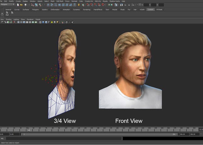
Face Robot
Part two of the animation improvements was getting the animators involved in the pipeline. Previously, no matter how well we thought we'd described what was needed, we found that often the animators were too divorced from both the script and what happened to their animations after they were done to have the proper context for what was needed.
With GK, we pulled the animators in and had them exporting their own animations and setting up the initial sequences where they were used in the game. They had more context for what was needed and what animations might come before and after theirs. This left the Cinematic Artists with more time to devote to polish, since they didn't have to do as much work setting up sequences. As a result, Gabriel Knight has the best animations of any of our games so far.
5. In-Depth QA Involvement
Previously, while QA was always working on the game we built it, they were separated from the other teams for the most part, only doing a quick daily check-in with production, and submitting and tracking bugs via our system (Redmine). Having noticed that communication issues on bugs and issues in previous games, like Cognition, had led to problems implementing and testing fixes, our QA lead Wayne Sung was determined to change this.
He worked with the production coordinator to create a QA calendar and started weekly department meetings to set priorities and assignments for each tester. As well, QA attended the production meetings more, to give input and keep their information on top priorities up to date and in step with production.
These changes to our workflow helped QA better understand and plan priorities, and helped them communicate their information to the rest of the team more directly. Individual testers were better able to focus, which made for a more streamlined and efficient QA process and in turn helped production go more smoothly.
1. Not Scheduling R&D Time for New Systems or Complicated Puzzles
While we're good at identifying areas we know will take R&D to work out, we were not as good about actually scheduling the proper time for that R&D work. In GK, these issues were most notable with proximity puzzles and first-person POV scenes.
Proximity puzzles: in the original Sins of the Fathers, there are a few puzzles where, when Gabriel gets close to another character, his proximity triggers the character to either move closer to him or move further away.
The most complicated example is in Day 1, where a mime in Jackson Square will follow Gabriel if he walks close enough to it. This then gets complicated by non-player characters (NPCs); if the mime walks closer to one of them, he will stop following Gabriel and start following that person.
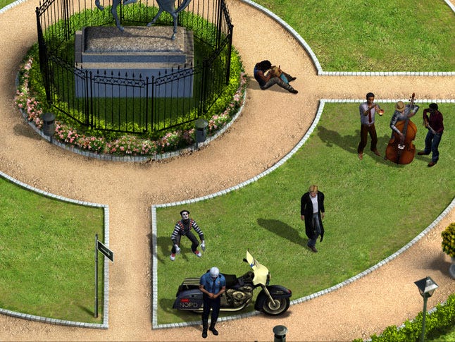
Our programmers and scripters had to do a lot of work to make sure the mime would follow correctly and also that the puzzle wasn't impossible -- there needed to be a possible clear path between getting the mime and Gabriel's destination with him, while still making it a challenge.
Many players find the release version of this puzzle hard enough, but in several unreleased versions, it was so tough even Jane couldn't solve it! We kept the NPCs out of this scene for too long, and adding them in was a huge part of testing this sections playability, and also continued to delay working on it in favor of working on larger sections and later sections of the game.
First-person POV screens: Very early in the remake's development, Jane toyed with the idea of adding hidden object scenes to draw in fans of her casual games. Eventually, that idea was scrapped because we thought HOG elements would be too much of a turn-off to fans of the original game, but the close-ups created for the proposed HO scenes were visually interesting, so we planned to use them for first-person puzzles.
With some this was easy: For example, the bookstore's counter inset, where you find two objects, and get some fun descriptions of other items that offer insight on Gabriel and Grace. In other cases, such as the Voodoo Shop inset, it didn't work as well. The inset has a lot of voodoo flavor that we didn't want to lose, but figuring out a puzzle to add proved difficult.

We intended to add one for opening the sekey madoule (small coffin) seen here, but it both took some time to plan for a puzzle that could fit without taking the player out of the game and could be executed well. It would've involved arranging the cross on the coffin using voodoo doll pins, but we waited too long to fully plan and test this in-game. Eventually, the idea was scrapped, though the inset and the items found and used in the screen remained.
2. Translating Word Puzzles
We knew all along that we would be releasing the game in French, German, Italian and Spanish as well as English, and that this would be a sizable task. There were approximately 10,000 lines in the edited version!
Due to some pick-ups and edited lines, we waited on sending it to translators until a little later than was ideal, but we wanted to try and avoid doing incomplete translations and having to go back to the translators several times. Inevitably, as happens with translations, there were things we didn't anticipate needing to translate until we got down to the wire, and the biggest hitch for these were the puzzles in the game that required putting together specific written messages.

One of these had a very specific answer that we eventually decided didn't need a translation because the final answer is briefly shown to the player in English, and the player then needs to recreate that message. The biggest problem then became one where Gabriel writes a message using a "voodoo code" that needed certain words spelled out correctly. It wasn't just that the message being written had to be translated, but the messages that Gabriel was reading as well, which would've included changing the art being used for every language.
This is how it was done in the original, but as it never came up in the design stage for the remake, that extra art wasn't accounted for. By the time we did realize this, we didn't have the time or budget to create that art and program for it as well. Eventually, the solution we came to was to have the message still appear visually in English, keep the translations in the subtitles only, and for those playing in another language, some of the key words they needed to spell out would be shown to them. We would have done it differently if we could, but at least the finished product is playable in other languages.
3. User Interface Input Came Later than it Should Have
While the original Gabriel Knight was also a mouse-based point-and-click game, it had eight icons to choose from and a huge inventory. One of our first tasks was to condense these, eliminate unnecessary ones, and redesign the GUI to be more intuitive and user-friendly for today's audience, which meant having a touch screen-friendly interface in mind from the start, as a major goal of the remake was to get the game in front of a mobile audience as well.
While the original game had eight possible actions that could be used on everything you could possibly click on in every screen, we cut this down to five interactions and only the relevant ones come up for any given hotspot. We also eliminated some hotspots in favor of not cluttering the screens with things that weren't needed. While the action wheel GUI overall works well and is in the final game, other interfaces didn't go as smoothly once we got past the first few test screens, and it was clear we had failed to consider some key elements.
The biggest of these was the inventory. Originally, to make the inventory less intimidating, it was represented by a small icon in the corner that expanded into a scrolling bar when clicked. You could then click each item to get interactions available for it. When Gabriel is only carrying around up to ten items, that works just fine, but once it got to the later days where you could potentially have up to 30 items, it's unwieldy and a pain to try and navigate, especially in a game with many inventory-specific puzzles.

As QA pointed this out, we then had to redesign the entire system to use a larger pop-up window, which went through several iterations before becoming a window that would resize itself automatically. This way, the early sections of the game retained an inventory that did not appear overwhelming to new players.
While we found a solution that worked, we wasted valuable time that could have been saved with more careful planning earlier on. As a project that was moving fast and had to be released by a certain date, anything that caused delays hit us fairly hard.
4. Unclear Cutscene Communication
The decision to keep the 2D, comic-panel style cutscenes was made from the start of development and agreed on by everyone, and for most cutscenes this worked out fine. However, as we got further into development, some of the complex scenes that in the original had 2D panels broken up by in-game animations needed further discussion.
The two scenes in particular were the Voodoo Quiz / Ceremony on Day 6 and the finale, another Voodoo Ceremony with a lot of changing parts. Both scenes, if done exactly as they were in the original, involved a lot of animations that would only be used in these scenes, unique character models, and programming for a lot of variables.
In the interest of saving time and money, we turned these scenes into complete 2D cutscenes. The artists kept pointing out that these scenes had interactive parts that would still need to be considered which had been dismissed or forgotten about, but when communication between teams broke down, both animators and artists were working on the same parts of the scenes.
![]()
The animation tracking doc - click for large version
Decisions about what would be animated versus what would be a cutscene panel were not made until much later than they should have been. New panels had to be created from scratch that didn't exist in the original game, so the artists did not have a clear picture on exactly what was needed or how many new panels there would be. Panels would be created and the videos edited together only to find that things were missing or needed to be changed entirely.
All the while, animators were creating and refining animations for these scenes that ended up not being used, wasting time could have been spent refining other animations instead. Cutscene creation and refinement continued until the last minute in production, and was one of the reasons we needed to delay release by two weeks.
This again was something we managed to get right in the end, but we could've saved ourselves a lot of time, stress, and unnecessary back and forth by having better communication between artists and designers, so everyone knew exactly what was needed the first time around.
5. More Room for Redesign
You may have noticed a pattern by now from the things that went wrong: a lot of them stem from communication failures and a lack of attention during the design process. As promised in What Went Right, design was a factor in What Went Wrong as well. This isn't to say we didn't pay attention during the pre-production design phase; far from it. But in the aftermath, it's now easy to see how things could have gone much more smoothly with even more consideration.
For many of the systems (including action wheel interface, autosaving, inventory, and dialogue topics), we fell into the trap of having put them together for a one- to two-room demo, seeing that those rooms worked, and checking them off the list as being complete. The reality was that not every system showed up in those first few rooms, and not every exception to every system did either.
With so much of the design already done from the original, it was easy to think we were all set and all we had left to do was plug-in the lines that were already written, recreate art and animation assets and test it like mad. Knowing what we know now, every puzzle and every scene needed a more careful combing through and we should have given ourselves more room for redesign on puzzles.
Beyond the puzzles mentioned previously, a big example is our review of lines before calling them final or cutting them. Some rooms or puzzles were cut outright, so the lines that were used in that room or scene were also often cut with them. This resulted in missing some lines that we still needed for certain objects or actions that had been moved to a new scene.
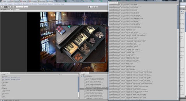
Conversations in the bookshop - Click for larger version
As well, Activision did their legal review of the game when reviewing builds, and we had a number of things that we needed to change based on that. All told, this meant new lines needed to be recorded, and not just for Gabriel -- the only one we'd anticipated having back for pick-ups. For example, some variations on the flow of the finale that changed from the original game meant we needed lines from Grace and Mosely as well.
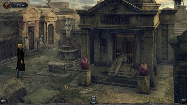
We also had to create some awkward workarounds for a few other scenes so as to avoid needing pick-ups from minor characters. An example of this is in the St. Louis Cemetery. In the original, all three screens of the cemetery were available from the start of the game; the decision was made to lock these and open each one up only as it became relevant, but we didn't consider that new players would not know about or how to get to the additional screens as the location had only one map icon. Lines were needed in the first screen to indicate that there were other areas, which was a somewhat awkward workaround.
While pick-ups at the end of development aren't unusual, since the script was ready so early and was considered final (as mentioned in What Went Right), it was also recorded much earlier than would usually be the case. For us, this ended up meaning more studio and actor time, and more money had to go into pick-ups late in development than we planned for.
A lot of these headaches came from being a little too tied to the original design. It's a hard line to walk in remaking such a beloved game: too many changes and you alienate the old school fans, too few and it feels outdated to potential new fans. I'm confident that we made and released a solid game and worthy remake, but even with a game as solid as Gabriel Knight: Sins of the Fathers there was room for improvement, and a few more changes from the track laid out by the original could have made the game even better, in addition to making our lives easier during development.
Overall, Gabriel Knight had the smoothest production of any of the games we've made so far, and the most polished look, but still had its problems. For myself and the other directors on the project, it was a big waypoint in terms of organization and how much our team has grown in terms of our skills.
A lot of mistakes that we had in earlier productions (Cognition, Moebius) we made a point of addressing when working on this game and it helped immensely to make those changes or to have those past experiences under our belts to learn from. Gabriel Knight also showed us places where we still need improvement, where our communication tends to break down, and where we've tended to make assumptions that we shouldn't be making.
In fact, that's a lesson I'm constantly learning and relearning: never make assumptions and always double check any time you need people to be on the same page. Even when you think you have a solid roadmap -- such as a game that was completely designed, produced and released twenty years ago -- be prepared to adapt as development goes on. All of these are lessons we'll be taking forward into our next projects, whether they are remakes, inspired by, homages, or something else entirely.
Katie Hallahan was the assistant designer and PR director for Gabriel Knight: Sins of the Fathers 20th Anniversary Edition. A board member and PR director of Phoenix Online Studios and Publishing, Katie was also a designer and director on The Silver Lining and Cognition: An Erica Reed Thriller, and assistant designer for Moebius: Empire Rising.
Developer: Pinkerton Road Studio & Phoenix Online Studios
Publisher: Pinkerton Road Studio
Release Date: Oct. 15, 2014
Platforms: PC, Mac
Number of Developers: 26
Length of Development: 12-13 months
Budget: $215,269.50
Lines of Code: N/A
Development Tools: Unity, Maya, Adobe Premiere, After Effects, Adobe Photoshop, Redmine, Motion Builder, Google Docs, SVN, Face Robot
Any other interesting information: 11,952 build revisions; 20,190 bugs reported; 1 Easter egg hidden (still not found!); 3 UI designs; 59 musical score revisions; approximately 100,000 lines of dialogue.
You May Also Like