Trending
Opinion: How will Project 2025 impact game developers?
The Heritage Foundation's manifesto for the possible next administration could do great harm to many, including large portions of the game development community.

Featured Blog | This community-written post highlights the best of what the game industry has to offer. Read more like it on the Game Developer Blogs or learn how to Submit Your Own Blog Post
This blog details the steps that led toward resurrecting the graphic point-and-click adventure Shadowgate. It further narrates the design decisions that led to the User Interface and game controls developed for the title.

So I would be lying if I said I wasn’t blown away by the Kickstarter success of Tim Schafer and Double Fine. To be honest, it wasn’t so much the amount of money they raised (although that was incredible) but rather that there was such positive feedback about bringing a new adventure game to the market. I remember watching the number rise, sitting in a small office, and wondering what the response would be to Shadowgate (if we ever re-acquired the rights). Certainly it wouldn’t be anything like Double Fine. I mean, Schafer was pretty well known and his adventure games were some of the best ever made. However, we knew there were Shadowgate fans out there and my desire to work on the title was still quite high. Dave Marsh and I had continued to talk about the game since the last port (Palm OS believe it or not). So, let’s go through the steps it took to get the game to the point of the funding the game on kickstarter…
The Rights
Back in 1997, I was working at Viacom New Media in Chicago, making various games for MTV, Nickelodeon, and Paramount. However, the company decided to close the doors of our office and I was preparing for a move to Virginia. Eugene Evans, a friend of ours from the ICOM days, asked if Dave could help him secure the rights to the MacVentures as well as a number of the FMV (Full-Motion Video) titles such as Sherlock Holmes Consulting Detective. Dave, of course, obliged as he wanted to see these titles continue. Eugene did a great job with these, and we helped him get the games on the GBC (again, with KEMCO -- the NES developer -- on board as distributor) as well as various smart phones. When he took a job at Mythic Entertainment, he pretty much shut down his studio.
Fast forward to 2012 and Double Fine. Dave gave Eugene a call and asked him what his plans were for the titles. He said he didn’t have any. Dave asked if we could acquire them from him and he said that he would be happy to make a deal. We struck a royalty deal that weekend.
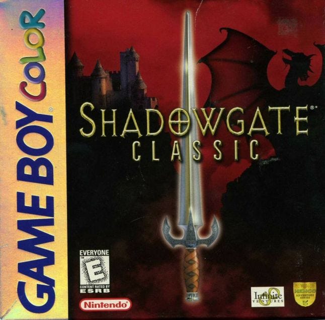
Shadowgate GBC box cover
First things first
That first week was a bit of a whirlwind, to be honest. Dave immediately worked on creating an LLC and a company name (four hours with a name generator resulted in Zojoi). From there, we knew we needed a killer programmer who was interested in getting back in the game biz. We talked with Brandon Booker (at that time a Flash programmer) and, because Zojoi was basically a startup, he agreed to work with us for royalties and the occasional soda from Panera. Our first real question was: Where to start? Although it was hotly debated, we decided to begin by porting, at the very least, the Sherlock Holmes titles to PC, Mac, and iOS. Eugene had the original Beta SP video source and illustrations and the Sherlock movies were popular so it seemed reasonable to go with them. Plus, (and we really didn’t realize how important this was until later), they were great titles to get our feet wet again and feel each other out before we took on Shadowgate, our most popular title. Booker would take on the programming and Dave and I would handle scripting, artwork, video, and v.o. manipulation. We also decided to try and kickstart the Sherlock titles. That’s a longer story but, suffice it to say, that campaign wasn’t successful for a variety of reasons (I will probably do a blog on Kickstarter soon.) Regardless, we moved forward with the Sherlock titles in February of 2012, developing in Flash and finished them weeks before the Shadowgate Kickstarter.
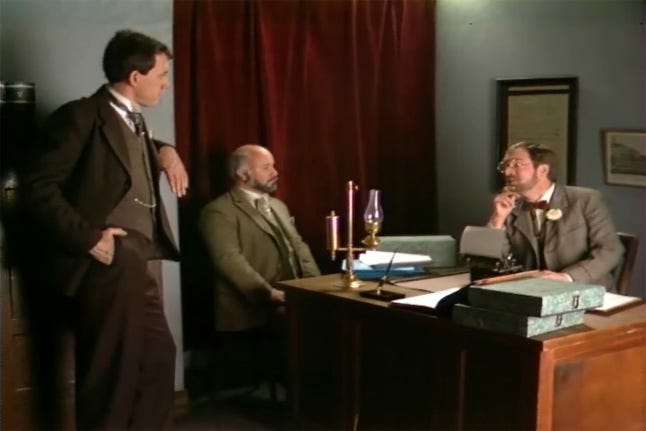 Screenshot from Sherlock Holmes Consulting Detective: The Case of the Mummy’s Curse
Re-imagining Shadowgate
So, around May of 2012, we decided to get started on Shadowgate as well. We had a number of big questions going into working on this title:
Port or no?
How are we going to fund it?
What’s it going to look/sound like?
What is the right balance between the UI we created and the most common UI these days?
I’ll try and run through 1-3 relatively quickly for you.
1. We decided on day one that we we wouldn’t do another port. We had done at least 10 of them already and if you wanted to play the NES version, there was surely a Flash version out there. But you already knew that didn’t you (from the previous blog. :) However, we DID want to build the new game on the bones of the old. We liked a lot of the environments but weren’t happy about most of the puzzles (Why was there a werewolf woman chained to the wall in a tower anyways?!) or the lack of story. So we would build on it and change the vast majority of the puzzles while keeping the familiarity of many of the rooms.
2. We took what we learned from the Sherlock Kickstarter and launched our Shadowgate KS campaign. However, compared to our contemporaries, we decided not to ask for the moon and figured out how we could structure the company to make a killer game. (Again, more on that another time.)
3. As I may have mentioned, many fans have told us that the NES version scared them as a kid. Dave and I were shocked by this. Dunno why. I guess a pink behemoth never put the fear of God into us :) So we hired speed painter Chris Cold to create the art for us. We liked his rough, atmospheric style. We knew we wanted Shadowgate to feature a single image, painted room style (rather than 3D rooms) and we didn’t want them to look like they were painted for IKEA. As far as the audio, we were ecstatic to have the opportunity to create a new soundtrack for the game. So Dave found Rich Douglas who had done an orchestral version of one of the NES tunes on YouTube. Rich did an amazing job, creating multiple instrument tracks for each tune so that we could turn them on and off depending on what was happening in that room at that time. Finally, we got the rights to feature the original NES chip tunes in the game as an alternate mode. Fun stuff.
4.The biggest challenge was balancing the UI (immersion, flexibility and modern controls). So let’s look at a few of the larger bits…
Commands
Modern adventure games (both first- and third-person) have moved away from flexibility for minimalism. We get it. Fewer UI elements on the screen is attractive but it also makes an adventure game (which has limited replayability) much easier to beat. With many of these games, this means that the player is only allowed to do what the developer decides is most appropriate for them to do. We like the AD&D model more. If you find something, you should be able to try nine commands on it. Sure, you might not be able to eat a certain key but you should be able to try. And, who knows, the puzzle may require you to eat a key at some point.

The Command Bar for Shadowgate
So we were in full agreement that we wanted the game to have all the interaction of the original MacVenture games. This meant embracing the command system of Use, Look, Open, Close, Take, Eat, Speak, Go, and Hit. What we didn't fully decide was HOW this was to be implemented. Should we stay true to the original and use a set of commands that were always on screen or do something different?
One early design featured a swirling set of commands that would spin up around objects as they are selected. We had two choices there: All nine commands swirl up or only those commands that were pertinent to the object. This design had several drawbacks.
The first being that players might get very tired of having icons swirling up on screen all the time. Imagine every time you wanted to examine something, the command wheel spun up. This is OK in Paper Mario when you are in a fight, but not in a point-and-click adventure.
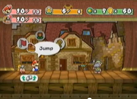
Command Wheel in Paper Mario
Another issue was that these icons might interfere with the background and other objects. Or, worse, the swirling icons would have to be smart enough to not show up on a side of an object if that object was at the boundary of a scene. That means that the icons would not be in a consistent location, possibly causing frustration to the player.
Still another issue was giving away what the object could do. Let's say the object is a bookcase - so logically you could look at the bookcase, perhaps try to open and close it. So we have three commands associated with it, but perhaps one bookcase you could go closer to. So, either we add a ‘go’ icon to that bookcase or make a ‘go’ icon appear for every bookcase -- a giveaway in both cases. It soon became clear that what we really needed were a set of commands that could be used on any object at any time - a set of icons that were available to the player at all times -- sound familiar yet?
Last, we thought about going with icons at the top of the screen instead of words. Certainly, we could do this, but we were creating a game for first time adventurers as well and we just weren’t sure that we wanted them to be trying to figure out if the hand meant USE or HIT. Or the mouth is SPEAK or EAT. Sure, we could do ‘tool tips,’ but then why not just put the words up there.
So, during our earliest design discussions one of the first things we all agreed to was: when in doubt, look to the original game. In the end, we felt that the command system via buttons on the screen was the best way to present our adventure game while giving the player as much choice on what to do as they could.
Now, that said…
We realized that not every player wanted to play the game with the command system. With modern UI’s, you SHOULD be able to play the game without commands on-screen. So, we wanted to offer players a number of options/shortcuts to make Shadowgate even more flexible.
Key Binds: Every command has a keyboard shortcut (along with all other UI elements).
Default Double Clicks: We created default double-click actions. Double clicking most objects in the game performs a LOOK command. Double-clicking a closed door performs an OPEN. Double-clicking an open doorway performs a GO.
Locking Commands: Players can double-click a command to lock it so that they can use that command over and over without selecting it again. They can also Double-tap the equivalent key bind to lock it. Simply right-click to deselect anything.
Quick-Use: Since the Inventory is a separate overlay, we give players the ability to assign the numeric keys to the inventory objects (or UI elements) to make things quicker. Simply press the number and that object would automatically be USED on a selected object.
Immersive Mode: Finally, players can hide the UI entirely with a touch of a key. Mousing over where the UI is hidden will bring it up that individual element or simply play the game with the key commands for a more immersive experience.
Are these the only ways we could handle the commands, or the way we will in future adventure games? No. But we feel for this game -- Shadowgate -- which bridges the old school gamers with the new, we felt this command scheme was appropriate.
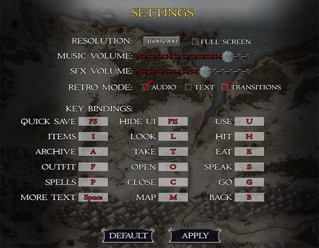 The Options Screen
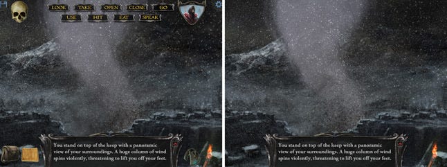 The Tower Keep: Normal Mode (left) and Immersive Mode (right - with mouse over the text box)
Inventory
The early MacVentures were known as some of the first graphical adventures including scenes that one can interact with as well as take items from. This meant having an inventory where you can interact with everything you've picked up during your adventures. Our re-imaging was going to be no different; our earliest discussions about the inventory revolved around three screens that you could swipe between. We envisioned having one screen to show the player's view, another shows the inventory, and the third showing the map. The user interface would be much like an iPad, where you swipe your finger left or right to access a different screen.
Well, we decided that since our game was first being designed for Windows and Mac, a touch-screen functionality wouldn't be the best thing to base our design on. So, we moved away from that idea toward having a small inventory that would show four to five items running top to bottom on one side of the screen. The problem with this is that there are so few things that you could see at once, you would be scrolling up or down via arrows trying to find the one thing you needed. No, that wasn't going to work. So instead, we decided that simplicity is the often the best route -- having a window overlay over the scene which would contain all the objects (allowing 3X 7 objects to display). I know, brilliant.
Our early iterations of this had two tabs that switched between the inventory proper and a spell book. This was kind of cool, but it felt a little clunky and didn't have the benefit we thought it would -- it was probably a lot more about form over function, if I’m being honest. We got pretty far in our development before our Beta testers encouraged us to re-think the inventory. They said, there were too many objects and it was too hard to scroll through and find the thing you wanted. So we took a page from Shadowgate 64 and created specific tabs dedicated to Items, Archive (books), Outfit (equipment) and Spells. This allowed for better sorting of items and a better play experience.
Again, we will revisit this, especially in Beyond Shadowgate, as the game takes on a few more RPG elements.
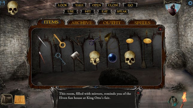 The Inventory showing the ITEMS tab
Other bits
So, there are other elements that make up the UI like your torch, the online help assistant (Yorick the skull), the text box, and a map, but they were much more straightforward. More in the next blog!
Read more about:
Featured BlogsYou May Also Like