Trending
Opinion: How will Project 2025 impact game developers?
The Heritage Foundation's manifesto for the possible next administration could do great harm to many, including large portions of the game development community.

Featured Blog | This community-written post highlights the best of what the game industry has to offer. Read more like it on the Game Developer Blogs or learn how to Submit Your Own Blog Post
About 5 months ago, I released Thermometers Puzzles on all major mobile platforms. On Google Play, downloads were quite decent and reached 50,000 players. I took some time to extract data and analyze the behavior of 50,128 Android players.

 About 5 months ago, I released Thermometers Puzzles on all major mobile platforms. On Google Play, downloads were quite decent and reached 50,000 players a few weeks ago. I took some time to extract data gathered with Game Analytics SDK and analyze the behavior of 50,128 Android players.
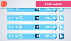
Levels are grouped in packs of 20, 40 or 100 levels each. Packs A to I are free, and J to O must be purchased (either one by one or all at once). There are 260 free levels and 960 levels in total.
This chart shows how many players completed each pack. Blue players are still active (and might complete more packs in the future), while orange players are inactive (they didn’t launch the game in the last 5 days).
The numbers after the pack name correspond to the size of the grid.
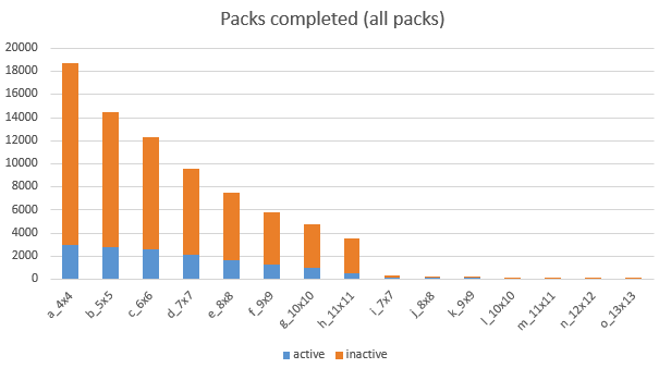
No surprise here, players are playing the packs in order. I made another chart below with only the paid packs for scale reasons, and we can see that players also complete the paid packs in the order of the menu, even if the first paid packs are supposedly easier than the last free ones.

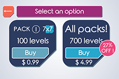
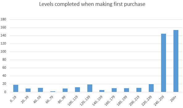
I made a blog post a few months ago about revenue (numbers are outdated, now) but here I’m focusing on purchase behavior. The first charts show the number of levels completed when making their first purchase.
The next one shows days since install when making the first purchase.
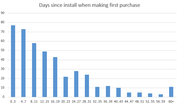
Most players go through most or all free levels before purchasing. I might get a better ARPU (average revenue per user) with less levels, because 260 free levels is a lot of content. We can see on the second chart that users usually play for a few weeks before purchasing.
I also noticed from the raw numbers that some players completed the same levels multiple times. They wiped their save game to start again. That’s why in the first charts the legend says 260+.
Among the players completing all the levels, 10.88% bought at least one item.
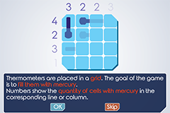
The tutorial is always difficult to get right for a game like Thermometers Puzzles. You give too much information (that many people don’t bother to read), and the player gets bored. And if you have no tutorial at all, some players don’t understand and give up early.
In Thermometers Puzzles, the tutorial is made of several steps (most of them are interactive) and is run automatically the first time you tap the PLAY button. Here are the statistics of players behavior in the tutorial.
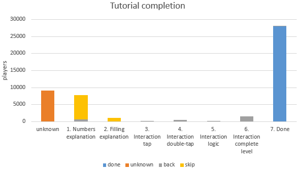
Each bar represents the number of players that left the game in the given step. The section unknown is for players that left the tutorial without pressing back or an in-game button, so I couldn’t record the precise step. The steps are numbered in chronological order. Steps 1 and 2 are non-interactive and have a skip button, steps 3 to 6 are interactive and ask the player to solve a part of a simple level.
The color differentiates between players that aborted with skip or by pressing back on their device. Of course, the goal is to have all players in the final bar: Done.
The Done section represents 58% of the players attempting the tutorial.
This next chart shows the ratio of players that completed at least 1 to 5 levels split in two groups: those that completed the tutorial and those that didn’t.
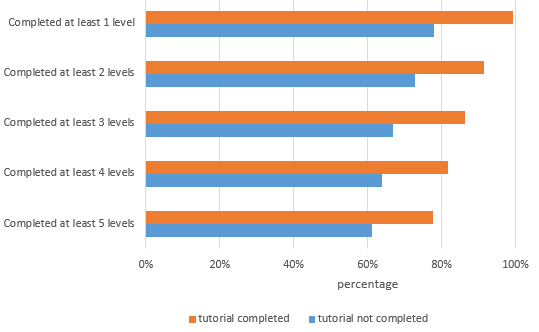
There are different possible interpretations of this chart, but I was surprised by the fact that so many players not completing the tutorial still kept playing for a few levels. Also, the rate of players giving up after each level is similar in both categories. Without tutorial at all, I wonder if we would see a behavior similar to the blue bars or an average between blue and orange bars.
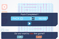
Once the player has completed some levels in the game, at the end of the level, a “rate me” popup is displayed. The player has three possibilities:
Rating the game by tapping OK, this will show the rate screen on the store and the popup will never be displayed again.
Dismissing the popup by tapping Later. The popup will only come back in another game session and after more levels are completed.
Ignoring the popup and tapping Next Level, as usual. In this case, the rating popup is displayed again at the end of the next level.
There is no downside of ignoring it the popup. The popup is not in the middle of the screen so it doesn’t disrupt the usual flow of the players, as you can see in the small screenshot above.
Here is a pie chart showing the button chosen by the players that were presented at least once the rate popup.
None means the player never tapped on a button (always ignored the popup)
Later means the player always tapped Later (once or more)
OK means the player tapped OK the first time it appeared
Later & OK means the player tapped Later once or more, and then tapped OK
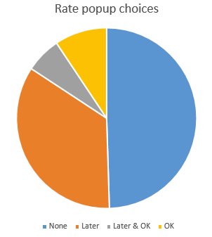
Most players simply ignore the popup. 15.7% finally decided to choose OK. Not all of them rated the game (I have more OK taps than ratings in Google Play) but I’m still very happy with the ratings with 4.68/5. It’s by far the best rating of my 6 mobile games. It might also be due to the fact I try to display the popup to players that are enjoying the game.

A more difficult to read chart, now: the number of times the popup showed up before players tapped OK.
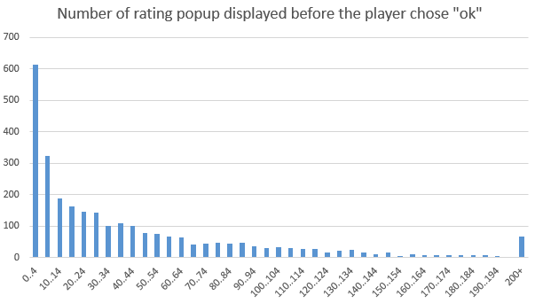
Most player that chose OK did it on the first few appearances of the popup.
This section is focused on evaluating the difficulty of the game through usage analysis of three features:
Hints: players can tap a question mark to have a hint. It highlights a possible move.
Retries: players can retry a level entirely. When tapping the retry button, a popup asks for confirmation.
Undos: players can undo their last moves.
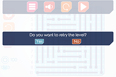
In the initial release of the game, the ingame screen contained hint and retry buttons. There was no undo feature. As the feature was highly requested, I developed it for the v1.3 update. The in-game screen now contains the hint and undo buttons. The retry option was moved in the pause menu.
Let’s see the usage of these features from players with at least 40 completed levels.
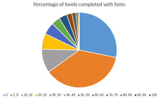
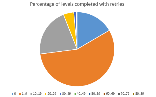
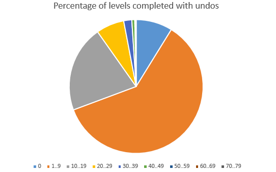
Here’s how to interpret these pie charts, with en example: the blue section of the first pie chart means that about 27% of players never used hints to complete levels. The orange section means about 33% of players used hints in 1% to 9% of levels they completed.
It shows hints are used more often than undos or retries. Some players even used hints in all the levels they completed. I personally thinks it removes the fun in that but if that’s how they like to play, I’m fine with it ![]()
But most of the players just use these features from time to time, which is good, I guess.
Because the position of the “retry” button changed between the initial version (v1.0, directly on the screen) and the latest (v1.3, in the pause menu), it’s interesting to see the potential behavior change it created (be careful with the scale starting at 91% on the left of the chart).
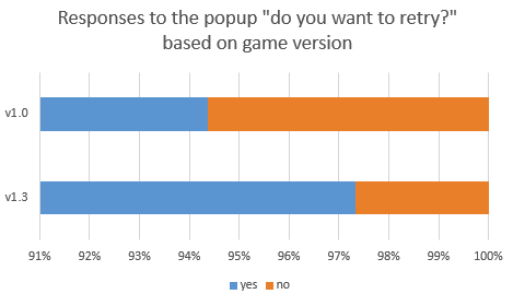
Here’s my interpretation: as the option is just displayed as an icon, it’s highly probable that many players just tapped the option to see what it does, or thinking it’s an undo button. When realizing it’s not what they want, they just cancel the action. With the new design, the option is buried inside the pause menu, and therefore it’s clearly an advanced option. People willing to retry will search for it and more players will actually confirm the action.
Finally, this section shows usage statistics of the options of the main menu.
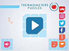
more_options is the main button (on the bottom right) used show all the other options. Players not using this option can’t access all the other shown on the chart below.
infos is the credits screen (exclamation mark on the screenshot)
facebook, twitter and mail are classic links
more_games is a link to all my games
This chart shows the percentage of players that used each option.
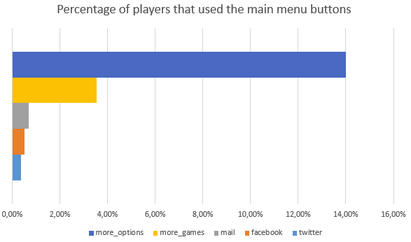
Not much interactions here, but it’s not really a game full of options and social features. I’m not sure the more_options button is easy for player to understand, but they were not that curious to try it ;).
I realized recently that the more_games button looks a bit like Google Play Games and that may be the reason why players used it (mistakenly). Google Play Games integration (especially cloud save) is a requested feature (and is the next one in my TODO list).
The sound settings is working a bit differently: it is on by default (there’s only sound effects in the game, no music). Originally, the switch was only available in the mainmenu. An update released slightly before v1.3 made it possible to switch the sound from the pause menu, in-game. The statistics on the next chart shows the sound configuration of each player, separated depending on version.
on_untouched means the sound option was never used, so it’s ON
on mainmenu/game means the sound was touched but is now ON (set from the mainmenu or game)
off mainmenu/game means the sound was disabled and is now OFF (from the mainmenu or game)
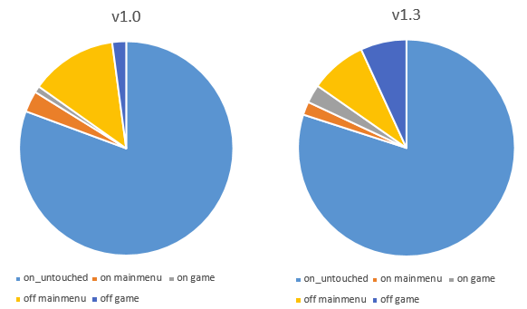
The new version obviously made more people use the option in-game, but it didn’t change the percentage of people disabling the sound in one way or the other.
Just for fun, here are some numbers showing extreme players in various ways:
Most levels played by a single player (including replays): | 5084 ! (completed all levels more than 5 times!) |
|---|---|
Level where hints are most frequently used: | Pack O, level 82: hints used 65.0% of the time |
Level where retries are most frequently used: | Pack A, level 2: retried 29.7% of the time |
Level where undos are most frequently used: | Pack A, level 2: completed with undos 43.4% of the time |
Longest time between first play and purchase: | 129 days |
Most rating popups opened by a single player: | 1889 times |
Most rating popups dismissed by a single player: | 117 times |
That’s it for the charts and numbers, feel free to share, tweet or leave a comment.
For the curious developers, the code used to generate statistics is on Github (in Python).
If you want to try the game, it’s available on Google Play, Kindle, iPad/iPhone and Windows Phone.
Read more about:
Featured BlogsYou May Also Like