Trending
Opinion: How will Project 2025 impact game developers?
The Heritage Foundation's manifesto for the possible next administration could do great harm to many, including large portions of the game development community.

Featured Blog | This community-written post highlights the best of what the game industry has to offer. Read more like it on the Game Developer Blogs or learn how to Submit Your Own Blog Post
A whistle-stop tour of game-branding from my experience in both indie and AAA publishing. This guide details eight actionable steps to creating an identity for your game - from concept to execution.

In my first blog a few months back, I detailed out five steps for studio branding. It was all about how you and your team are an extension of your games, and the way you present your studio should dovetail with the way your games look and feel. One feeds the other, and cohesion is important.
In this follow up article - the sequel, if you will - I want to focus on the games themselves.
What follows is a whistle-stop tour of game-branding from my experience in AAA publishing. As with my last guide, I'm striving to focus on specific, tangible steps that anybody can replicate (and hopefully without budget - this is indie-focused). I’ve never been a fan of wishy-washy guides without points that can be quickly actioned on.
Enough pre-amble, then - let's get stuck in. Here are EIGHT STEPS TO BRANDING YOUR GAME.
An important point at the top of this list: don't wait to start this work until your game is finished. This isn't PR or end-of-line marketing. Brand is the identity of your game and ensuring it's market-friendly; start this work yesterday.
Your design decisions directly affect the brand of your game. Some examples: the clothes your characters wear, the dialogue you write and the conclusion to your story can all have a profound impact on the brand of your game.
Creating iconic costumes will prompt cosplayers to attend conventions as your characters, great dialogue can birth catchphrases that enter the gaming lexicon ("The cake is a lie", "You have died of dysentery", "Finish Him!" etc etc) and writing an ending that doesn't close narrative doors will ensure you can develop a sequel (should that be your intention).
All of the above can effect your position in market and how consumers will perceive your game. Don't leave it too late - design a market-friendly game to begin with; retrofitting any of the steps below ain't easy.
Before you write a pitch a deck, design doc or script, write a press release. Do this is as early as you can. Do it when your game is but a twinkle in your eye. It will feel premature and weird, but thinking about your game as a finished product and preparing language for a hypothetical journalist will help you zero in on your game's USP and hooks. It'll help you design with a clear outcome in mind, and ensure you don't stray too far from your big sell.
Going through this process will also force you into writing a headline (effectively your logline/elevator pitch), and detail out your key features. Coming up with an elevator (or X Statement) is bloody hard, but contextualising it in the form of a press release makes it easier - you're writing with a headline in mind; you're imagining it slapped on the front page of your favourite website or magazine.
When I announced Headspun, I didn't have to do much work to my press release. I'd written it before I'd written a line of code, and it helped shape the development. 'AN FMV GAME SET IN THE HUMAN BRAIN' the headlines read, 'PEEP-SHOW MEETS HER STORY'.
(Superstring Patrons can gain access to this press release and more as part of the original post).
Unless you've managed to invent yourself an entirely new genre of game (well done if you have, nice one) you will have competitors, and working out how you are similar (or unique) to said competitors is at the heart of branding.
By surveying the land and creating a competitive set, you can highlight what everybody else in this category is doing (or not doing) and carve out your own little spot. It's not about redesigning your game or adding new features, but rather elevating your existing features or attributes which make you stand out from the crowd.
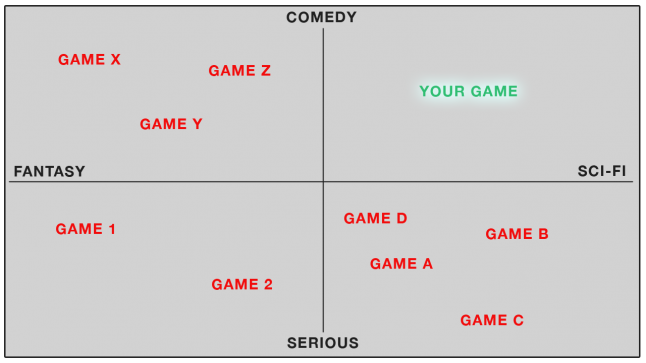
Here is a crude example I spent no way near enough time making:

Let’s say you're developing a first person narrative game (a walking-sim, if you will), your competitor graph might look something like the above.
The idea is to find a nice, comfy little spot for your game on the map, and then double-down on owning that space. In this example, we can see that there’s a hypothetical gap for a funny sci-fi game (I’ve no idea if this is actually true), so can craft your trailers or promotional imagery with this tone and direction as your focus.
You can shimmy the axes around until you find combinations which give you an ownable outcome - if you can’t find a spot to own, whack in a different set of axes and continue your brand work accordingly.
This work is not only helpful for brand, but also if you're seeking investment and trying to prove a gap in the market.
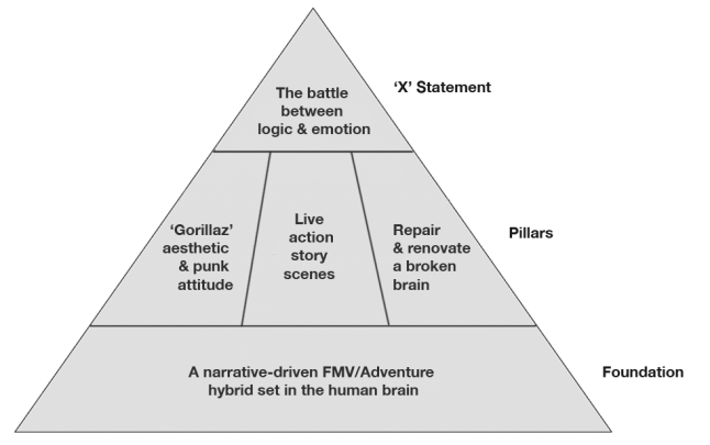
This could get controversial; these pyramids take many different forms depending where you look. One publisher's is different to another's, and everybody has their own preference. They all attempt to do the same thing, though: give you a framework for which your game will be defined by in market.
Using Headspun (as good an opportunity to plug it again as any) as an example it might look a little like this:

Here you can see:
Foundation - the base/canvas on which your game is based. This can be as simple as the genre you occupy, or the broad narrative set up. It should be pretty literal.
Pillars - these are the features or concepts that hold everything up. Across your campaign, these will form the bulk of your talking points and messaging. They’ll often be related to your three key features - in another pyramid they might be called ‘functional benefits’, and represent the things that separate you from the competition.
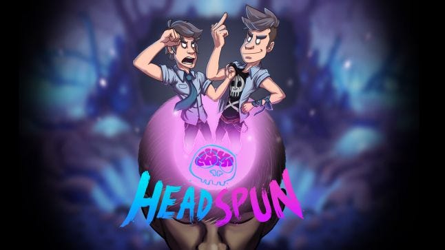
‘X’ Statement - this, as you can tell by its home at the top of the pyramid, is the most important part of the pyramid. It’s what everything else supports and is generally what all your positioning and brand work boils down to. It’s your razor. Your player promise. It’s - sometimes - your tagline for the game. It’s not a feature, though - it’s thematic; the fantasy your game offers to players. Any marketing assets you create should ideally reflect this statement in some form (I’ve included the Headspun key art below so you can see how it correlates to my pyramid)

Note: game designers will, quite naturally, come at this pyramid task with a design brain. Design pillars, however, are different to brand pillars. This isn't about mechanics or systems, necessarily. It can be features of your game, but it's always viewed through a brand lens. It's more about feeling than features.
Good luck!
(There's about five full articles waiting to be written on this point alone, so I'm going to leave this be for now. It is, however, a step you'll need to complete before other work can be done (like the below)).
If you're an indie developer, you're not going to be able to afford the tens of thousands it costs to conduct market research. That doesn't mean you can't test your assets, however. Send WIPs of logos or art to friends/colleagues/family/your colleague's family to test assumptions and see what sort of reaction you get.
I'm a firm believer that consensus breeds mediocrity, and all feedback should be taken on board with a pinch of salt; you're the vision-holder. Don't compromise your vision by keeping everybody happy. All the best art in this world divides opinion. Don't be put off by a few negative reactions, just make sure that all the reactions aren't negative. This is why market research is important - we all have blind spots sometimes.
Test your assumptions!
Equally, if you're indie, chances are you don't have the time/resource to be farting about creating a fully-fledged style guide. Depending on the level of your aspiration, however, it's an invaluable tool for cementing the brand and vision of your game, and ensuring others (partners, publishers, stores) don't bugger up your carefully curated identity. Your guide should cover:
Logo and rules for use (dos and don'ts)
Iconography usage rules
Approved fonts
Key art and appropriate usage
Colour swatches (your approved colour palette)
Social media avatars/headers
Once you've covered everything you feel is relevant, PDF up that badboy up and ensure any partners you work with have access to it. It can be updated at any point, so don't be afraid to get stuck in on this asap.
Phwoar that was a wanky title to end on, wasn't it!? Basically, though, once you've established all of the above and cemented your brand, you need to live up to it. You need to birth it into the world. And it's more than just imagery.
All of the channels for your game - from Twitter and Facebook posts, to videos, adverts and patch notes - need to carry the correct tone of voice which reflects what you've created. Think about the language that you use when interacting as your brand - how would your game walk and talk if it were personified? You need to summon the voice of this person and use it when communicating as your brand. And you won't be able to do it without going through all the steps listed above; conjuring this imaginary person out of thin air just won't happen.
—
That’s about all I got this time around. As I said, this is a quick and very surface level guide to game-branding (I'll return to step 5 another day, across various different articles), but I hope somebody finds some use in it. You can find more articles and discussion over on the Superstring Patreon. Feel free to drop me a line if you have questions or want a deep dive into specific areas.
Jamin
Read more about:
Featured BlogsYou May Also Like