Trending
Opinion: How will Project 2025 impact game developers?
The Heritage Foundation's manifesto for the possible next administration could do great harm to many, including large portions of the game development community.

Featured Blog | This community-written post highlights the best of what the game industry has to offer. Read more like it on the Game Developer Blogs or learn how to Submit Your Own Blog Post
The article describes the process that guided me in designing the levels of DY: Prologue, and my attempt to translate a three-act story structure into level design. It covers a tutorial level (Act 1), a multi-path level (Act 2), and a boss arena (Act 3).

(30 min read)
SYNOPSIS — The article describes the process that guided me in designing the levels of Die Young: Prologue, and my attempt to translate a three-act story structure into level design. It covers a tutorial level (Act 1), a multi-path level (Act 2), and a boss arena (Act 3).
[Note: Die Young (PC/Steam, 2019) is an open-world first-person action/adventure game developed by a team composed of 8-12 people, using Unreal Engine 4. The game is focused on free exploration and narrative. I was the lead designer. It is set on a Mediterranean island inhabited by an enigmatic rural community. As Daphne — a young woman who found herself trapped in a well, not knowing who kidnapped her and why — your ultimate goal is to escape the island.]
1. Introduction
2. The Outline
3. Act I "The Sewers" – Tutorial Level
4. Act II "The Harbor" – Main Level
5. Act III "No Escape" – Boss Fight
6. Final Thoughts
7. Appendix
8. Credits
In the last year of development of Die Young, the game director approached me with the idea of a free playable teaser to be released before the launch of the main game.
There were only a few guidelines for the project:
Stand-alone (not a demo).
Showcase of the main game’s mechanics (parkour, climbing, crafting, melee & ranged combat, fire weapons, AI interactions).
More action-oriented than the main game.
Short (a maximum of 7 minutes in a speedrun).
At the time, the main game was in full development, but still lacked several key features, such as ranged weapons (namely, the crossbow), fire mechanics (torches, molotovs), and more advanced AI routines. This playable teaser was a good opportunity for the team to focus on those features on a relatively tight deadline.
As the teaser was not intended to be a Die Young demo, new levels had to be designed. From a production standpoint, I did not want to waste artists’ efforts to craft assets not included in the main game; on the other hand, I did not want to create anonymous levels just as “practice grounds” either. Also, since the main game was mostly a non-linear exploration game, I wanted to respect players’ autonomy as much as possible, although on a very small scale.
So these were my self-imposed guidelines:
Use ready-to-use (or scheduled) art assets.
Write a story to be set in the same world.
Add alternative/optional routes (but keep story beats consistent).
Starting off from the script I was writing for the main game, and challenging myself to make sense of a teaser trailer of Die Young we published a few years earlier (when we did not even have a story yet), I came up with the idea of a Prologue: a stand-alone short story, featuring a new character and set on the same island a few days before the events of the main game. The plan was to have a three-act story structure: one level for each act. The main character would struggle in a last-ditch attempt to leave the island alive, fighting her way through increasing obstacles and turns of events. To build the rising action, I wrote down the story beats playing with McKee’s concept of “gaps” between expectations and results. This is the story outline:
Environment: Community’s island (sewers, harbor, abandoned dock).
Time of Day: Twilight.
Mood: Sense of mystery and dread.
Timeline: Two days before the events of Die Young. The community’s militia is dealing with a massive drug intoxication among their prisoners/workers, which caused riots and bursts of violence (the intoxication was set up by a group of infiltrators to create a diversion).
Name: Nehir.
Background: An infiltrator of the island’s community. Her task was to kill the head of the community and let one of their prisoners escape. The mission failed and now she is chased by the community’s militia.
Objective: Survive, reach the rendezvous point to find her way off the island.
Militia (melee fighters, crossbowmen, trained dogs)
“Junkies” (drugged workers/prisoners)
ACT I – “The Sewers” (Tutorial Level)
[cutscene] Chased by your enemies, you have just reached the entrance of a sewer system and shut the gate behind you, buying yourself some time for the escape.
[gameplay] You walk deep into the sewers. The tunnels should lead to the rendezvous point, but something is wrong: a door that was supposed to be left open by your partner is locked instead. You must find another way.
ACT II – “The Harbor” (Main Level)
[gameplay] You have found an exit from the sewer. Far in front of you, you recognize a cliff with a lighthouse: your rendezvous point is just beyond that cliff. But there is a problem: the detour led you to a guarded harbor. You have to cross it to reach your goal.
[gameplay] You sneak into the harbor. Something odd is going on: the guards have gathered the workers inside the fenced area where the fuel tanks are, and locked them in. The workers’ behavior is erratic and aggressive, as if on drugs. To get past the harbor, you will have to confront both the drugged workers and the soldiers.
(Note: here the player can choose from different routes and approaches, experiencing a different set of story beats; “ACT II” has its own three-act structure; more in the dedicated chapter below).
[gameplay] After a climactic confrontation, you manage to leave the harbor and your enemies behind. You reach the cliff and spot a light near the coast: a dinghy in a shadowy bay not too far away — it must be your rescuer. This is your way out!
ACT III – “No Escape” (Boss Fight)
[gameplay] You walk down towards the bay. It is an abandoned dock, half-covered with overgrown vegetation. You find your way towards the sea, but you do not like what you find: your rescuer is dead, killed before he could force open the gate to the pier. The whole wharf is fenced. It is a dead end.
[cutscene] Things get worse: enemies arrive from a tunnel. A trap. Among them, a big guy you do not want to mess with.
[gameplay] You hide among the reeds but it is only a matter of time before they spot you. It is you or them.
[gameplay] Against all odds, you are the last one standing. Barely. You search the big guy’s dead body and find the key for the tunnel gate. A few meters into the tunnel, the lights go out.
[cutscene] You find your lighter just in time to see a creepy guy punch you in the face. “Sweet dreams, kitty” is all you hear before passing out.
[cutscene] You wake up tied to a chair in a cabin. It is morning outside. The creepy guy is rambling on about you and your partner. He wants answers, but you will not talk. He kind of likes you. He promises to get back to you after dealing with your partner. Then, you faint again.
[cutscene] You are awakened by a folk song playing on a radio. You look around: the cabin is clear. Time to make an escape. The rope is tight, you are growing impatient, you fall. But you are almost free now. Almost.
The creepy guy bursts into the cabin. He holds an axe. “Sorry, kitty,” he says. “I have got orders.”
Words did not even have time to leave your mouth.
THE END
Since the Prologue was a stand-alone game meant to be released for free (potentially reaching different kinds of players), we needed a level to introduce the mechanics of the game in a safe environment. I made a full list of these mechanics and ordered them by difficulty (some mechanics, like “jumping”, were repeated multiple times on the list, in order for the player to practice them in an increasing level of challenge).
The idea of setting the tutorial inside a sewer system was convenient for two main reasons: 1) I could design each room for a specific purpose, and then order and easily connect them through tunnels, 2) we already had a modular kit for sewers.
The downside was that there was a high risk for the level to feel too linear and dull (a common problem in tutorials, anyway). To mitigate the infamous “string of pearls” structure, I gave myself some additional “rules”:
Give each room a unique look.
Do not make it longer than strictly needed.
Add small emotional twists along the way.
To fulfill the first one, I tried to characterize the spaces with different shapes and architectures (e.g. high-ceiling rooms vs. claustrophobic spaces), players’ movements (twists and turns, ups and downs), perspectives (top-down vs. bottom-up), lighting (dark vs. light, warm vs. cold) and set dressing (draining rooms, personnel rooms, storage rooms, etc.).
As for the small emotional twists, I used a few tricks and (again) “gaps” to keep the player vigilant despite the linearity of the tutorial. Some examples:
The room design and lighting lure you to a gate, but it is closed; turning back, you notice a drainage tunnel to crawl into (the so-called “bait-and-switch“).
In the silence of the sewers, you hear a man crying; he is trapped in a small, inaccessible room at the end of a long tunnel. You cannot help him (this is actually a setup for a payoff in the main game; the inaccessible room can be visited in Die Young).
There is a message for Nehir (the player) left by her partner: a map picturing an exit route from the sewers, and a lighthouse. You are on the right track, after all!
You find the exit door marked on the map, but it is blocked. Something must have happened to your partner. You must take a detour to an unmapped section of the sewer and find a new exit route.
Walking down a slope, you enter a long, narrow tunnel; at the end of it, a silent human-shaped silhouette is blocking the way (you can face or avoid him using a small tunnel on the side).
With the addition of these little twists, the level should feel less linear and predictable. I tried to space these beats evenly throughout the level, alternating tension and relief, pacing them along the increasing difficulty curve of the new mechanics. It was also important to insert in-between spaces where no action or events take place. These “silent beats” serve to:
Provide time for the player to process an emotional beat (e.g. after leaving the crying man behind).
Give the player resting time after a difficult task (e.g. after the advanced climbing section).
Create a relaxed and confident feeling before an unexpected twist (e.g. before seeing the dark silhouette blocking your way).
Finally, I arranged a couple of rooms to allow the player to take a peek at future sections of the same level, in hopes of conveying the feeling of a structurally consistent gamespace.
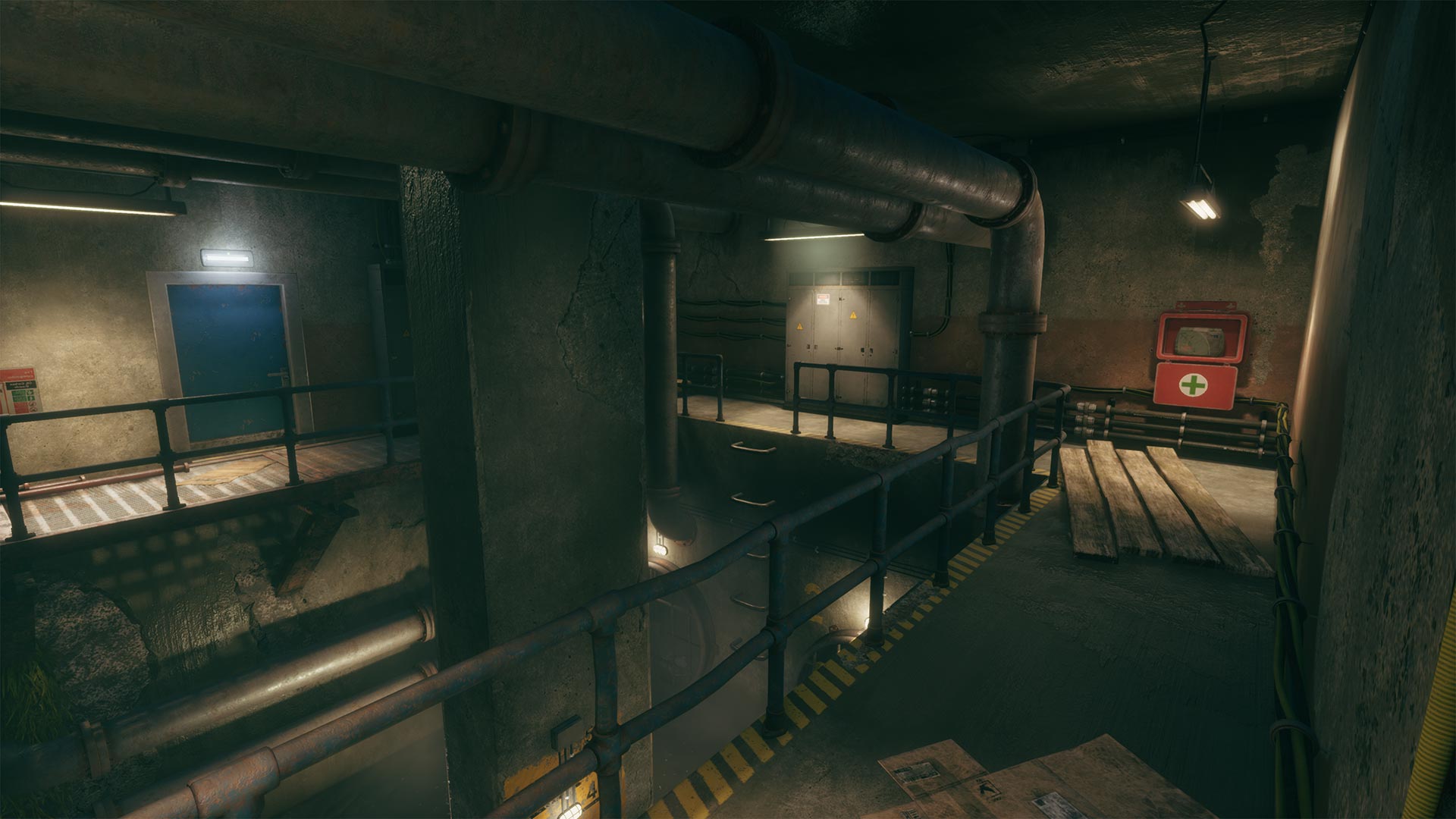
(Click to enlarge)
The level ends with you reaching the exit tunnel, showing a vista of a lighthouse (the same as drawn on the map). You now enter the “Harbor” level.
Just like I did for the entire Prologue, for this level too I decided to adopt a three-part structure (to not confuse the two, here I will use the “Setup / Confrontation / Resolution” definitions). It is worth noting that the three-part structure can work as a fractal: from story to acts, all the way down to single beats (however, using this structure recursively might lead to predictability, so I would advise to use it prudently).
SETUP. This part is set in a natural environment between the exit of the sewers and the harbor entrance. It has three purposes:
1) Setting up the main objective.
2) Offering a vantage point over the next section.
3) Introducing stealth mechanics.
The first one is immediately addressed as the player reaches the end of the sewers: the last tunnel frames a lighthouse standing on a cliff with a distinctive natural hole in the rock. I thought it would be the perfect landmark: the lighthouse would be visible virtually from any point of the harbor, while the hole in the cliff grabs the eye and invites the player to go through it.
The vantage point was trickier. I wanted the player to have the best strategic view over the next area, so I raised the landscape on the left, modeling a slope. The problem now was to push the player to get there first, before proceeding to the harbor. I tried different approaches to catch the player’s attention: a lone tree, “breadcrumbs” (pickups), a swarm of fireflies… nothing seemed to be working in playtesting. Only much later, while I was working on the harbor area, I got the (macabre) idea of a pile of burning bodies; which not only did the trick (a fire has all you need to grab the eye: light, movement, and contrast) but also fit and enriched the story background. Oftentimes, design problems are great opportunities to improve your work!
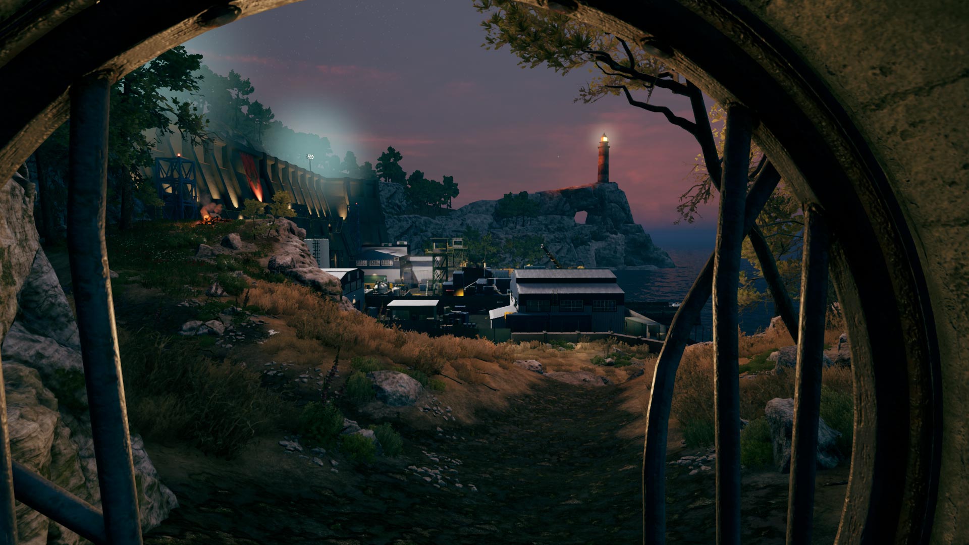
(Click to enlarge)
The landmark is inspired by the “pierced cliff” (Sa Foradada) in Majorca, Spain.
Once the player reaches the burning pile, surveying the harbor from the vantage point is almost inevitable. I put a lot of effort into that vista. I wanted it to be as readable as possible, offering the player the chance to plan a strategy from the start, evaluate different objectives, routes, possibilities, obstacles. While blocking out the harbor area, a camera view from the vantage point helped me to keep an eye on the composition.
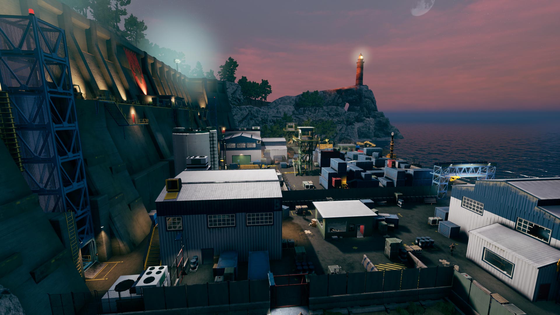
(Click to enlarge)
The vantage point offers a nice view of the harbor, suggesting short and long-term objectives. While most of the area and main structures are readable and not overlapping, I purposely hid one of them (the Fuel Tanks area) to save it for a future emotional beat.
Finally, I used the wide space preceding the guarded gate of the port to introduce stealth mechanics. Tall grass and a few low props were arranged to get the player to crouch and hide among the bushes, reach the enemy from one side, and distract him with a rock.
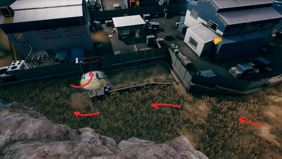
CONFRONTATION. This is the actual core of the Prologue, where the player makes use of the mechanics learned during the tutorial and is free to approach the area as they see fit.
Keeping in mind my self-imposed guidelines (use mostly ready-to-use assets, tell a story, encourage players’ autonomy), I started doing research about the setting, collecting references for me and the artists (warehouses, container yards, fuel docks, etc.). We already got most of the 3D assets at the time. For the blockout, I could use our modular kits and even some finished models. While I was looking for references, I also started making a list of ideas as they popped into my mind.
It is advisable to have a varied list of “cool moments” (gameplay or emotional beats) before proceeding with the level layout. It is kind of a wish list, an unstructured collection of ideas; there is no rule, and they could range from specific locations (a maze-like container yard, a construction site, a drug laboratory), to spaces for core mechanics (parkour among the racks of a warehouse), interactive objects (sliding gates, shutters, elevators, fuel valves), “puzzles” (moving containers with forklifts to create a path to a hard-to-reach location), AI encounters (an enclosed area where the “junkies” are locked in and threaten anyone who approaches the fence; you have to pass through them or dangerously walk above them on a plank; you can open the fence and let them fight the guards for you), scary moments (a pitch-dark tunnel filled with junkies), new items (an unknown drug, a lethal chemical), secrets (you must locate a container hinted at in a document), etc. Anything goes, in this phase.
Once I had a stronger knowledge of the setting and listed enough ideas to fill the level with, I began to work on the layout: this is when those ideas start to be spatially and logically organized (in scale pace, and beats).
First of all, I had to consider the extension of the level. Since the Prologue is set on the same island as the main game, I wanted it to fit inside a specific — and relatively small — area of the original map (as often happens, limitations breed creativity; this limited surface forced me to optimize spaces and make use of verticality).
I identified seven macro-areas for the level and divided the space accordingly. For each of them I defined their look and features, enemy types, gameplay, and main beats:
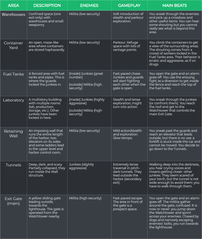
(Click to enlarge) “The Harbor” Macro Design
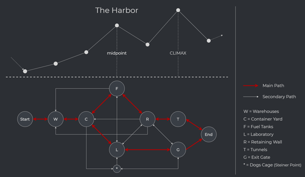
To respect players’ autonomy, I intended to offermultiple routes to get past the harbor. However, I wanted to make sure that each player would experience at least two intense beats during their playthrough. To this end, I placed climaxes just before the two possible final exits (Tunnels, Exit Gate), and peaks at the two main alternative midpoints (Fuel Tanks, Laboratory).
The resulting flow is something like this:
Now that I had a solid overview, I moved on to the proper blockout phase (I find paper design too limited for 3D games: there is a high risk of neglecting verticality, and the perception of scale is also compromised). Having modular kits is extremely useful at this stage (we designed our “buildings kit” very early in the development of the main game; it proved to be very versatile and helped us to keep our metrics consistent throughout the game). Using these kits, I began to define buildings and spaces inside the macro-areas. I wanted to squeeze as much gameplay as possible out of the limited surface I was working with, and since one of our core mechanics was parkour, I knew that I should aim for different layers of heights: virtually every floor, ledge, and roof in the level had to be walkable and used to create more possibilities for the player.
Keeping in mind the main flow and tempo of the beats, I started working on sub-nodes inside the areas (ground-level and elevated routes, gates, rooms, ladders, hidden paths, etc.). I had to make sure to provide enough clues for those possibilities, clearly declaring the main objectives but subtly suggesting the paths to reach them.
This is when composition, sightlines, and lights come in. Colors and lights help to keep track of the key elements of your level, since grayboxes can quickly become unreadable without. Those key elements are also the ones that should stand out more once the level is fully finished, so it is important to identify them as soon as possible and ensure they are correctly framed from the player’s perspective.
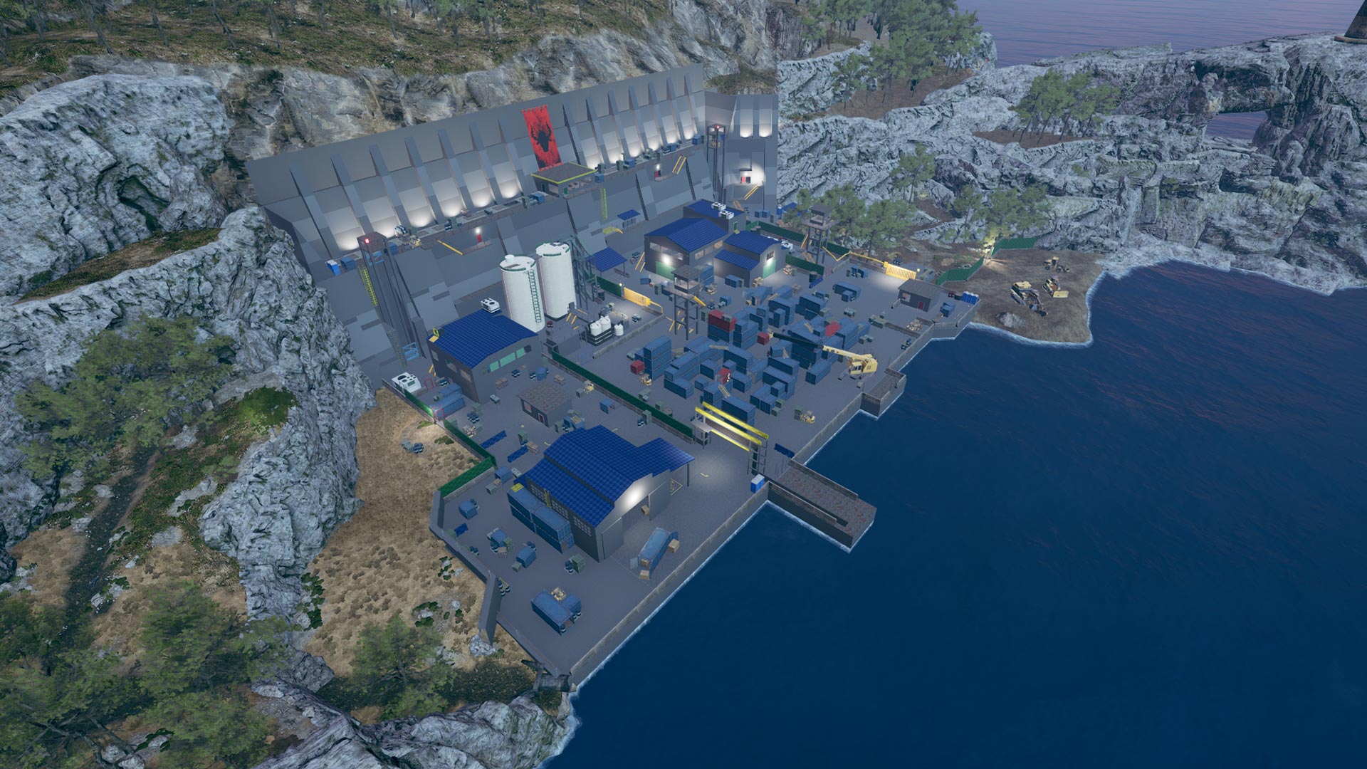
(Click to enlarge)
While working on the blockout, in addition to our modular kit for buildings, I also reused some of the finished assets from another level of the game (e.g. the two huge fuel tanks).
Iteration after iteration (sped up by the use of the modular kits), I got to a fully explorable space: all routes and waypoints were in place and each route could be tested to get you from start to finish. Once the navigation felt nice and smooth, it was time for enemies and covers.
Enemy and cover placement has a huge impact in weighting the players’ routes. Subconsciously guided by the principle of least resistance, players evaluate paths for their efficiency and perceived threat: an enemy guarding the fastest route forces the player to seek alternative, safer paths; similarly, an open, wide space with little or no covers (the so-called “prospect space“) is perceived as potentially dangerous.
In setting up covers, it is extremely important to ensure that there is absolutely no space for ambiguity. The player must be able to read covers at a glance, clearly distinguishing them from non-covers: no prop should lie in the “buffer zone” between previously defined heights for covers (low and high) and non-covers.
In the harbor, I used a set of 3D assets taken from previous levels of the main game (small containers, boxes, tanks, barrels, stacks of pallets, etc.). Their heights were consistent and they could easily be categorized as low or high covers. Since we were short on time, using these finished assets already in the blockout was a production necessity. This means that by placing covers I was not only managing gameplay but also set-dressing most of the level. This is something that can easily slip your mind while working with generic gray boxes, but covers should always seem logical in the environment, as they can contribute greatly to making the gamespace feel believable.
For the sake of readability and flow, it is better to organize covers in clusters. These clusters work as nodes, guiding the player from cover to cover, letting you — the designer — predict their movements inside your level; this allows you to work with sightlines more easily, evaluating what the player should or should not see in one location or another.
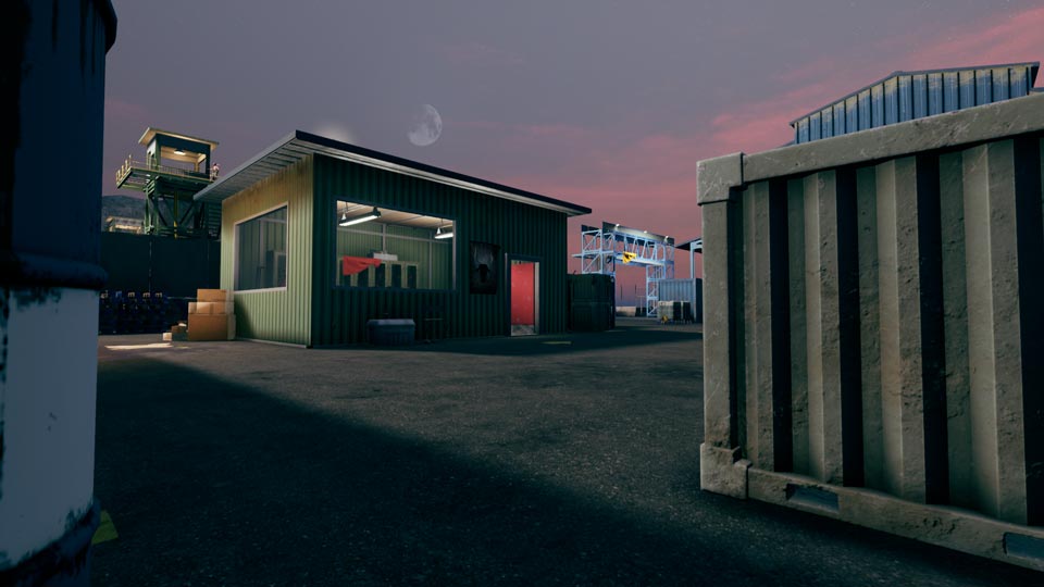
(Click to enlarge)
This is the view from your cover at the entrance of the harbor. Not only did I ensure that no cover cluster would block the sightlines towards the next goals, but I actually used covers to frame them, hiding any other distraction (also note that the fence in the back is purposely screening the rest of the harbor).
After a new set of iterations, the level was ready in all its gameplay elements. Working side by side with artists, we implemented the final art. Again, color and lights were carefully chosen to achieve the desired mood and guide the player. The harbor is characterized by cool colors (mainly blue and green) to feel like an inhospitable place; warm colors (especially yellow and red) contrast more with this background, making them the colors of choice for highlighting objectives and possibilities (main gates and doors, stairs and ladders, climbable ledges, etc.).
At first, I was not sure about using white color for the roofs, but in the end, I think that the contrast with the ground level helps to expose their affordances.
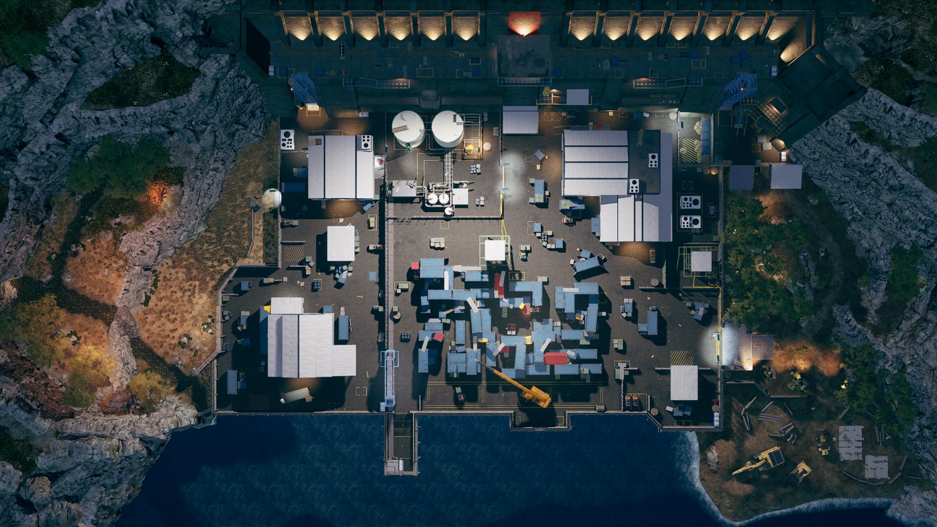
(Click to enlarge) Top view of “The Harbor” level.
RESOLUTION. This area mirrors the one from the setup. It is a natural environment that separates the harbor from your destination: the hole of the cliff under the lighthouse. To reach it, you must cross the guarded area and crawl into a narrow cave where the enemies cannot follow you.
There are only two entry points for this area:
from the Exit Gate
from the Tunnels
If you get there from the Exit Gate, the guards are alarmed and you will have to run for your life towards the cave. If you arrive from the Tunnels, however, you may stealthily avoid the patrolling enemies and reach the cave.
The access into the cave is at the highest point of the area, with a path leading up to it; to prevent the player from reaching the sea, the strip of coast outside the harbor is blocked by a construction site. If you arrive from the Tunnels, the cave is on the same line of sight as the lighthouse, hard to be missed; if you come rushing from the Exit Gate, the cave is slightly to your left. For sure, I could have handled the latter better: the space in-between the cave and the construction site, hidden by trees, is ambiguous: is that a path or a dead end? Players might be easily fooled: this confusion might translate into panic during the escape. It was not at all intended, but I wonder if this coincidentally improved the climax of this beat.
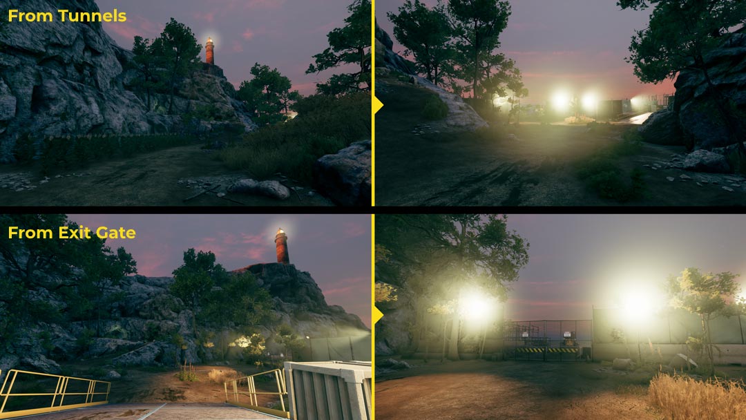
(Click to enlarge)
I placed some fireflies to highlight the entry to the cave, but it is the surrounding spotlights that do most of the work here; the lighting artist and I arranged the lights in such a way as to blind the player whenever they would look in the wrong direction (that is, towards the harbor or the coast).
Once you have crawled your way out of the cave, the lighthouse is again framed to lead you to few jumps on the side of the cliff: you now stand in the hole in the rock you saw from a distance at the beginning of the level. On the other side of the cliff, you spot a light: a dinghy docked in an abandoned bay. Your rescuer is here!
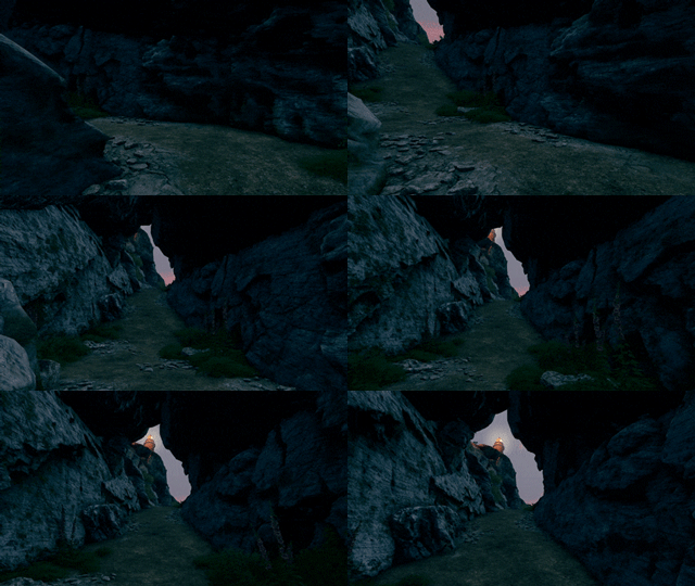
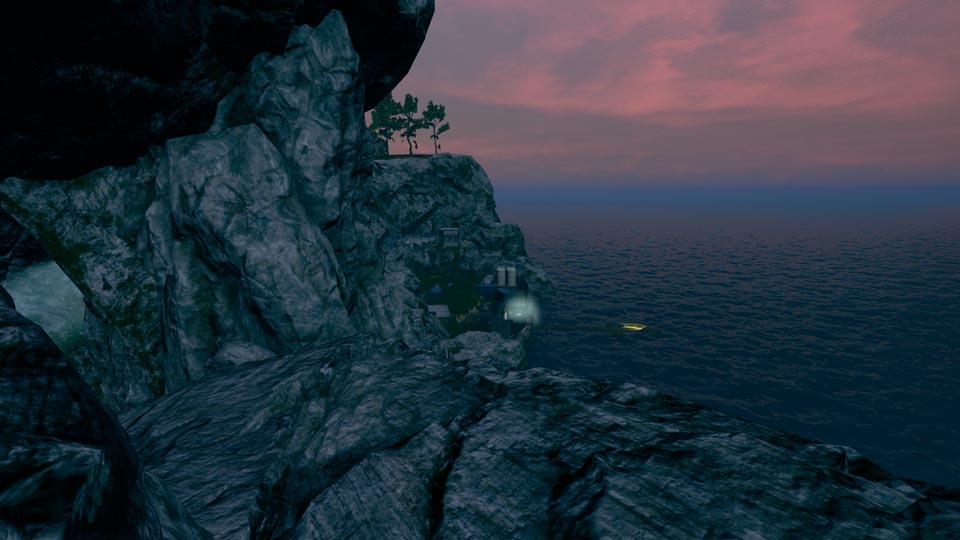
(A) (B)
(Click to enlarge)
(A) The framed view of the lighthouse, crawling out of the cave. (B) Vista of the final area. This vista is honestly poor, and it could use several improvements: for instance, the foreground frame should contrast more with the background, instead of blending in; the pier is barely visible; also, it is lacking balance on the right side (maybe a light cone from the dinghy would do?)
After spotting the dinghy from the hole in the cliff, a path takes you to the backside of the abandoned dock. Aside from the light coming from the pier, the area is pretty dark. I wanted the player to instinctively run towards the rescuer, so I also cleared a path among the giant reeds and placed an empty container to funnel them towards the light. The wild canes, blocking the view, delay the gruesome discovery: the rescuer was killed.

(Click to enlarge)
As you reach the dead body, a cutscene is played to introduce the enemies entering the arena.
The boss fight can be summarized like this:
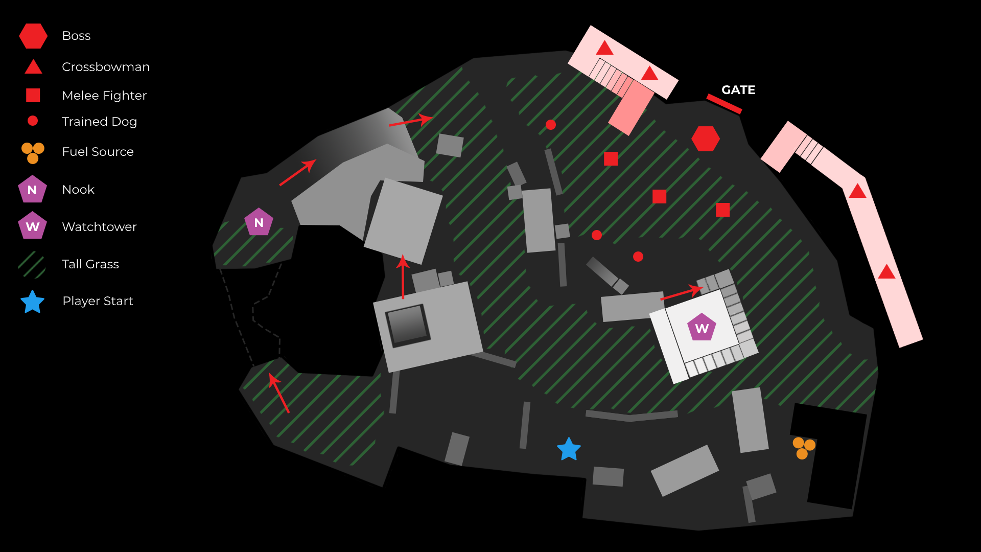
Enemies:
Boss “Huge Hammer Guy” (high HP, heavy melee attacks, slow but strong ranged attack)
Crossbowman x4 (only ranged attacks)
Melee Fighters x3 (melee attacks, slow and weak ranged attack)
Trained Dogs x 3 (only melee attacks)
Main Goal:
Kill the boss enemy and take his key to escape the area through a tunnel.
Secondary Goal:
Kill all the other enemies.
Available Weapons (on-site, not counting the ones collected by the players earlier in the game):
Crossbow & Bolts
Molotovs (to be crafted using materials found in the arena)
Harpoon (strong melee weapon)
Starting conditions:
The enemies do not know the exact position of the player: they search the area randomly. The crossbowmen are on a higher, inaccessible ground: they cannot reach you and you cannot reach them.
Strategies:
You can use the wild canes to hide from your enemies and stealth kill them using the crossbow, one by one. If they spot you, you have two refuges:
The ruined watchtower: enemies cannot follow you to the top, but you are exposed to ranged attacks. The top cabin offers protection from ground-level enemies; from there you can shoot the crossbowmen, but they can also shoot you.
A nook in the cliff: only trained dogs follow you there; you cannot shoot the other enemies unless you expose yourself to their ranged attacks.
You can use these two refuges to face the enemies separately (crossbowmen from the watchtower, dogs from the inside of the nook) and to “take a breath” during the fight (for healing or replanning your strategy).
Molotovs can be used to kill several enemies at once. You can craft them by collecting the materials scattered across the arena and using the fuel source located in one corner of the dock (it takes time to interact with it, so you have to be fast or stealthy).
The best strategy is to kill all the other enemies before confronting the boss.
The boss’s melee attacks deal enormous damage. His ranged attack (rock throwing) is slow but powerful, and it can knock you down. The most effective way to kill the boss is using ranged attacks (crossbow and molotovs; headshots deal more damage than body hits). Additional bolts can be looted from the crossbowmen as they fall to the ground when killed.
Ending:
Once you got the key from the boss’s dead body, you can open the gate that the enemy squad used to get inside the arena. After a short walk in the tunnel, the lights go out and the final cutscene starts playing.
(Click to enlarge)
Map of the “No Escape” level. The reddish platforms to the right, where the crossbowmen spawn, are inaccessible to the player. On the left, the player can reach the nook from a narrow passage inside the rocks, or from above by climbing the surrounding structures.
WHAT WENT WRONG. This last boss fight was designed and produced over a very short period of time, and the end result was surely disappointing for most of the players.
First of all, I underestimated the time needed to make the AI work in such a small space. Back then, the only boss fight we had was against a custom-made AI in the main game, which could only be killed by luring it to some electrified fences (not exactly exciting, either). This time, however, I planned to use a variation of a bulky enemy type we had; still, this AI was used in wide, open areas as a scary enemy to keep away from during exploration. Making it work in a tight boss fight arena was something else entirely, and I should have foreseen that.
The first problem, of course, was navigation. Due to the AI’s limited navigational parameters, the main issue was that the AI was often seeing its target (the player) out of its NavMesh, therefore switching to range attack (rock throwing); however, in such a small space, it had a hard time finding the right position to perform those attacks, becoming a sitting duck for the player (even worse, sometimes it kept doing range attacks even though it was constantly missing its target). We tried a simple script to force the AI to move to specific locations whenever the player would step into areas that had caused the AI to “act up”; nonetheless, there are still exploits you can use to win the fight.
Another major design problem was level readability. The dock is lit by lampposts and spotlights, but there are still too many dark spots in the area. On the ground level, the tall vegetation makes it difficult for the player to aim properly at enemies, while on the higher ground crossbowmen are hardly visible against the rocky background.
For the same reasons, the player would also miss a lot of the materials and items scattered across the arena, especially the ones needed to craft molotovs, and loots from the dead crossbowmen. So, even if the area itself provides a good number of resources and ammunition, players are probably going to either miss or waste them, due to bad readability.
The result is that most of the players feel like they do not have enough “firepower” to use against the level boss, especially after spending lots of their resources to kill the other enemies in the arena.
Furthermore, damage balancing was a bit off. Molotovs do not feel powerful enough against the boss, despite the effort required to craft one (gather the materials, reach the fuel source, etc.). The boss’s HP amount might also feel a bit overwhelming, especially if you aim your bolts at the body, causing a damage that is only 1/25 of his total HP (headshots are 4 times more effective, but they are easy to miss).
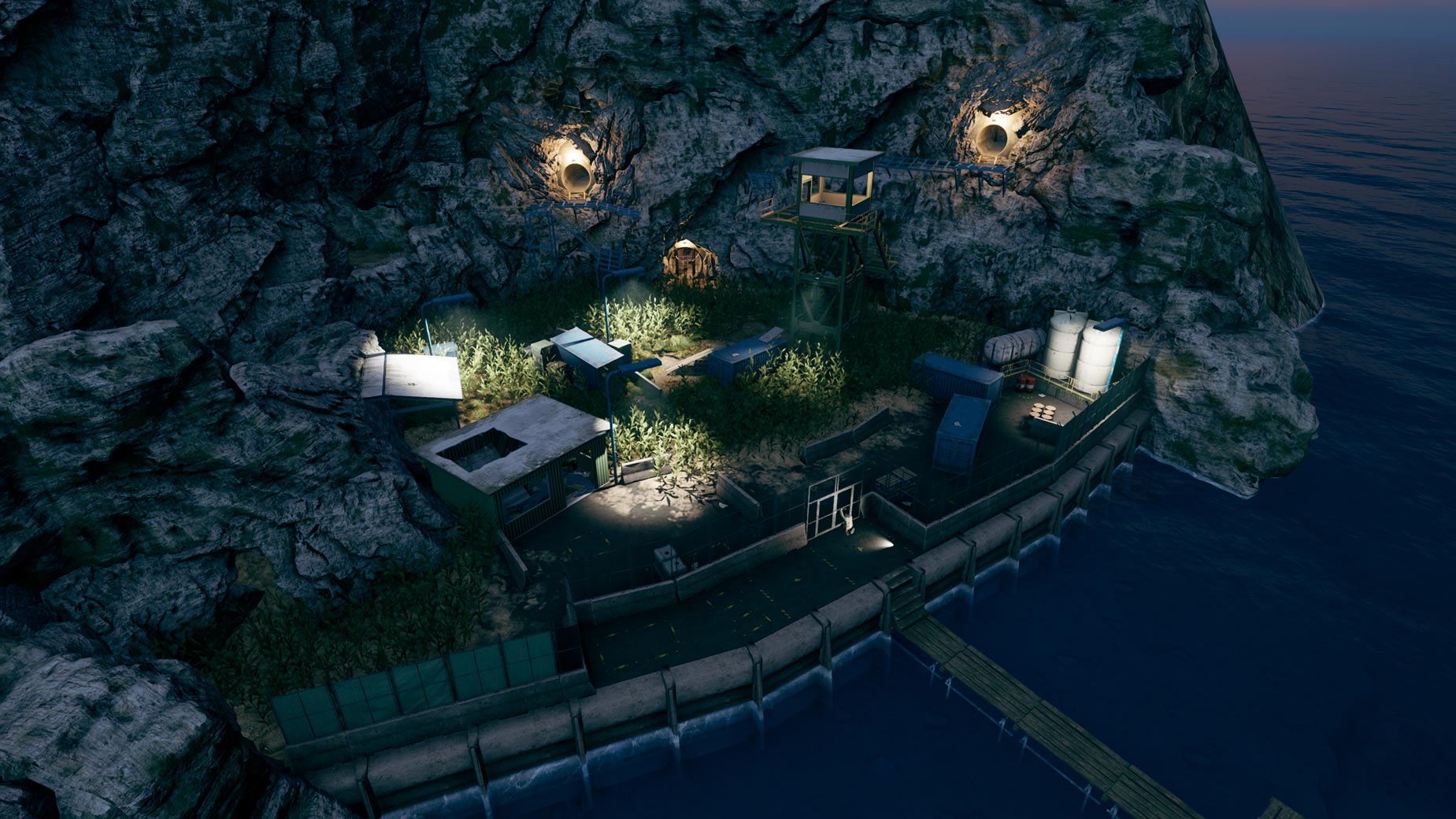
(Click to enlarge) View of the “No Escape” level.
My biggest regret about the Prologue is that we did not manage to properly polish the game due to limited time and resources. Even though the game was generally well-received when it was released, there was recurring criticism about some specific design issues:
1) The boss fight. In such cases, extensive playtesting is the key to identifying these kinds of issues. To the team (ten people), a couple of external testers, and me, the boss fight did not feel too difficult (some even won on their first try), but you cannot really trust those who know the game too well. And you definitely cannot trust yourself when it comes to difficulty balancing! Ask non-expert players to try your level out and never underestimate the time needed for testing and iterations.
2) No “stealth kill” option. Since the main game focused more on exploration than on confronting enemies, we did not have a “stealth kill” option at the time. There was a plan to implement it for a while, but we prioritized other features and, in the end, we never added it to the final game. However, in a more action/stealth-oriented game such as the Prologue, you can feel that something is missing. I tried to compensate for the lack of this feature by encouraging the use of the crossbow as a stealthy weapon, but why waste bolts when you could sneak up on enemies and — say — cut their throat? The protagonist is a well-trained field agent, after all. It was not simply the lack of a gameplay feature, but its absence felt wrong from a narrative standpoint, too.
3) “Random” checkpoints. In the main game, you can manually save at campfires (or anytime by crafting one); it fits the setting, since you are on your own to survive on a hostile island. The Prologue is different: the events take place in the last few minutes of a desperate attempt to flee the island. Using a campfire would make no sense. Since implementing a new save system only for the Prologue would have taken too much time, we decided to use checkpoints: the game would automatically save the first time the player enters a trigger volume.
I placed these volumes in what I thought to be key moments of the level, but they proved to not be enough. Many players complained about the arbitrary location of the checkpoints, lamenting about losing significant parts of their game.
In retrospect, I probably could have used a slightly modified version of our consumable “campfire” item, mostly using the same logic, but with an “unlimited use”; players could have selected it from the inventory (or the quick slots), triggering a quick save any time during the game. I could have renamed the item “Lucky Charm” and used it as further characterization of the main character (once again, turning a design problem into an opportunity).
(Click to enlarge)
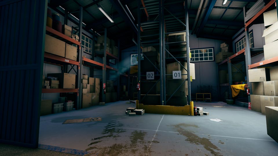
In this warehouse, you can climb and jump on the racks to reach the broken window on the top-left (highlighted by “god rays”). This path will take you to the roof of the warehouse, then to the upper part of the pipe-bridge (which is a good vantage point) and eventually to a medical container with lots of useful items.
(Click to enlarge)
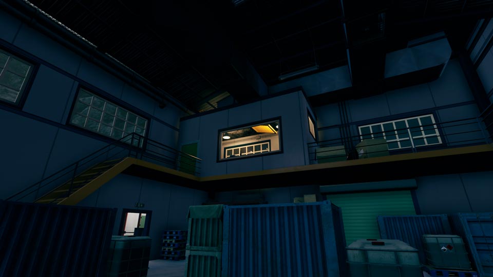
In this warehouse, only the room on the first floor is lit. The door is locked from the outside, but you can see a loose air vent on the ceiling, suggesting a way through the roof.
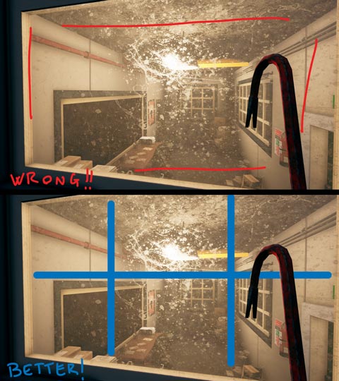
This is a classic example of a design trap you might fall into (like I did) when you are too accustomed to your game’s “rules”. Here I wanted the player to be able to peek inside the locked room, so I placed a window on one side. In Die Young, you cannot smash things, and this caused me to overlook the possibility of new players attempting to hit the window using their tools or weapons (ironically enough, I was more focused on making the glass stand out by using dirt and scratches!). When denying an affordance, try approaching it like you would in real life. In this case, a grill on the window would suffice.
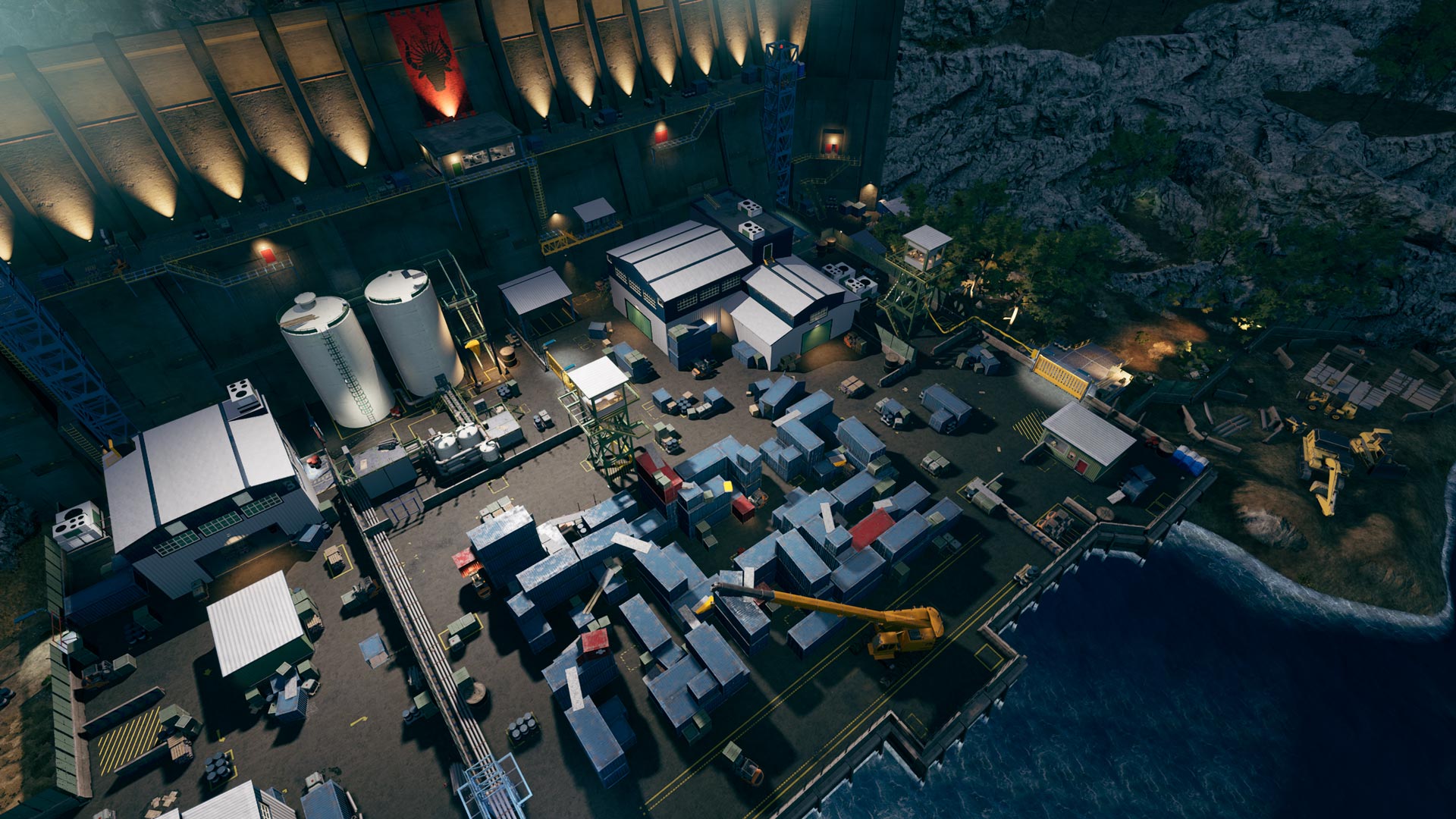
(Click to enlarge)
This area was designed to be a refuge space where the player can climb on top of containers to reach several vantage points and survey the surrounding areas (Fuel Tanks, Laboratory, Exit Gate). It is also a place where you can retreat to after you have been spotted by enemies, since the maze-like structure makes them lose your tracks. I needed several iterations to get this right.
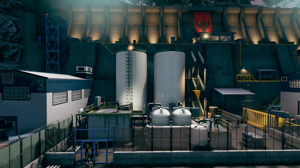
(Click to enlarge)
This is a view of the Fuel Tanks area from a vantage point in the Container Yard. From here, you can see the two possible entries and a route that can take you to the roof of Warehouse B (eventually, also to the upper part of the Retaining Wall, using the elevator to the left); you might also spot a ladder on the right, close to the Laboratory’s roof, leading to the control room on top of the wall.
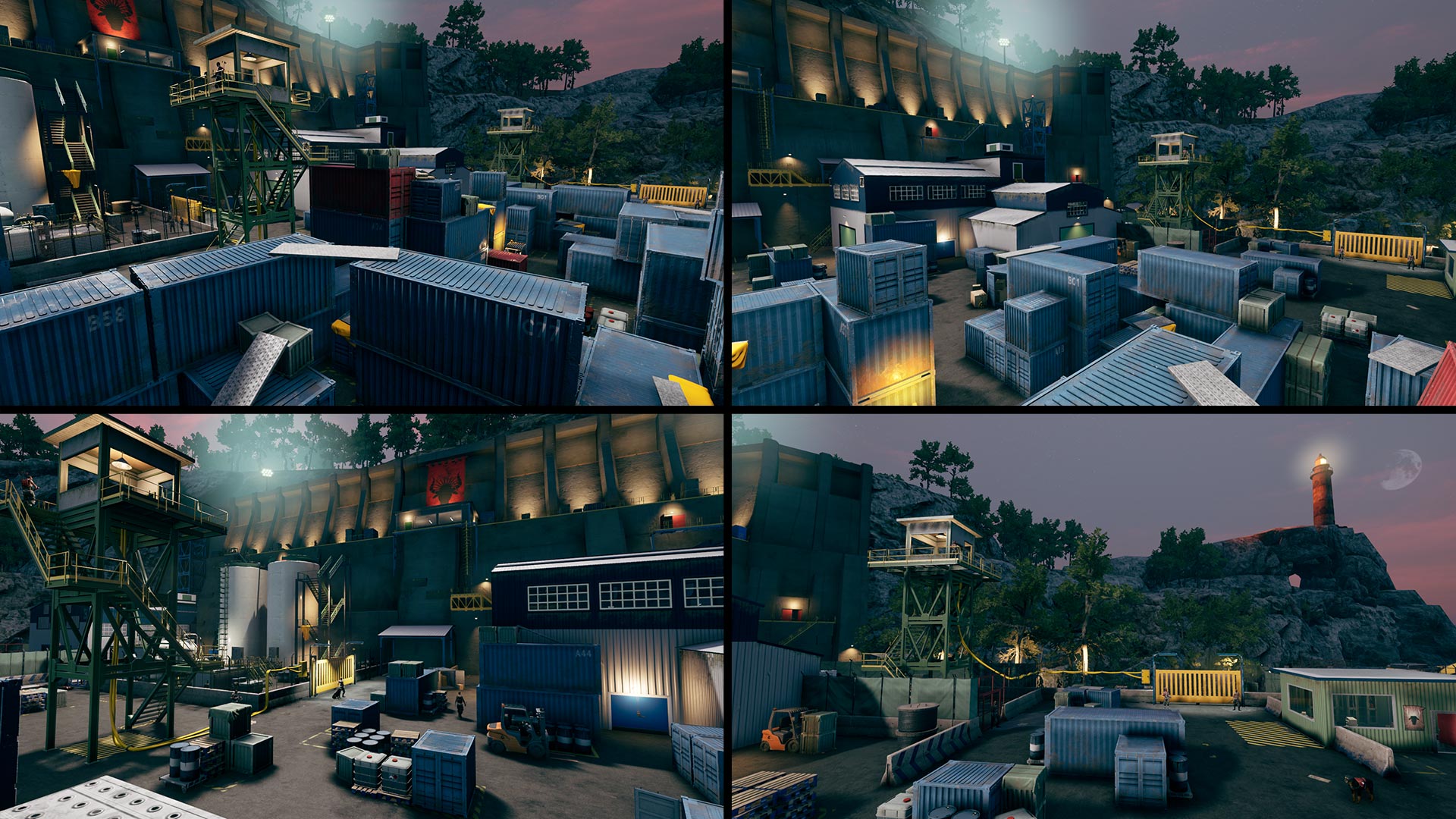
(Click to enlarge)
Views from other vantage points in the Container Yard. From here the player can take their time planning different routes to get past the harbor. Should I open the exit gate using the control panel in the Watchtower? How do I get there? Can I jump from the roof of that building? How can I enter that building? And what about that elevator in the back? And those open doors in the Retaining Wall? Are they related?
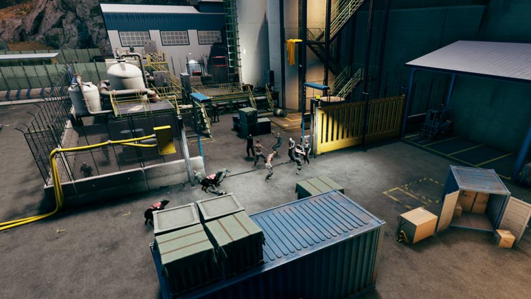
You can open the sliding gate of the Fuel Tanks enclosure to get the junkies and militia to fight each other. You can use this diversion to go through the area unnoticed, or to get into the fenced area, running through them. The fight is not scripted, but relies entirely on the enemies’ AI logic, so it turns out differently every time.
(Click to enlarge)
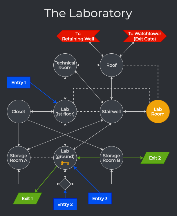
A graph of the Laboratory building. The building has three doors with padlocks that can be forced open from the outside using a crowbar (blue entries). The militia locked some junkies in. If you force open “Entry 3”, you will find yourself face-to-face with these aggressive enemies (most people get a jump scare here). You can use this door or operate the shutters from inside the building (green exits) to also “unleash” the junkies onto the surrounding guards.
(Click to enlarge)
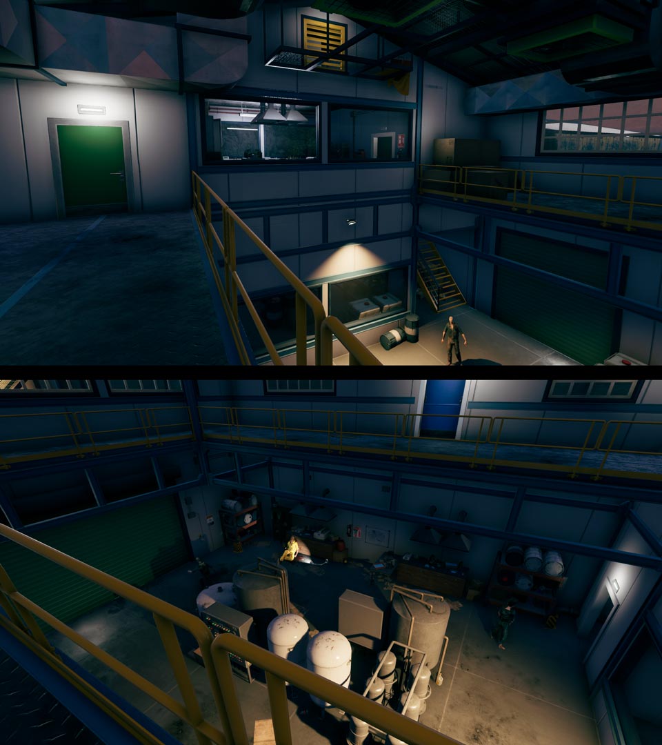
Top: a view from “Entry 1”, the safest entry in the building; from here you can check the ground floor, take a peek at the lab room on the first floor, search the closet to the left, or go up through the air vent.
Bottom: on the ground floor, there is a dead lab technician; by searching his body, you can get a key to the lab room, which holds several powerful items and a story-related document. Some other useful items can be collected when exploring the other rooms in the building.
(Click to enlarge)
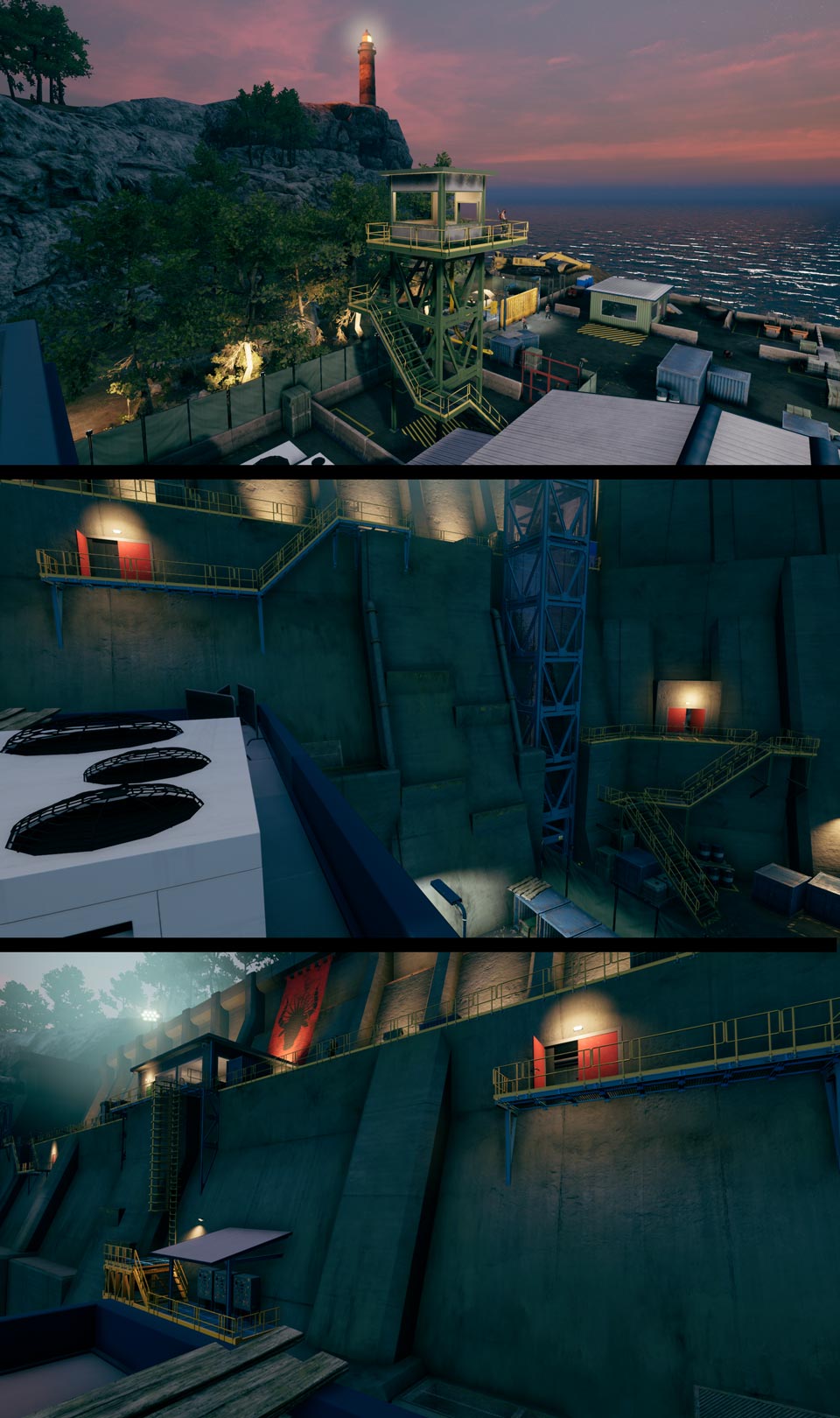
Views from the roof of the Laboratory building. From here you may choose the “loud approach” (get the exit gate open from the watchtower, setting off the alarm) or investigate a possible “stealth approach” (using a secondary exit from the Retaining Wall).
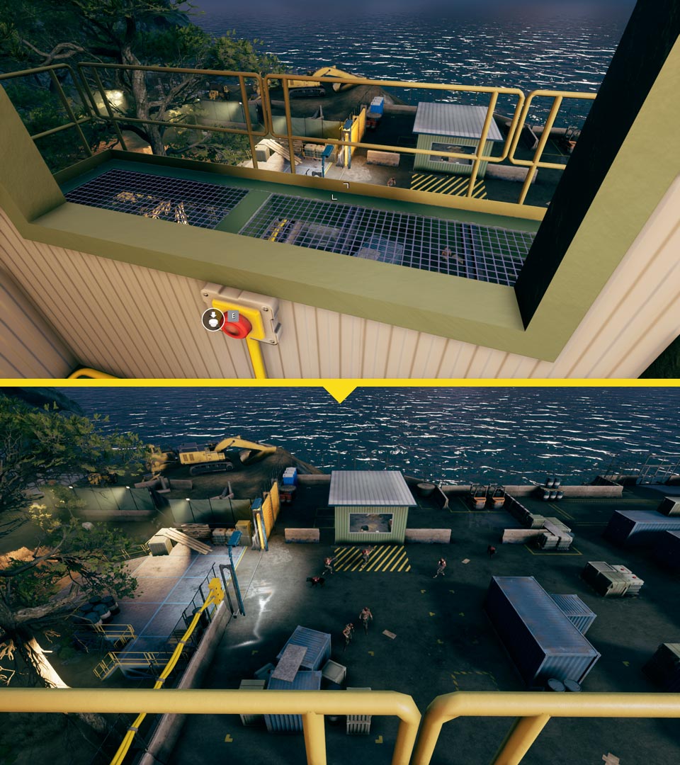
(Click to enlarge)
When you open the exit gate from the watchtower, the guards will be alarmed and they will converge in front of it.
Lighting, Characters & Cinematics
Paolo Pallucchi (Lead): ArtStation
Environment Art
Claudio Rapuano (Lead): LinkedIn
Sacha Piedimonte: ArtStation, LinkedIn
Marco Di Luca: ArtStation, LinkedIn
Read more about:
Featured BlogsYou May Also Like