Trending
Opinion: How will Project 2025 impact game developers?
The Heritage Foundation's manifesto for the possible next administration could do great harm to many, including large portions of the game development community.
In the second dev log from the time-trial arcade game "Bea the Bullet" we look at how we failing in our early decisions helped us plot a path forward.

Hello! I’m Devon Wiersma, lead level designer at Jellyware Games for our little game called Bea the Bullet, a time trial game where you control a tiny character (the size of a bullet). In Bea The Bullet your goal is to fly through obstacles to reach your target in the shortest time possible, shaving off time through subsequent runs to beat your previous times and collect objects on your way through levels.
A few months ago I wrote another blog post about how our level design plans for the game would make for interesting gameplay and now I’m going to tell you why we were wrong!
Our plan for Bea the Bullet was initially to have the player navigate around the same environment with different obstacles within it. To create new levels and challenges we would simply swap out obstacles and change the start/end points of the level.

While it felt like a good idea to begin with, our game’s design began to change. In very early prototypes we noticed players having difficulty reading and navigating the gamespace, especially in instances where the environment was more open and left them with the ability to approach obstacles more freely. Our initial concept for the levels would use this type of design in some areas which only caused problems as players couldn’t figure out where to go and would turn themselves around frequently, essentially proving that open spaces weren’t the way to go.
On top of that, once we had implemented some of our core game mechanics it became even more apparent that navigating one changing game space while simple to design would get boring very quickly.
We wanted Bea the Bullet to have a quirky and fun style to it and it didn’t take us long to realize there was only so many ways we could utilize the environment of an office in a manner which was intuitive to our game before it became to surreal or abstract.
So that’s the direction we started to go towards.

Instead of having environments which kept our design visually familiar but uninteresting we started to generate greyboxes which operate more outside the realm of traditional architecture – things like diagonal walls with holes in them, floating blocks and other nonsensical obstacles which proved to be much more interesting to fly through.
We also came to the conclusion that if we wanted longer playtimes from our small project we would need to encourage replayability and making new environments and levels with new twists and turns would be more interesting to fly through, so we decided to craft each level individually instead of carving them all from the same playspace. SabreCSG helped us out immensely in making this process simpler, so a little bit of time spent practicing and researching the tool saved us from having to model them all individually which helped save our artists some time!
With moving back to abstract spaces we also reconsidered our narrative. Our initial concept involved a lot of dialogue between Bea and the player, where she would frequently speak to them about their objectives, her targets and provide backstory and context for every level. But our abstract levels, coupled with our new intention on focusing our efforts towards a gameplay-driven experience where you can actually be a “bullet” meant we had to thin out the context for the game and simplify our narrative as a whole and pushed the conversations with Bea only to the level select screen before the player starts the level.

With our new gameplay-driven approach we found players were much more interested from the outset and it has proven easier to measure player experience from a gameplay perspective instead of a narrative or stylistic approach. After all, our game could have had a great early appeal to players but if it wasn’t fun then it’s safe to say we would have been pretty disappointed!
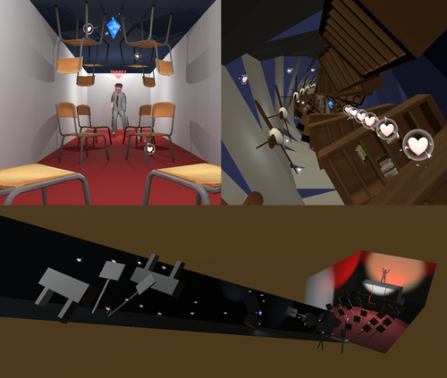
The current plan for the game is that Bea is an agent of love who flies into the minds of people who are feeling down and gives them love – something like a self-care cupid if you will! This “headspace” environment will allow us to develop environments which are more surreal and also allows us to play with the player’s sense of scale and perception of the world around them which could potentially create for fun and eye-catching levels. We’re still working on them, but here are some early concepts of what we have so far!

That’s all I’ve got for you for level design work on Bea The Bullet this week, but feel free to follow our Twitter for more updates as we push forward!
Thanks for reading!
Read more about:
BlogsYou May Also Like