Trending
Opinion: How will Project 2025 impact game developers?
The Heritage Foundation's manifesto for the possible next administration could do great harm to many, including large portions of the game development community.
Gamasutra contributor Joel Couture's eBook, Fallen Down: Heartache and Compassion in Undertale, is part of the August Video Game Storybundle. This excerpt explores the game's character design.

Gamasutra contributor Joel Couture's eBook, Fallen Down: Heartache and Compassion in Undertale, is available today as part of the Summer Smash Game Storybundle (curated by UBM's Simon Carless). This excerpt explores designer/composer Toby Fox's unique approach to character design.
They aren't very hard to draw, and the low resolution of the pixel graphics allows a lot of artistic interpretation. I was really hoping for that. – Toby Fox
It’s not just the story of each character that is built to help make a connection with its characters. The character designs themselves are even built to tell a story about each of them. Whether through an aspect of their looks, the facial expressions they make, or even the simplicity of their design, the characters draw the player in.
Drawing from the characters the player has only seen within the game’s first half-hour, the player has already experienced an expressiveness in their features. Flowey’s sinister grin and Toriel’s cheerful smile help the player bond with their character and know them, seeing the emotions they go through played out on their faces.

Further characters are just as capable of that expressiveness, even in simplicity as well. Sans shows a great deal of his character depending on the pupils in his eyes, with a simple shift there causing his lighthearted tone to fade in moments.
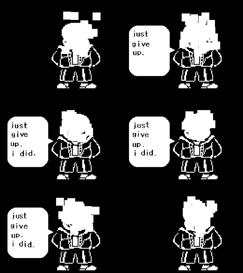
Sans, jokester for much of the game, suddenly becomes an unsettling character when two white dots are removed from his dialogue box image.
“if you keep going the way you are now…you’re gonna have a bad time.”
This threat comes up if the player has been especially murderous on their playthrough, and is punctuated with an image of Sans with no pupils in his eyes, showing vacant, black sockets. Normally filled in with a pair of white dots, this moment will send of bolt of alarm through any player that’s paying attention, with something so small demonstrating that something drastic has changed. Not only this, but that Sans, our pun-loving skeleton buddy, might just have another side to him that we really, really don’t want to know.
"Fox does all of this with a few words and the absence of a pair of white pixels. It’s a careful design decision, and one that shows the power within the simplicity of the game’s characters."
Fox does all of this with a few words and the absence of a pair of white pixels. It’s a careful design decision, and one that shows the power within the simplicity of the game’s characters.
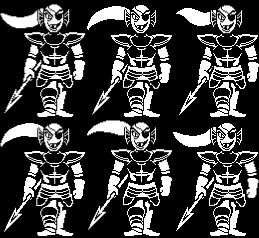
Other characters go through these same expressions, from Papyrus’ outbursts of joy, to Alphys’ nervousness, to Undyne’s enraged faces, all showing a variety of emotions the characters go through, continuing to strengthen that sense that these are people with ranges of feelings.
There is not just one image in the dialogue box to indicate that these characters are talking, but a range of emotions to go along with what is being said. The dialogue communicates that emotional context just fine, but these images further strengthen that sense of a being shifting through varied emotions.
It’s not just an expressiveness through simplicity that makes them effective at bonding with the player, though. The simplicity in the characters also opens them up to projections of the player’s emotions and imagination as well. The characters feature somewhat simple designs (although still with a lot of thought put into details), so some thinking is required to fill in some of the gaps. In creating characters in this style, it forces the player to furnish a place for these characters in their mind.
 Like novels, Undertale pushes the player to use their imaginations a bit. Not entirely, as books often do (although some describe characters TO DEATH, only to have you imagine them however you want anyway), but Undertale does give players a bit of a loose shape to work with, often rendering them in simple white with only a few stand-out details. It provides a structure for these characters so that players can get to know them, but their designs are just loose enough that a player’s imagination is coaxed to life.
This can be seen in all of the fan work that exists out there for Undertale. Thousands of pieces of fan art, videos, songs, and other forms of media sprang up around Undertale before and after its release.
The audience that got to play this game and get to know its characters found themselves inspired to create something out of the space these characters now occupied in their minds. Yes, they had character traits and designs and color schemes and personalities that were already in place, but the simplicity in their design still got the imagination going.
Again, this is another trick of good fiction. Good fiction often does not go out of its way to overexplain a subject or item. For starters, it doesn’t bog the reader down with unnecessary details. Most readers know what a forest looks like, so going into details about the trees can be a waste of time. Readers can be given a lowdown on what a character’s physical traits are, but that forces their imagination in a direction it may not want to go, giving them a laundry list of eye colors and clothing types when they should be concerned with learning who your character is.
 Fox’s designs don’t bog the player down with every minute detail of the character. There is a solid representation of what Fox wanted for his character, some important pieces of clothing and colors that help shape their personalities, and that’s it. It gives the player room to let their imagination wander with the subject, and in doing so, make the character their own.
With some pixel artwork, there is that sense of interpretation that comes with viewing the style. Not every aspect is laid out for the player, and while occupying that space, the player is forced to create their own interpretations in their mind. The character is not just that clutch of pixels to them. Maybe it is in a simplistic game of say, Pong, but in a game with detailed characters? The mind naturally starts to fill in visual details.
When one pictures Sans, it is not always the simple version one sees on the screen. That is just a representation of what exists in Fox’s imagination, used as a means to get his concept of Sans over into the player's.
Now, the player has their own version of Sans, loosely guided by the visuals on screen, but also informed by dialogue, his text sounds, and general attitudes. He becomes more than just the pixel image on the screen, here. He’s wormed his way into the player's imagination, and taken on a bit of a shape of his own, informed by the player's own life, thoughts, and feelings.
As stated in the quote at the beginning of the chapter, Fox wanted to leave things open to interpretation. In doing so, he allows the player to shape more of the character in their imagination, creating a bond between the player and that character.
When the player has a hand in creating a character, even if it is only in their own head, that character belongs to them, to an extent. They’ve been molded and shaped by their creativity, and therefore bond with them more than something that belongs, wholly, to someone else. In the player's interpretation of the art in their mind, they get to keep a part of Sans that belongs to them and no one else.
You May Also Like