Trending
Opinion: How will Project 2025 impact game developers?
The Heritage Foundation's manifesto for the possible next administration could do great harm to many, including large portions of the game development community.
"The game’s second visual iteration took on a very colorful, Saturday-morning-cartoon kind of vibe, which ended up working really well with the game’s quick pace and need for instant player reactions."

20XX is a fast-paced sidescrolling roguelike that's found an appreciative audience on Steam since it launched last month. It mixes a decidedly Mega Man X-esque play style with generated levels to constantly test players’ twitchy jumping and shooting reactions. That’s meant that the art and animation has been a very, very important part of the game.
20XX has always worn its inspirations on its sleeve, but there’s plenty beyond that that’s informed the game’s aesthetic. says Chris King, programmer and designer at Batterystaple Games, developers of 20XX.
While a Mega Man X aesthetic appeared due to its inspirations, 20XX looks like it does not just because of where the game came from, but because its ever-shifting level structure and enemy layouts require players be able to react quickly and decisively, reading information on-screen without having to focus on it.
More than just for visual appeal, 20XX looks like it does to help players succeed at its challenging roguelike play.
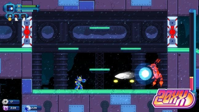
"The skills gained by implementing a given asset made us much more capable of fixing up older assets, which is a good bit of why we’ve iterated on the visuals so much."
None of that is to say that the visual style doesn’t have an aesthetic appeal to its developer. 20XX’s art style isn’t just designed for readability, but also for that same reason any developer would choose a certain art style: because it looks good and suits the game they’re striving to create. Having sprung from a Mega Man X inspiration, this meant a futuristic, mechanical sci-fi appearance, but it’s one that has continually evolved over the game’s development.
“We’ve learned a tremendous amount over the past four years while making 20XX, and ‘How to make it look better.’ has been a pretty consistent part of that," says King. "We were new enough on the scene at first that the skills gained by implementing a given asset made us much more capable of fixing up older assets, which is a good bit of why we’ve iterated on the visuals so much.”
Part of that design process meant shifting art styles here and there, gradually changing the exact appearance of the game over time as they experimented with variations on the look they began with. They also simply learned more as they worked at the game over a four year span, growing in skill over that period.
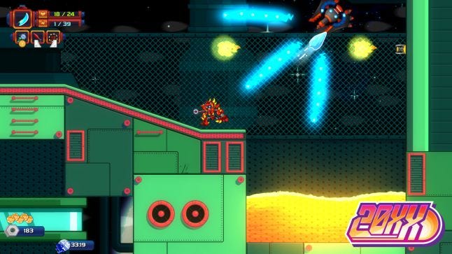
"Somewhere in the game’s second visual iteration it took on a very colorful, Saturday-morning-cartoon kind of vibe, which ended up working really well with the game’s quick pace and need for instant player reactions."
This is part of what would lead them to the look 20XX has now – a growing skill and a slow honing of what art style felt right to the developers at Batterystaple Games.
“Somewhere in the game’s second visual iteration it took on a very colorful, Saturday-morning-cartoon kind of vibe, which ended up working really well with the game’s quick pace and need for instant player reactions," says King. "Zach Urte’s style leans into the game’s rounded edges and smooth curves, and he definitely took a good bit of inspiration from Chris Sanders’ (Lilo & Stitch) work.”
“I guess what I strive for most is consistency and fidelity," says Urtes. "I want the game to be the best version of itself, and finding what that means has been an ever-present part of the learning process. Sometimes less is more; learning where to snipe quality and when to pull back’s been a big deal for us. On a personal note, I’ve just always wanted to make a game that feels like a colorful, exciting action cartoon. I think we’ve done that here.”
That ‘action cartoon’ style was not just the result of the developers feeling their way toward the art style that felt right for 20XX, but also a way they could work on the important features of readability and reaction.
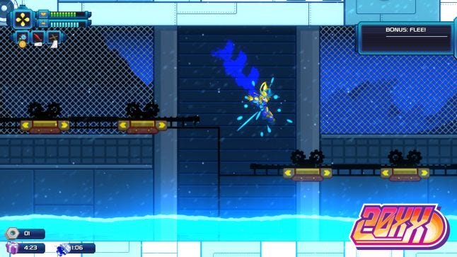
"The game’s foes and projectiles have to be clear enough that a player immediately knows what’s come on screen without having to fully shift focus to it, which turned out to be a serious challenge"
That vibrant, rounded Saturday morning cartoon style was the final step in the constant struggle toward clarity the developers had been working at. 20XX would require that same twitchy reaction time that the games that inspired it required, but the randomization aspects meant that players couldn’t just memorize enemy layouts and shot patterns. They would have to react to them with no previous experience (in that exact, repeated situation) to train them.
20XX has undergone more than one facelift since we started making it four years ago. We’ve learned a lot while making and remaking it, and one of the key lessons is that the game’s pace prefers instant readability to painstaking detail when it comes to asset and environment design.” says King. “In order to avoid getting in the way, the game’s foes and projectiles have to be clear enough that a player immediately knows what’s come on screen without having to fully shift focus to it, which turned out to be a serious challenge.”
King and the development team would need to make enemies and their projectiles crisp and visible without requiring the player take their attention away from what they were doing, requiring their visuals be recognizable at a glance. If it required any more attention than a moment’s peek, or drew even slightly more focus to identify them, the game would fall apart.
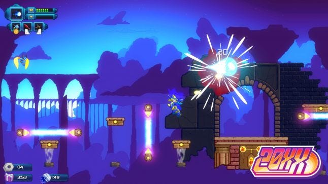
"Spine (our animation software) lets us layer animations on top of one another, so we don’t have to be too concerned about what movement state a player is in on attack-press - we can always snap to action instantly when required."
They made that less of a problem by focusing on the animations of the characters and enemies. “Crisp gameplay is key," says King. "In a game like 20XX, it’s super important that every button press results in an action instantly, and that dictates how most of the player animations need to play out. If it takes Nina three frames to raise her buster before firing, or if Ace’s base sword slash takes three frames to get in front of him and deal damage, the game’s immediately much worse.”
Players needed to be able to react to surprising situations they hadn’t seen before in 20XX, or to enemy attacks that might not immediately jump out at them. They had worked to make these attack visuals stand out, but if the player couldn’t react to them quickly enough, their work would have been wasted.
“Spine (our animation software) lets us layer animations on top of one another, so we don’t have to be too concerned about what movement state a player is in on attack-press - we can always snap to action instantly when required," says King. "To make up for that a little, we add more weight to the non-player-action animations - things like landing, stopping, lowering your weapon, etc all get a little more detailed since they’re not instant-player-input sorts of actions, and them taking a little time doesn’t cost us anything.”
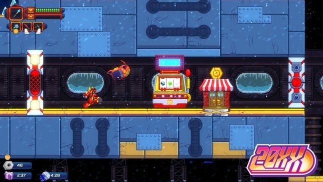
"Games like 20XX are all about pattern recognition when it comes to dodging bad guys, so super conspicuous tells before enemies take action are really important."
The player’s attacks in 20XX are all instantaneous, allowing players to switch it an attack animation the moment they sense they need it. This deliberate decision to animate in this was would be key to allowing players to deal with new threats or changes in the environment quickly, rather than force them through a few frames that may result in their death. Readability was important with the art style, but being able to react to what is read with a quick attack animation was the other half of the equation.
And that’s not to say that there aren’t some elements of memorization at play, either. “For enemies, it’s the exact opposite," says King. "No enemy should attack without warning - games like 20XX are all about pattern recognition when it comes to dodging bad guys, so super conspicuous tells before enemies take action are really important.”
Enemy animations would have long tells that the player could learn to recognize, as while stages were generated, enemies would still have known actions and behaviors players could pick up over time. Even for a brand new player, these kinds of animated tells would indicate that an attack was imminent, getting the player ready to use their tools to react and dodge or fight back.
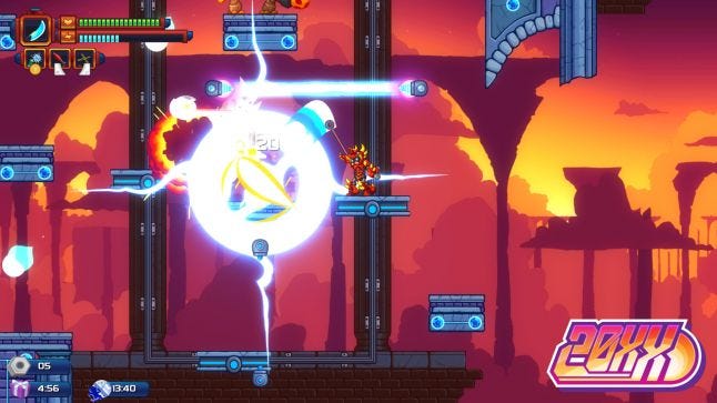
These three items – focusing on readability in visuals, quick player attack animations, and enemy attack tells – form a means of keeping the action at a fast pace while still giving the player tools to instantly know what is happening and how to react to it appropriately. Through these animation details, a player is given multiple levels on which to deal with a threat that they see clearly before it’s coming, see clearly when it’s on its way, and be able to drop everything and deal with it.
“First and foremost, the game’s visuals serve to abet its rock-solid gameplay -- after that, we hope it’s nice to look at,” says King.
You May Also Like