Trending
Opinion: How will Project 2025 impact game developers?
The Heritage Foundation's manifesto for the possible next administration could do great harm to many, including large portions of the game development community.
Jeremy Ooi, co-founder of Kaigan Games, explains how he and his team turned the common mobile phone user experience into game mechanics in the "found phone" SIMULACRA horror games.

The Gamasutra Deep Dives are an ongoing series with the goal of shedding light on specific design, art, or technical features within a video game, in order to show how seemingly simple, fundamental design decisions aren't really that simple at all.
Check out earlier installments, including building an adaptive tech tree in Dawn of Man, achieving seamless branching in Watch Dogs 2’s Invasion of Privacy missions, and creating the intricate level design of Dishonored 2's Clockwork Mansion.
I am one of the three founders of Kaigan Games along with Shah, who handles the business side of things and Azmi, our technical director. Founded in 2017, the studio has released three games so far: SIMULACRA, SIMULACRA: Pipe Dreams, and SIMULACRA 2, all of which are “found phone horror” games.
Before becoming a full-time game designer, I was an indie theatre practitioner for over eight years as an actor, director, and producer. I’ve always had an interest in working out how to systematically construct narrative using the given physical and abstract spaces, particularly abstract ones; how does distance between characters convey tension, how do varying positions and height convey power dynamics, how does silence convey emotion, etc. I feel that my theatre experiences gave me my own unique design identity, and I’m improving its application when I approach making games.
In this Deep Dive article, I will be going over the design philosophies of building the core mechanics of a “found phone mystery game” based on our experiences with the first SIMULACRA game and what we tweaked and improved moving into SIMULACRA 2.
How much can we learn about a person just by looking through their phone? We store so much information in our phones that, in theory, our lifestyle, personality, and habits can be mapped out by looking through our calendar, text history, internet browser, social media posts, and so on. It is an extension of our being, where the idea of losing our phones or having it invaded by someone else incites a feeling of extreme discomfort and anxiety.
SIMULACRA is all about unravelling a mystery about the owner of a phone. As this is a relatively new medium, it was important for us to establish some sort of design language. We started with the gameplay loop of traditional narrative-based mystery games, from point-and-click adventures to 3D “walking simulators.” Those games tend to follow a three-part process; a core interactive function (mostly dialogue) for plot advancement, an exploration of space which leads to a puzzle, and solving this puzzle grants you a clue or a key item to advance the plot. Using this as a base, we then needed to tune this loop into a new design space where instead of a physical space that you could move around in, everything you interacted with was through a phone UI.
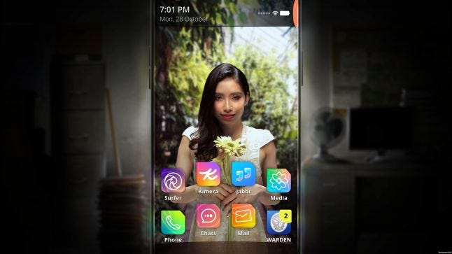
While this is a new medium, we were not the first to attempt a “phone UI” game. Our biggest inspiration came from SOMI’s Replica, which inspired us to make SIMULACRA. Games like A Normal Lost Phone and the Mr Robot game 1.51exfiltrati0n, launched during the development of SIMULACRA, and they both provided some insight as to what mechanics worked and what didn’t.
Working around the design space turned out to be a huge challenge, and it’s something that we are still discovering today. The first thing that we needed was to establish our spaces and their functions.
For spaces within mystery games, you can use environment design, character design, dialogue, and movement, either in parts or in combination, to paint out a proper scene. When it comes to a phone UI, your scenes are locked into one place in specific apps, where each app represents an aspect of your space, often without much context. If you’re looking at chats, it's mostly dialogue. If you’re looking at the gallery, it's mostly pictures and videos. If it’s “Jabbr” (our version of Twitter), it's mostly social media noise. The idea is that we need to establish what the identity of these spaces are and how to weave them together so we can give players a narrative that they can follow.

Both email and Jabbr provides different perspective of Arya’s need for followers
Traditional game mechanics like interactions and movement also need to somehow translate well into common phone functions. Playing the game still needs to feel like navigating a phone or common phone applications. While we try to keep it as realistic as possible, we still have to follow traditional gameplay vocabulary, and sometimes the phone might do things that are unrealistic. We had pick specific moments to break the rules, and as the game has a horror element, we could attribute these moments to supernatural events.
Narrative
When playing a mystery game (or any game for that matter), the game slowly unravels as you progress. You access new levels, meet new characters, get new items, and so on. That is not really the case when it comes to phones. When you pick up someone’s phone, every single thing from the past to present is presented to you in one glance. We had to find a way to gate that. This is one of the reasons why the narrative always presents the phone as “incomplete,” where either a failed reset deleted most of the data or the phone was corrupted somehow by an unknown force. You will then need to restore it through solving puzzles. This allows us to filter phone content that’s only relevant to the story and remove any chatter that might otherwise distract the player.
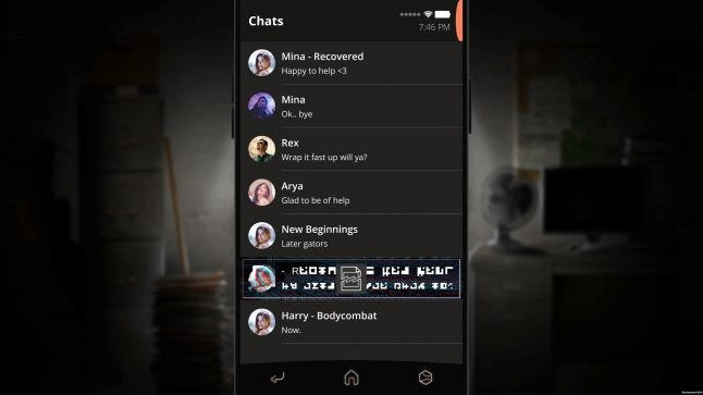
Corrupted files become “locked doors” for players to open later on
Plot Advancement
When we think of advancing a game’s story, the biggest question we ask ourselves is “who do we talk to?”. The “who” are the characters we need to interact with, and the “talk” takes the form of text messages in the chat app. It became very clear early on that the chat app would become the bread and butter of the game, and how it presented and received information needed to be well thought out.
Some things became very obvious almost immediately. The question “who CAN we talk to” was the easiest. In other games, you might have icons over key characters that move the story forward. What better way to translate this than to use notification icons over a character’s profile pictures in chat?
Other things were not so obvious. For example, how the dialogue is structured. In other games, often it’s your character that’s driving the dialogue, and you make choices to push the narrative forward. In SIMULACRA, the chat box itself has a limited space and is mostly text, which can become tedious to go through. If an NPC talks too long or if the player can respond automatically after making choices, it really drags the game down. We wanted to maintain a punchy pace so that the player feels like they’re constantly in control of where the conversation is going, even though they are limited by a short line of text. This is why our dialogue choices and NPC responses are short. To increase the velocity of the dialogue, we gave the NPCs more agency than the player, where they are the ones pushing the plot forward and you need to react accordingly.
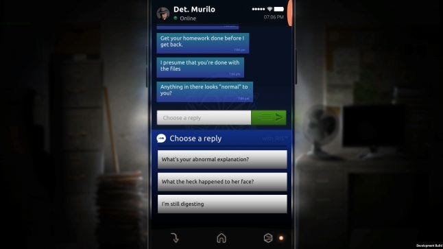
For the player to deliver exposition to NPCs, we needed a way for a vast amount of information to be summed up with the press of a button. So, we made sure that some plot points could be summed up in a single image or piece of video footage which could then be sent as an attachment. All the player needs to do is to send it and the NPC will do the rest of the work.
The best analogy I can think of is to imagine the plot as a “train’’ that needs to move to its destination. In most games, the player is the train driver, and when presented with multiple tracks, they decide where to go and the relevant outcome will play out. The roles are sort of reversed in SIMULACRA, where the NPC is the driver and we are the one who are switching the tracks, observing where the train goes.
Exploration and Puzzles
Due to the lack of physical environments, item navigation through different spaces needed to be refined. In other games, the space itself often tells its own story. If you’re in a bedroom, you know that it’s an intimate and personal space. A bar is a social space, a basement is a place of hidden secrets. We wanted the player to have that same kind of clarity when they navigate through the game.
In our game, the spaces are predefined by the medium, where the phone acts as the nexus to different parts of the NPC’s lives through the various apps. People know how the common apps work and their real-life functions, so we basically just replicated that feeling in our game by exaggerating the dialogue. Chats became the space of personal relationships. In chats, dialogues are written more emotionally and intimately to convey the character’s hopes, dreams and aspirations. The game’s emails became the space for professional relationships where the exchanges are often tied to organizations, companies or services. Jabbr, the Twitter of our game, became the space for world views where NPCs shared their thoughts on events and outcomes of the world at large. We wanted players to explore these spaces and subconsciously remember the functions of these spaces based on the content they saw. This makes it easier when a puzzle requires them to navigate to the correct spaces quickly.
When designing puzzles, we always start from a top-down approach. We ask ourselves what kind of problematic experiences we face when we use phones and how we can simulate those experiences for engaging gameplay. We wanted something familiar to players so they would know intuitively what to do. One example would be navigating through an automated phone system. In this puzzle, you need to talk to a specific person working in a fashion company but all you have is a public hotline. Hidden somewhere in the game is that person’s office extension number. Another example would be giving directions to someone navigating an unfamiliar space. That puzzle turned into a sort of mini-heist, where you needed to refer to a blueprint of a police station so that you could guide someone to steal evidence from storage.
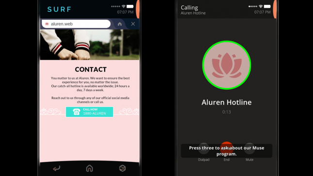
Interacting with automated phone response systems becomes a puzzle that’s easy to understand.
Clues and Items
While we aimed to make the game as immersive as possible, we had to balance between making the game more “game-like” or “phone-like”. Something we discovered in the early stages of prototyping was that sifting through the phone’s content can be quite overwhelming. When you enter a new environment in other games, you might have a key item glow to indicate its importance, or you might have a cutscene play out to show that you’ve advanced through the game. In our game, when you access an app, all the information that can be presented will be laid out in its entirety. It can be quite difficult to filter through walls of text to find one specific piece of information. For example, if the player unlocks a text message that reveals a key plot point, we need to make sure the player actually “reads” the pertinent part of the text. We needed some kind of feedback for the players when they discovered something important that moves the game forward.
In SIMULACRA, if there is key plot information attached to text or an image, we had that specific file corrupted; the only way to restore it is to solve an arrangement puzzle. While this did ensure that players have indeed read and hopefully understood the plot information, the puzzle itself felt out of place and broke the immersion for some players. They often wondered why they were arranging these files, and “the phone’s haunted” never felt like the correct answer.
In SIMULACRA 2, we decided that the best way around this was to actually build some sort of inventory system where players can “scan” information from specific content and use the stored information to send to other NPCs. Narratively it was introduced as WARDEN, an advanced phone restoration system that can scan important information and use them as restore points to recover deleted files. While it was a little outlandish, it made sense in the context of the story and the mechanic itself was familiar and intuitive.
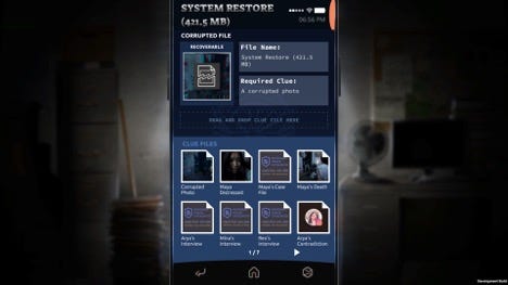
Clues can be scanned, stored and used to unlock new phone content.
In the end, SIMULACRA came together pretty nicely, and we’ve improved the experience when we moved to SIMULACRA 2. Using traditional mechanics as a starting ground, we got the game off to a good start, and we are now finding our own identity in this unique genre. As we get feedback on all of our games, we’re getting a clearer picture of the kind of players we attract, so we are slowly refining the game to better fit them.
Our goal right now is not so much to find what works and what doesn’t, but more on innovating on future titles. What other experiences, stories, and gameplay mechanics can we do on a phone UI? I will admit that the design space can be quite limiting, but I also believe that working with limitations can spark new ideas and innovation.
You May Also Like