Trending
Opinion: How will Project 2025 impact game developers?
The Heritage Foundation's manifesto for the possible next administration could do great harm to many, including large portions of the game development community.

Featured Blog | This community-written post highlights the best of what the game industry has to offer. Read more like it on the Game Developer Blogs or learn how to Submit Your Own Blog Post
A collection of thoughts, discoveries and considerations while designing user interfaces for visually impaired gamers.

2019 was a groundbreaking year for accessibility awareness in the games industry.
We saw some of gaming’s biggest franchises leap to the front page of news publications (such as Forza, Gears of War, Spiderman & Tom Clancy) when their studios promised to take on improved accessibility. We saw platform owners get in on the action too, with Microsoft cementing it’s mantra of “When everybody plays, we all win” into it’s business strategy, as well as Nintendo thinking seriously about accessibility on the Switch with their magnification update.
This is seriously impressive because if you rewind further back to 2018 and asked us game developers about accessibility, we would probably say, “Don’t worry, we have subtitles”. It’s not that we didn’t care, but most of us didn’t understand the other issues or grasp the scale of the problem in modern games.
For me, the Game UX Summit Europe 2018 in April of that year was a turning point. One of my favorite experiences at the conference was understanding that UX designers have a solid role in helping our studios with accessible design, because nobody else had the time to think about it.

I had a bunch of discussions with people about this problem. One such discussion was with the amazing Ian Hamilton; a video game accessibility consultant and advocate. Ian gave a talk at the conference too, about the latest advances for accessibility in game releases of 2017 which included some interesting stats about how accessible game design benefits all players, not just those who need it. (If you would like to see this talk for yourself, I highly recommend you check out the YouTube video below)
In his talk, Ian also informed us about some impending legislation referred to as CVAA, which was slated to take effect for all games featuring online communications in the USA at the beginning of 2019.
CVAA stands for 21st Century Communications and Video Accessibility Act, and was signed into Law in 2010 by President Obama. CVAA requires communication functionality (which it defines as text/voice/video chat) to be made as accessible as reasonably possible to people with disabilities, including the path to navigate to these features (regarded as “the ramp” to communication features).
Whilst the legislation was not specifically written for the gaming industry; when CVAA was proposed the FCC (Federal Communications Commission) did not anticipate the impact the law would have on games, and industry bodies fought for an extension to allow developers more time to create systems for accessibility in communications.
In our case at Splash Damage (making multiplayer shooters that utilize both text and voice chat), we need to be compliant, as almost all of our games encourage strategic team play and require good communication with teammates. This is a big deal for us to get right.
Because we need to make “the ramp” accessible, I want to discuss the high-level design for menu screens that are accessible by players without sight or with strong visual impairments. This then allows our engineers to create an interface that anybody can use to get to the features they wish. (For the purposes of this article, all example imagery will be game agnostic).
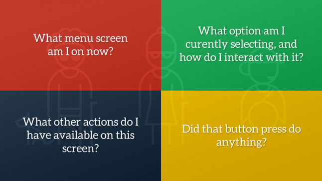
After conducting some initial research into gamers without sight, we learnt that when a visually impaired gamer interacts with menu screens, they are confronted with a number of challenges:
What menu screen am I on now?
What option am I currently selecting, and how do I interact with it?
What other actions do I have available on this screen?
Did that button press do anything?
Traditionally, users with visual impairments resort to relying on a sighted partner to help them through menus, utilize OCR (Optical Character Recognition) software to read text from screen captures, listen for audio cues to guide them or just brute force their way through the experience and use muscle memory to guide them in future sessions.
Whatever solution we designed had to remove this friction where possible, so they can comfortably navigate without the need for sighted assistance or guesswork.
We chose to build a “narration system”, to read aloud menu text to the player as audio based on current screen information and the currently selected item. This concept is not new, as the web, desktop and mobile apps have championed this for some time, but doing it properly for games where not all needed information is available using focus is a challenge, and can often lead to overwhelming the player with all information at once.
In UX, Progressive Disclosure is a concept described when a feature that is used less frequently by users is pushed back in visual hierarchy, or to a secondary screen, to ensure that primary features are front and centre. We can take this concept and apply it to our narration system design; we plan to reveal all the simplest and most crucial information first, then layer on additional context if the player is still waiting for the right information. Let’s look at this in action…
When a player enters a new screen, they need to know what screen they are on, what options they have to navigate or interact with and what buttons they need to press. They also need validation that their previous action got them to the right place.
With progressive disclosure in mind, a new player can take their time when they enter the screen as more contextual information is revealed to them, whereas an experienced one can quickly interrupt the narration and speed through the menus by taking an action early. So what does this mean for a menu screen?
Let’s take a look at an imaginary Settings screen:
If there is a submenu or tab system in place, it should read the selected tab category label and how to change it, so that the player knows there is more content on this screen than simple navigation will reveal.
In our UI, the first element in the list becomes focused by default. This means that default focused interactive element will narrate the text label, UI control type, value and tooltip description if available.
Once all focused narration is complete, we finish by appending narration for any global contextual actions available on this screen, so the player knows how to proceed when they have all the information at hand.
Global contextual actions are presented in a container of button prompts, often called an Action Bar, in the bottom of the screen. This tells the player which button to press to interact with the currently focused item, or how to access an entirely new submenu. For example, how to change the value of a selected setting, or how to open the global text chat overlay.
Here is a system diagram for how this might work:
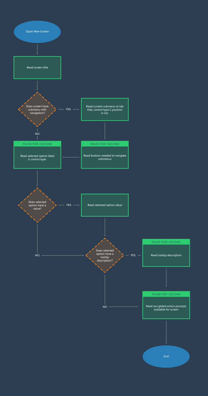
For the example Settings screen we showed earlier, a new player may hear the following:
Settings Screen.
Controls - Tab - 1 of 5. Press Q or E to change tabs.
Controller Preset. Stepper - Standard.
Change the controller preset used in gameplay.
A - Select. B - Back. X - Open Text Chat. Y - Open News.
At any point, the player can interrupt all the previous narration by moving their selection to a new item on the screen. When this happens, we stop the narration and instead play only the new focused item information, followed by the action bar prompts again, in case the player missed them when skipping navigation and in case the prompts change based on the selected item.
Here is another diagram showing how this works:
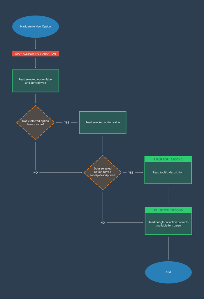
For example, selecting a new option might sound like this:
Change controller bindings. Button.
Change specific bindings used for actions in the game on a controller.
A - Select. B - Back. X - Open Text Chat. Y - Open News.
At this point, you could also elect to read any value-specific information here, but we felt that this was too detailed for the use case of navigating options to find the right one.
If the player can change the value for an option and they do so, the new value should be read out followed by tooltip information relating to the new value (if this is available). Here we can go into more detail with what each value does, as we know if a player is interacting at this level then they are looking for information regarding a new setting.
We make sure that the action bar prompts are read out again, in the case that there may be new prompts relating to the value (though this is a rare use case, there is no harm in offering the information again; most players who don’t need it will have already finished interacting by this point).
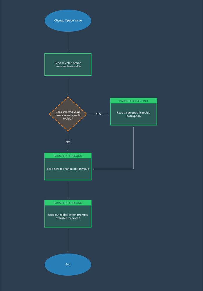
If the player was interacting with the Mouse Smoothing value shown in our example, it would sound like this:
Mouse Smoothing - On.
Mouse positions will be adjusted each frame to offer smoother movement.
A - Select. B - Back. X - Open Text Chat. Y - Open News.
There may be events happening in your UI which can trigger a change in state at an indeterminate point in time, such as a matchmaking system, friend invite or installation progress. These should be made accessible for visually impaired players, but present a challenge in how they should be narrated when a player might be doing something else with your interface.
Should we interrupt the currently playing narration to tell them about this new state change? In the case of narrating indeterminate progress, how often should we alert the player with an updated value? Should all state changes be treated equally?
The approach for this may vary based on your game, but we decided to treat them all equally to build consistency with how the player expects narration to behave across the UI. See the diagram below for details:
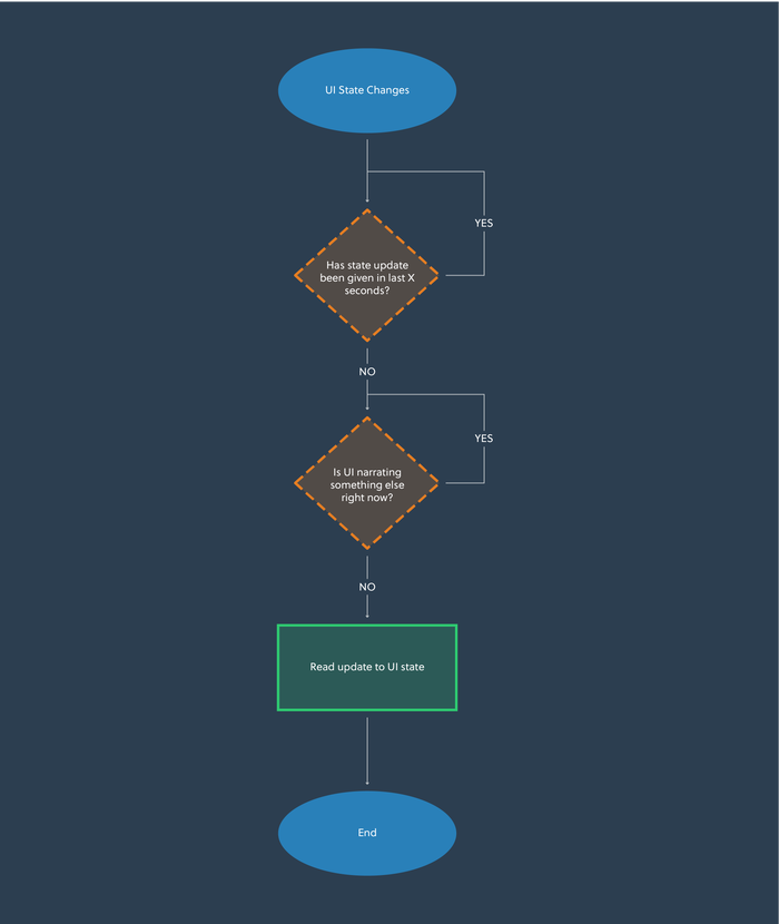
We don’t choose to interrupt the player as we feel our state changes are less important than realtime navigation updates. We also choose to base our state updates on timers if they represented indeterminate progress, like a loading bar. This allows for the UI to give the player regular updates without overwhelming them when the progress bar is moving quickly.
I want to briefly discuss a couple of approaches we have taken to implement narration, including the benefits and drawbacks of both systems that designers should be aware of.
This won’t, and can’t, go into too much technical detail, but should be enough to kickstart some of your own research.
Screen Reader support allows external third-party programs, such as NVDA or Microsoft’s built-in Narrator, to access UI tree information of your interface and attempt to read the information presented to it on behalf of the player. This is achieved by ensuring that your implementation follows conventions set out by Microsoft’s UIA framework https://docs.microsoft.com/en-us/dotnet/framework/ui-automation/ui-automation-overview.
This has a number of benefits for the player, as it allows them to use their existing screen reader with customized reading speed, narrator voice and level of detail. It also means that internationalizing the content is much easier, as the player’s screen reader engine will handle narrating in their local languages.
However, only Windows and Xbox platforms allow players to use UIA as of the time of writing, and some other platforms do not have screen reader functionality yet. This means multi-platform games should think carefully about this approach and do some research before committing, as it may prove to be more expensive.
Also, because screen readers are looking for specific information in the UI tree, it is usually incompatible with gameplay feedback and custom HUD information without some hacky workarounds.
Synthesized narration is the process of shipping a speech synthesizer engine with the game client, and having your game code interface directly with it.
This has a number of developer benefits, as it gives more control over what is read out as the strings passed into it are completely customized. This is also a better cross-platform option as the game is responsible for the narration, not a platform feature or third-party program. It can also be used with whatever feedback systems are needed, not just UI.
However, the benefits for players are not as good, due to the lack of customizability with narration speed, voice and level of detail. Consideration will need to be made for language support and this could become expensive with regards to client size, as any speech synthesizer engine aiming to be multi-lingual will need to ship with various voice packs.
It is also possible to use cloud services, such as Microsoft’s Playfab suite, to offload the speech synthesis based on a player’s regional settings. This means a string can be pushed to the service, and it returns synthesized audio for the player. This incurs a pay-as-you-go cost to run the service and requires the player to be always online in order to have their game accessible, which could be a drawback for your players.
Whilst a bare-minimum approach can be achieved by supporting only the screens that are required by CVAA, if you engineer narration at a systems level you have already done a large chunk of the work and therefore could argue for the entire menu to be done. This would make the better experience for players.
All of this work can be avoided by removing all communication features from your game, but this is often a decision that will alter the design and player experience drastically, and therefore is not advisable. More mainstream game engines are doing work in this space to make the tools better, so you could expect this to become easier with time.
The FCC allows for exemptions in circumstances where the company is too small to build a solution, or there are insurmountable technical challenges. Despite this, the FCC expects game studios to be keeping up-to-date records of the achievability of complying with CVAA in detail, so this can be justified. In cases where you want to file for a waiver, an achievability analysis can be submitted for approval by the FCC. This is a worse outcome for players that need the features, so careful consideration should be taken to assess if this is the right direction for you.
Thinking about these issues early when planning for CVAA in your upcoming projects means the work can be done much more cheaply than it sounds. With the right tools, this work can even be duplicated across other projects in your business.
One member of the community we spoke to at length and brought to our studio is SightlessKombat, a gamer without sight and accessibility consultant in the games industry. In addition to working with studios like ours, Sightless also runs regular streams on Mixer and produces video content on YouTube.
Sightless helped us to validate some of the core ideas in this design, and also played some early builds of games we worked on to provide feedback on the menu narration. He also provided some other ideas that we have not yet validated…
If a specific screen or screens can not be narrated properly for whatever reason, it is advisable that you have your narrator call this out when a player enters the screen. This helps them understand that navigation on this screen won’t do anything for them and it’s not their fault.
As more and more games switch to games as a service models, customization systems and artistic content are getting more popular. This is one area that is weak for visually impaired gamers, as they cannot appreciate the content in the same way that sighted players can.
Sightless had an idea to include proper audio transcription for all cosmetic content, so the model mesh, animations and VFX can be described in a way that would help excite visually impaired players. He also had the idea to include an option to 3D-print cosmetic content you unlock, so the model can be felt with a pair of hands and understood in a tangible way.
Whilst designing the narration system for our games, what struck me was the complexity and lack of information out there to do this in a sensible way. Most of our work was built from scratch, and this was the biggest motivator for writing this post.
My dream is that the information in this article, alongside the other great work the accessibility community is doing, will help to kickstart discussions to define standards for narration in future games. In the vein of sharing and provoking discussion, if you have any thoughts please do get involved in the comments or contact me directly on Twitter at Tom Gantzer. Thanks for your time!
Read more about:
Featured BlogsYou May Also Like