Trending
Opinion: How will Project 2025 impact game developers?
The Heritage Foundation's manifesto for the possible next administration could do great harm to many, including large portions of the game development community.
The graphics in the newly rereleased Wonder Boy: The Dragon’s Trap map perfectly to 1989's original Wonder Boy III: The Dragon's Trap. “I wanted to make the game as I saw it as a kid on my screen," says artist Ben Fiquet.

Once you've read this article, be sure to check out Gamasutra's video interview with the creator's of the remake of Wonder Boy: The Dragon's Trap.
Ben Fiquet spent a great deal of time playing the 1989 Wonder Boy III: The Dragon’s Trap as a child, wandering around its wondrous worlds. The game made a strong impression on him. These feelings would well up again, years later, when Fiquet found himself working on the recently-released remake, Wonder Boy: The Dragon's Trap. Here, he’d be able to leave his own stamp on a game he loved long ago.
“I think I wanted to make the game as I saw it as a kid on my screen," he says. "It is, at the core, a vibrant and beautiful world that I could lose myself in.“
How would he capture that same sense of wonder he’d felt as a child, though? And how would he recreate a game he so loved while still preserving what he loved about it? The balancing act involved in making something his own, while still paying homage to the original, was a challenging. But it was an enjoyable task for Fiquet, who worked hard to stay within classic limitations, and create a visual love letter to the game’s original programmers and artists.
“When we started, it was like a fan project," says Fiquet. "We didn't know if it could become a reality. So, I didn't really think about it -- I just started to draw what I thought would fit the game most. But, I knew I wanted to bring something new, something unique.”
What he sought to capture with his work on the game was that sense of child-like joy at exploring fantastic worlds. “I sure wanted new players to have the same impression I had as a kid.” says Fiquet.
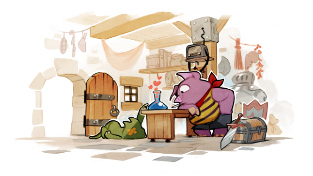
Fiquet's art was informed by anime and French comics
As such, part of him naturally meandered back to the other fantasy worlds he had explored during his childhood – comics and cartoons.
“I've been raised with French comics and manga/anime, and I think it pours in when it comes to design," he says. “Like many other French kids, I spent my childhood in front of anime coming directly from Japan without filters. I think I kind of understand the mindset of visual designs from that era in Japan. So, naturally, I tried to get that feeling of eighties anime, but also a bit of my own style as well. It wouldn't make sense to try to only replicate these particular styles.”
He also drew from the rich history and variety of bandes dessinées, or French comics, which had also been important to him as a child. “For a vast majority of the world, it is foreign” says Fiquet. “Which in my opinion is a good thing. There's a subtlety in all the various styles you can find in French comics. Nothing is the same; every comic is different, in style and story. I guess it's the arrogance of French people who want to impose their own signature But it gives a real diversity. I think it adds a bit of difference.” says Fiquet.
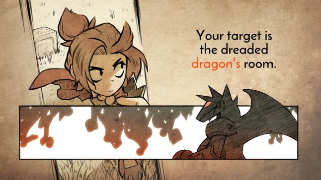
That sense of child-like wonder was connected to these art styles, and they naturally followed when Fiquet wanted to leave his own stamp on the game.
Fiquet may have known what stirred up certain feelings within him, but that didn’t mean he was just going to apply those art styles without a consideration to the original game. For him it was very important to preserve as much of the original Wonder Boy: The Dragon’s Trap with his new work. “I wanted to keep the sense of a colorful, inviting, and charming world.”
Part of that preservation, other than having a style that invoked a sense of wonder, involved using the same tile-based art style. “Since the game is directly based on the original, we used that canvas to the fullest. That also means that we kept the tiling system in place.”
Compare the original to the updated version
The tiling system had helped its original developers save valuable space in making the original Wonder Boy: The Dragon’s Trap, but in keeping it now, it would involve some artistic risk. Having tiles with specific art on them placed throughout each screen ran the danger of the artwork repeating itself, and in making that repetition obvious, boring the player with an art style Fiquet had put so much work into.
“So, structurally, I had to work with these tiles, but at the same time, try to go beyond. I tried to manipulate what you see on screen to make you believe that there is no repetition.”
Fiquet developed a few tricks to hide the fact that they were including this homage to how the art had worked in the original game. “The easiest one was to have large textures up to 1920 pixels. That way, you don't see a repetition until you've travel across the entire screen - until then you've forgotten what the beginning of the texture looks like. I don't have to tell you this is the one programmers don't like at all.”
Making the programmers upset wasn’t Fiquet’s goal, so he developed a few more tricks with his tile artwork. “Making visible parallax was another. When the repetitions occurs, you can have different elements (in front or behind) that don't repeat the same way as the main texture does. Fog, some clouds, or some objects placed differently gives you the impression every step is different.”
 In adding a few scrolling elements or other objects, Fiquet could mislead the player, taking their attention off of the original tiles and onto another object. And there were even further tricks. “Using fake lights and shadows. I've added layers that act like Photoshop layers with multiplication (for shadows) and addition (for lights). By placing them strategically, you once again give the impression that it is different, even though it's the same textures,” says Fiquet.
Tiling wasn’t the only limitation Fiquet applied to his work, though. “I had to stay in the boundaries of the animation of the original game. Even if I added 10 times more frames, the length of an animation could only be coherent with the original ones.”
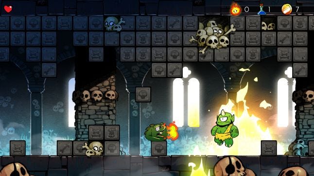
Fiquet’s animations were to be in keeping with those of the original game, only updating how they looked. If a character walked in a certain way, they would carry themselves in the same manner now. Still, that didn’t mean he couldn’t smooth out those animations, giving them a look like a cartoon in motion.
 “One thing that adds a lot is having a lot of transition animations. With the same inputs, you can have a totally different feeling just by having anticipations or overlaps. It gave the game a much-needed smooth feel.” says Fiquet.
Making these animations look more fluid was a joy for Fiquet, who has a long-standing love for making game characters look good in motion. “I wanted to make frame by frame animation, as I see a real beauty in it. I'm a huge fan of Dave Perry's work during the Genesis era. Games like Aladdin, Cool Spot, and Earthworm Jim were beautifully animated. This skill has been lost over the years, but as an animation geek, I couldn't pass up the opportunity to implement traditional animation.”
Fiquet drew from his own childhood wonder, and what had made him feel so much for these digital worlds, to create a whole new experience. Even so, he managed to do so with some self-imposed limitations to keep him in the spirit of the original developers.
“It has been sometimes a bit tricky in certain areas because there was not much to rely on. The original game, due to technical limitations, was sometimes a bit empty. I could do whatever I wanted but I had to keep in mind what the original creators wanted to see at that time.”
As empty as those places technically were, in his childhood memories, they stood for so much more. “It's hard to pinpoint exactly what made me click. For this game, I guess it's a mix between a good old nostalgia and just the charm of it all. You see a little village, pyramids, lava, jungle, etc ... You have a sense that you're on an adventure exploring a vas t and rich world.”
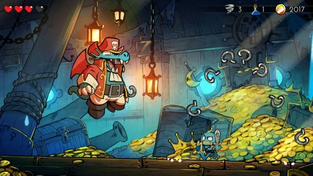
The original art for the boss Captain Dragon and the updated version
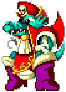

Fiquet got to fill in those worlds with his own imagination, using the limitations of the original artists to join in the feeling they would have felt when initially creating the landscapes that would fuel his imagination. He got to step into the shoes of the artists who had inspired him as a child, and give them back a gift using his own sense of wonder and creativity.
“I feel like I've added something to the Wonder Boy history. We met with the original creator, Nishizawa-san, in Kyoto last July. He told how much he loved what I had done with the game, I got really emotional. It's not every day that you can give back to a dear childhood memory and be rewarded for it. I don't think he thought he would had so much impact on two little boys at the other side of the globe.”
You May Also Like