Trending
Opinion: How will Project 2025 impact game developers?
The Heritage Foundation's manifesto for the possible next administration could do great harm to many, including large portions of the game development community.

Featured Blog | This community-written post highlights the best of what the game industry has to offer. Read more like it on the Game Developer Blogs or learn how to Submit Your Own Blog Post
Grids of tiles in games can represent vastly different scales, and be arranged in many different ways. An overview, and some untried ideas.

I've been thinking about the different kinds of grids of tiles and blocks used in games, which come in a variety of scales and shapes.
By scale I mean how much real-world space each tile represents, not its size on the screen.
Strategy games tend to use very large grids. The very largest map tiles can represent hundreds of kilometres, or even thousands of lightyears. At this size, there is usually a large amount of extra information associated at least with some tiles. Civilization's tiles can cover thousands of square kilometres because a city tile has a lot of internal detail.
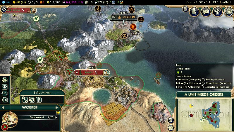
Making your tiles as large as possible has the advantage of simplifying the information available to the player. Unit movement speeds of 1-3 tiles per turn are easier to think about than ones of 40. There is no point in adding detail that does not matter to the game experience you want to provide.
You also don't have to worry about whether a unit can fit through a given space, or even how many units can fit through at once. If your tile is a lightyear across, any number of spaceships fit with space to spare. Nor do you have to worry too much about whether two tiles can be sensibly placed next to each other. They're big and self-contained enough that any combination seems plausible. A mountain next to a swamp? A jungle next to a desert? Sure.
Games with intermediate grid sizes are fairly rare. SimCity's tiles are the size of a mid-size building, maybe 30 metres. Brigador's are maybe 5 metres, which makes them quite unusual - and impractical.
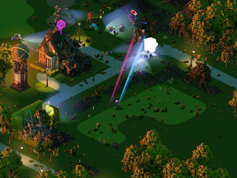
As always with Brigador screenshots, I've brightened the picture so you can see what's going on.
With small enough tiles, each tile is a piece of furniture, a segment of wall, something human-sized. You can build up the map from repeated parts. A building is composed of floor tiles, furniture, wall segments, doors. With large enough tiles, each tile is a whole entity: a building, a town, a district, a solar system.
At say 5 metres, each tile is a room or a patch of ground. How do you represent a corridor? As an entire tile? 5 metres is far too wide. You'd need to include corridors inside tiles that also contain small rooms, in various different arrangements.
The scale is detailed enough that repetition is obvious. Small tiles can be composed to build up different things. Large tiles represent generic enough ideas that it doesn't matter. But seeing the same 5x5 piece of land with three shrubs over and over again? You'd end up having to make a lot of different tile types - which is indeed what Brigador does.
Starting at a 10+ metre scale, the size of a house, I think there is unexplored territory in game design. The granularity of a game map heavily influences what it's about. So what kind of game plays out at the scale of individual houses, small fields, patches of forest? It could be an interesting scale between the personal and the impersonal.
Role-playing games and block-building games like Minecraft often use grids at the scale of about one metre, because that's a convenient size where one person fits onto one tile.
But this still causes problems with representing things at the right size. Minecraft's block size means that its buildings have absurdly thick walls, and it's far harder to make something small and cosy than something massive and imposing.
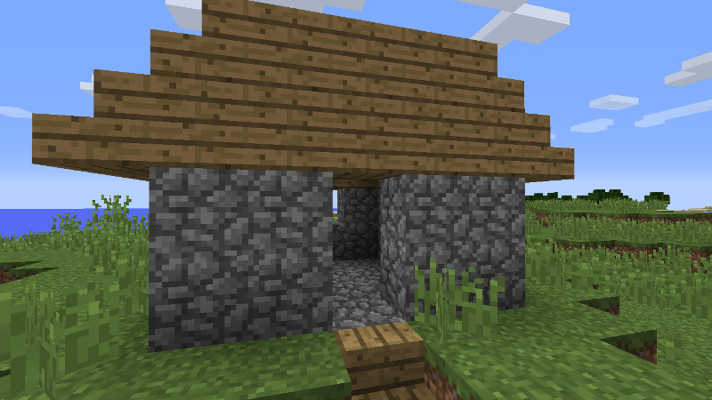
A cosy hut with walls like a bunker.
Notch once wrote that he considers the addition of half-height blocks and stairs an ugly hack, and that it might have been better to make the blocks half as tall. Imagine a Minecraft where all the blocks were 1x1x0.5 metres.
Of course, that still leaves the walls, and even 50cm is still very thick for a wall, so really, the block size would have to be maybe 25cm. At which size, due to memory constraints, the world would be a quarter the size in each dimension as well. Say goodbye to expansive vistas and hillscapes and deep mines. Gone, in exchange for sanely sized walls. It would be a different game.
Moreover, making the tile size smaller than a human body introduces a host of headaches. You have to put in checks to see if the player even fits into a space. And the human body is quite squishy and bendy. Some people can fit through a 25x50cm slot easily. I don't think I could, but a 50x75cm one, sure! But most adults cannot stand in a 25x25x200cm hole, or get out of a 50x50x400cm one.
Again, this could be an interesting thing for a game to focus on, but how do you communicate this information to the player? Make a caving game and have the player get stuck in narrow passages and drown, like what happens to real-life cavers every once in a while? That doesn't sound like fun to me.
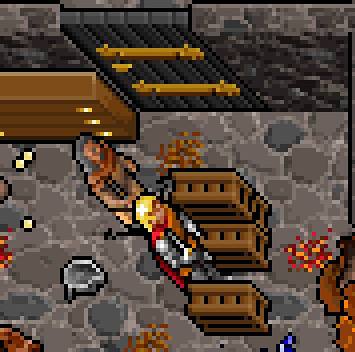
A compromise tile size appears to be just about possible with some bending of objects' sizes. Ultima 7 made its tiles just about big enough for one character to plausible occupy them, while making its walls a realistic thickness:
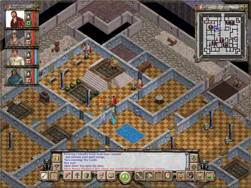
To get around the problem of representing walls, a lot of games just draw the walls thinner than the tiles they occupy. Walls are a full tile thick, they just don't look like it. The Avernum games are a good example of this:
Other games incorporate the information about which direction a tile is open in into the tile itself. This is common in physical games where the game map is built up over time by the players, such as Betrayal at House on the Hill or Mystic Wood. But doing so means that there's duplicate and possibly conflicting information: what if one tile says the way is clear, and the other one that the way is blocked? Different games have different rules about whether a tile can be placed like that.
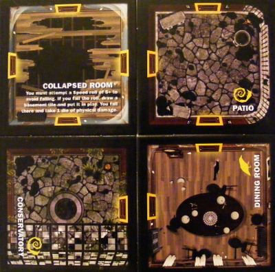
Note that there is no connection between the Collapsed Room and the Conservatory according to the game's rules.
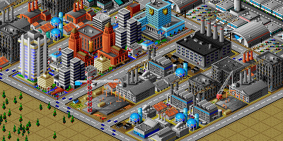
In practice, games get around problems with objects not fitting into a grid well by just changing the size of those objects. Take SimCity 2k: its roads are as wide as a house, because that's the tile size.
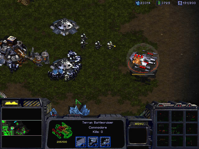
Or look at StarCraft: Based on the size of a space marine, a tile is perhaps 2m across at best, which would put a Battlecruiser in at about 16m. There's no specific size mentioned in the game lore, but its clearly at least an order of magnitude larger than that.
Civilization, too, plays havoc with scales of space and time. It would not actually take your spearmen 200 years to reach the next city. And you can see that the game's tiles are truly huge by looking at attempts to fit the real Earth into a standard-sized map.
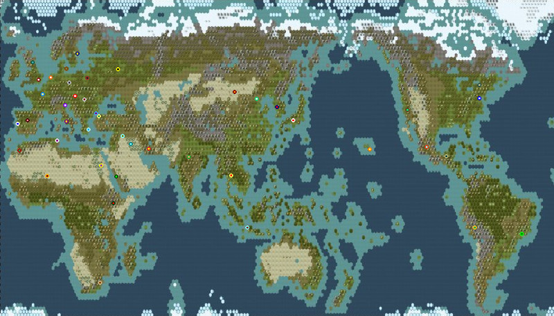
These are acceptable breaks from reality. Especially as we zoom out a bit, and are no longer dealing with human-scale objects, no one minds or cares that things are all the wrong size relative to each other. But still, those fat walls are vexing.
Another way to represent walls is to have them placed between tiles. This means there are really two different kinds of tiles: square floor tiles, which can contain objects, and thin wall tiles, which define which floor tiles are connected:
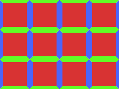
Red: floors. Green and blue: walls.
What about unequal block sizes in 3D? Minecraft sort of has this in the form of half-blocks, but it's a hack on top of a regularly spaced grid of blocks. But Dwarf Fortress actually has an unequally sized block system.
In Dwarf Fortress, if you mine out two horizontally adjacent blocks, they become connected. But if you mine out two adjacent blocks on different layers, they are not connected. They are still separated by a floor/ceiling. If you want to make them part of the same connected space, you need to use a different mining command - channel - to break through the floor.
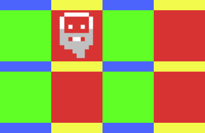
Blue and yellow: floors/ceilings. Red and green: rooms.
So Dwarf Fortress really has a grid that's made of alternating layers of thin and thick blocks - floors and rooms. But it does not have this alternation between horizontally adjacent blocks. Floors are thin in Dwarf Fortress, but walls are thick.
The most consistent way of dealing with human-scale 3D arrangements of matter without going into the complexity of having a block size that's smaller than a human being would be to have a 3D grid of alternating walls and blocks in all three directions. Each block would be surrounded by six walls on each side.
The block would be big enough for one person to crouch in - 80x80x80cm should suffice - and the walls would be a reasonable thickness - 20cm. The grid would on average be a clean 2 blocks per metre, but spaced in a way to allow for walls of a sane thickness.
Wall tiles could be empty, connecting two room tiles, or solid, perhaps containing a hatch or part of a door. A person would either occupy one block, crouched, or two blocks with no wall between them, standing.
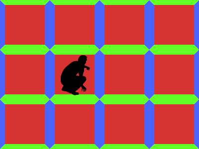
Red: blocks. Green: floors/ceilings. Blue: walls.
Many grand strategy games, such as the Dominions and Europa Universalis, use tiles that are of arbitrary shape:
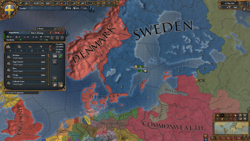
For more regular shapes, maths says that there are exactly three regular polygons that can be tiled without a gap: triangles, squares, and hexagons. Most games that use tiles use squares, perhaps rotated and stretched. Some use hexagons.
Volvox uses triangular tiles, which makes it almost unique:
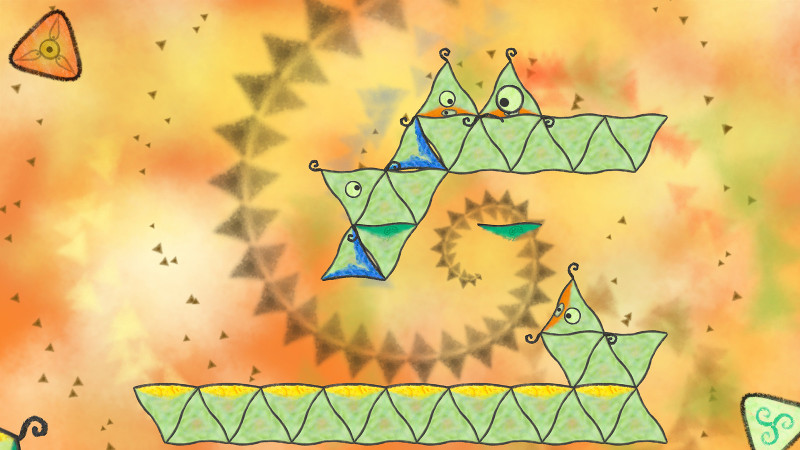
And Renowned Explorers is the one game I've found that uses a tiling scheme of irregular convex polygons, which is pretty cool:
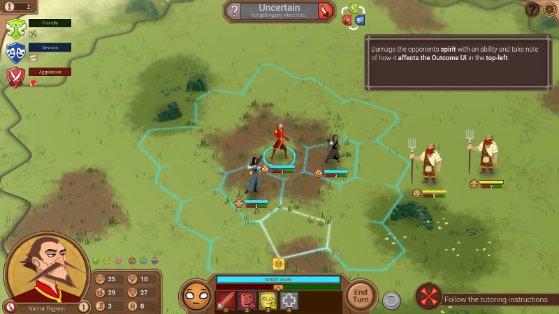
A tiling scheme using a mixture of different regular polygons would also be feasible, which could be very pretty, if perhaps confusing. But look at these:
A series of fortresses connected by causeways, with fields in between?
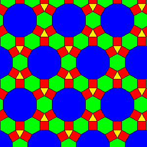
Ritual circles?
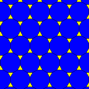
A strange, jagged landscape?
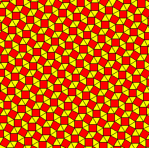
There's room for at least one game that does something interesting with this.
In conclusion, there's a lot of different ways in which you can quantise space in a game. Coarse- and fine-grained representations, homogeneous and heterogeneous ones, all have their advantages and disadvantages. There's a lot of unexplored design space to play with. Your choice of grid size and shape helps determine what's important in your game, and picking an unusual option may lead to novel gameplay.
Thanks to Robin Bornschein, Alastair Aitchinson, John Wilkinson, Tito Ghio and Reto Senn for game examples and screenshots. I most certainly missed some interesting games and tiling schemes in this article, so if you can think of any, drop me a line, and I'll make an addendum.
Read more about:
Featured BlogsYou May Also Like